
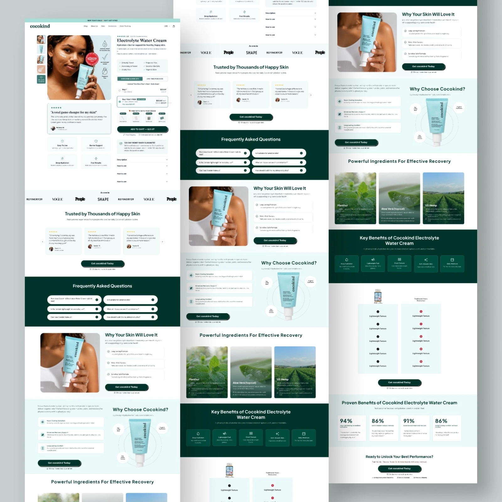
I just redesigned a skincare brand's PDP. Here's what the original was doing wrong:
❌ No primary CTA – "Visit our website" isn't a purchase button
❌ Buried benefits – "Why Choose" section reads like generic fluff
❌ Overwhelming FAQ – 9 questions before the buy button? That's doubt, not clarity
❌ Zero social proof above the fold – Trust signals buried at the bottom
What I fixed:
· One obvious "Add to Cart" CTA above the fold
· Benefit-driven headlines that match ad messaging
· Condensed FAQ to 3 essential questions (rest moved post-purchase)
· Moved trust signals (reviews, ratings) right next to the price
Result: Less friction → more confidence → higher conversions.
If your PDP is getting traffic but not sales, DM me "PDP" and I'll review it and tell you why is not converting and what to improve.
0 likes · 0 views · Aug 23, 2026
I just redesigned a skincare brand's PDP. Here's what the original was doing wrong: ❌ No primary CTA – "Visit our website" isn't a purchase button ❌ Buried b...


