Inorganic Dashboard UI UX Redesign
Hyginus Ukeh
I helped Inorganic Launch a Clean, Modular Dashboard UI With a Flexible Design System
The problem: The existing dashboard UI was cluttered, inconsistent, and hard to navigate.
The goal: To improve the usability, visual consistency, and scalability of Inorganic’s dashboard product by redesigning the UI and introducing a flexible, reusable design system.
Success Metrics: Consistent UI across 90% of the product tracked via design audit
Deliverables
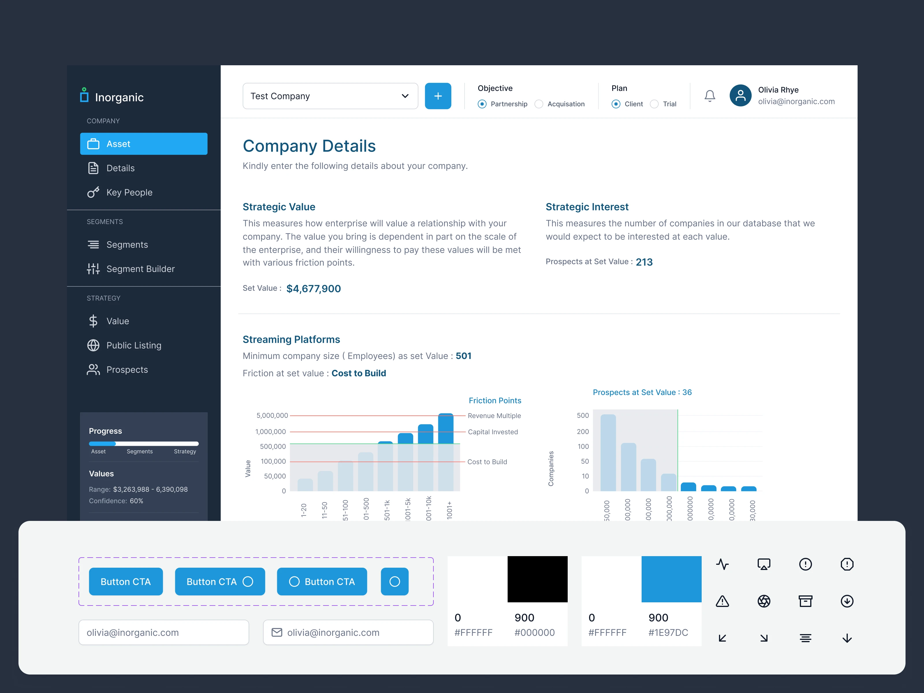
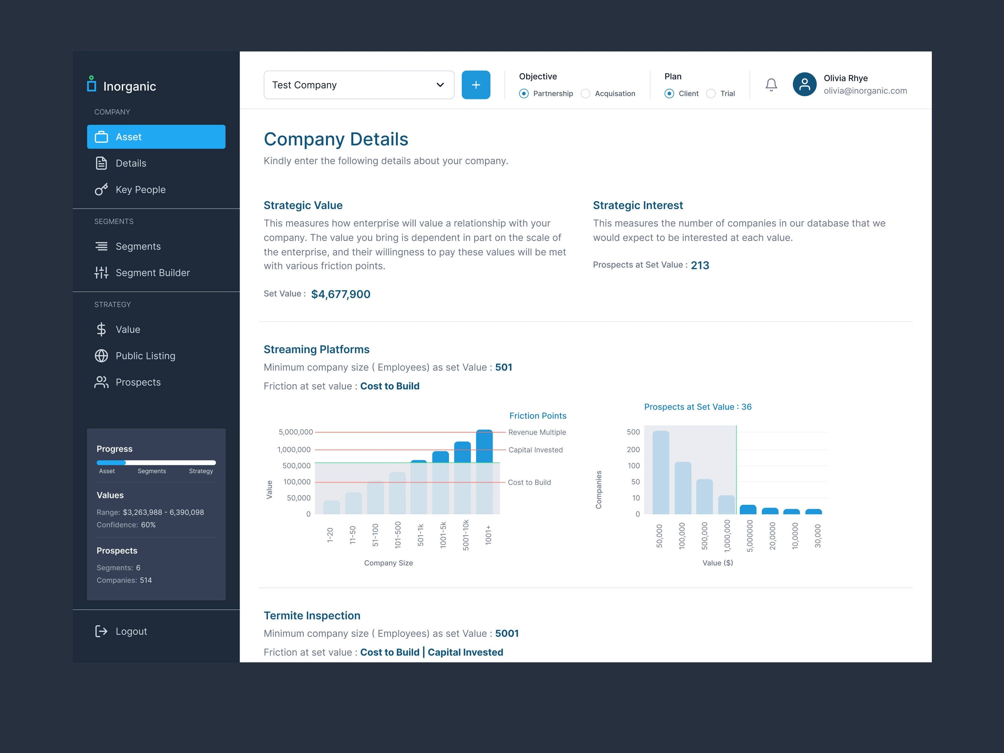
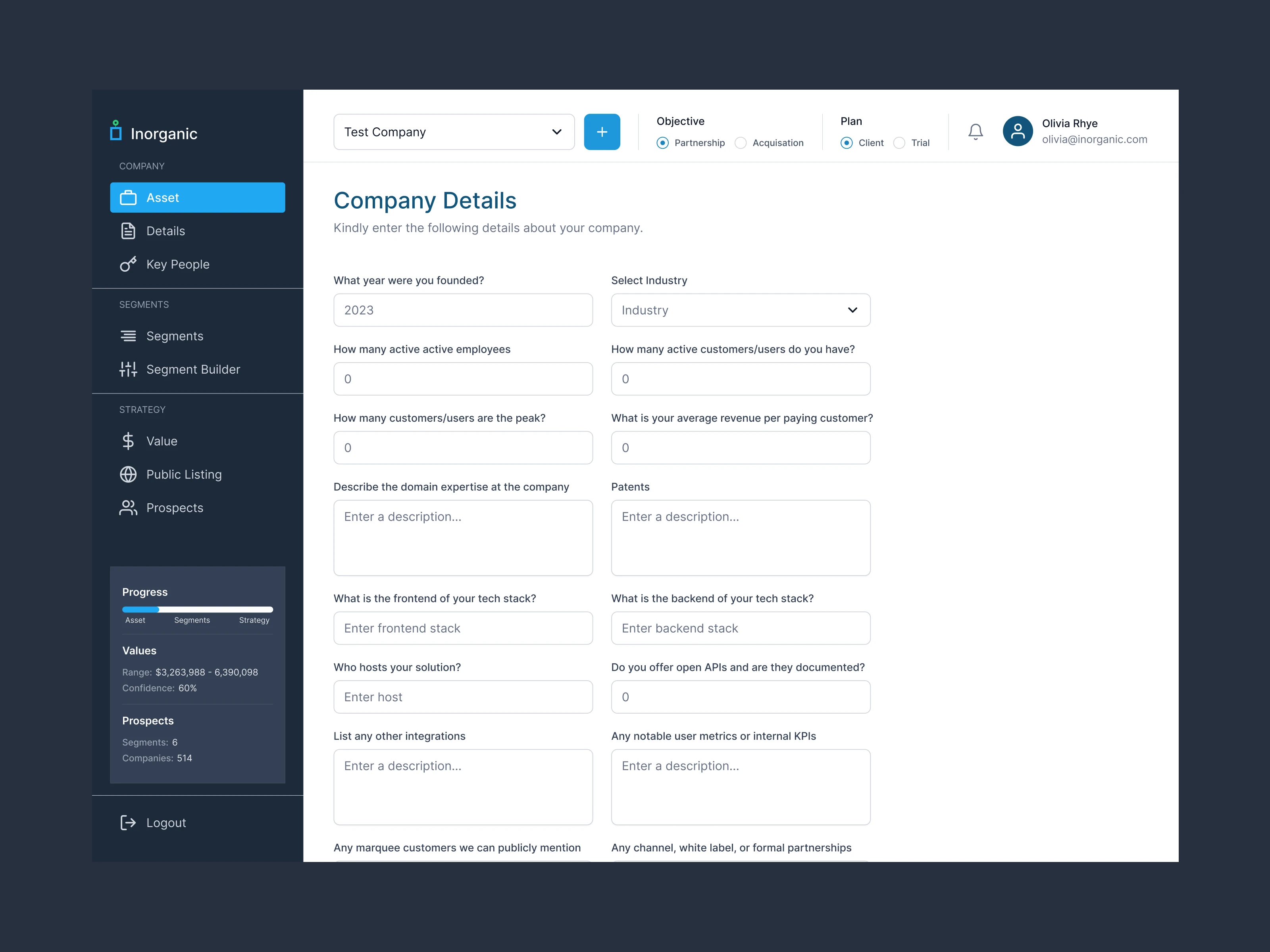
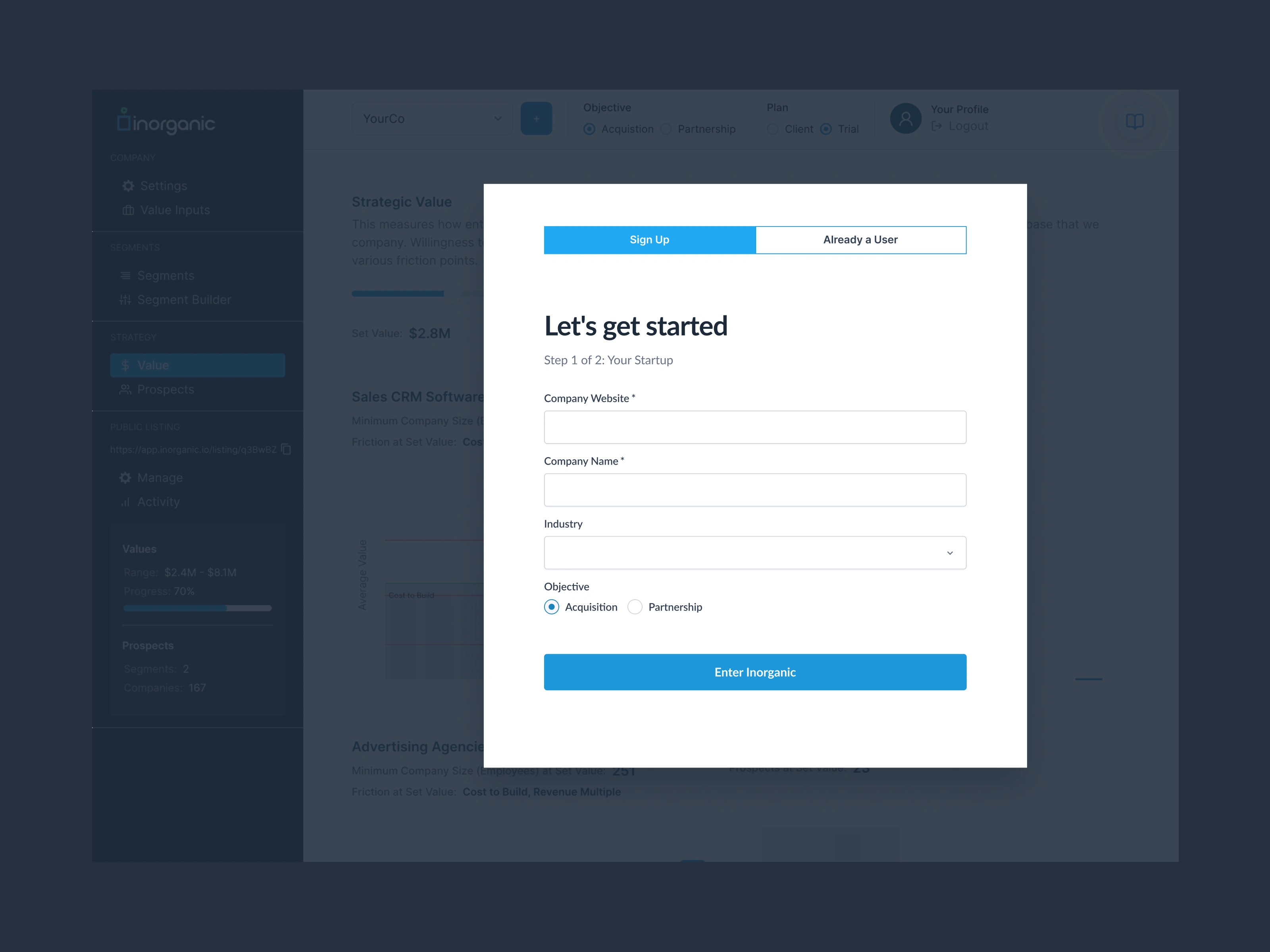
High-fidelity mockups for all key dashboard screens
Updated visual hierarchy, typography, spacing, and color usage
Improved layout logic for easier navigation and data scanning
Build a scalable UI component library including buttons, cards, tables, forms, modals, and navigation bars, complete with interactive states (hover, active, disabled) and a flexible spacing and grid system.
Develop a reusable design system with tokens for color, typography, spacing, shadows, and radius, complete with usage documentation, best practices, and consistent naming conventions to support seamless developer integration.
Create a design audit report highlighting before-and-after UI improvements, including a visual consistency score and a clear action plan to resolve remaining inconsistencies.
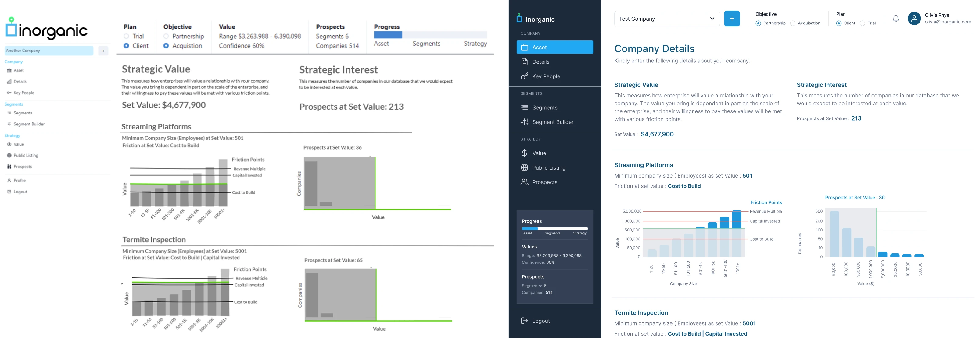
Before/After Dashboard Design Comparison
Challenges
As Inorganic’s team grew from 2 to 14 members, inconsistent UI patterns, duplicated components, and accessibility gaps began to slow down design and development. The product needed a unified design system that could support fast iteration for designers while giving engineers a reliable set of reusable, production-ready components. Balancing long-term scalability with immediate needs like improving the core dashboard, marketing pages, and user onboarding required a strategic focus on building the right foundations first.
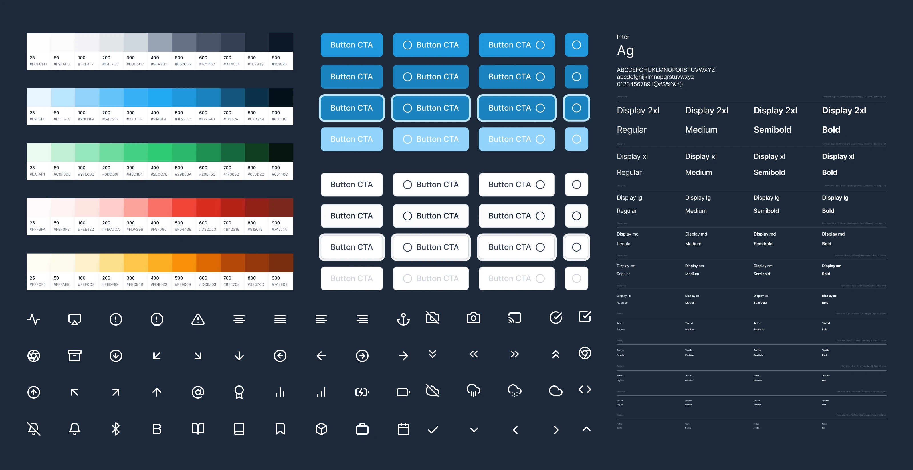
Some Component Library
Solution and Impact
The final design system for Inorganic introduced a WCAG-compliant color palette, responsive layout grids, and a unified icon set, all maintained in a living Figma library synced with engineering workflows. Core components like navigation, data cards, and modals were built with accessibility and dark mode variants from the start. Post-launch, the team was able to eliminate redundant UI patterns, streamline collaboration, and speed up implementation. A design audit conducted after rollout showed over 90% UI consistency across the product meeting our key success metric and setting a strong foundation for future scaling, onboarding, and feature delivery.
Client Feedback : "Excellent designer. Very responsive to requests and easy to work with. Highly recommend!" - Paolo, Assorted Startups
Like this project
Posted Jul 6, 2025
Redesigned Inorganic’s dashboard UI and built a flexible design system to boost usability, ensure consistency, and support future product scalability.
Likes
2
Views
32