Brand and Packaging Design for SVRY Nutrition
Amanda Guerassio
Logo, icons, packaging, print collateral, brand guidelines, web wireframes, art direction, and AI-generated images for nutrition start-up.
Client: SVRY Nutrition
Industry: CPG / Food & Bev
Date: 2024
SVRY Nutrition was born during a hot, sweaty run in NYC. Craving savory flavors while eating a sickly sweet energy gel at mile 12 of a 16 mile run, co-founder Claudia Dodge envisioned something unique – savory performance nutrition. This idea evolved into a range of savory protein bars, shakes, and oatmeals, balancing taste, nutrition, and embracing bucking the norm of sweet performance nutrition. SVRY redefines performance nutrition with flavors inspired by real ingredients, and aims to taste like food, not dessert.
I was brought on board while Claudia and her co-founder Schalk were still refining recipes. They knew it was going to be a long process from concept to packaged reality, and wanted a designer that could help them create and shape the brand long-term.
Over the scope of 9 months, and in very collaborative process including regular Zoom calls and a joint Miro board for sharing and commenting, we dialed in on the direction for SVRY’s visual brand, and started on making the pieces they needed a reality.
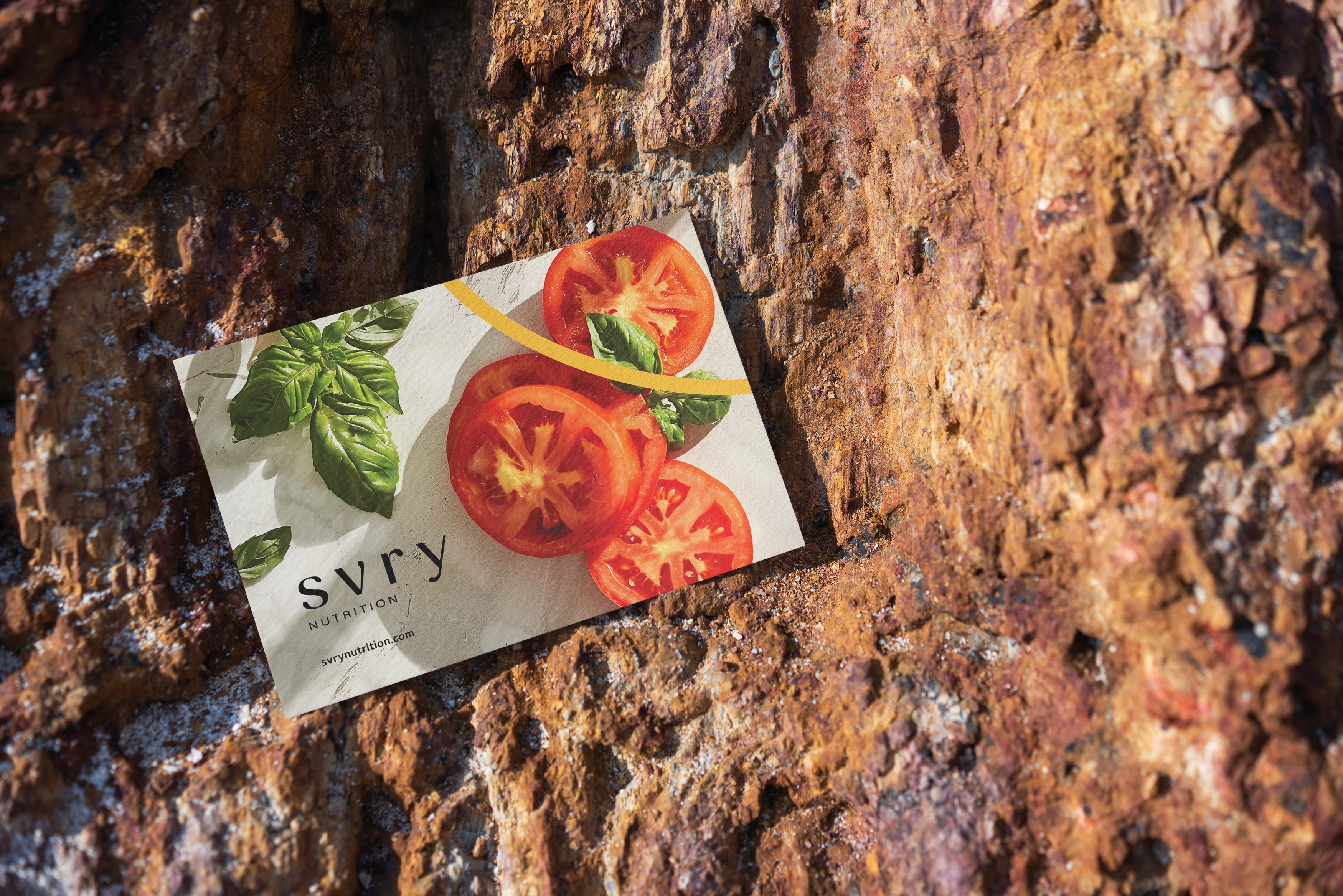
SVRY’s color palette speaks to a natural, earthy, and robust range, reflective of the brand’s commitment to real food and authentic flavors. The colors are drawn from a spectrum that one might find in a well-stocked, health-conscious kitchen, suggesting a blend of traditional wholesomeness and modern culinary adventure. The logo, with its refined and modern typography, conveys a sense of clarity and professionalism, aligning with the brand’s straightforward approach to nutrition, while still having an approachable feel.
The SVRY swoosh is a graphical element that adds visual interest and movement to designs, in a way that is still minimal and refined. It is a soft curve that is always leading off the edge of the page or element it is on, but bringing a splash of constrasting color.
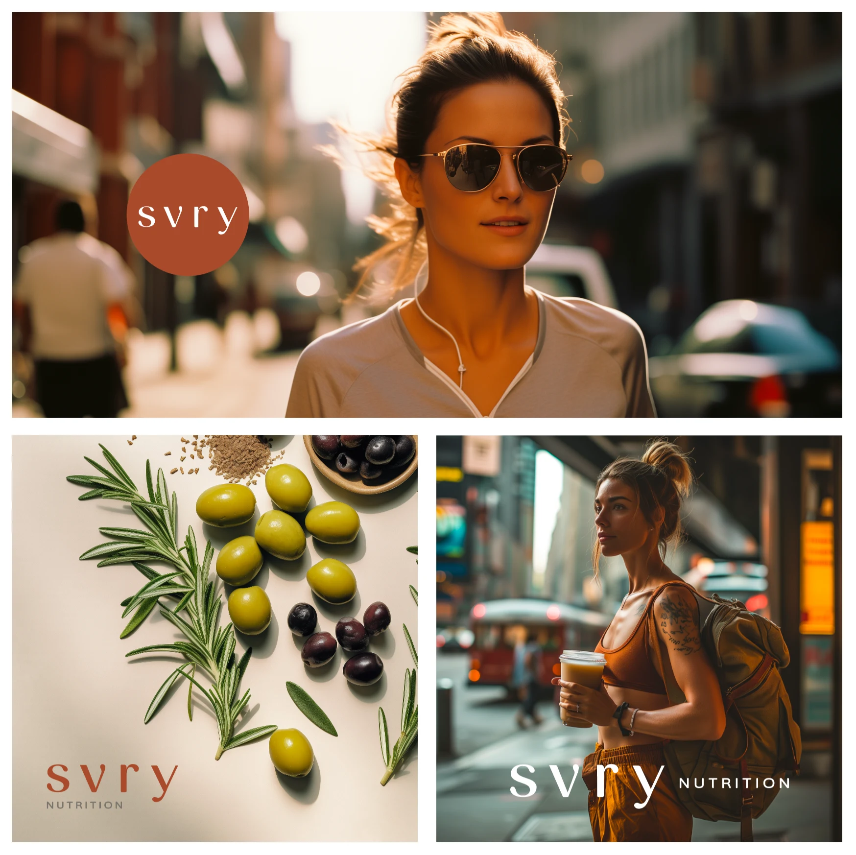
Working with SVRY also gave me the chance to explore the possibilities of AI-generated imagery, particularly with odd combinations of ingredients. SVRY’s emphasis on real food and real flavors meant that they are strongly photo-based (rather than illustration), but finding stock photos of particular ingredients and models that fit our brand (and weren’t holding a chocolate-covered bar) were hard to find. So we turned to Midjourney to produce some of the imagery used. The founders did later have a photo shoot with real models holding real products, as well. Together, they have a diverse library of images to use in materials.
SVRY Nutrition officially launched in fall of 2024. They sold out their first boxes, and have continued to go strong since.
Website and shop are live here.
Work included: creative direction moodboarding, logo suite, color palette, typography, product packaging, box design, R&D templates for packaging, postcards, booklet, letterhead, business cards, custom icons, AI-generated imagery, photo shoot direction, LinkedIn headers, social media templates, web wireframes, and a comprehensive brand guidelines book.
The initial creative briefs that you put together for SVRY Nutrition based on some information about our brand story and brand voice showed that you really “got” what we were trying to do, understood the voice of the brand and had great ideas for how that voice could be conveyed into a visual language. The briefs were also organized in a way that we found helpful and pointed towards an organized and experienced approach to brand development that we appreciated.
You created packaging and a brand that both stands out and fits into the sports nutrition space while expressing some of the unique value propositions of our brand, highlighting ingredients and soft colors and shapes while incorporating shapes that evoke movement and point towards performance. The brand book is a really great encapsulation of our work together, both because it captures the brand that we created together but also, in the specs and the AI generated pictures in between, the book imagines how our brand is expressed in different contexts, from packaging and t-shirts to digital collateral and ingredient layouts.
We also appreciated your flexibility throughout the process – this project represented a lot of firsts for us, meaning that different parts of the project had to be redone to meet new specs or demands throughout and you were patient with us going through that process.”
Claudia & Schalk
Co-founders, SVRY Nutrition
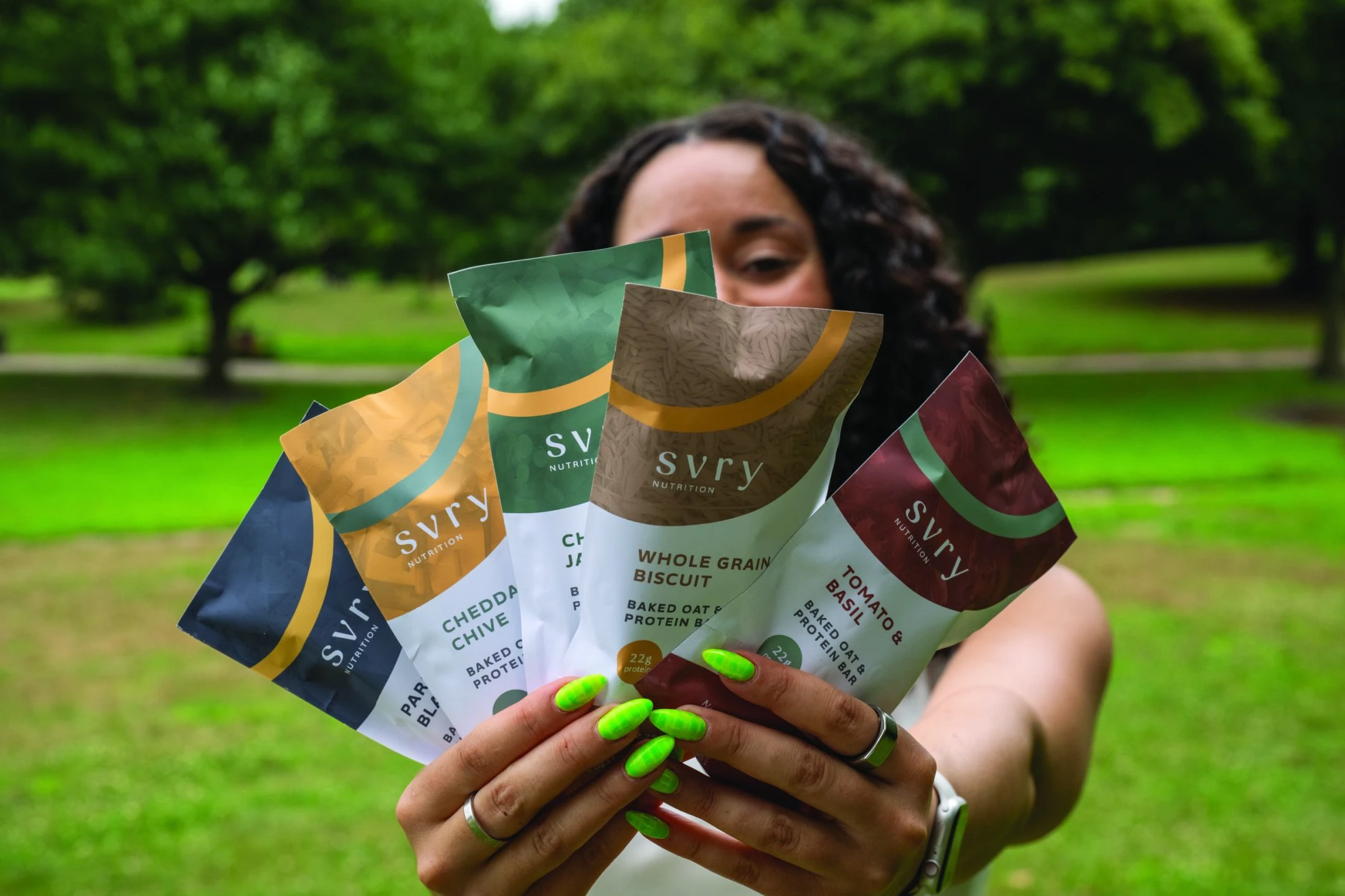
Actual bars (first batch) in action
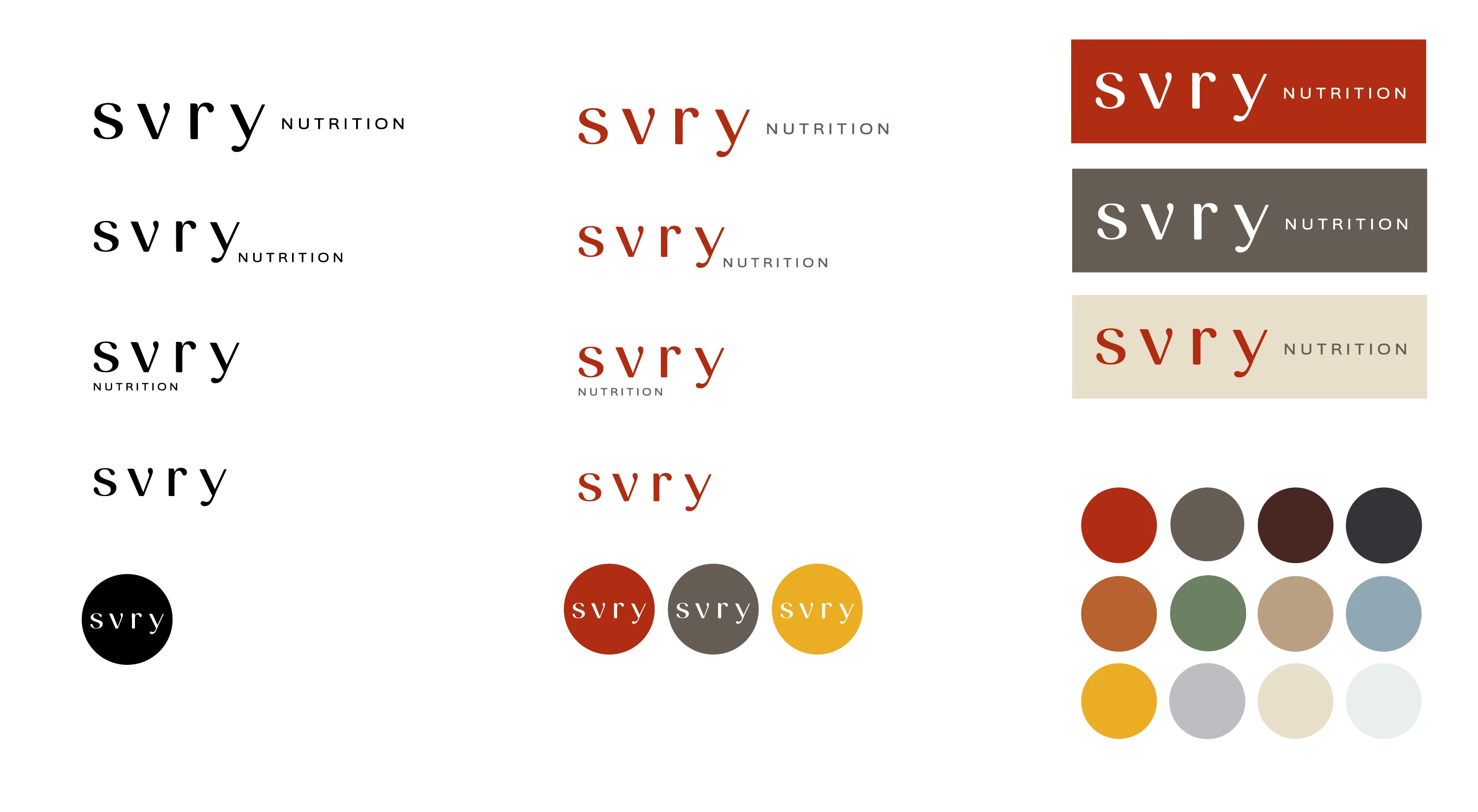
SVRY logo variations and color palette
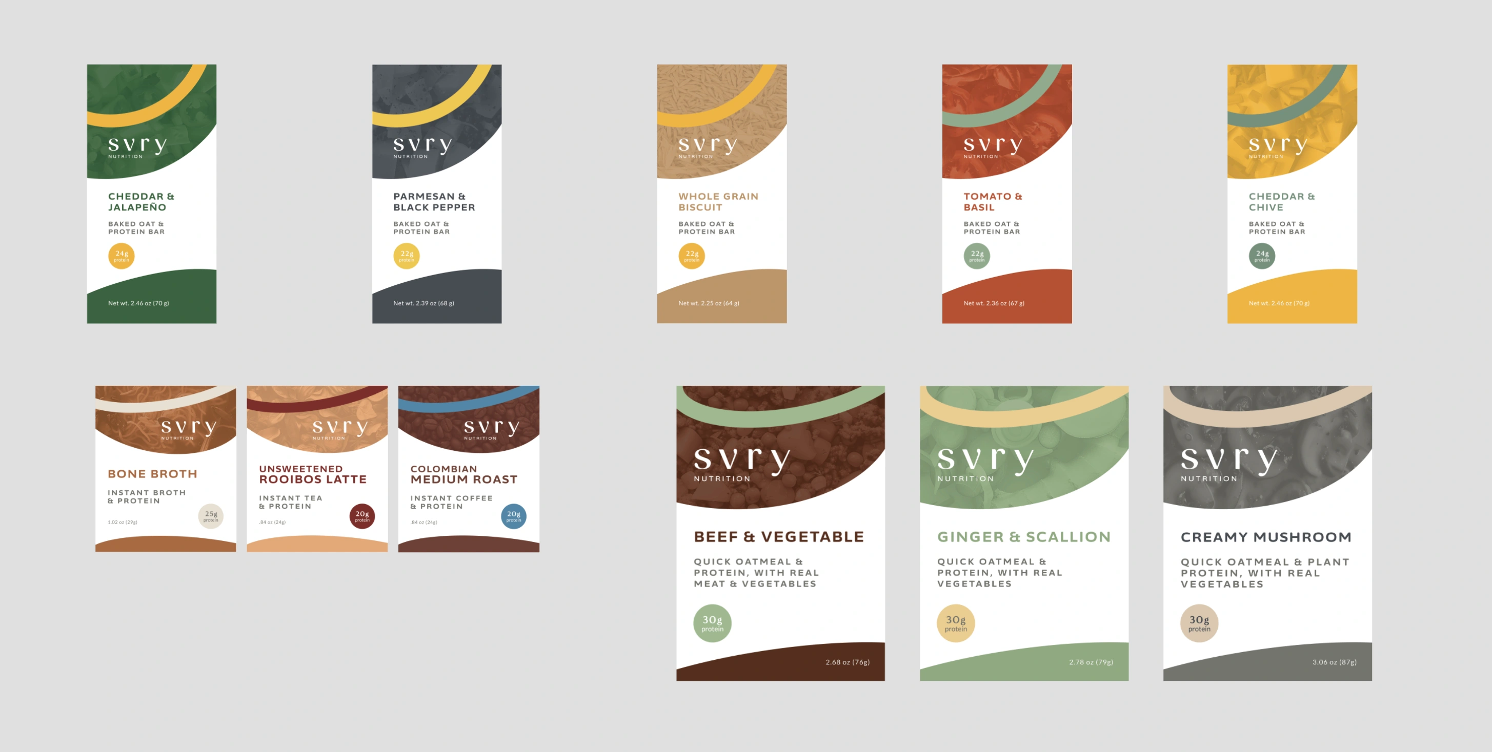
Full packging lineup
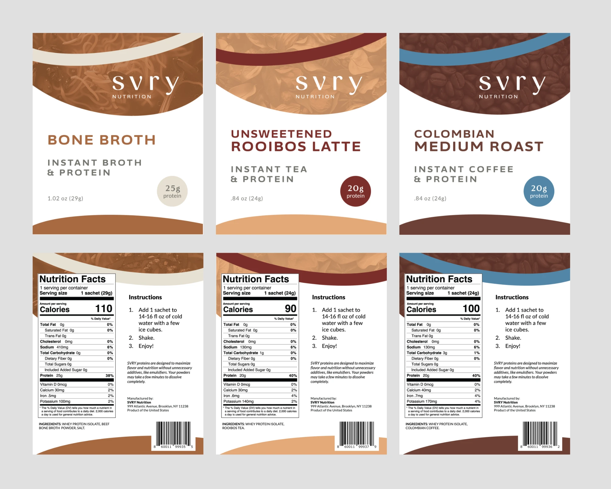
Drink mix packaging, front and back
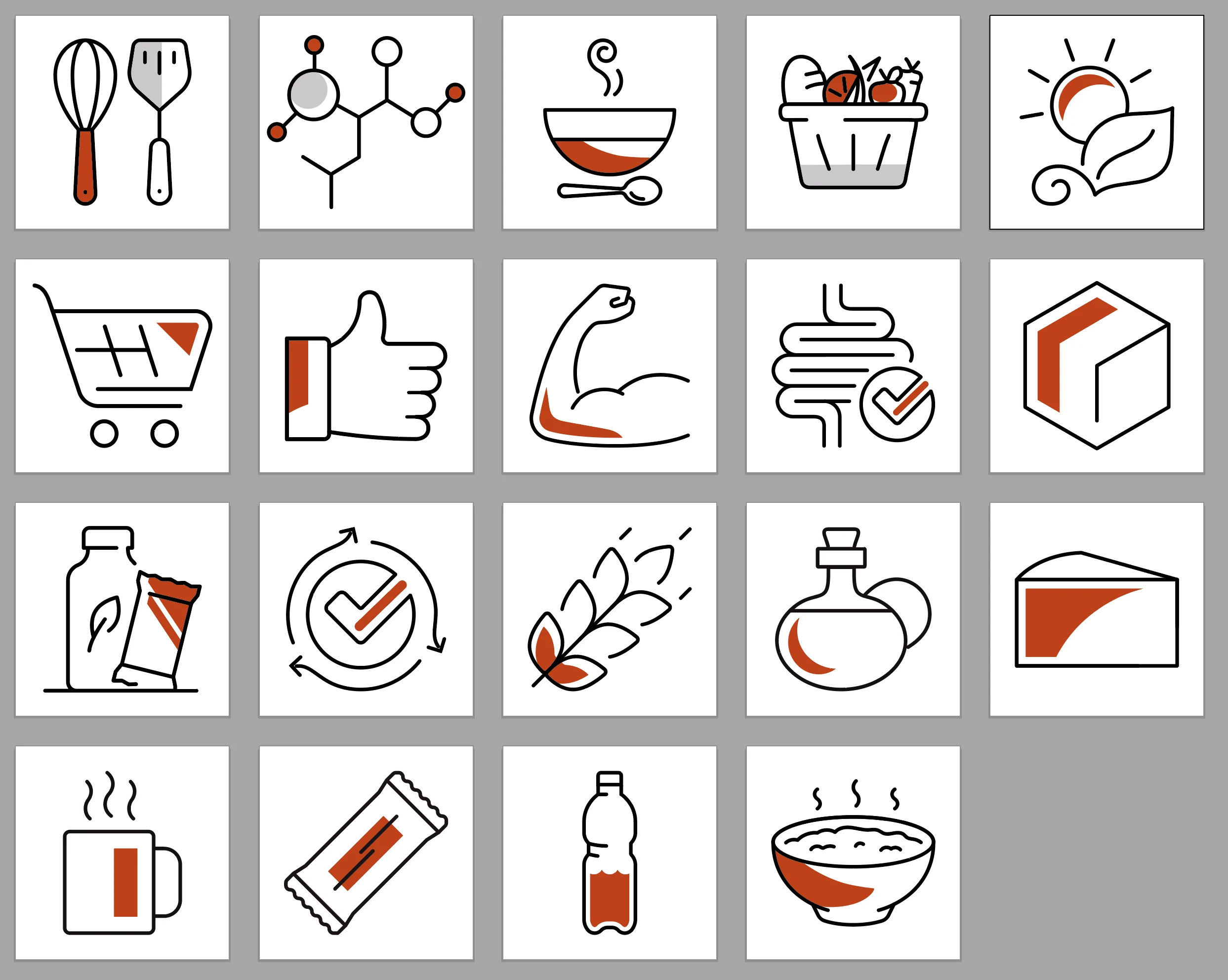
Custom icons
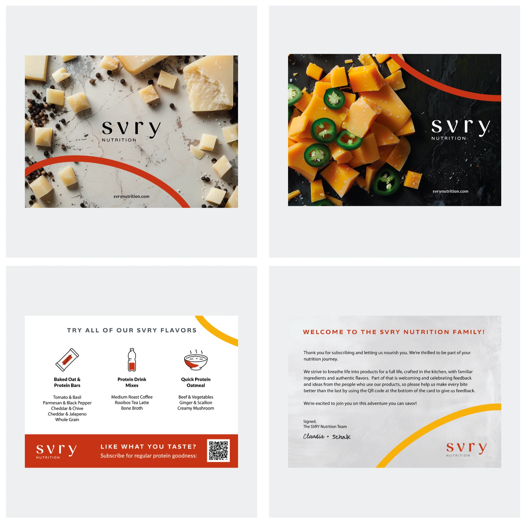
Postcard designs
Logos in use
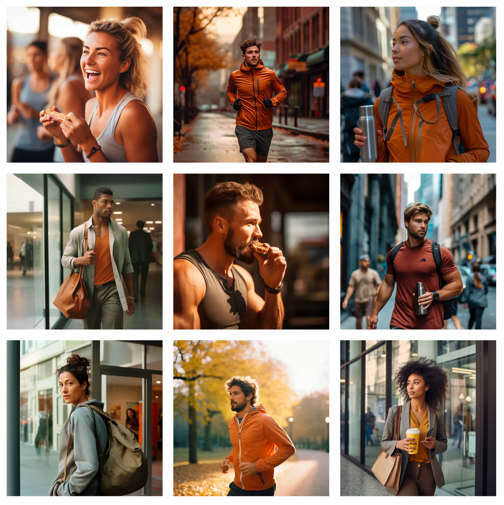
AI-generated custom imagery - people
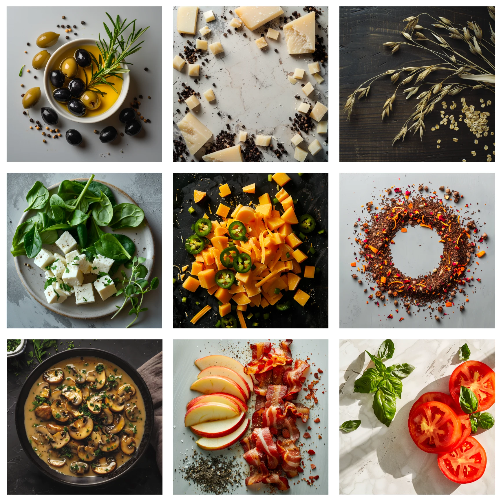
AI-generated custom imagery - ingredients
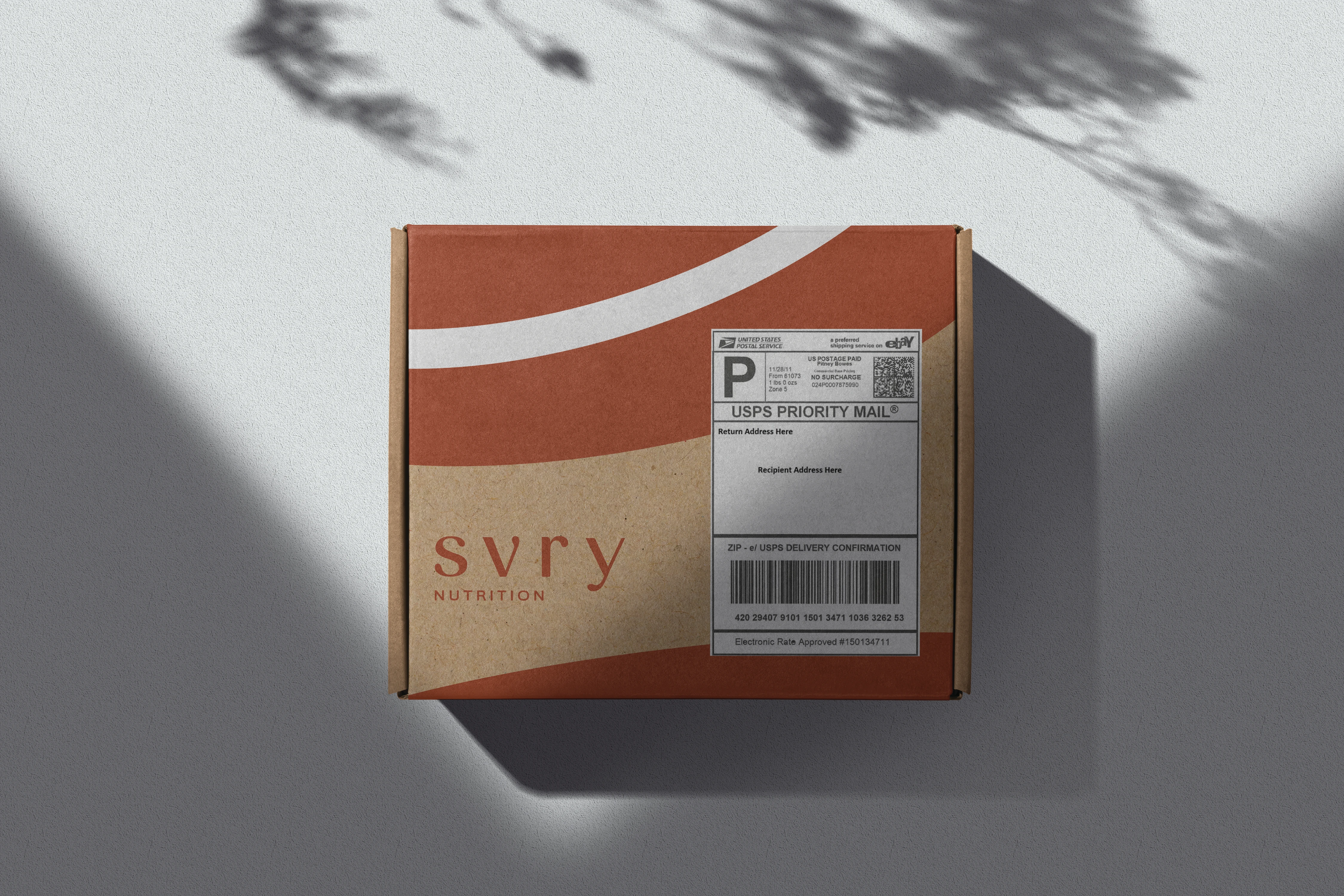
Shipping box mockup
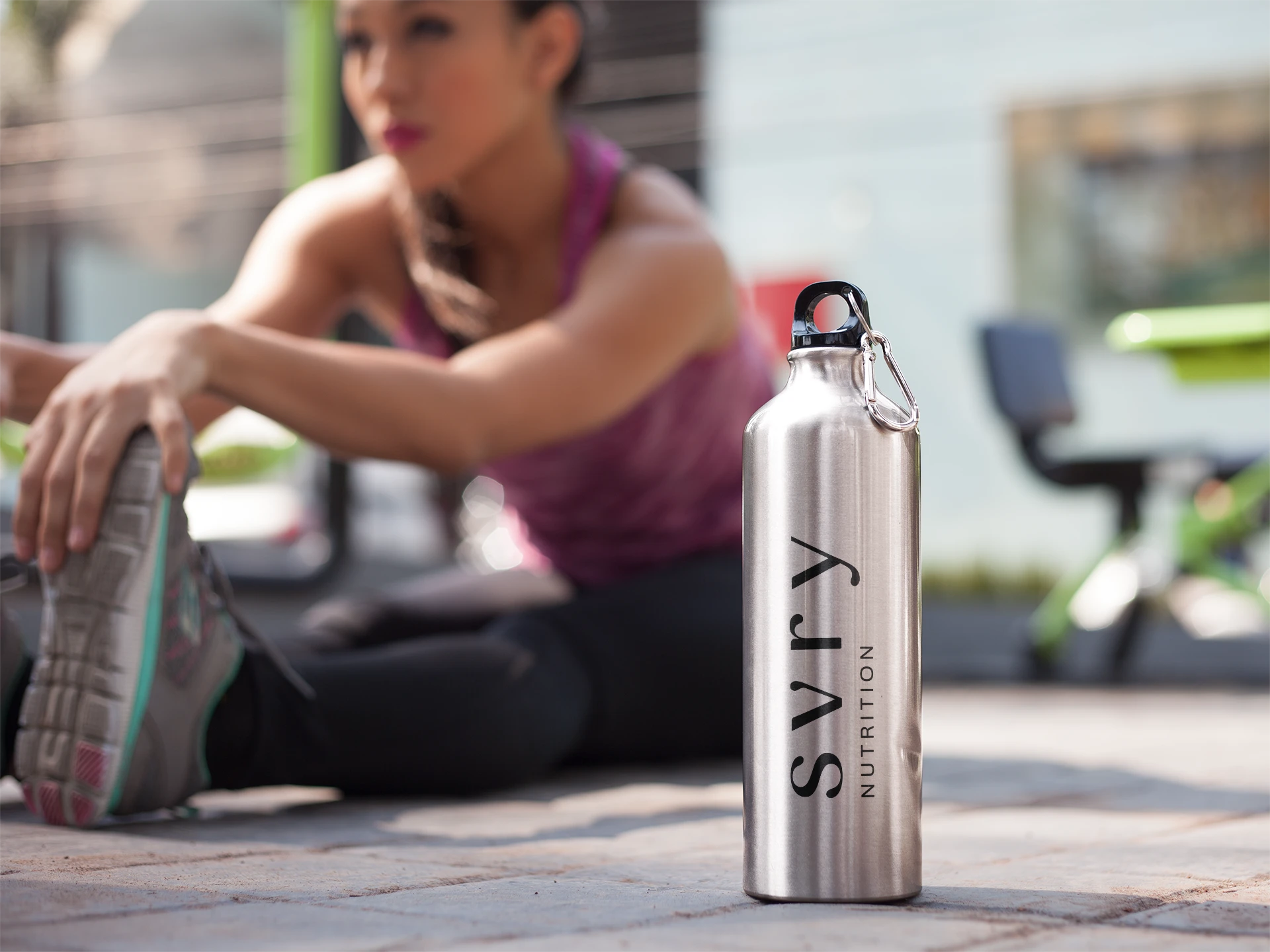
Water bottle
Postcard
Like this project
Posted May 28, 2025
Designed brand elements and packaging for SVRY Nutrition, a savory performance nutrition start-up.
Likes
0
Views
13
Timeline
Dec 1, 2023 - Sep 1, 2024