Apron | Concept Project
Erhan Kbekar
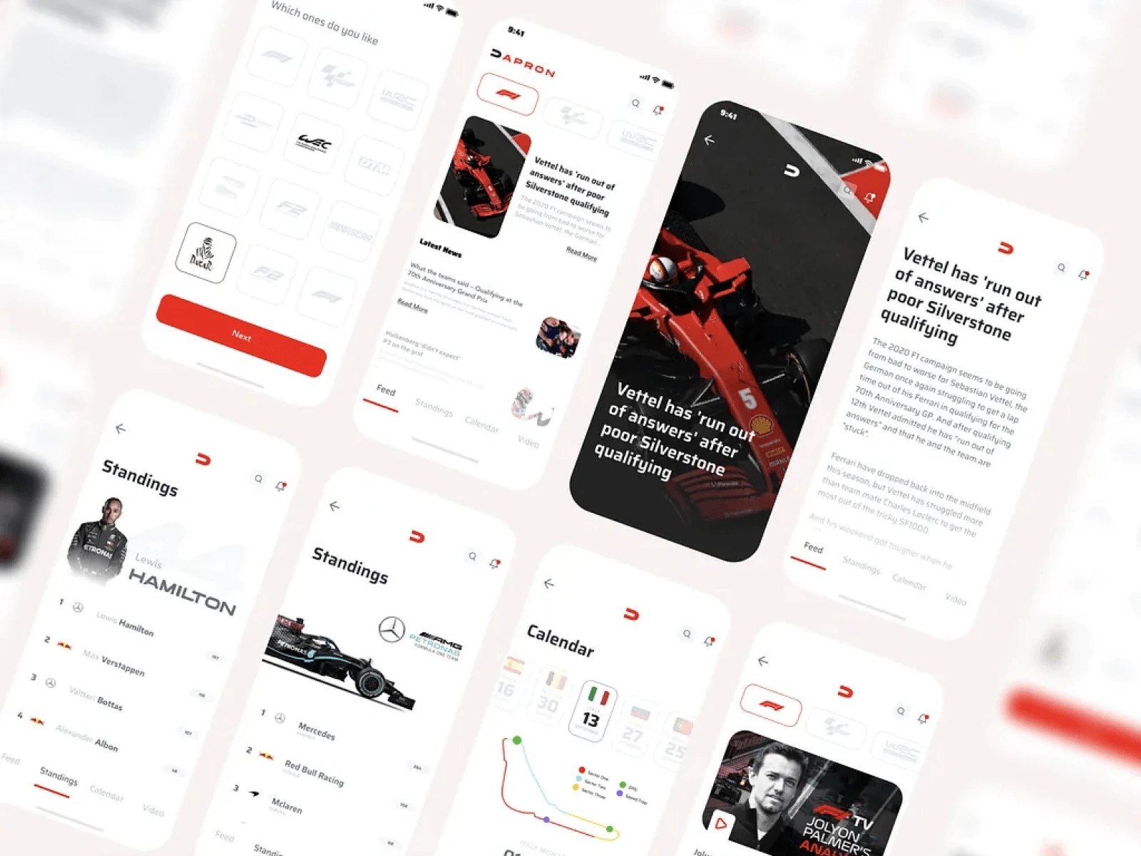
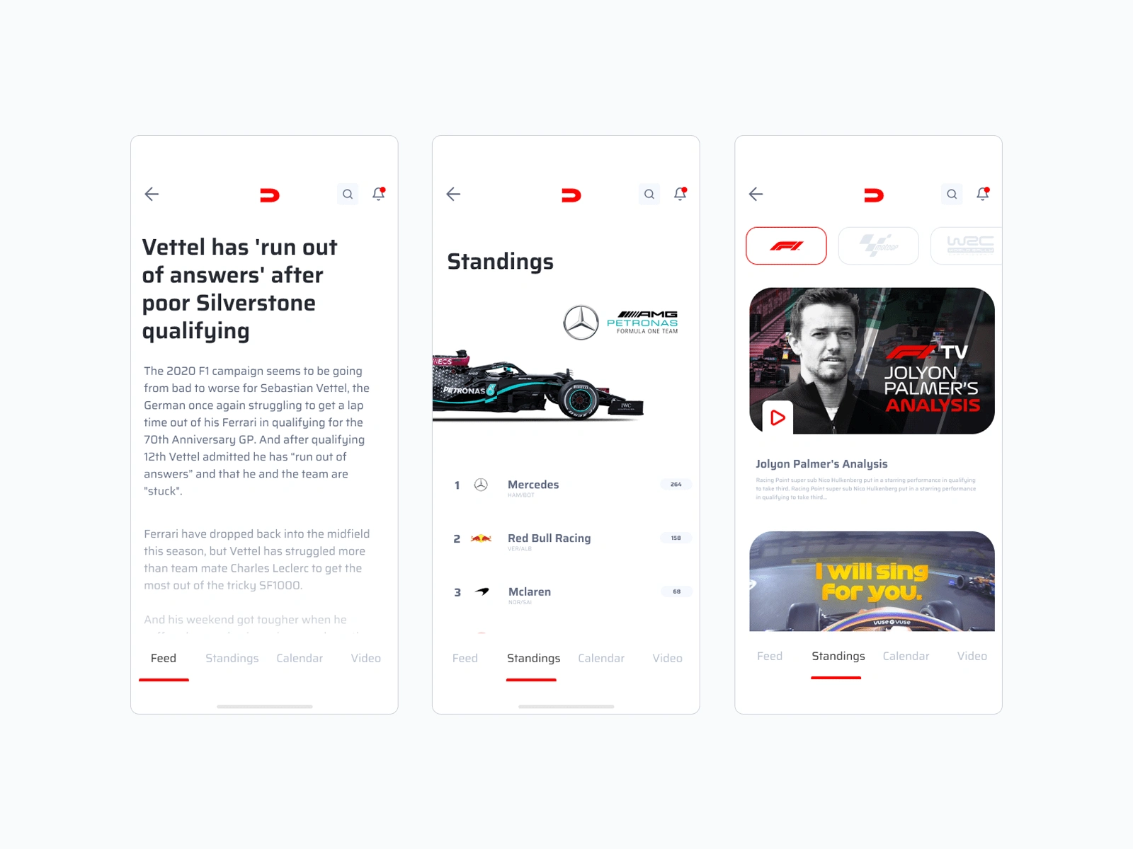
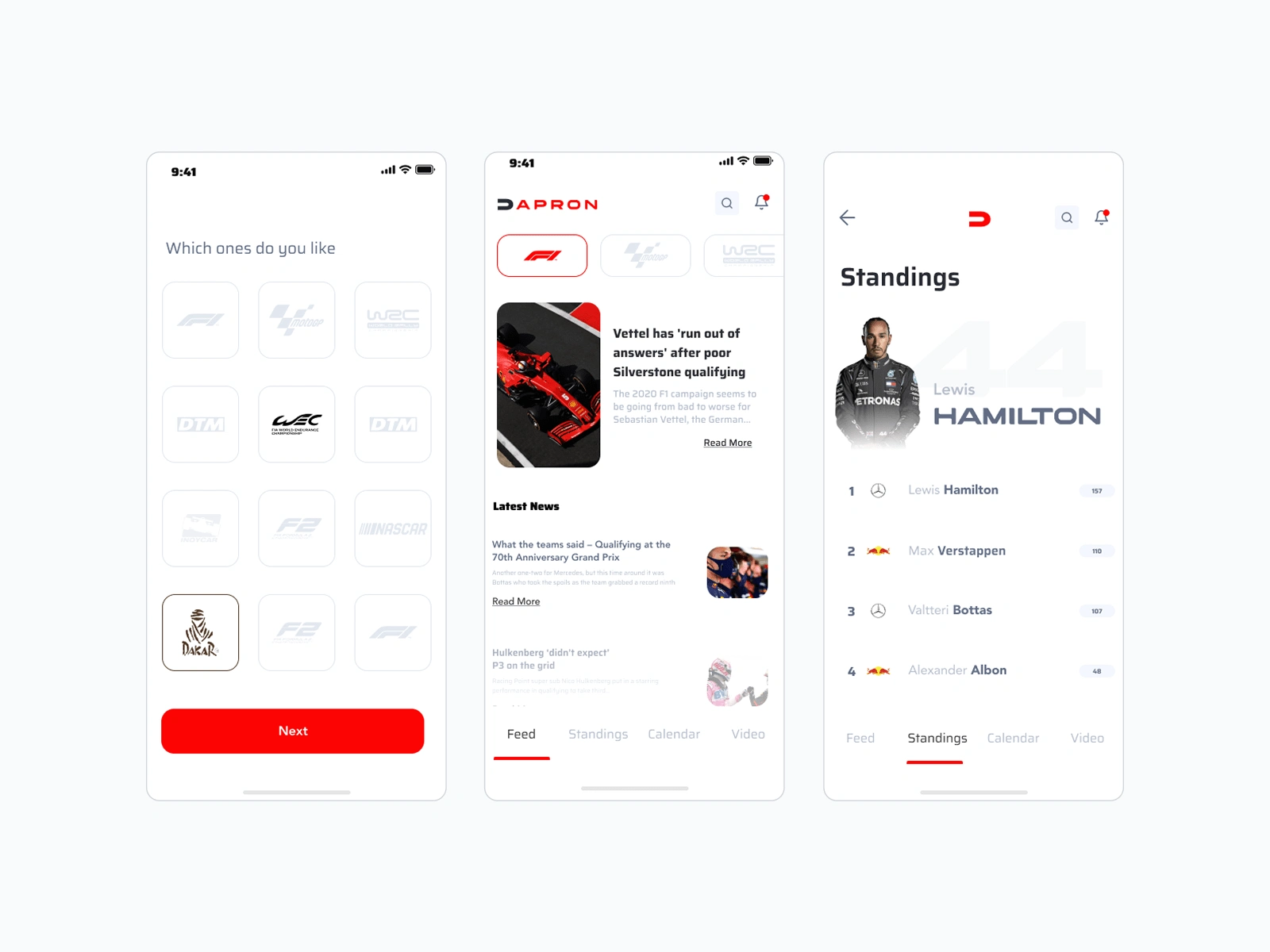
📗What is an Apron? The apron is a platform where those who love motorsports can follow the latest news and watch the races live.
🙌What have I done? I designed visual languages and brand awareness with a new logo, color scheme, application, website, and mobile application.
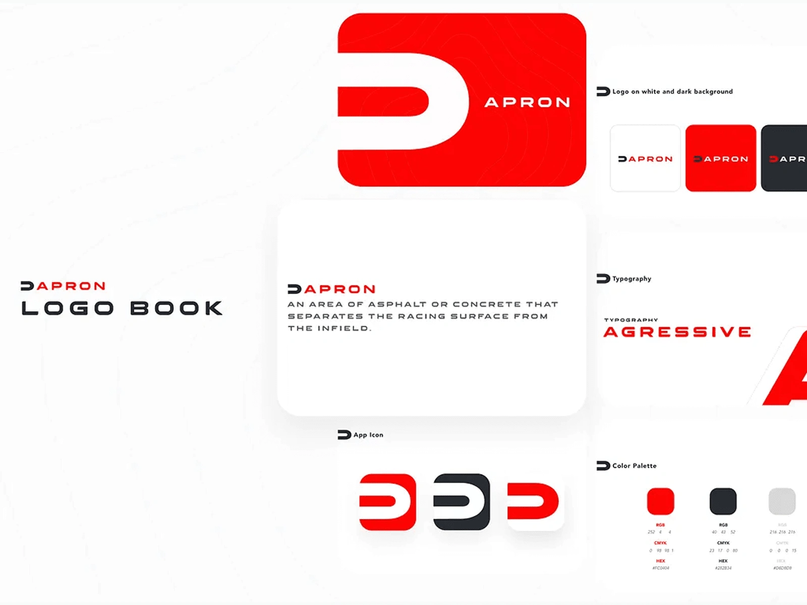
🧠Where Did I Get Inspired? The apron is an asphalt or concrete area that separates the racing surface from the field. I set red, which is often seen in motorsports, as the primary brand color.
What about this work?
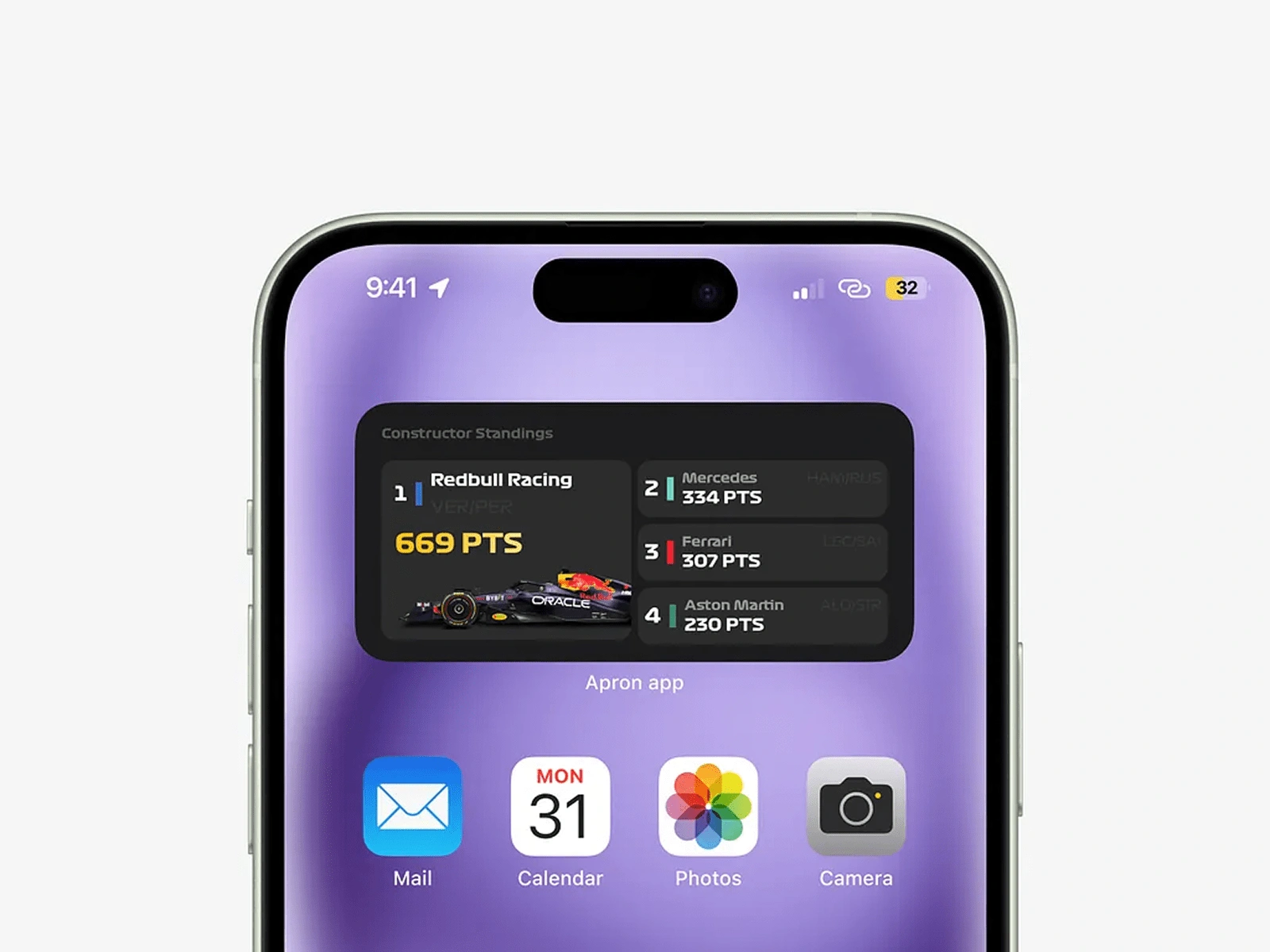
As a part of the app, ı worked on system widgets. The first example is team standings. Users can choose interests can follow the latest standings and stay in touch with the app.
Like this project
Posted Apr 30, 2025
Designed visual languages and brand awareness for Apron, including logo, color scheme, and applications.
Likes
0
Views
4
Timeline
Mar 31, 2020 - Apr 23, 2020