SleepGift
SleepGift is a lifestyle and wellness startup that's created a line of blankets to protect users from radiation emitted by everyday wireless devices.
Assisted in conducting market research to determine ways in which the visual identity of SleepGift could be adapted to appeal to the target market. After creating new graphic materials, SleepGift's digital and print content was updated to ensure all platforms seamlessly aligned with the new brand identity.

The new logo is intended to be friendly, playful and calming so we developed one with soft round edges and a hidden smile which can be used on its own as a logomark. For the new typography we chose different variations of Quicksand due its accessibility and its soft edges which match the logo. Finally, for the brand colours we created a simple pallet that features cool tones since blue is associated with rest and relaxation.
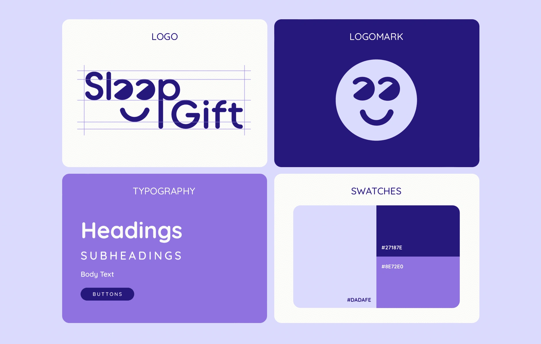
Brand Assets
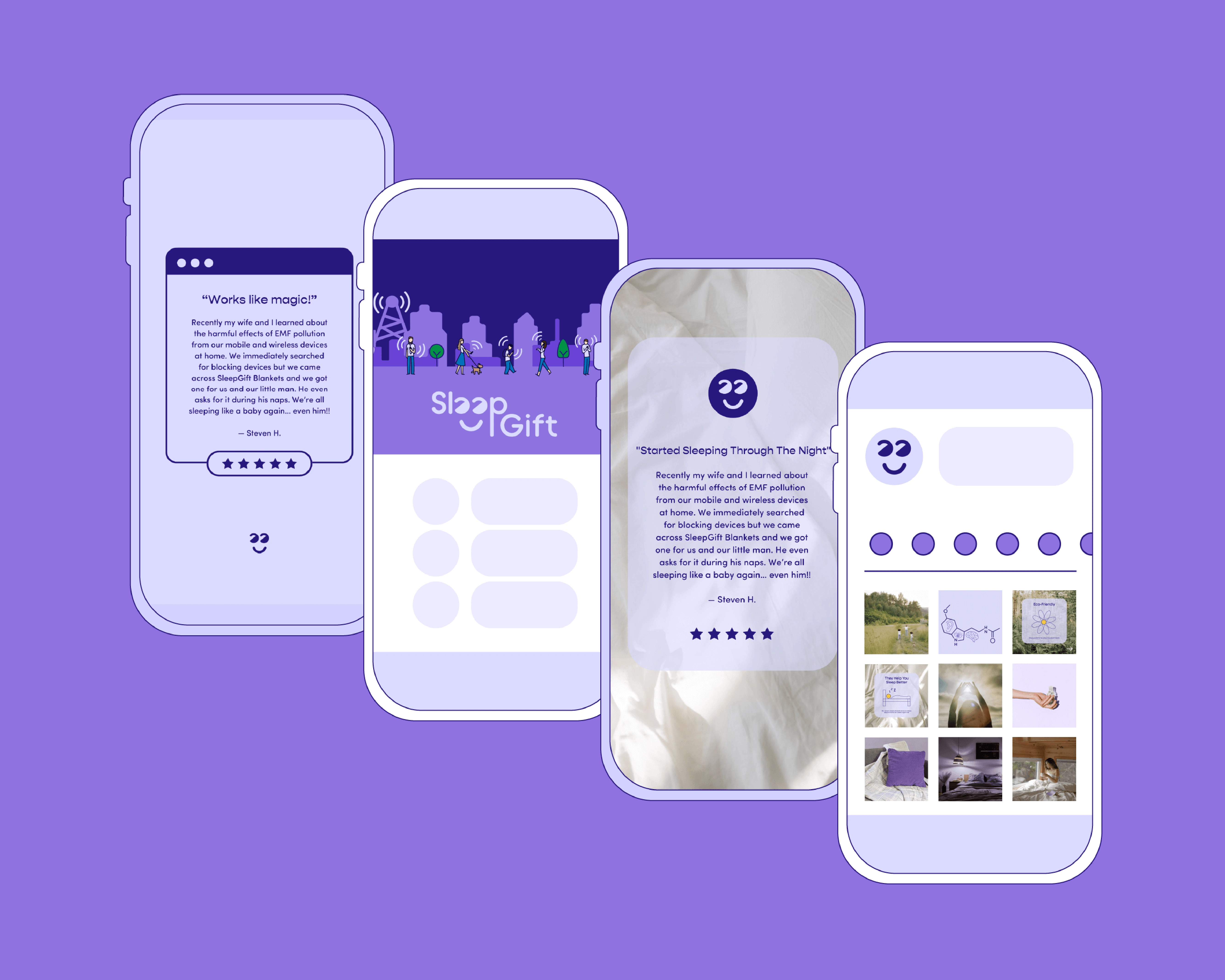
Social Media
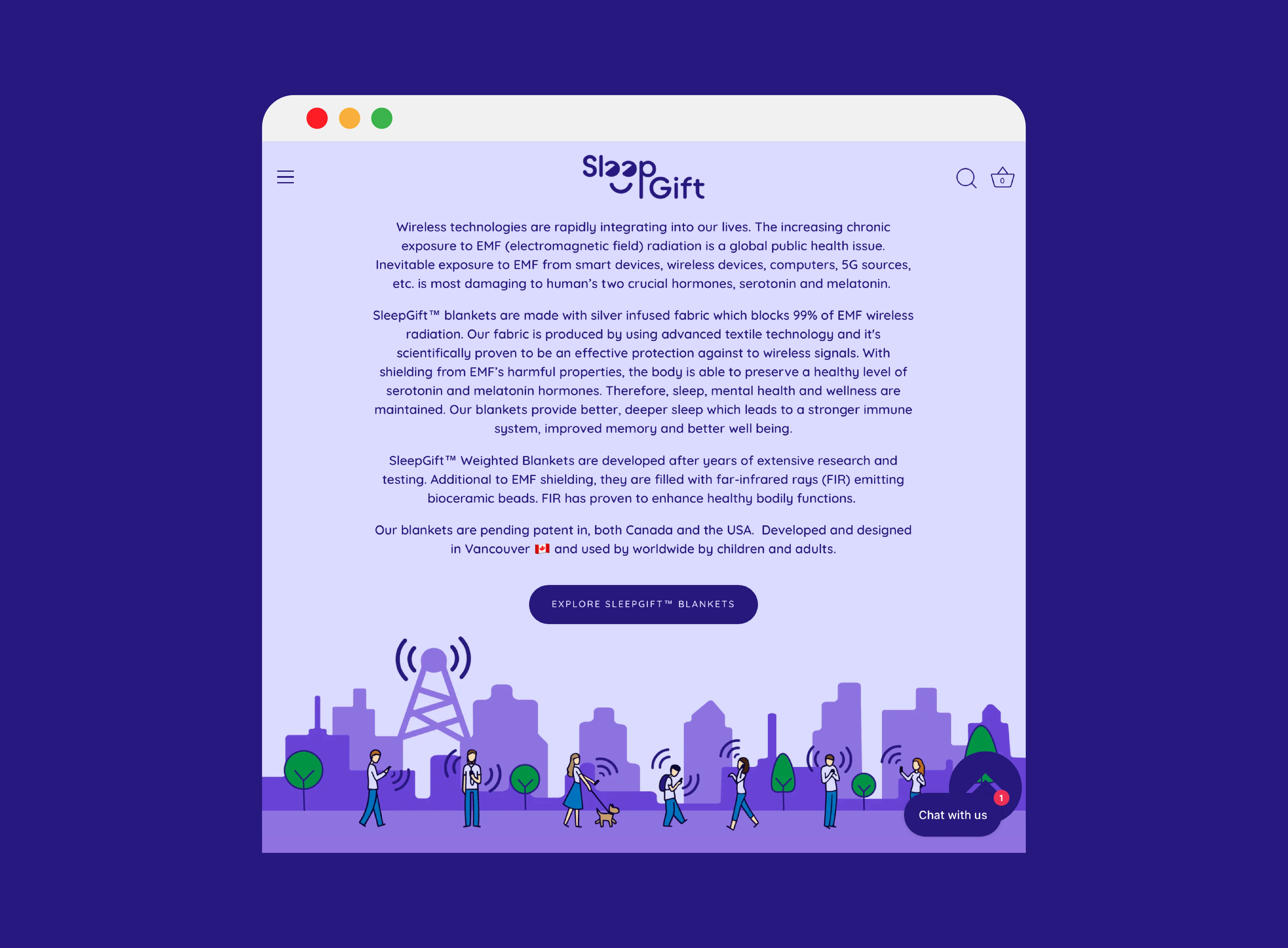
Website
Like this project
Posted Aug 3, 2023
A lifestyle and wellness startup that's created a line of blankets to protect its users from radiation emitted by everyday wireless devices.


