Lauterborn Media
Thay C
Lauterborn Media is a modern advertising agency focused on building strategic campaigns that evolve with culture and media. The client approached me to create a brand identity that felt premium yet approachable, creative but minimal—something that would stand out in a saturated market without shouting.

Goals
The goal was to develop a branding system that:
Captures the agency’s forward-thinking, human-centered approach to advertising.
Feels tranquil, confident, and modern.
Appeals to both startup founders and seasoned marketing executives.
Offers flexibility across digital, print, and merchandise applications.
The client emphasized a desire for:
Minimalism with personality.
Symbolism (sailboats, seagulls, palm trees, etc.).
Avoiding traditional corporate visual clichés.
A clear contrast from tech-forward logos like OpenAI.

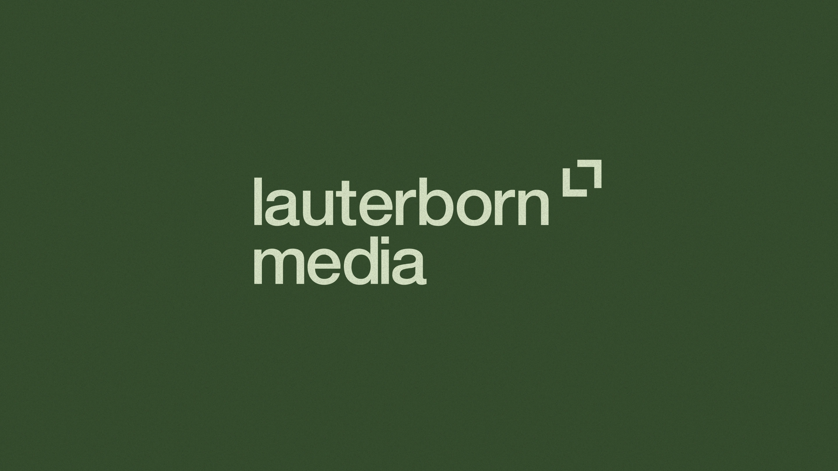
We explored two core visual directions—one playful and expressive, one more restrained and editorial. The client ultimately chose the more minimalist concept, grounded in a clean logomark composed of seven lines (a subtle nod to the client’s lucky number), paired with an all-lowercase logotype that conveys friendliness and humility.
Deliverables
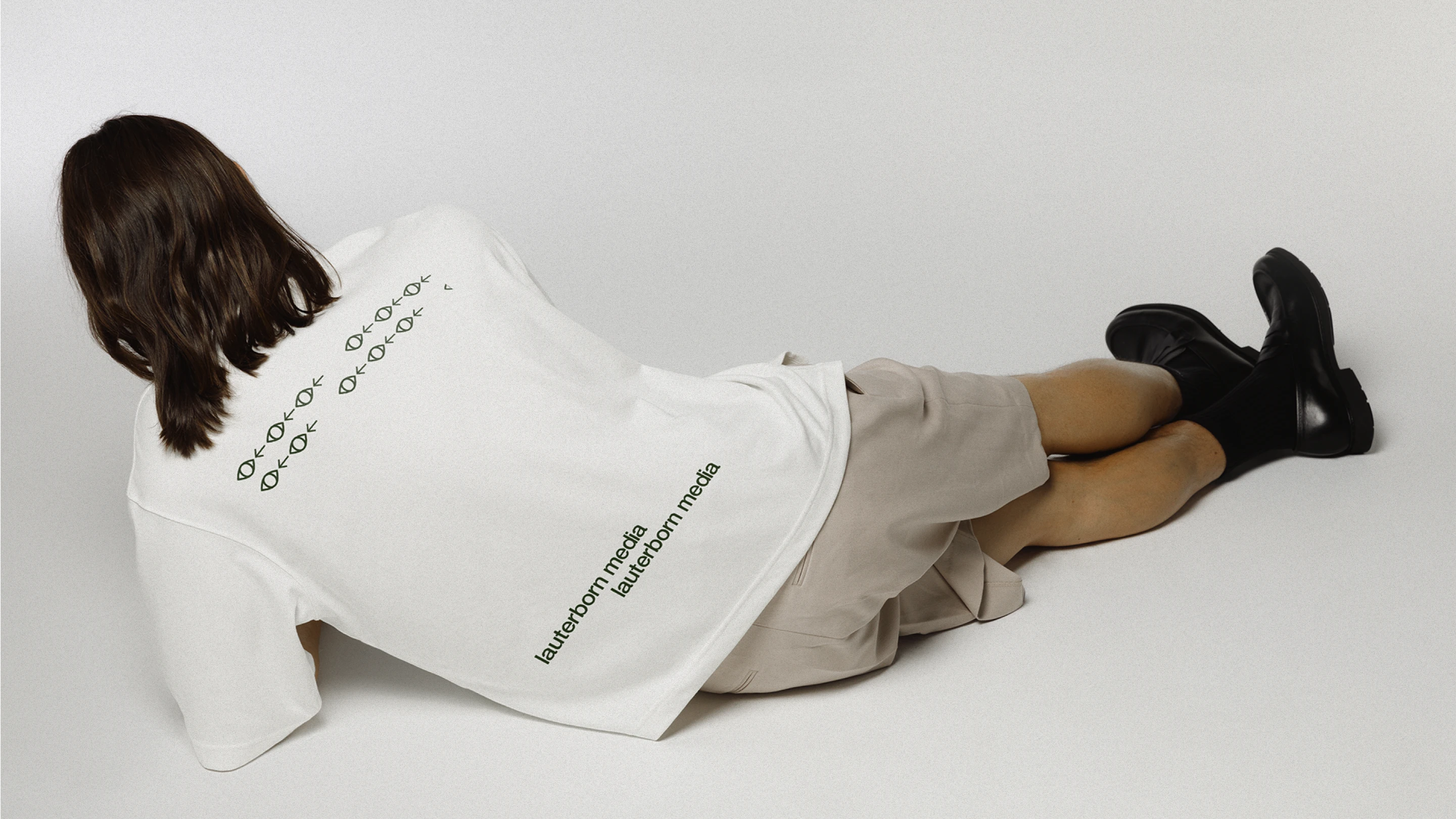
Logos (.jpeg .png .svg) & Icons in different colors
Brand Guidelines
Google Slides Template Deck
Like this project
Posted Jan 13, 2025
This new logo represents the innovation, precision, and simplicity tied to the concept of connection/framing representing media or campaigns.
Likes
0
Views
38