DreamHost Company Rebrand
INTRODUCTION TO DREAMHOST
DreamHost has provided web hosting since 1997, which is quite a long time in the tech world. Launched in a college dorm room in Southern California, it grew into a company with hundreds of employees. They remian one of the few independent company-owned hosting services still available. They are big vocal advocates for online privacy and freedom of speech - landing them occasionally in hot water.
The company has had three notable logo designs since 1997, the last update being introduced in 2006. Throughout all of the past versions the moon icon was the visual anchor making it the most iconic piece on DreamHost's identity.

With the rebrand for DreamHost, we wanted to focus on the qualities that we felt set the company apart from the competition of other web hosting providers. As a company, we wanted to remain authentic, and passionate that cares about its community and users. For a tech company, DreamHost takes pride in shameless honesty, being irreverent and fun while still being professional. It was important to us that our values and personality came across which the original logo lacked.
The design team was tasked with develop a handful of concepts that incorporated the classic DreamHost look and feel, as well as some concepts that would push the envelope of change, and pitch them to the redesign committee. The committee consisted of our founders, as well as the CEO, the VP of Marketing and Communication, and a handful of other associates that we felt would benefit the project. We came back with a few different concepts that would be presented to the committee. Here’s a handful of those concepts:
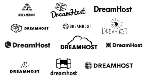

The final three logos were presented at the quarterly company “All-Hands” event in front of the entire company. DreamHost is a very democratic company, and it was gratifying to share the hard work that had lead up to these concepts with our co-workers. The votes were tallied up, shared with our redesign committee - and the winner was a combination of the old and the new below.
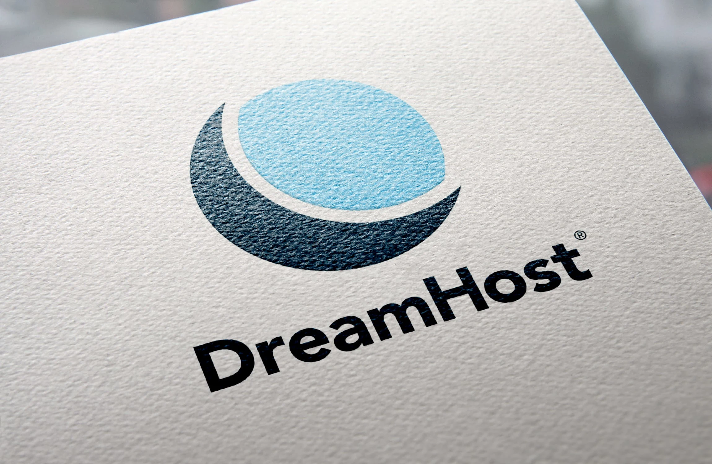
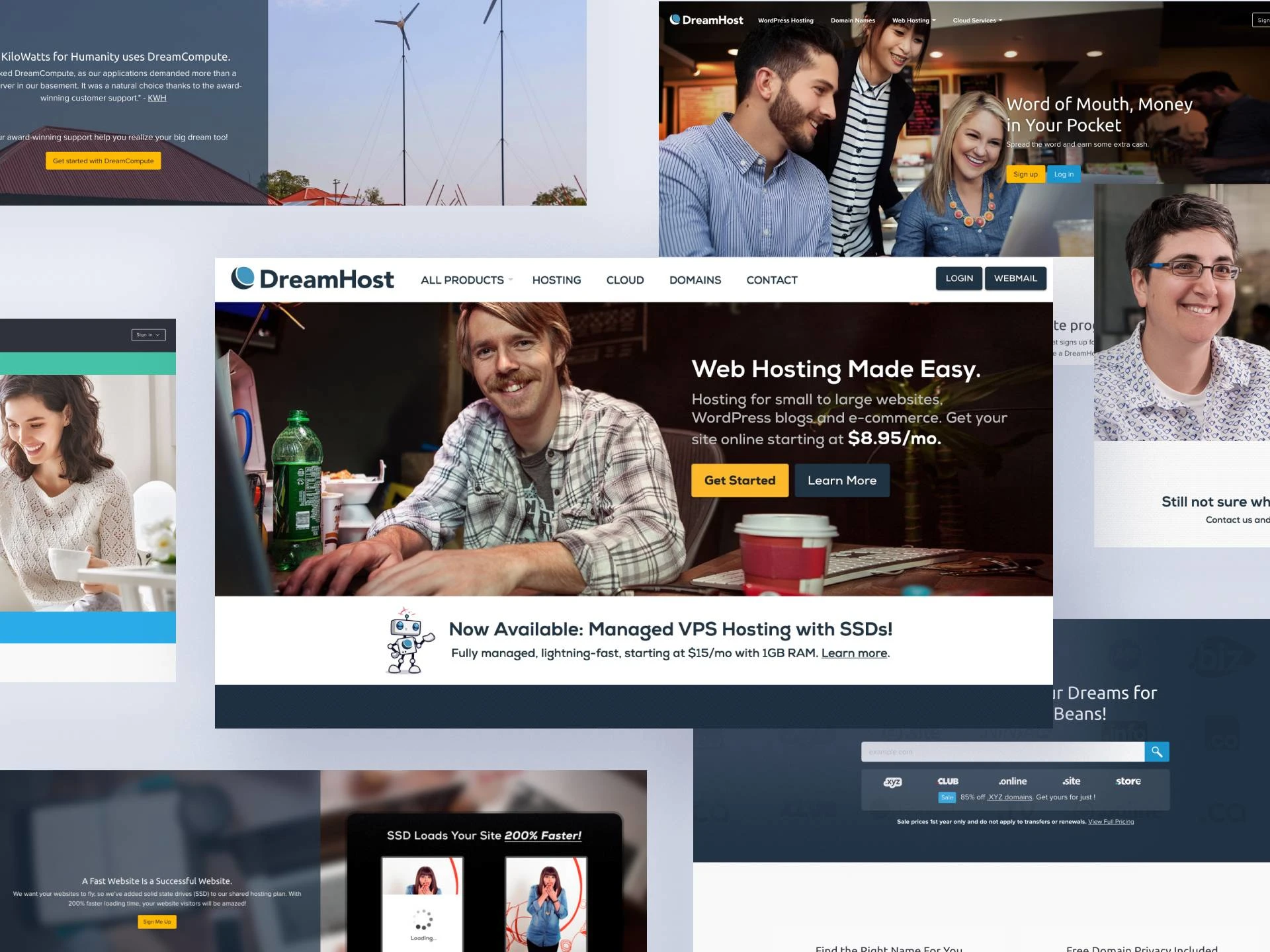
The final logo is a nice update to the original one as it stays within familiar territory. It keeps the moon icon where much of our brand equity is, turning it around and setting it in an upward more positive direction. We also kept the camelcase while updating the typeface in the fuller rounder Futura case, giving it more confidence. The old tech color blues were axed as well making the updated blues feel warmer and more inviting.
You can read the full case study on my portfolio site.
Like this project
Posted Oct 2, 2023
Full company rebrand

