Pcasa Logo Redesign
Giuseppe Cosenza
Pcasa
About the brand
Pcasa, a charming boutique located in Cariati, Calabria, embodies the aspirations of a local woman. Within its walls, the harmonious fusion of gastronomy and decor creates visually striking compositions. Her goal is to preserve the authentic cuisine and ceramic embellishments that characterize our nation, its customs and culture.
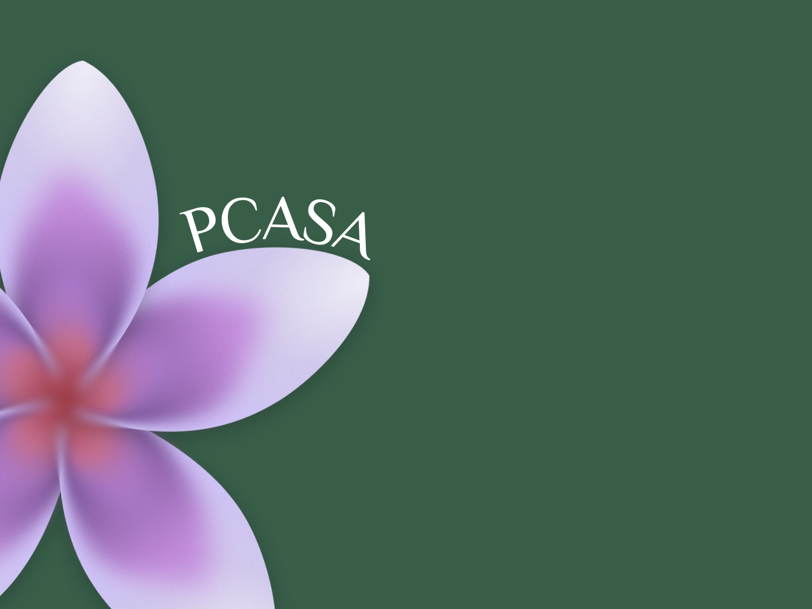
The store logo, a delicate flower adorned with petals, represents five distinct symbols that can be discovered by visiting the Pcasa store.
The creative process
The first Pcasa logo, located in the top left corner, has undergone a transformation. I improved the symbolism of the flower by making it larger, cleaner, more intricate and more refined. The store name now flows gracefully around the petal, evoking a sense of nature's harmony.
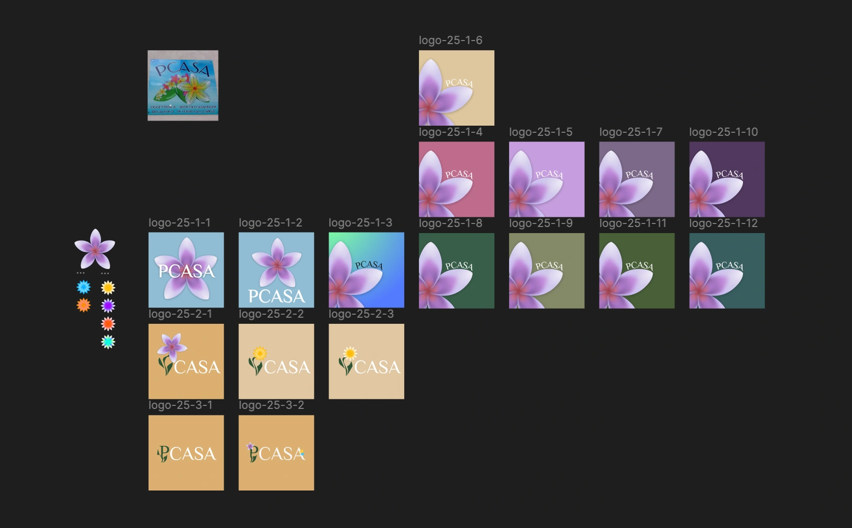
Logo exploration
Like this project
Posted Jun 25, 2025
I redesigned the Pcasa logo to improve its symbolism and design. I simplified it and made it more elegant while incorporating a connection to nature.
Likes
1
Views
19
Timeline
Jun 24, 2025 - Jun 24, 2025