Everydaze — Konjac Jelly Packaging Redesign

Kae Sandt


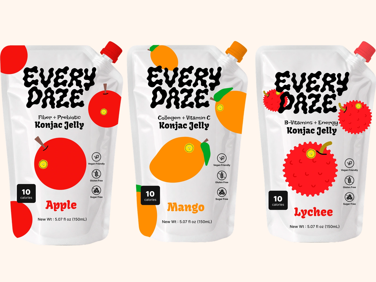
Everydaze makes konjac jelly, a snack that is common across Asia and almost unknown in an American pantry. I redesigned their packaging as a self-directed project for a packaging class. The problem was easy to name and hard to solve, because unfamiliar makes people put the pouch back down. So the design leads with fun instead of function. A soft, bouncy wordmark that moves the way the product does, and fruit illustrations with faces, big and flat and friendly, so the flavor reads from across the aisle. Each flavor carries its own job, with apple for fiber and prebiotic, mango for collagen and vitamin C, and lychee for B-vitamins and energy, set directly under the logo so you know what you are getting before you know what konjac is. It all had to hold up on a stand-up pouch, a curved and crinkling surface that forgives nothing, which is why the illustrations stay bold and the type stays heavy.
Like this project
Posted Jul 21, 2026
Packaging redesign for a konjac jelly brand. A three-flavor system across apple, mango, and lychee, built to make an unfamiliar snack feel approachable.