Digital Banking Website
A Modern, Reliable Design for Digital Banking Experiences
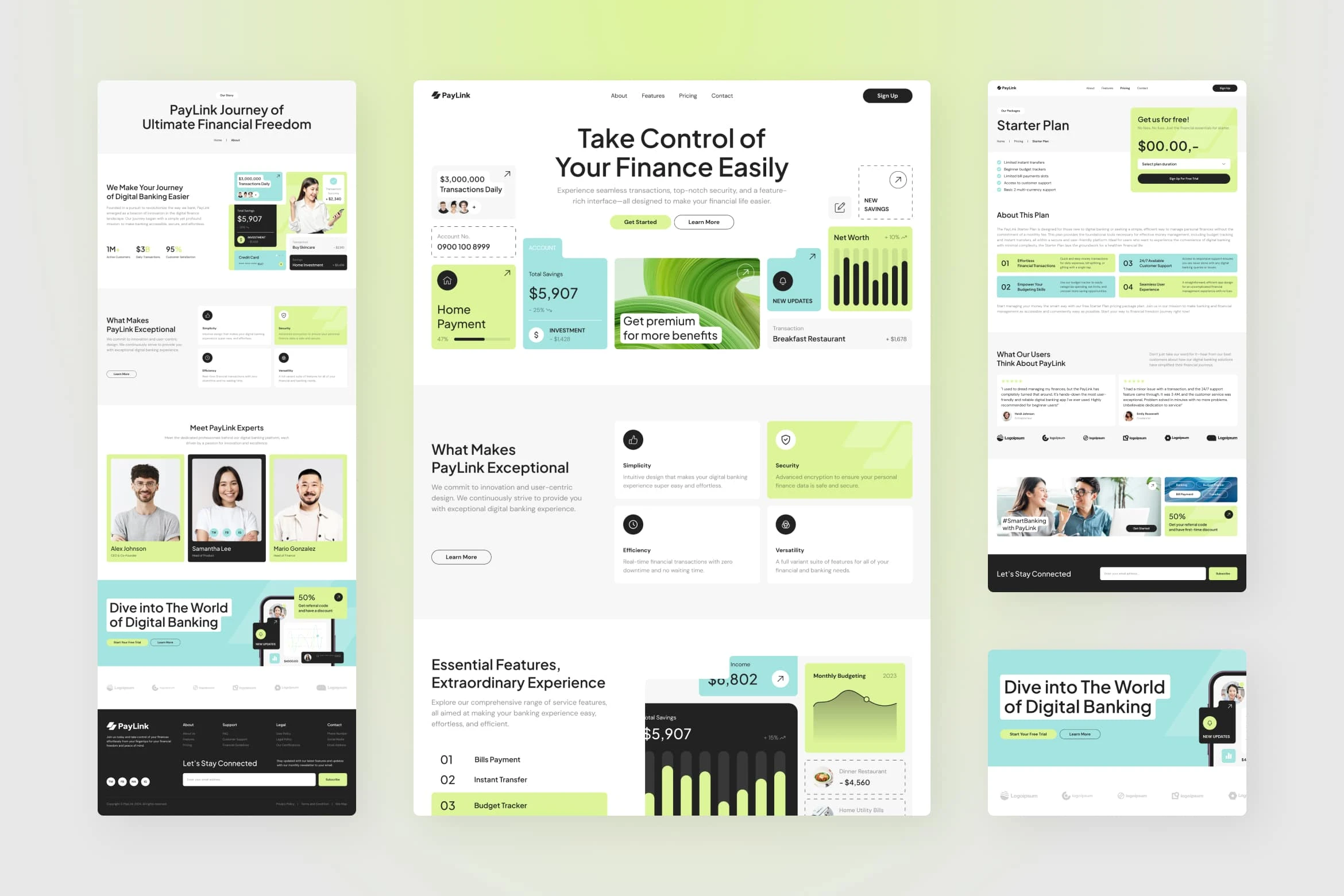
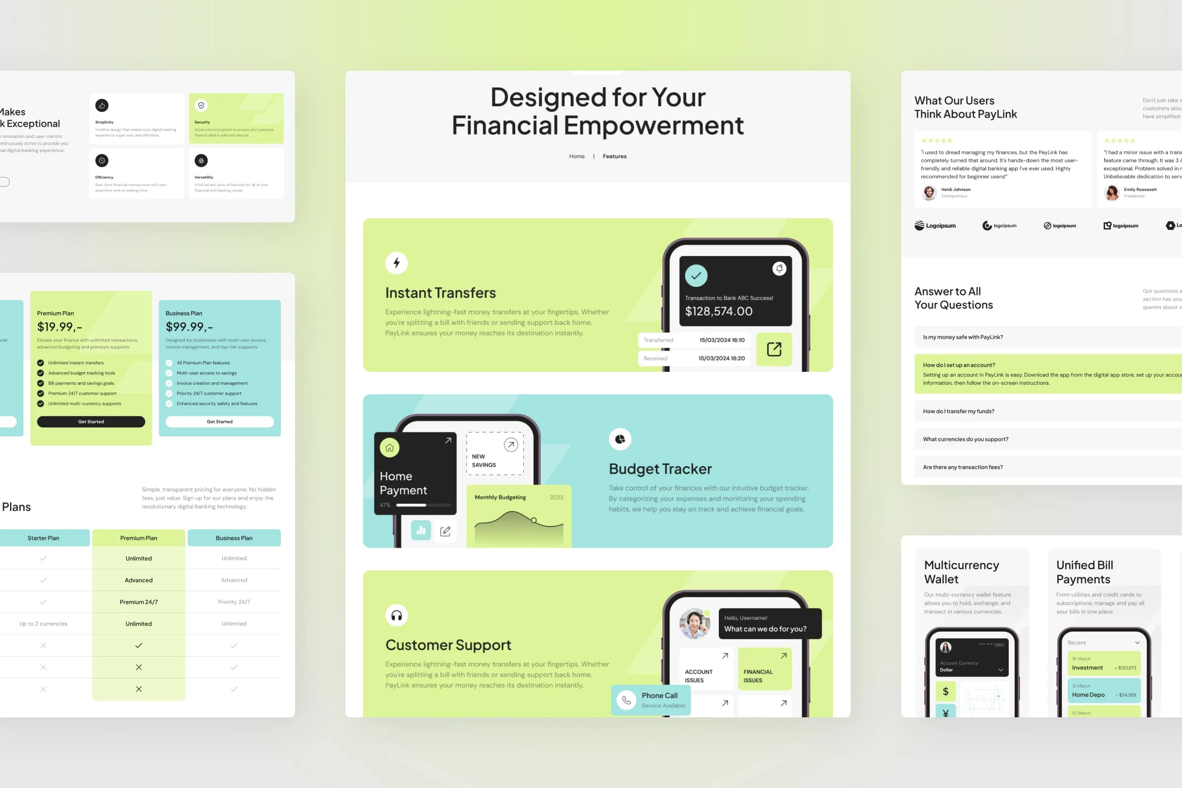
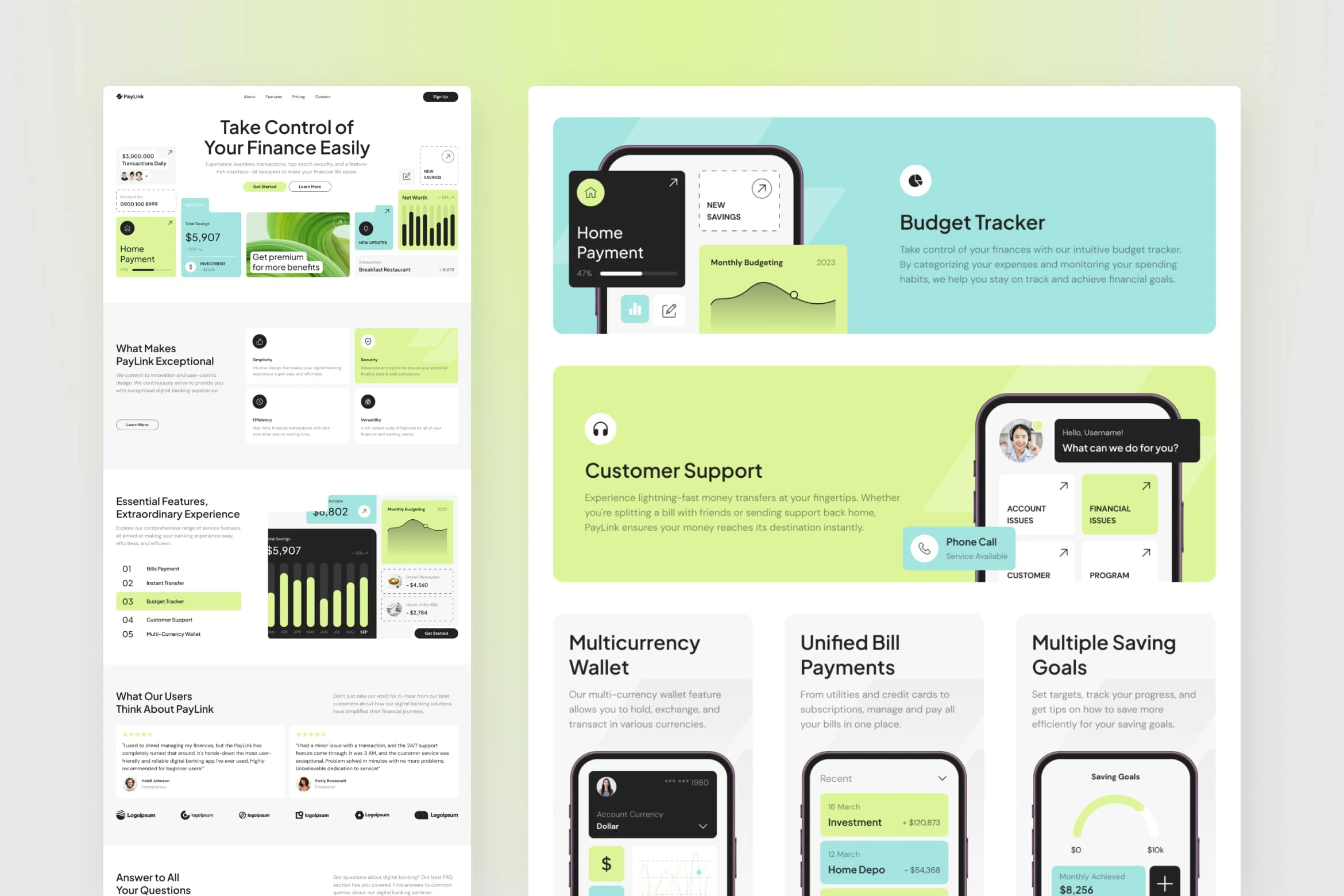
This design exploration for PayLink was developed to redefine digital banking interfaces with a clean, chic, and modern approach. With five essential screens—homepage, about, features, pricing, and pricing details—this design aims to create a seamless and inviting user experience for digital banking customers. The use of green, tosca, and white highlights a professional yet welcoming aesthetic, representing trust and modernity for a reliable digital banking brand.
Challenges:
Designing a visually appealing, user-centered layout that balances modern aesthetics with functionality.
Utilizing card-based design elements to effectively organize and present information in a clear, accessible manner.
Creating a distinctive color scheme that aligns with digital banking, evoking trust, security, and innovation.
Results:
The final design presents a polished and cohesive look, with card elements enhancing readability and engagement across each screen. The color combination of green, tosca, and white provides a fresh, modern appeal that reinforces PayLink’s brand identity as a trustworthy, innovative digital banking platform. This design successfully balances style and functionality, ensuring users have a pleasant and intuitive experience from homepage to pricing details.

Do you have a project in mind?
Let's get in touch!
---
Email: hello@peterdraw.co
Website: peterdraw.co
Instagram: @peterdraw.co
Like this project
1
Posted Nov 6, 2024
Explore a sleek, modern digital banking design with card-based layouts and a fresh color palette, crafted for seamless and secure user experiences.
Likes
1
Views
247


