TimeBillingX Home Page Redesign

Mauricio Gonzalez


Intro
The team was required to redesign the website to match the new look and feel of the product. We focused on improving the user experience through new fonts, shorter copy, and better use of color without overwhelming the user. This layout improved the mobile experience.
Summary
1x Landing page redesign
Hubspot integration for analytics, tracking, and forms.
GA4 for tracking
The redesign
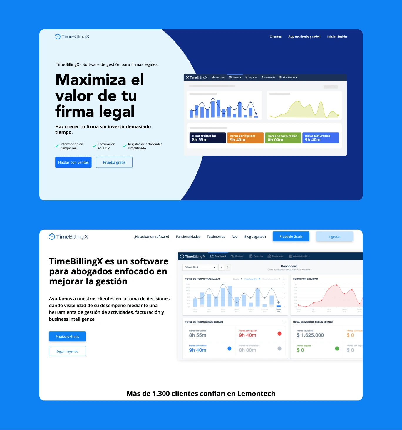
Hero section
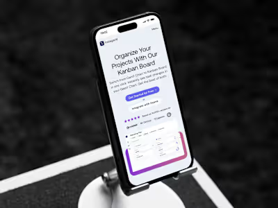
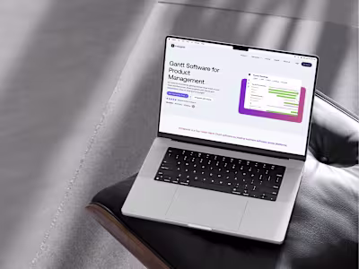
New Hero: we added more information using less text. Also, the visual hierarchy helps to add more with less content. The hero image was changed to a simplified dashboard mockup, to make the content easily scannable.
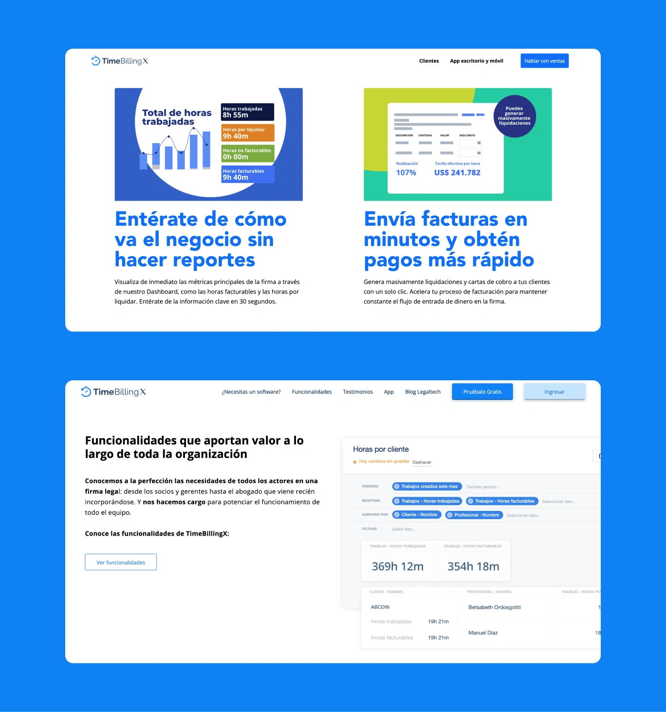
Features Section
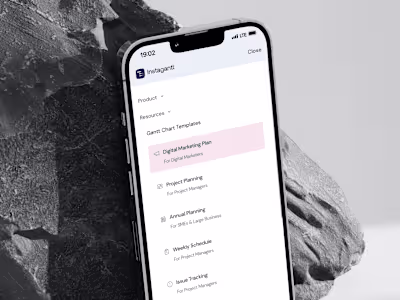
Features section: The design team crafted simplified layouts to show 4 main features. This helped make the content easily scannable and mobile-friendly. Mockups were created to help users understand the copy faster.
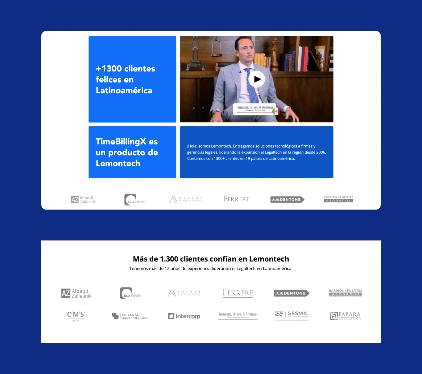
Social proof section
Social proof: besides customer logos, we added a featured testimonial video to enhance engagement.
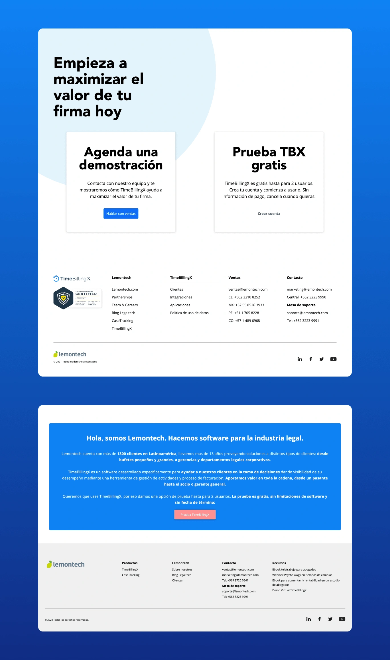
CTA and footer
CTA: On a personal note, I designed both CTAs. This shows the development of my UX and web design abilities through time. The final result presents the CTAs in a cleaner, user-friendly way.
Like this project
Posted Jan 31, 2023
The SaaS product website was redesigned and developed using Webflow. Integration with Hubspot for analytics, tracking, and forms.
Likes
0
Views
24
Clients
Lemontech