Label design for horse gel
Liya Malinina
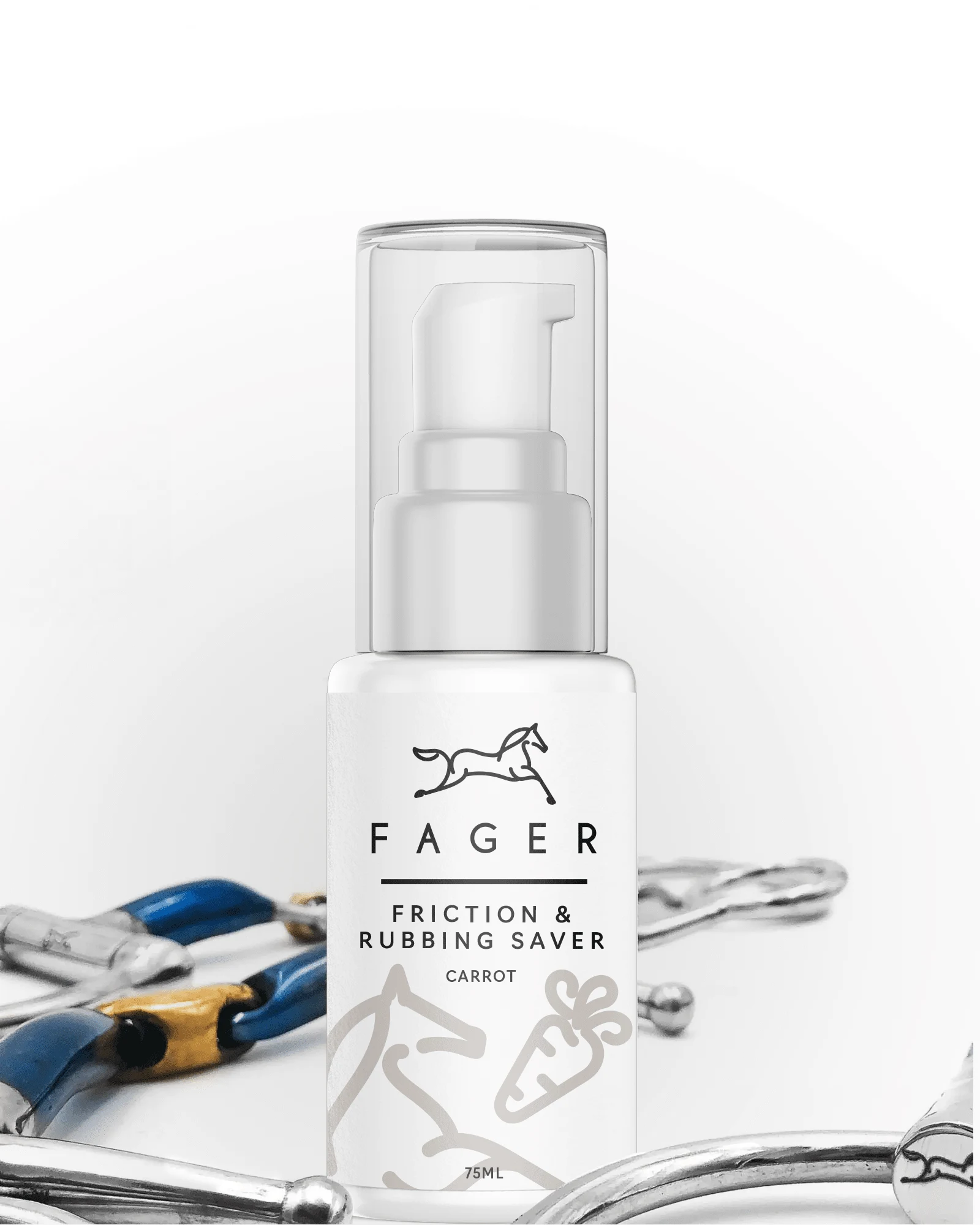
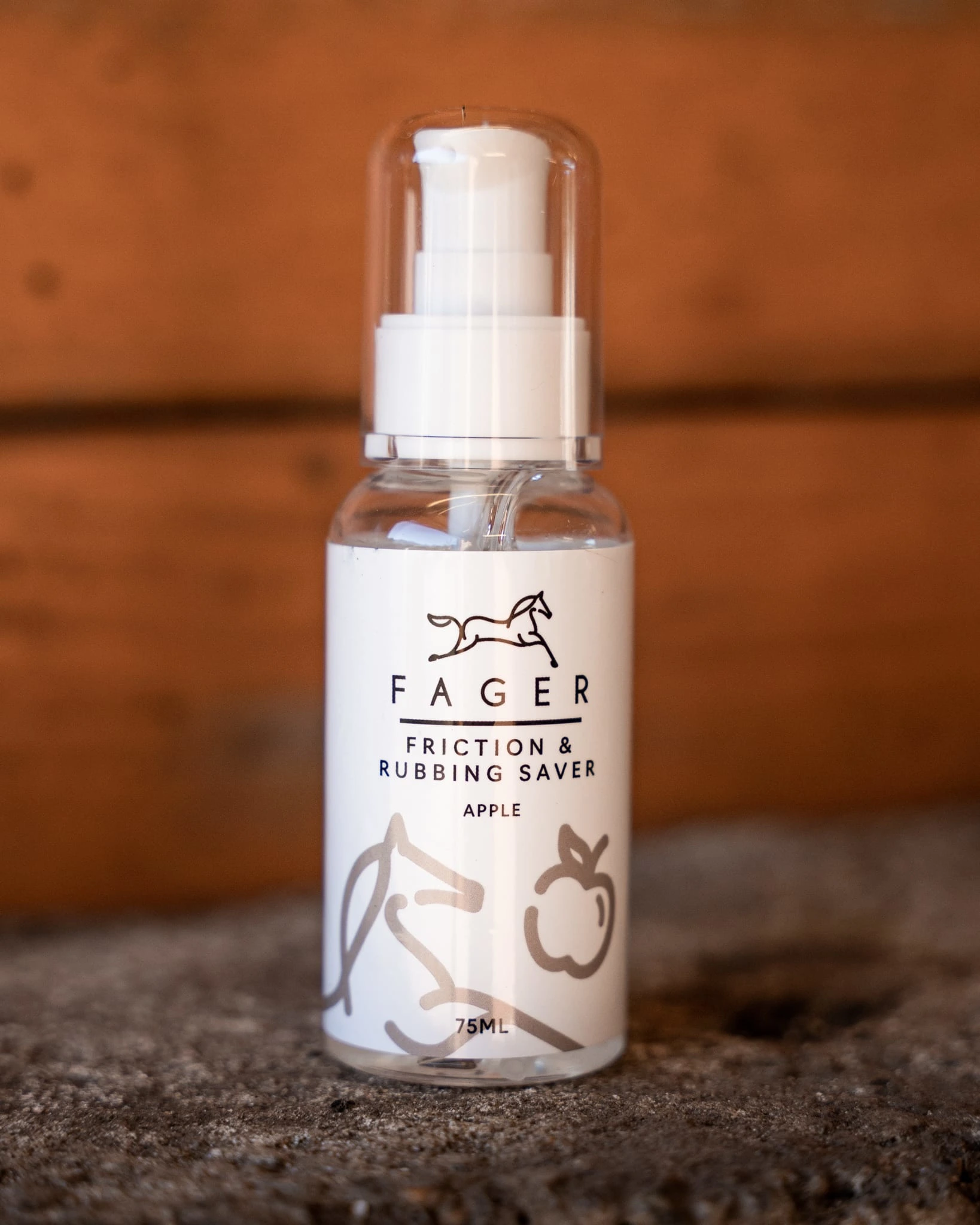
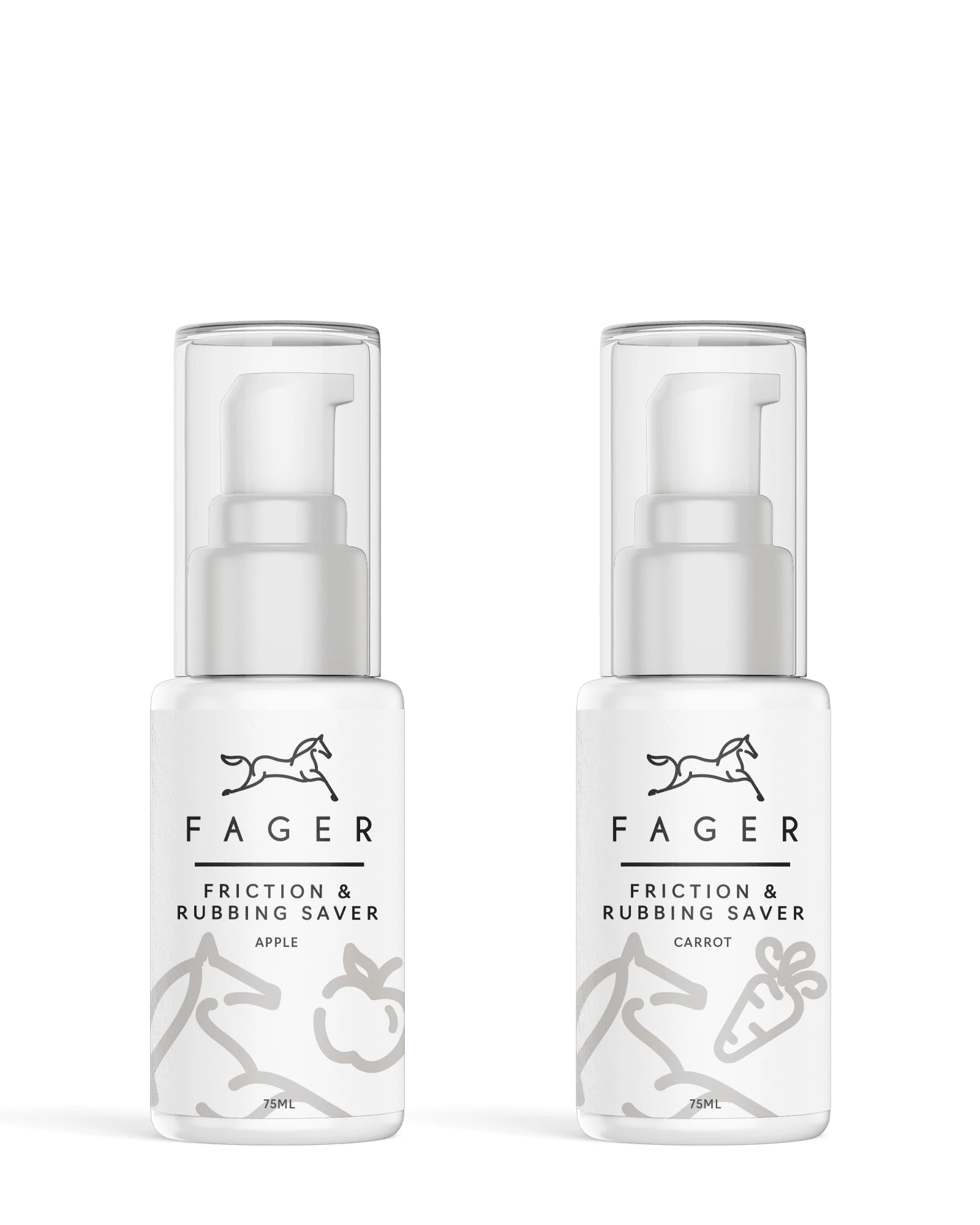
Label design for friction and rubbing gel with carrot and apple taste.
BRIEF
They would like to an updated label for our Friction and rubbing gel bottle. It is a pump bottle, 75ml.
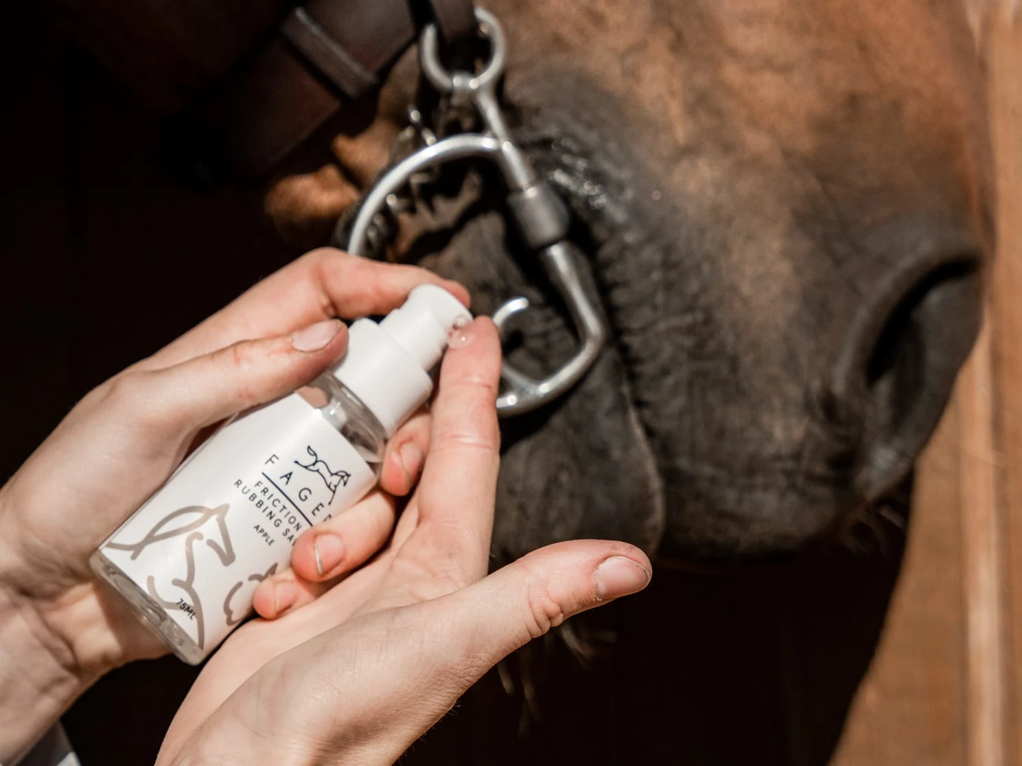
They are launching a new taste with Apple that prevents the horse´s mouthcorners to get wounds and also helps the horse to accept the bit better. So it should both look tastefull, and give a look of a "pharmacy product" you can trust. It could be a bit playful, but also with a touch of serious because of we want to promote it as a "problem solver" product.
Audience: Equestrians that owns a horse, both women and men. Age 20-60. Mostly Women at the age 35-40.
CONCEPT IDEA
In this concept, I used the idea that the horses soo loved the flavour and are chasing the apple/carrot. Since it should not be the main thing on the package so I made this scene more transparent.I think it's a fun, simple and memorable idea, but the design is more conservative. Also, if you want to add more flavours, it's easy to adapt. Compared to the old label, I slightly reduced the logo and increased the name so that everything can be seen without distortion.
Like this project
Posted May 4, 2023
Label design for friction and rubbing gel with carrot and apple taste.
Likes
0
Views
10