
I partnered with Smash Brothers Burgers to create a brand identity as bold and playful as their delicious burgers. From a fun logo to vibrant packaging and energetic design elements, I crafted every detail to reflect the lively atmosphere of this burger joint. The design celebrates both the quality of the food and the exciting dining experience.
Main Logo
Inverted Logo
Colors that one can recognize from a mile away and a character their audience can get familiar to, I designed their logo incorporating the swirls of the the secret sauce that makes smash burgers what they are!
Alternate Logo
Logo
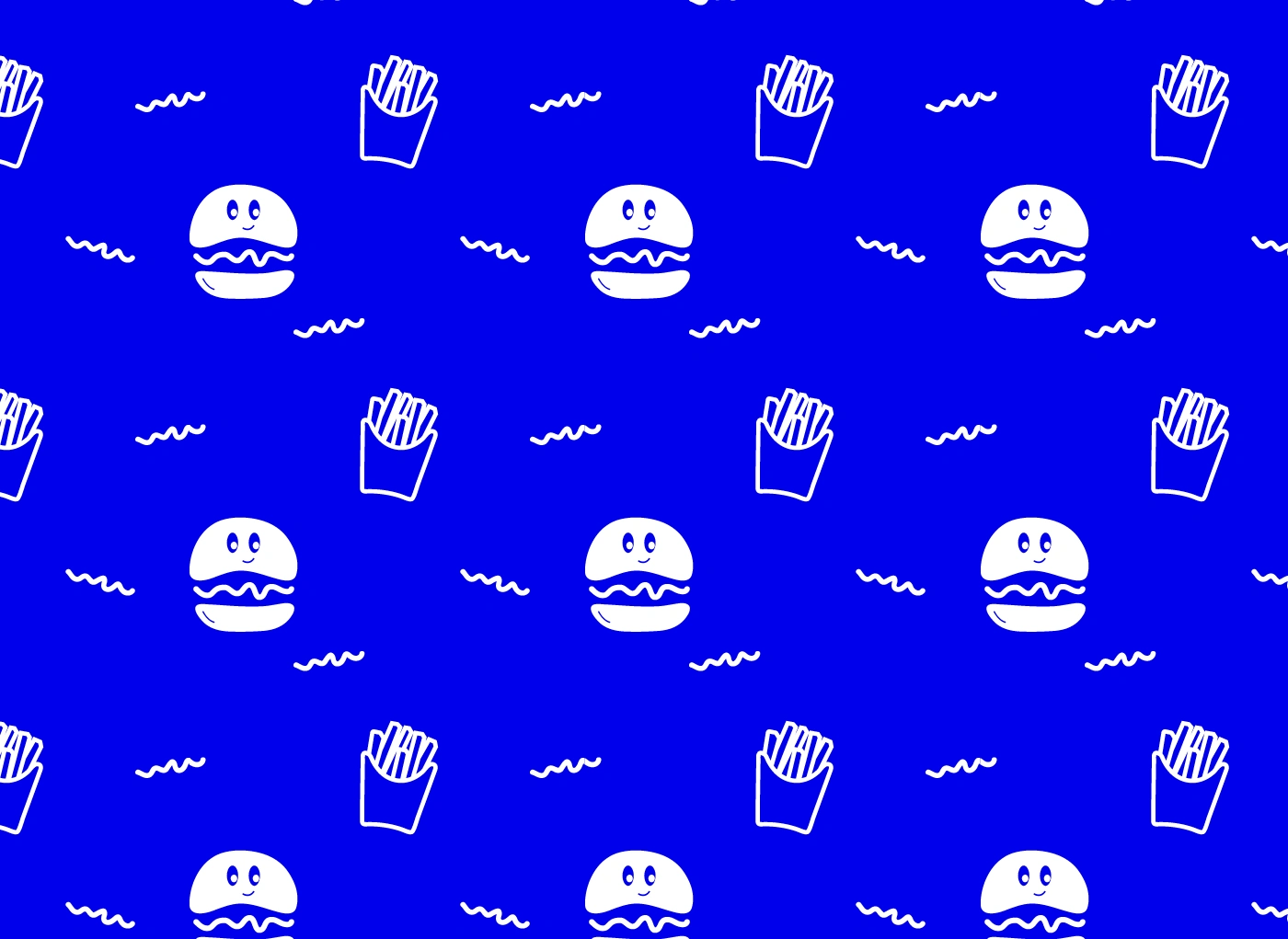
Brand Pattern Design
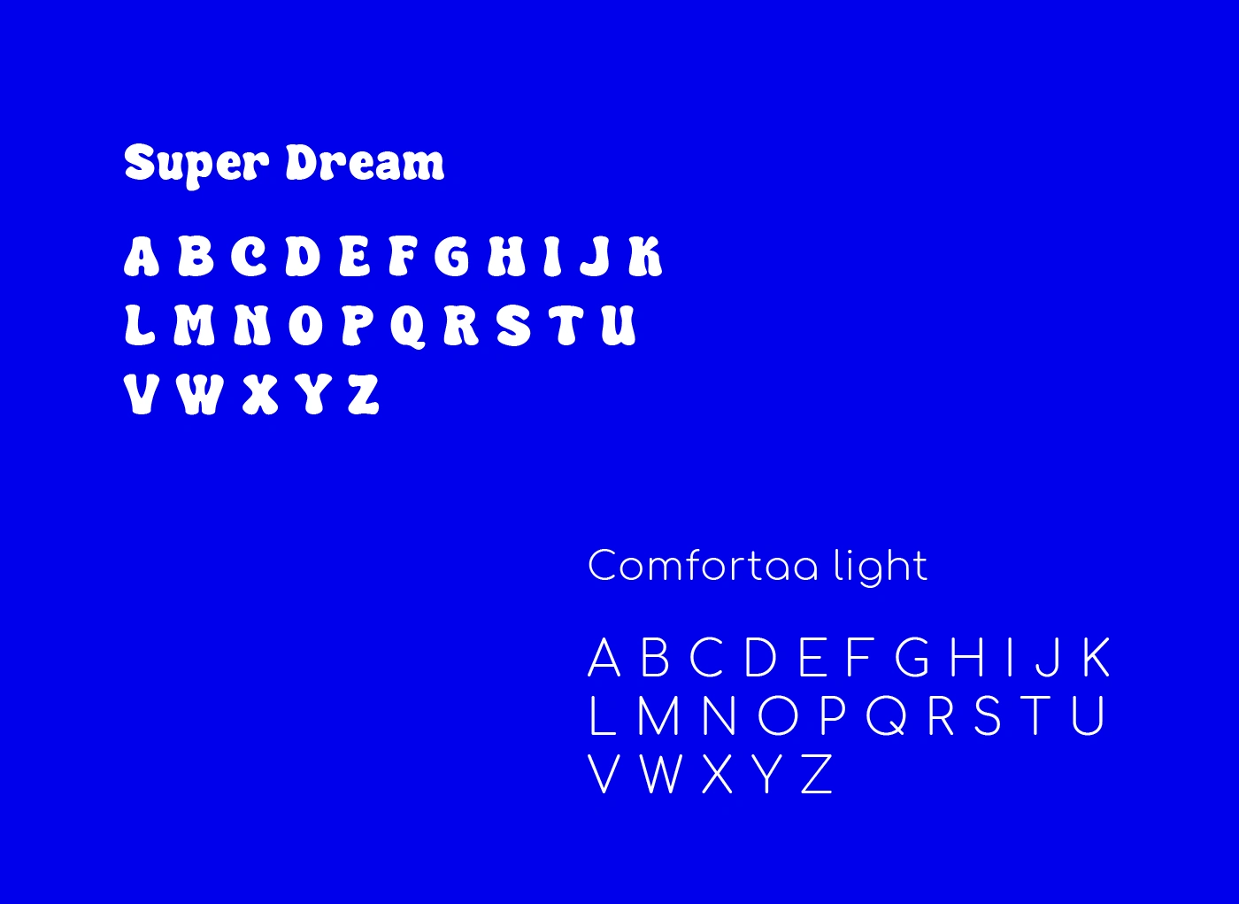
Brand Typography
Typography plays the most important role in a brand identity, it either makes a brand or breaks it and for smash brothers burgers, I made sure to keep both a playful feel and ensure readability. Hence, the choice of fonts that help the brand do both.
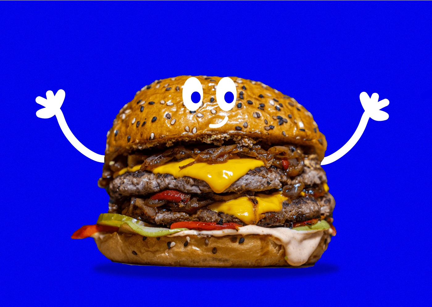
Illustration
I developed a dynamic visual brand identity that captures the fun, bold spirit of the burger joint. Making sure the colors and the elements are represented everywhere, from the packaging to the menu and even social media design, the playfulness should stand out.
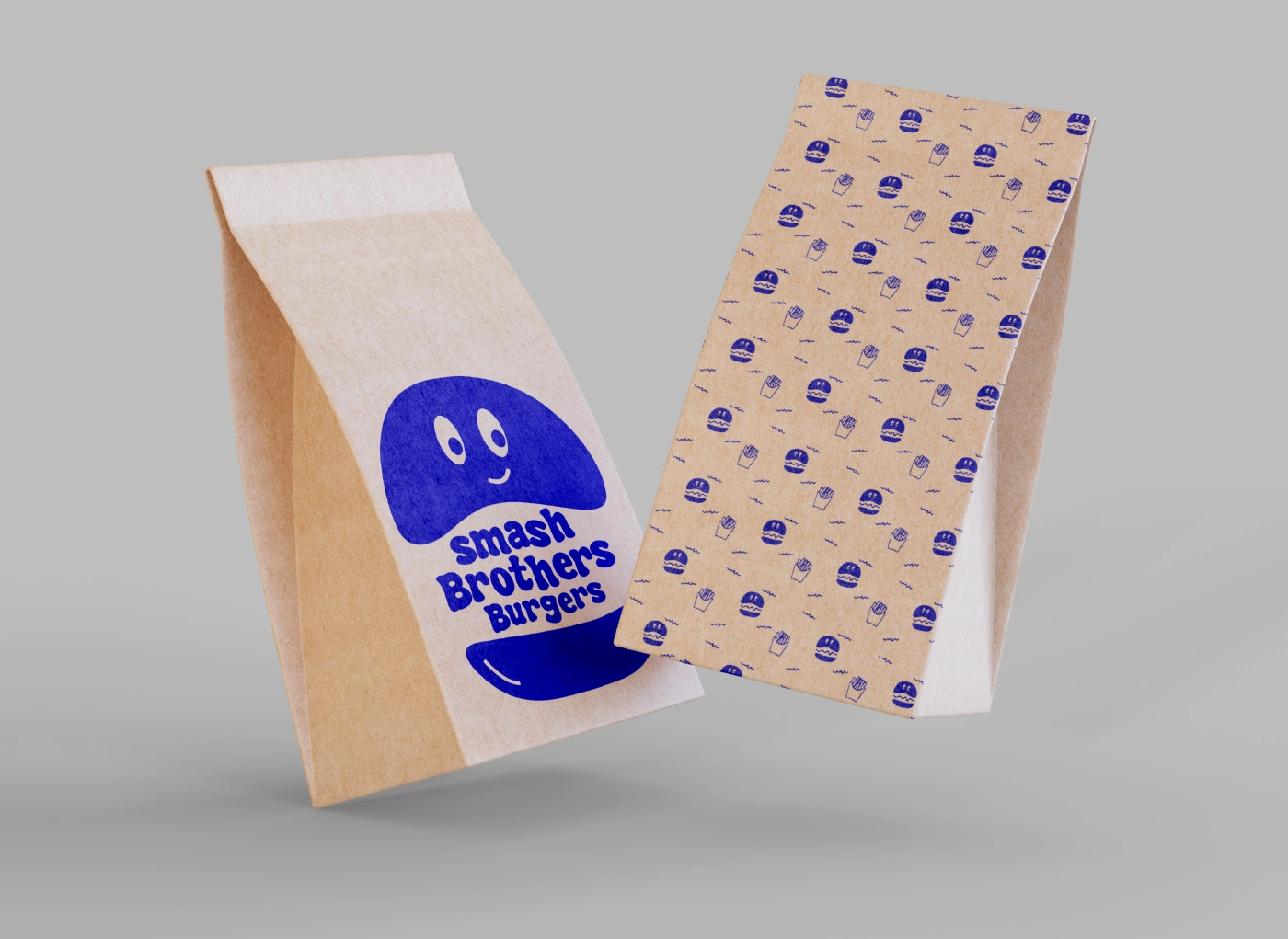
Brand Packaging Design
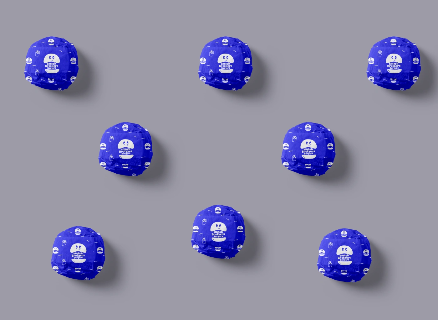
Brand Packaging Design
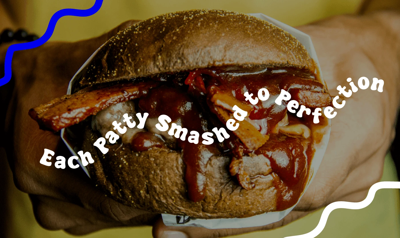
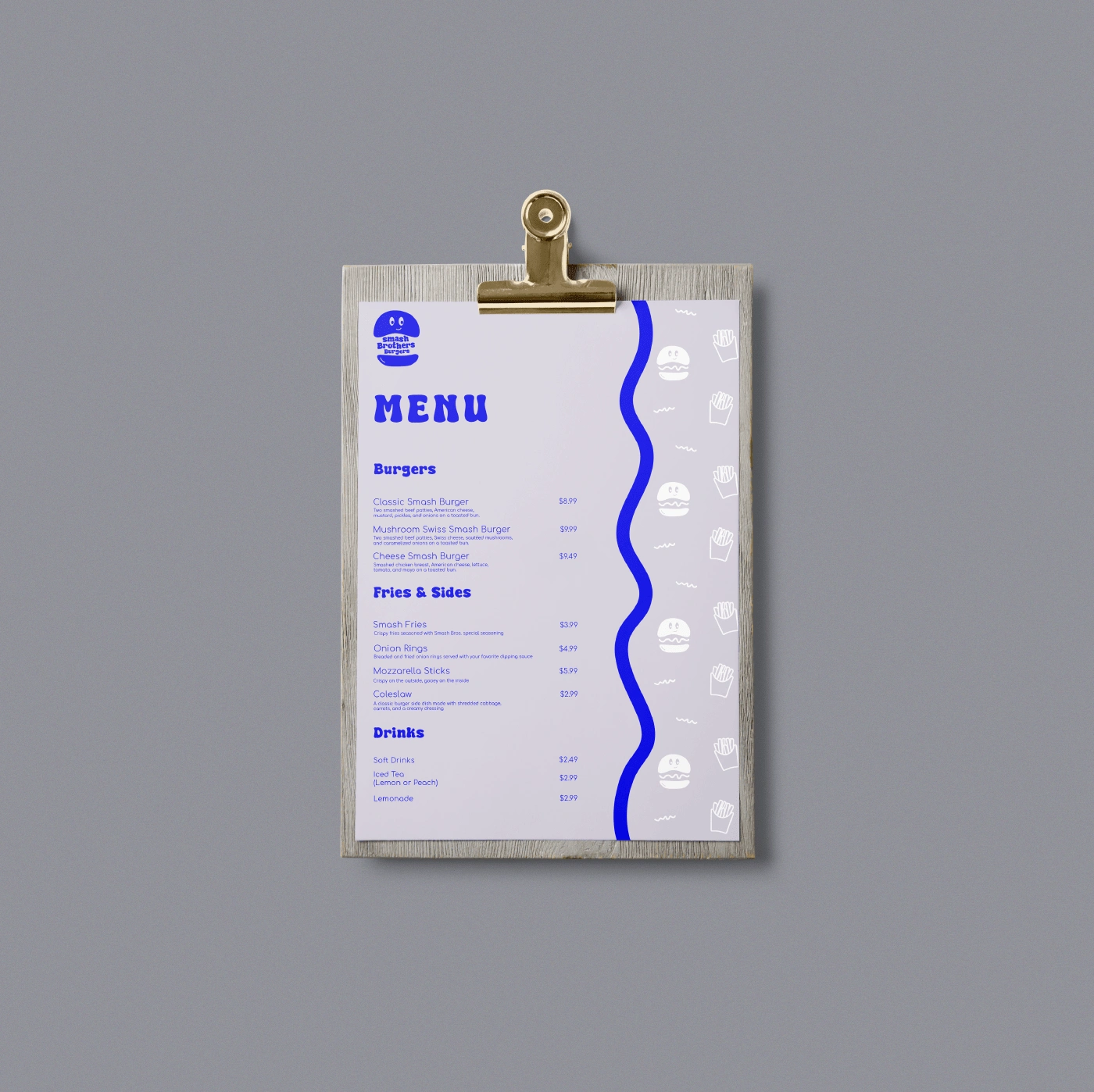
Menu Design
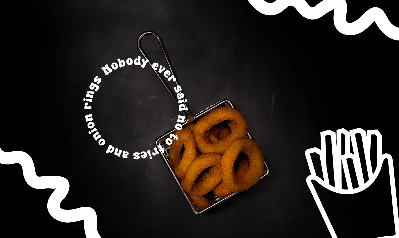
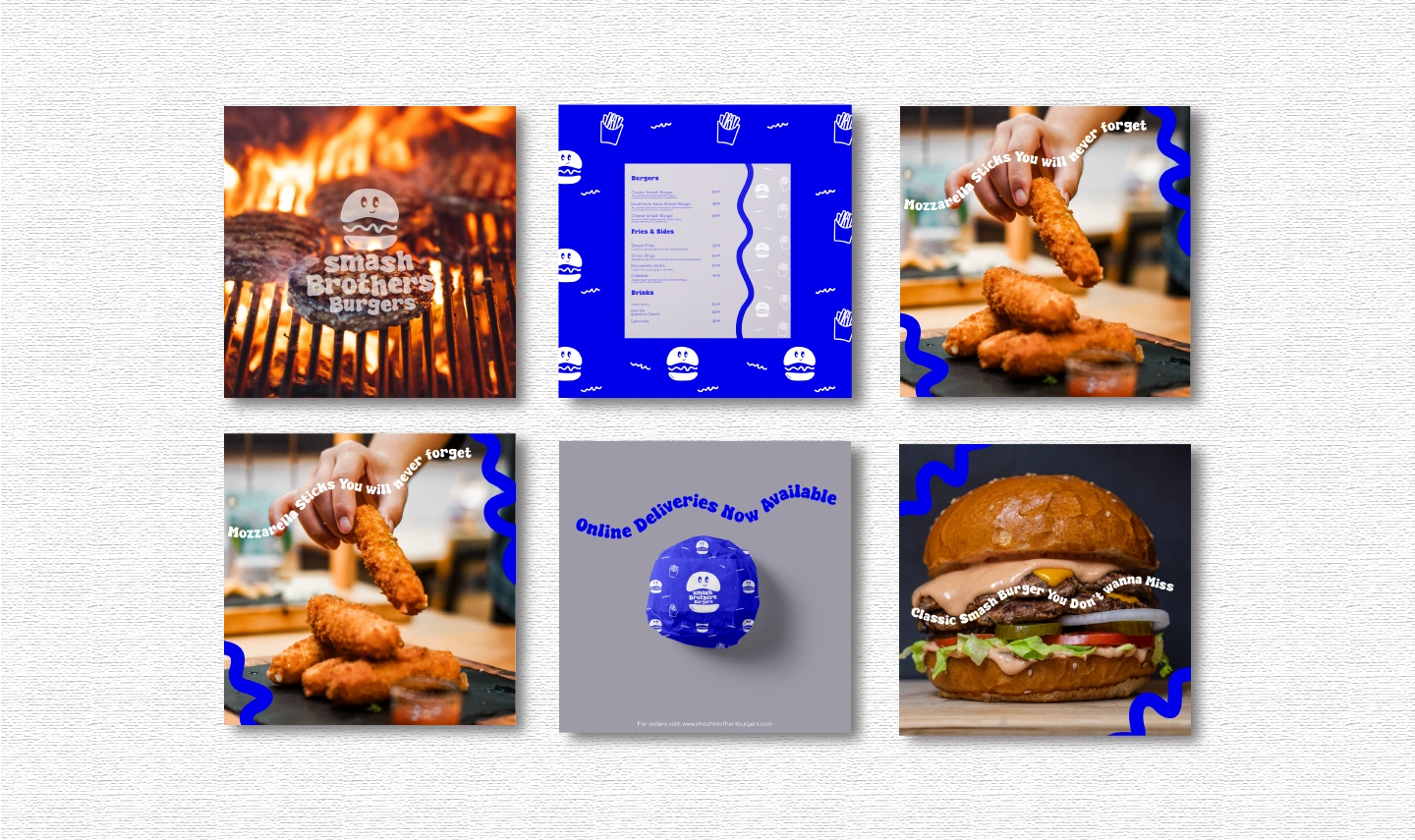
Social Media Content Design
0 likes · 21 views · Sep 10, 2024
Designed the Visual Brand Identity for Smash Brothers Burgers - a fun, playful burger joint


