Scientific Motion Graphics for a Postbiotic Brand Launch
Roger Rangel
Verified
Motion Graphics & Visual Storytelling for a Postbiotic Brand Launch
Designing calm, science-led motion graphics to introduce a new category in gut health.

The Context
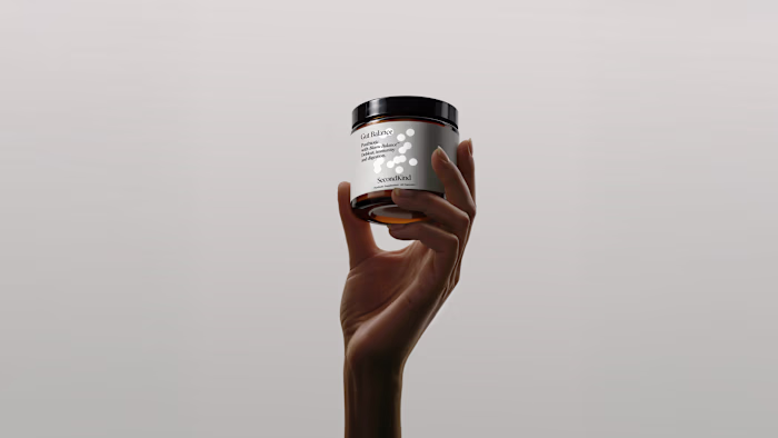
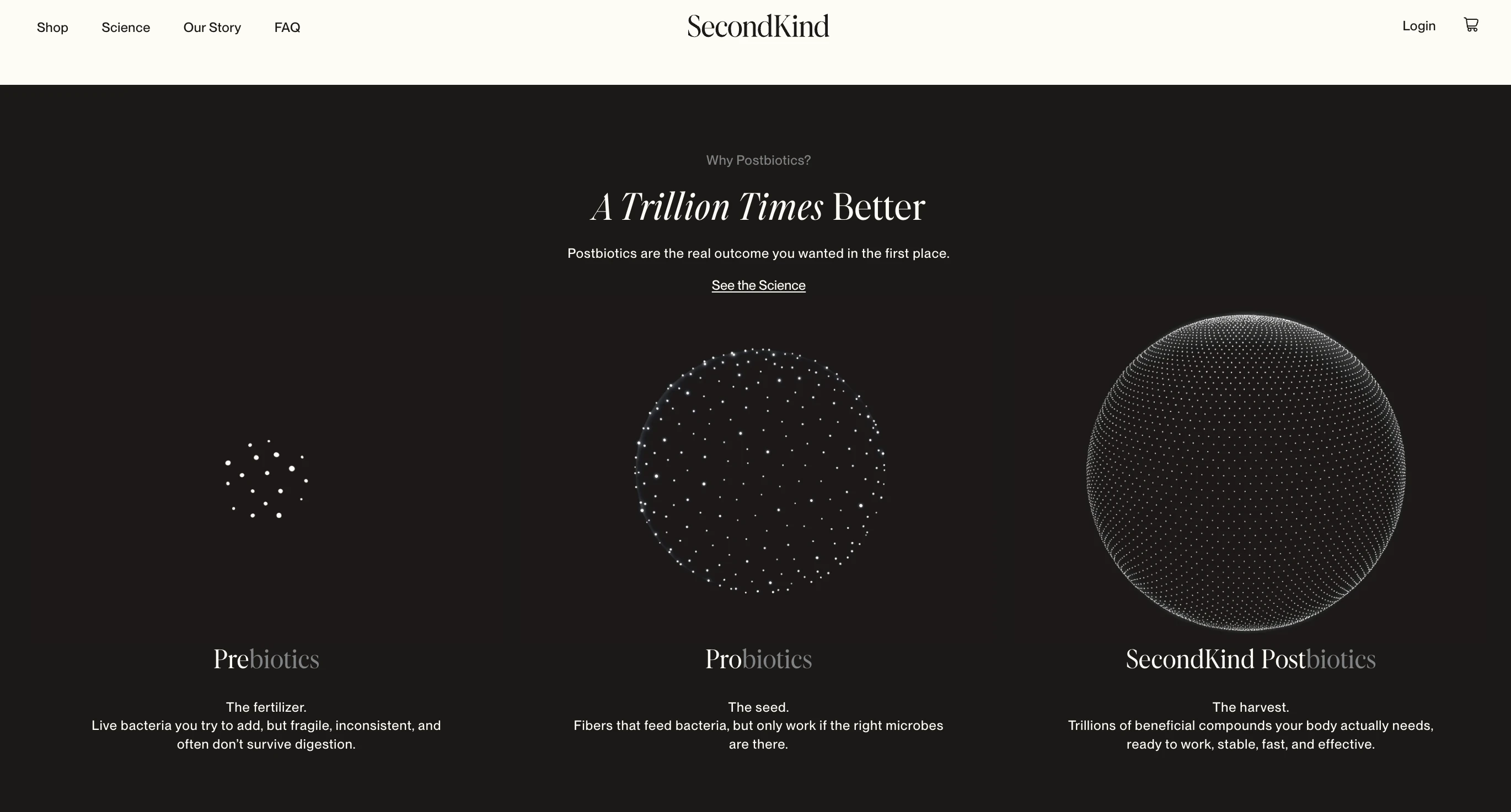
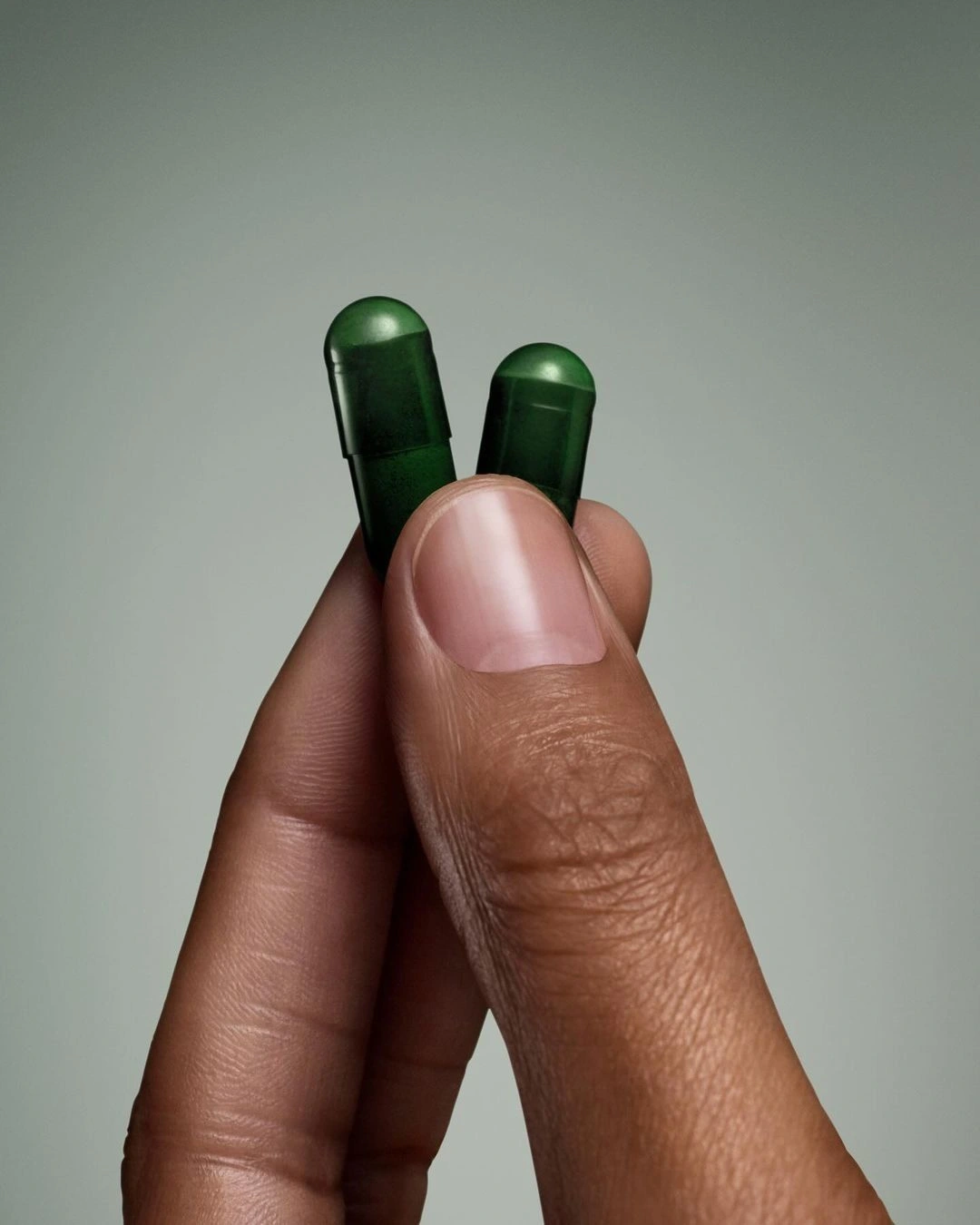
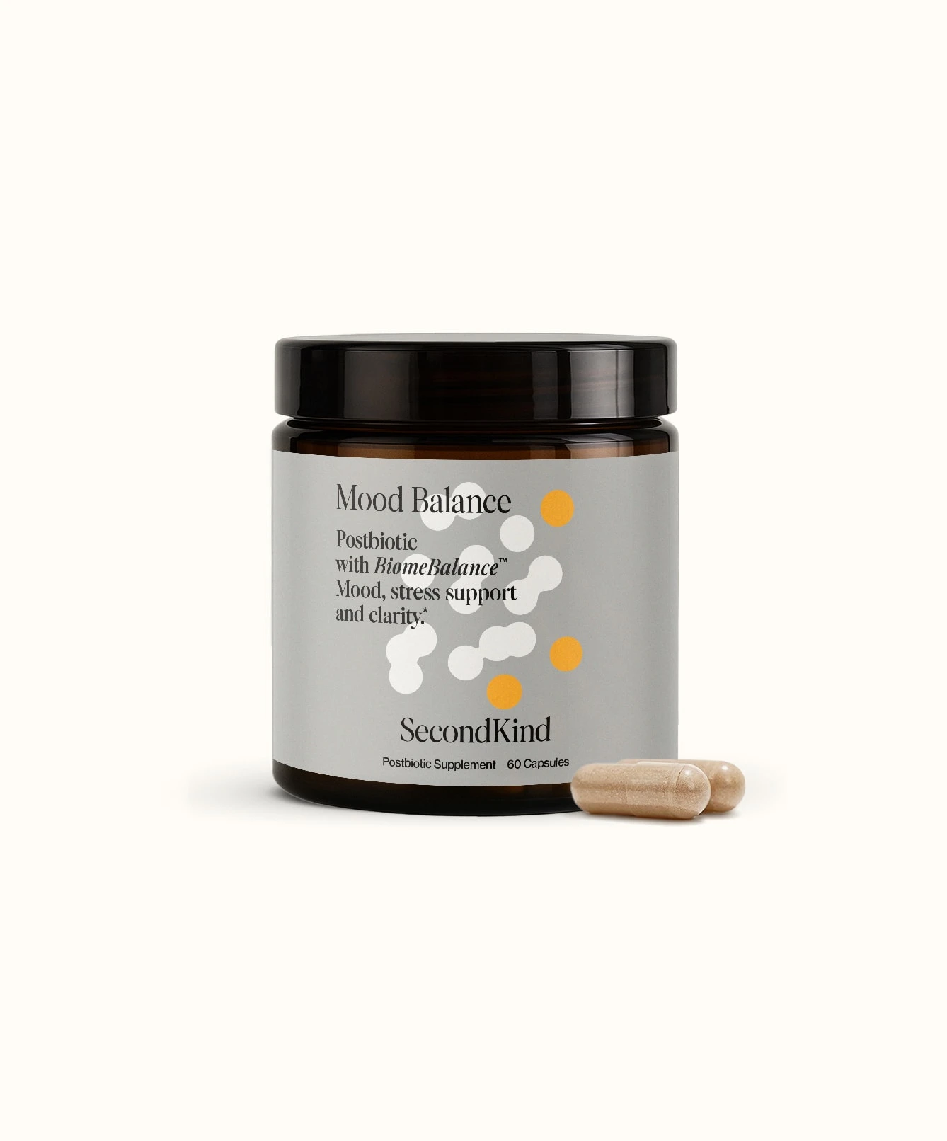
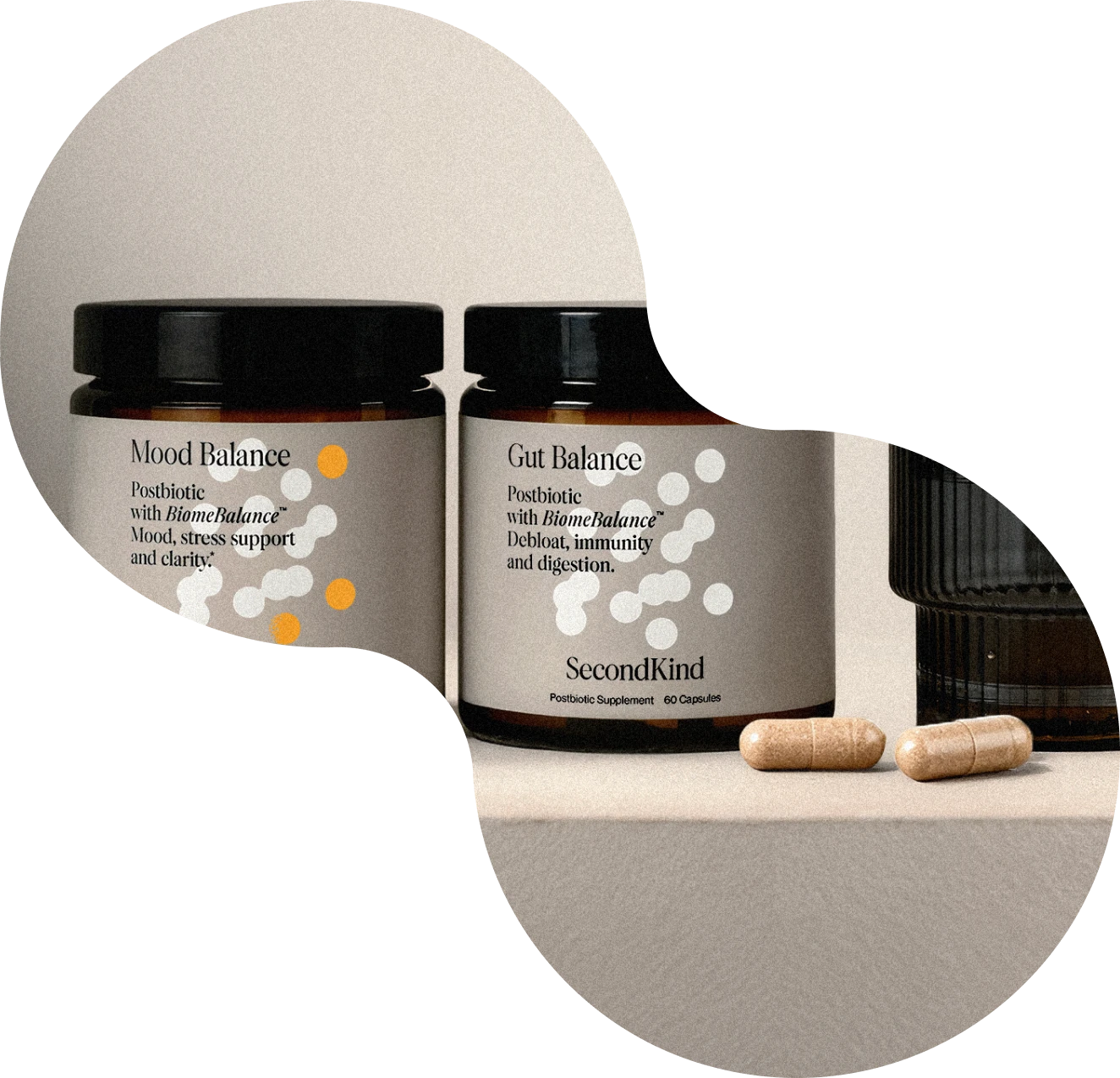
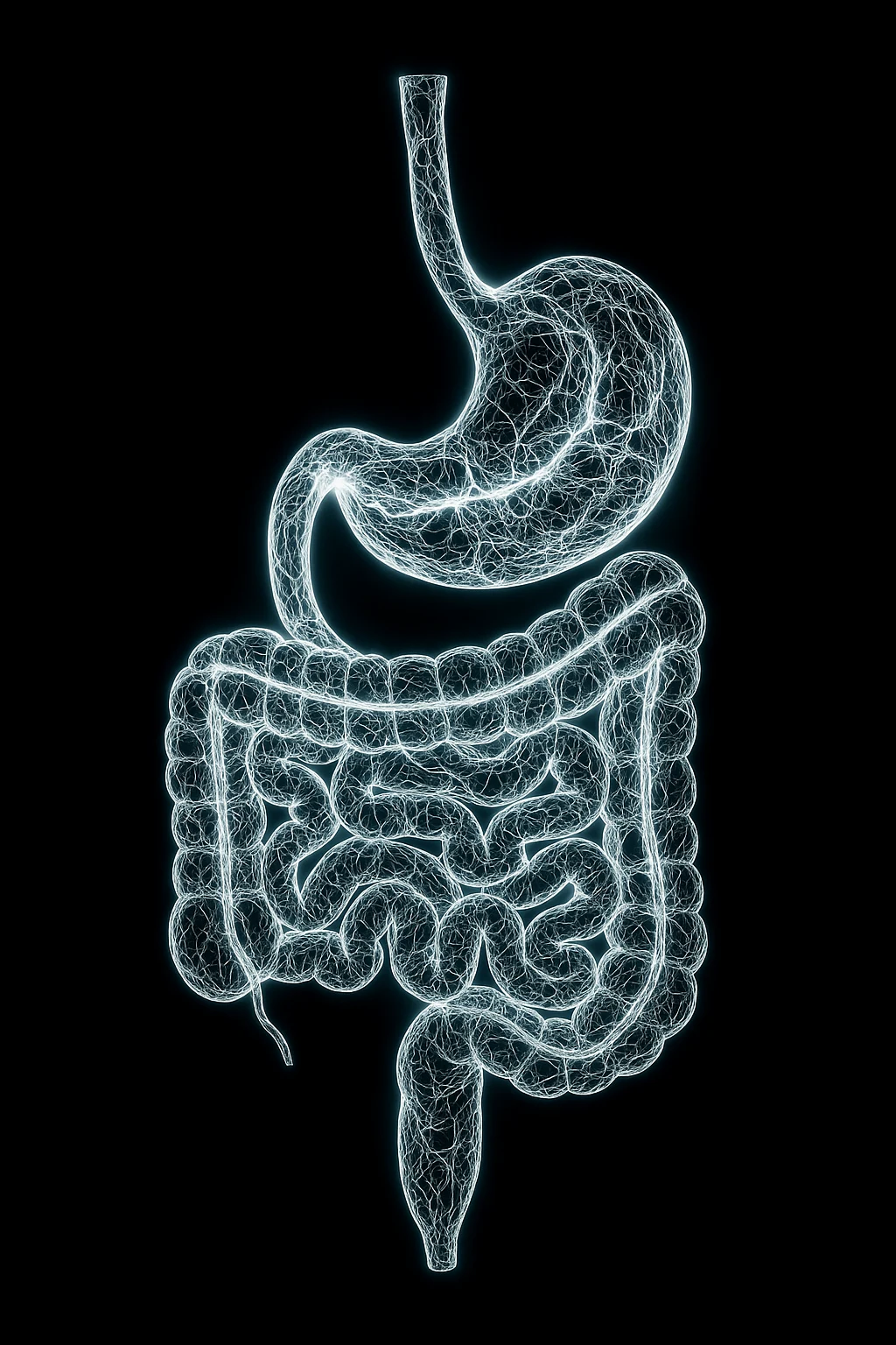
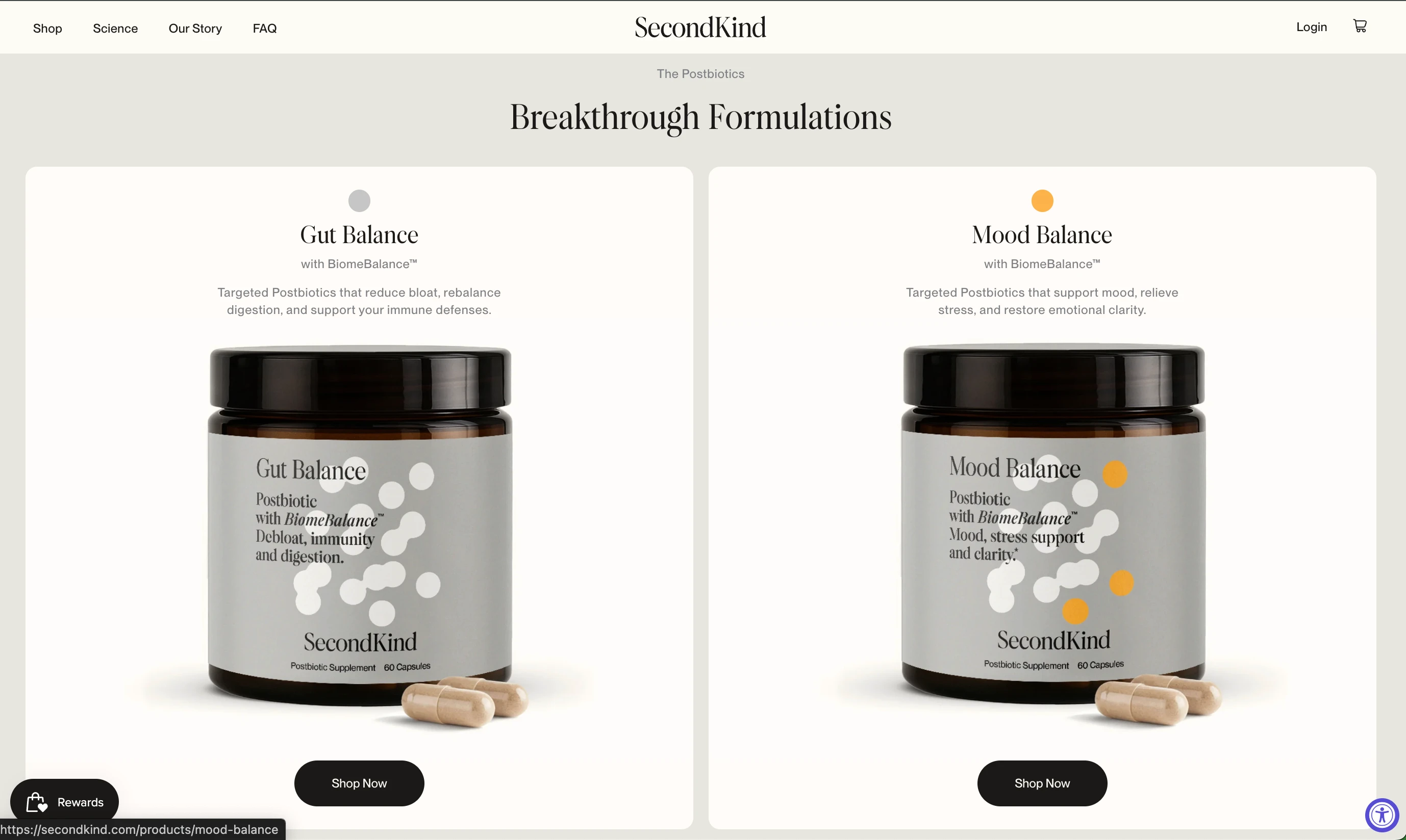
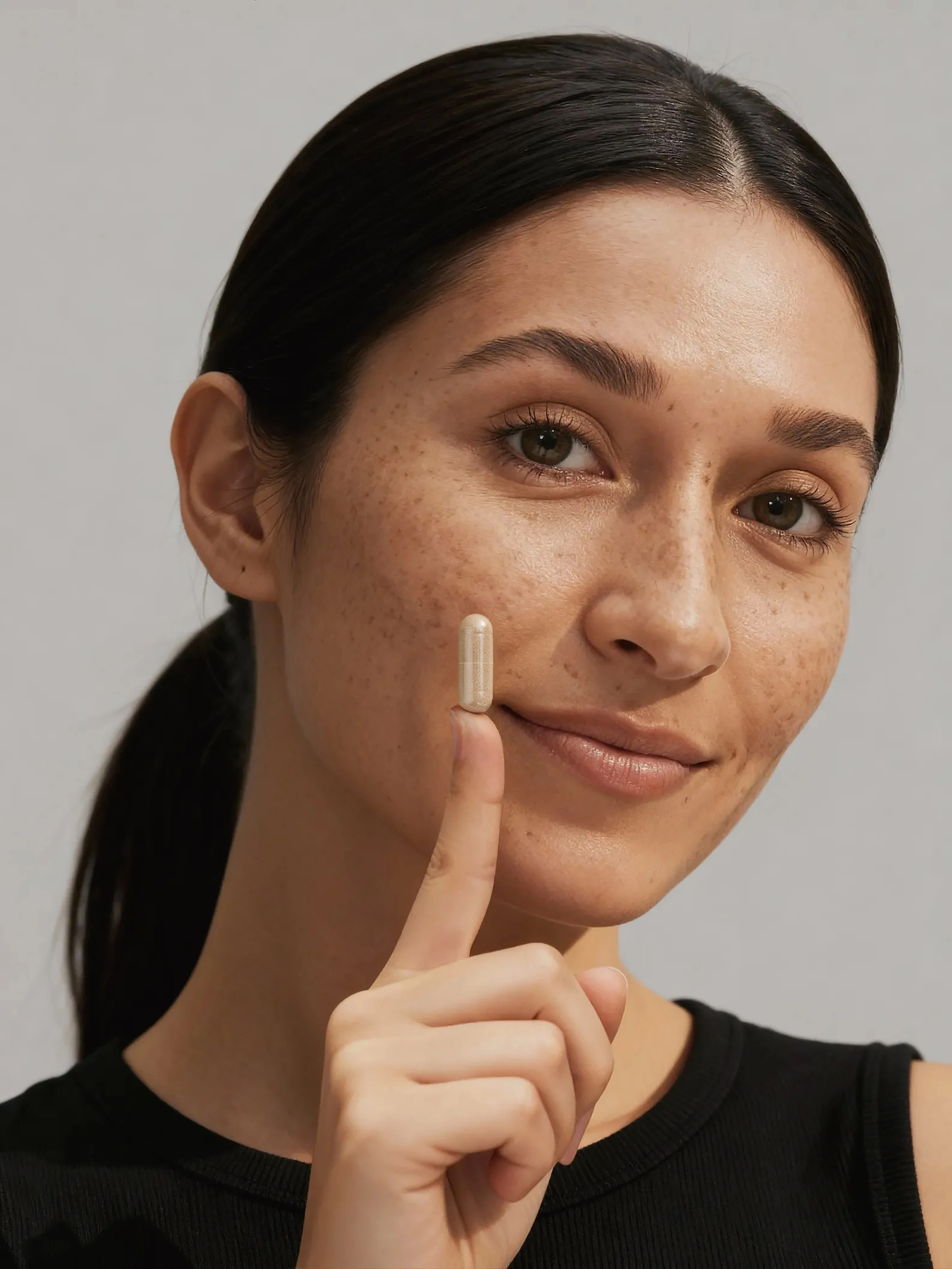
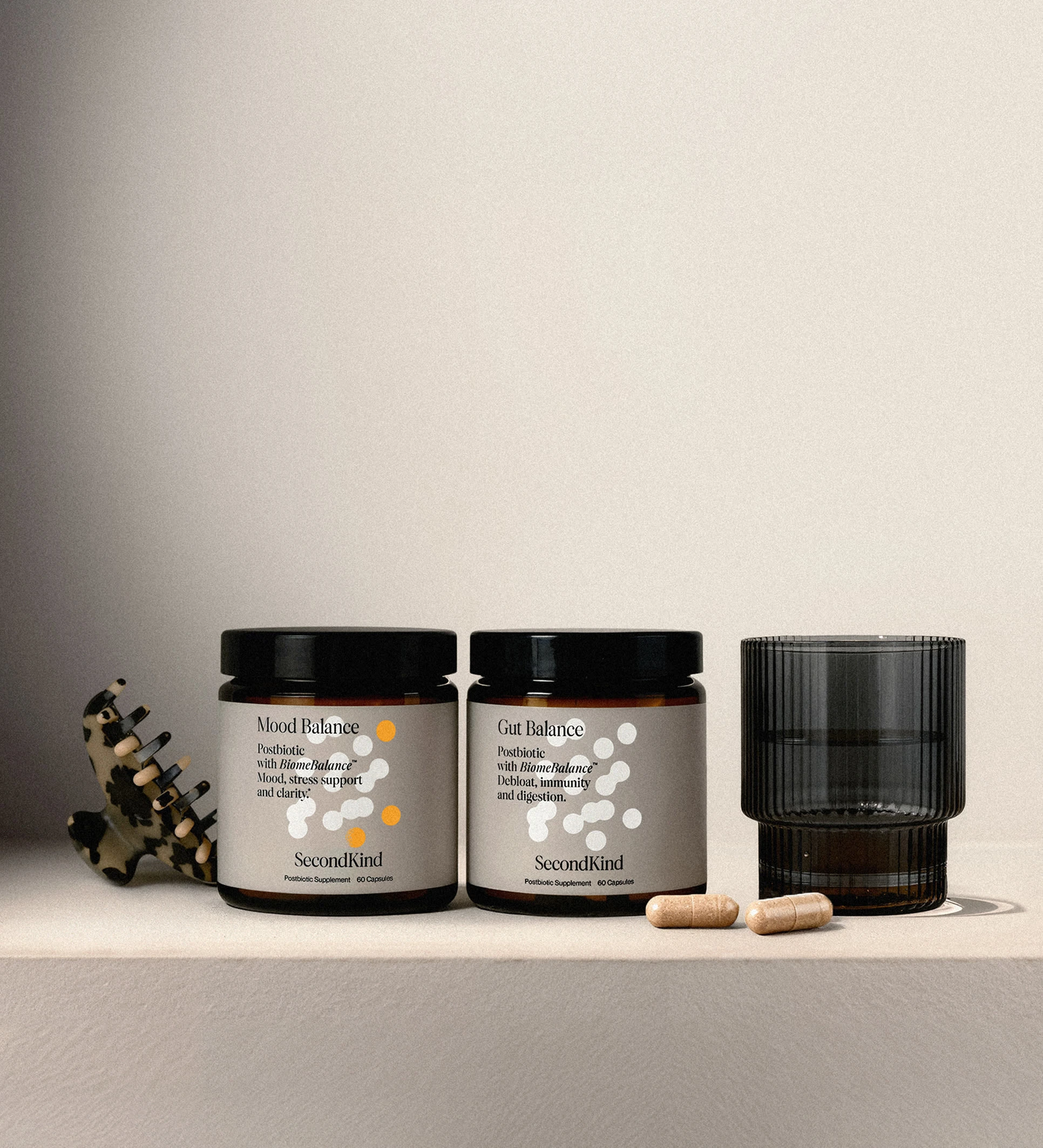
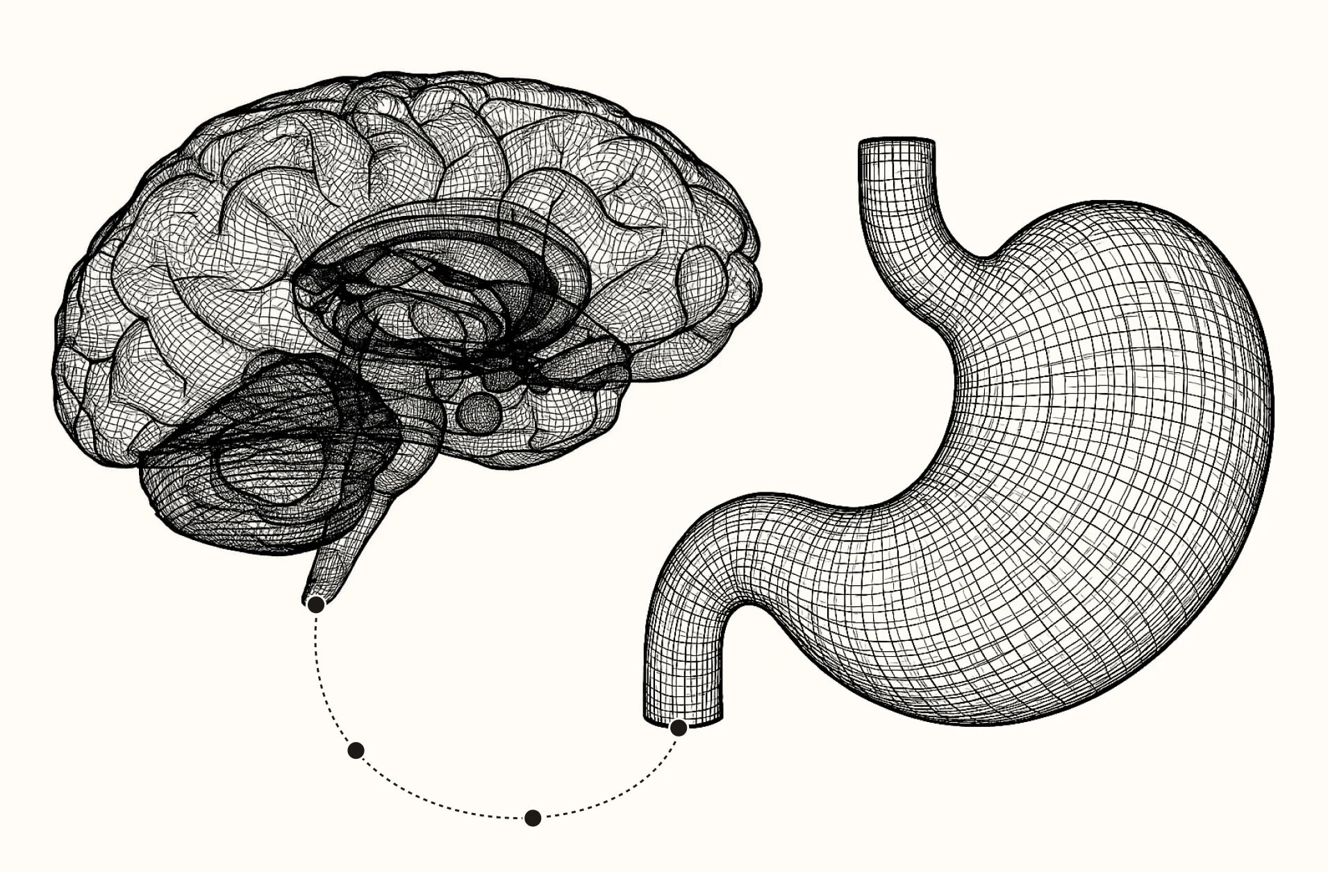
SecondKind is a science-backed wellness brand pioneering postbiotics — stable compounds your body actually uses, unlike fragile probiotics.
Launching a new category required motion design that could:
explain without overwhelming
feel premium, not clinical
communicate trust, balance, and clarity
The Challenge
Most gut-health brands rely on loud claims or complex diagrams.
SecondKind needed motion graphics that felt:
grounded in science
emotionally reassuring
visually restrained
timeless rather than trendy
The challenge was to make invisible biological processes feel intuitive — without turning them into marketing spectacle.
The Approach
The motion language was designed around three principles:
1. Calm Over Noise
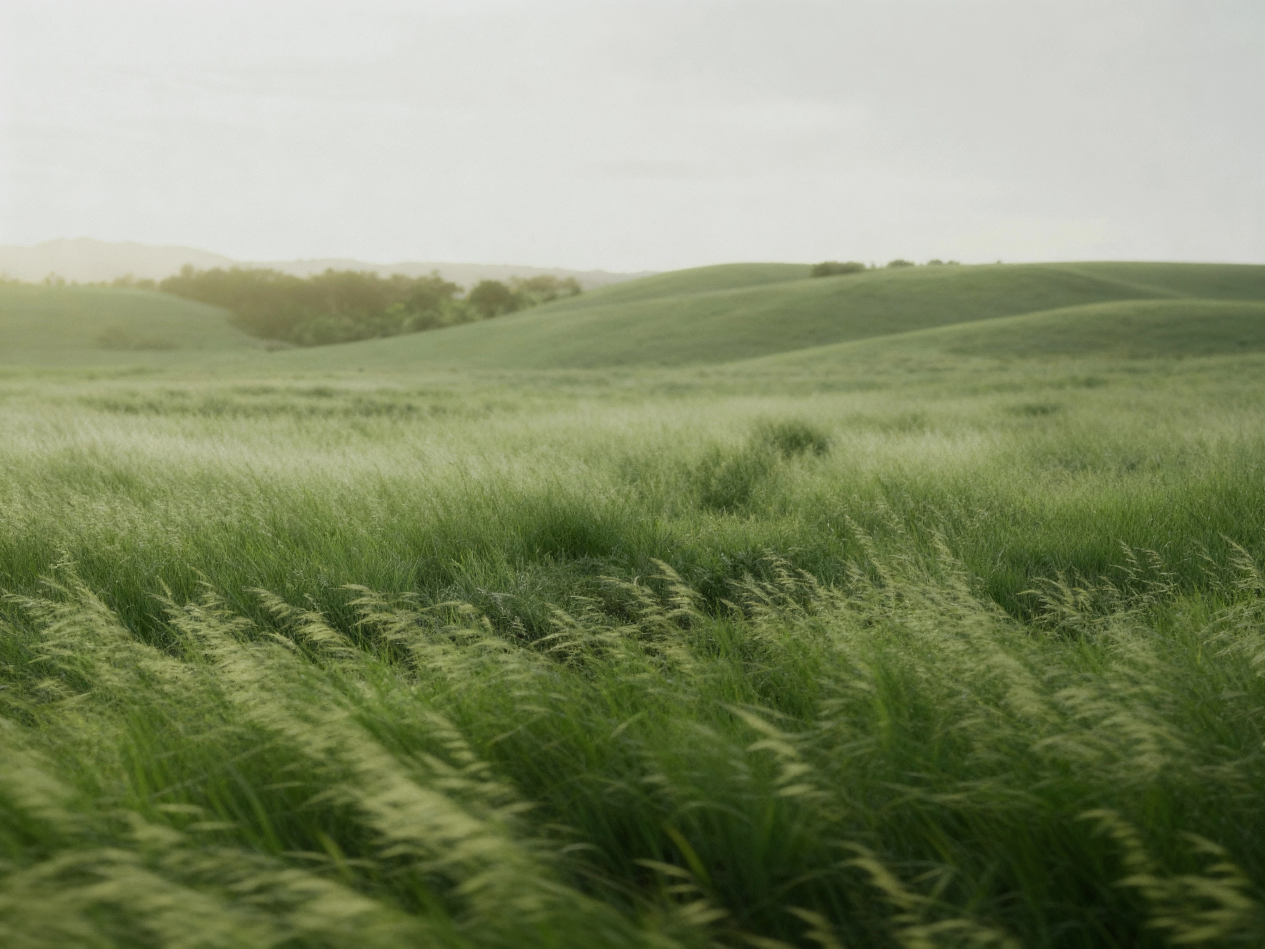
Slow pacing, soft transitions, and controlled motion to mirror internal balance.
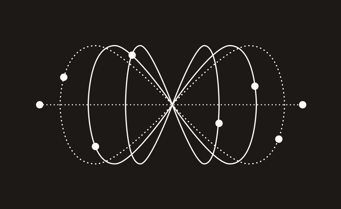
2. Abstraction Over Illustration
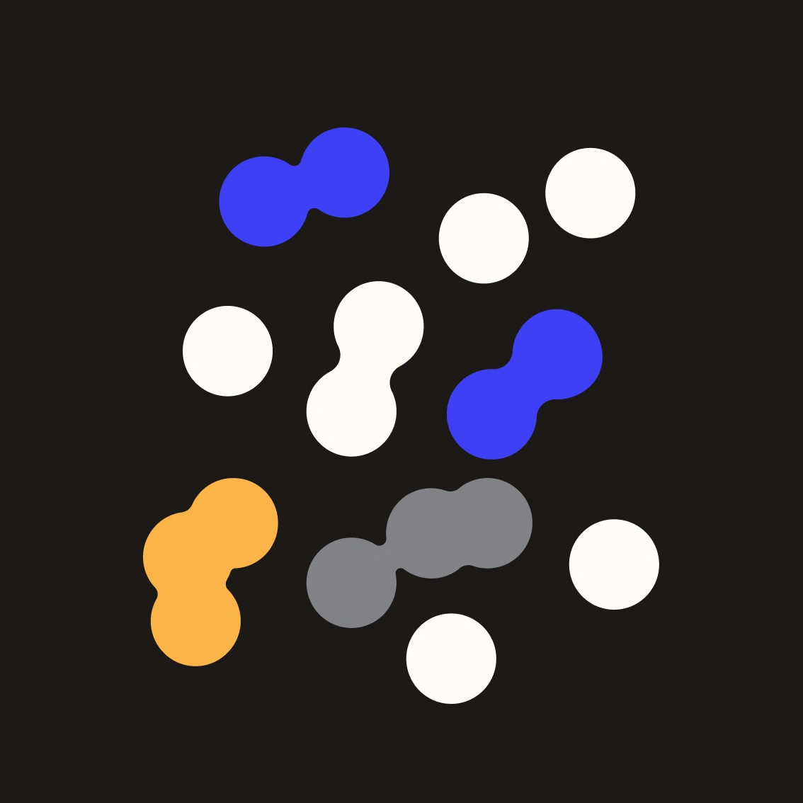
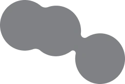
Using particles, dots, and flow instead of literal anatomy — allowing the science to feel elegant rather than instructional.
3. Brand First
Every motion decision reinforced SecondKind’s identity: modern, human, and quietly confident.

Motion Design Execution
Core Motion Elements
Abstract dot systems representing postbiotic activity
Subtle kinetic typography and pacing
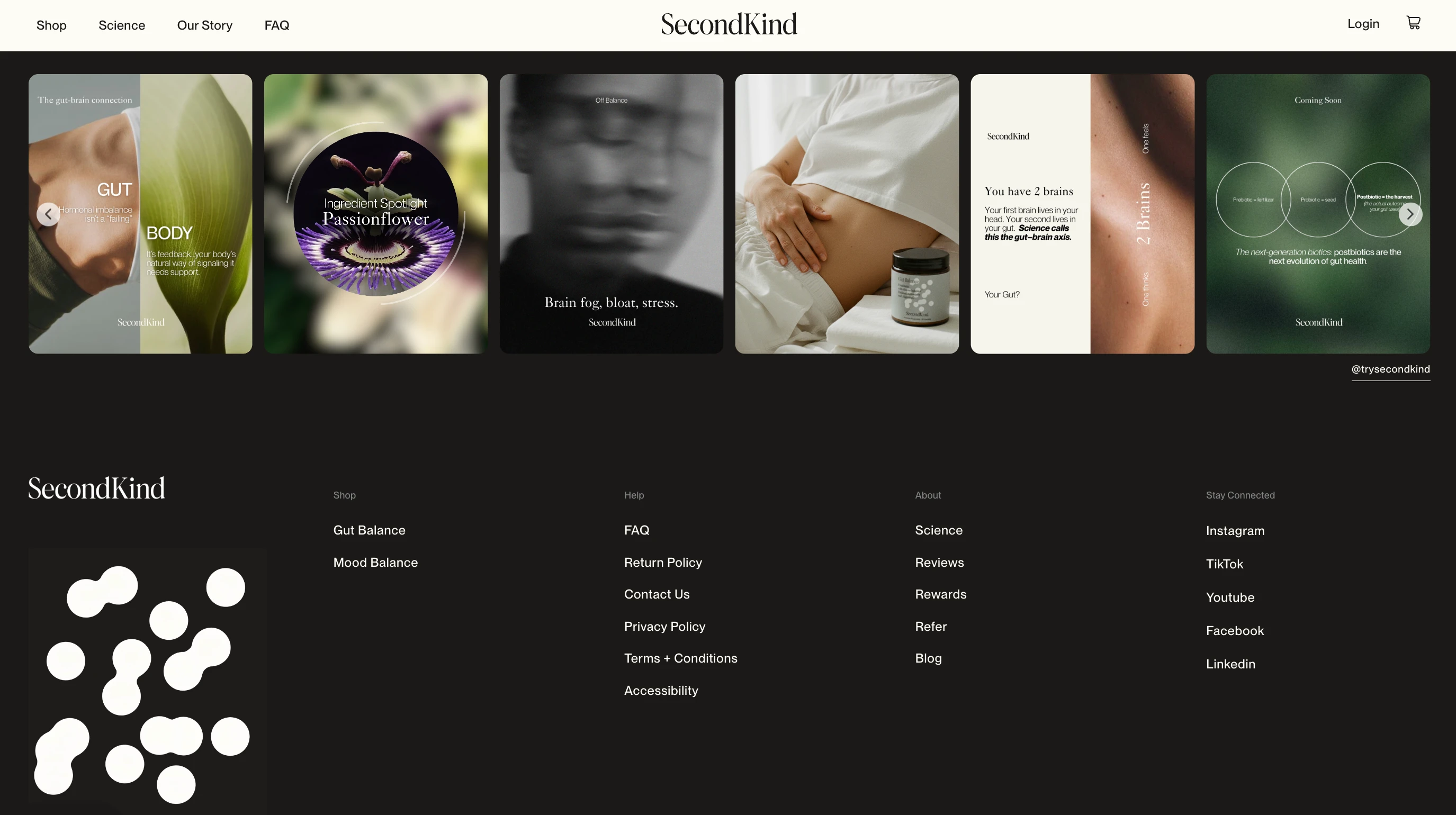
Clean transitions designed for web and launch video use
The motion assets were created to be modular, allowing the brand to reuse them across:
website sections
hero film
social snippets
future product storytelling

The Result
A cohesive motion system aligned with SecondKind’s scientific credibility
Motion assets that elevate trust rather than distract
A visual language that can scale with the brand over time
The final motion work helps communicate how postbiotics work — without ever needing to say too much.
My Role
Motion Design & Visual Storytelling
Working closely with the SecondKind team to translate postbiotic science into calm, brand-defining motion graphics.


Like this project
Posted Dec 15, 2025
Designed calm, science-led motion graphics to visually explain postbiotics and support SecondKind’s brand launch.
Likes
0
Views
15
Timeline
Nov 20, 2025 - Ongoing
Clients
secondkind