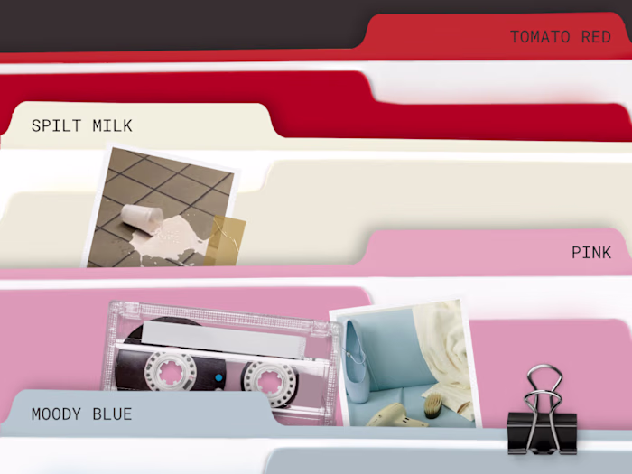
Wx4 Submark Design for Woxer
Claudia Geissler

Wx4 Submark Development & Design for Woxer.

Woxer Wx4 Submark
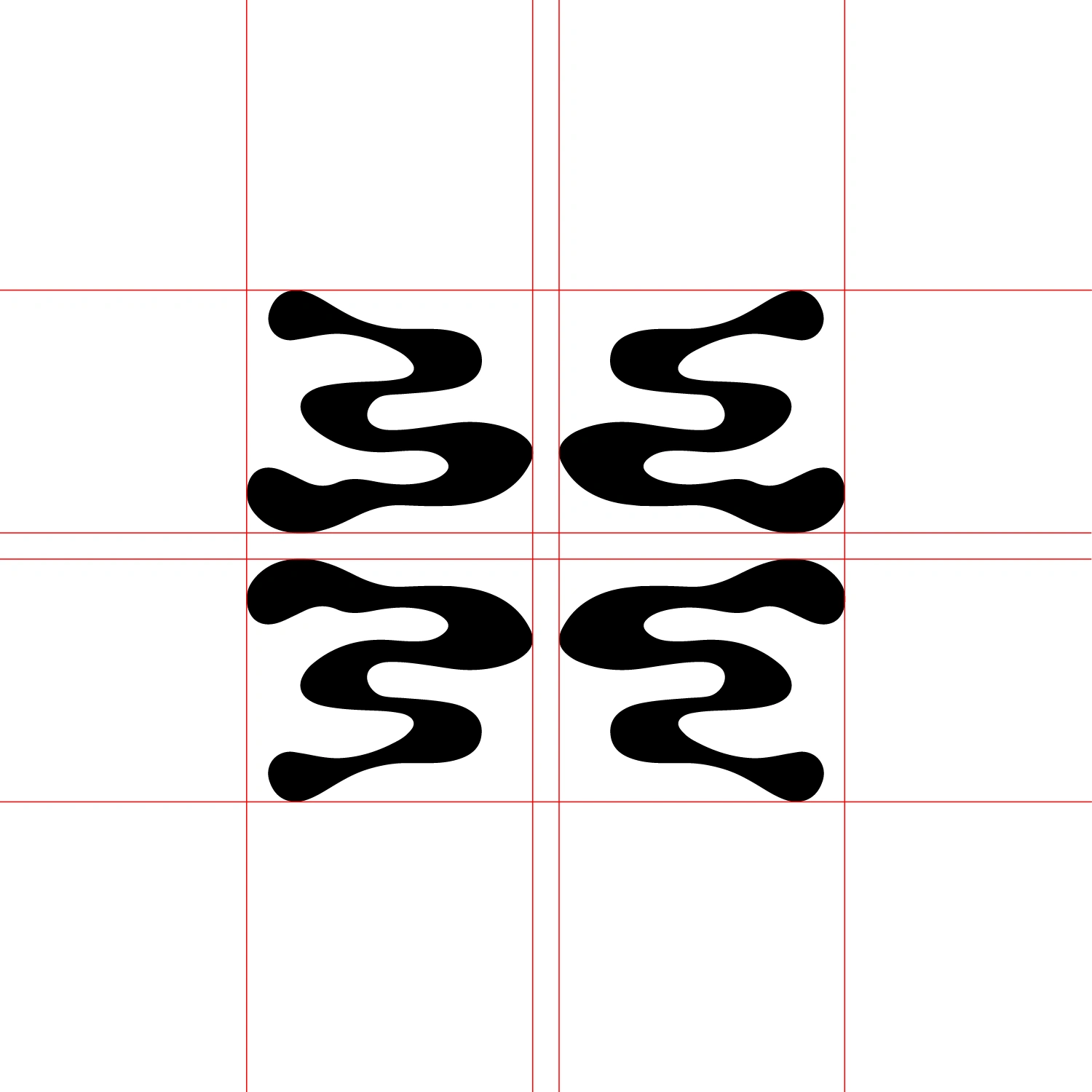
The brand needed a visual mark that represented inclusivity beyond its original 'Women + Boxer = Woxer' foundation. The Wx4 submark was developed using rotated 'W's' symbolizing ambiguity, symmetry, and the four corners of identity within the brand’s growing audience. Designed to be versatile across digital, packaging, and community touchpoints, the mark provides an alternate visual shorthand for those who may not identify with the singular “W,” reinforcing Woxer’s mission of comfort, confidence, and connection— without boundaries.

Campaign by Christelle de Castro. Collage by Mars Ibarreche.
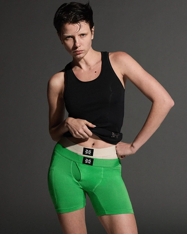
Wx4 Submark Featured in Woven Label of 'Fly' Product and Campaign.
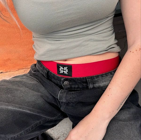
Submark Featured on 'Fly' Woven Label. Valentine's Day 2025.

Submark Featured on 'Fly' Baller in 5" Inseam. Worn by WNBA Player, Tasha Cloud.
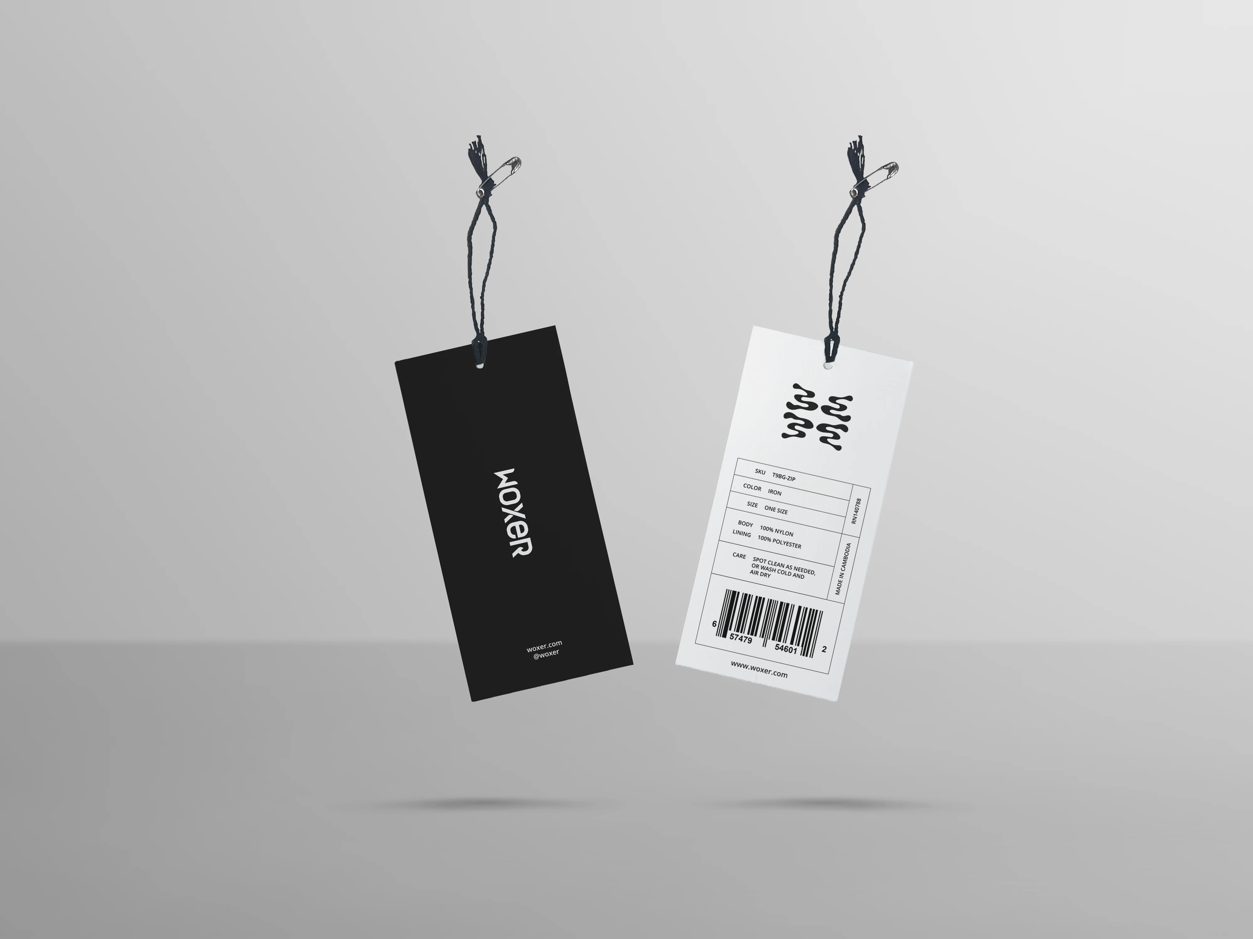
Hangtag Use-Case
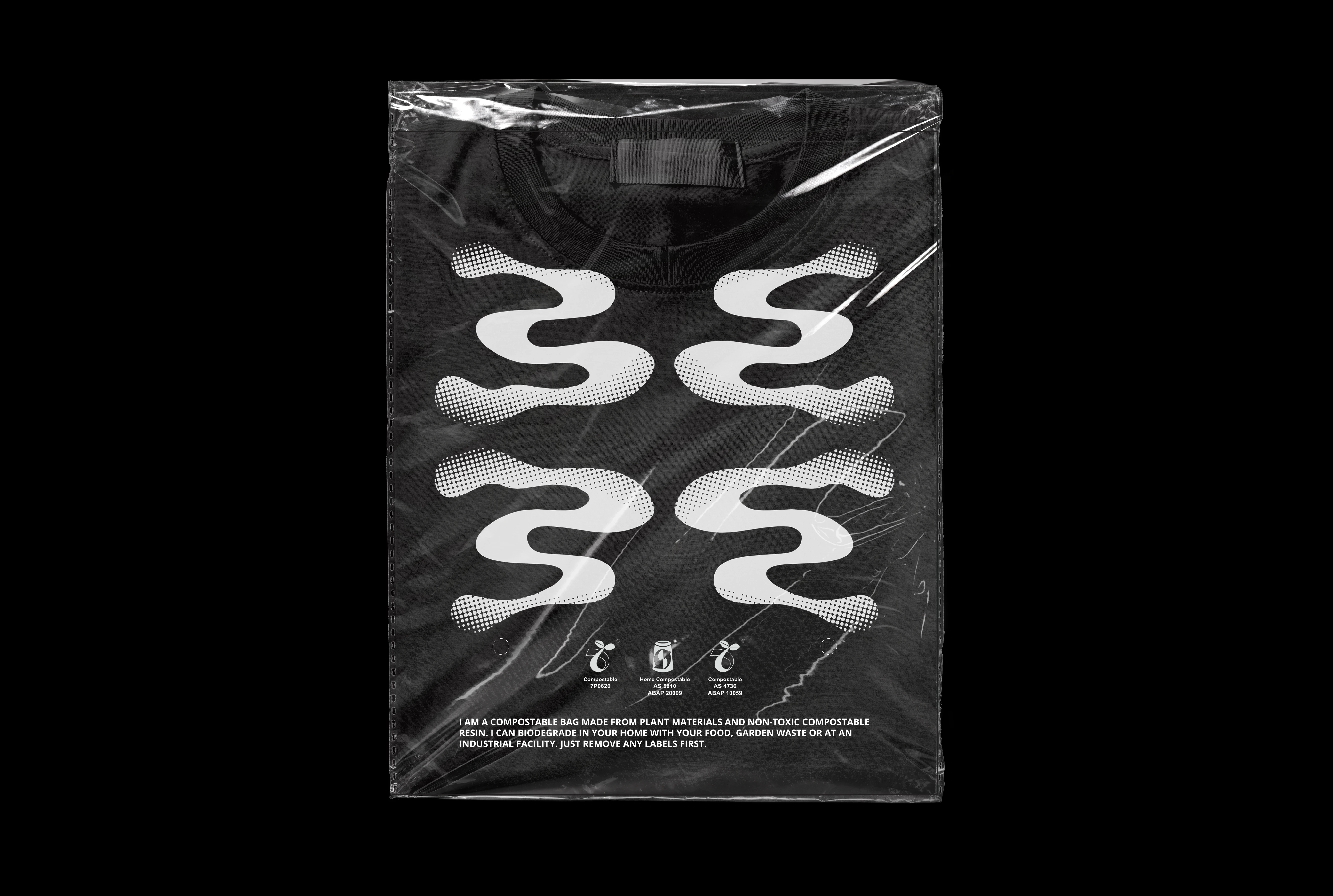
Garment Packaging Use-Case
Like this project
Posted May 8, 2025
Concepted and designed the 'Wx4' submark to build out brand architecture and expand visual identity for Woxer, a multi–8-figure brand.