
About the project
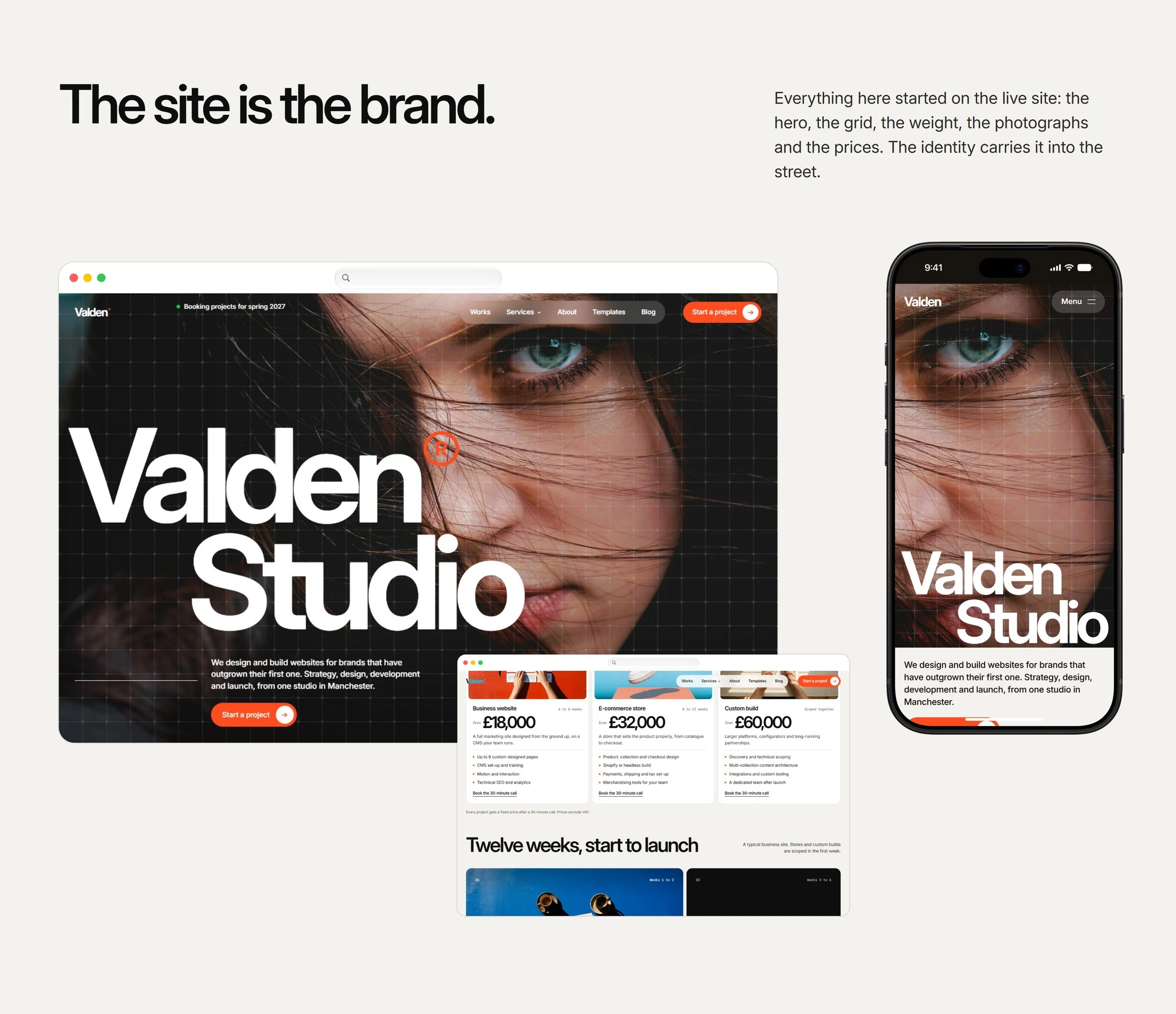
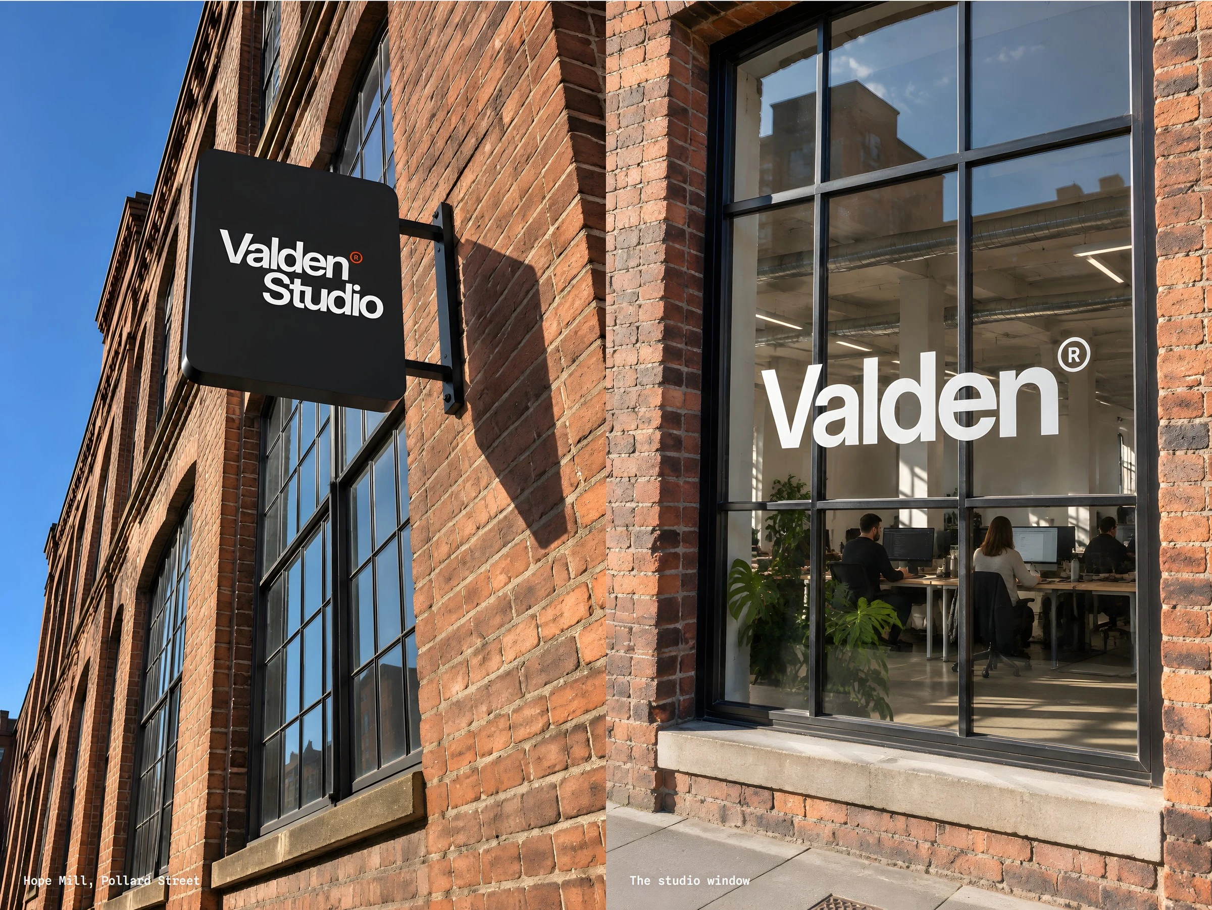
Valden is a web design and development studio at Hope Mill in Ancoats, Manchester. This is a self-initiated concept identity built from the studio's live site: the name, the type, the colours and the work all come from it.
The idea
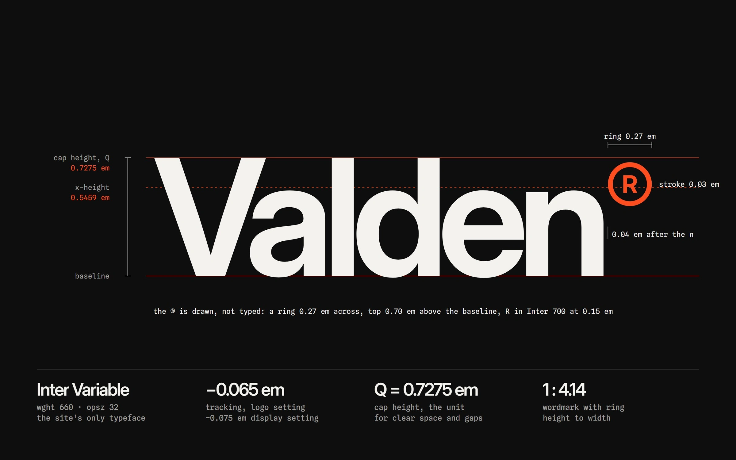
Outgrown: the name gains weight, never width. On the site the loader fills from 100 to 660 and the footer wordmark swells at a constant width. The identity makes that its one move. The wordmark gets heavier at the same width, and the heavier it gets, the more of the client work it carries.
The system
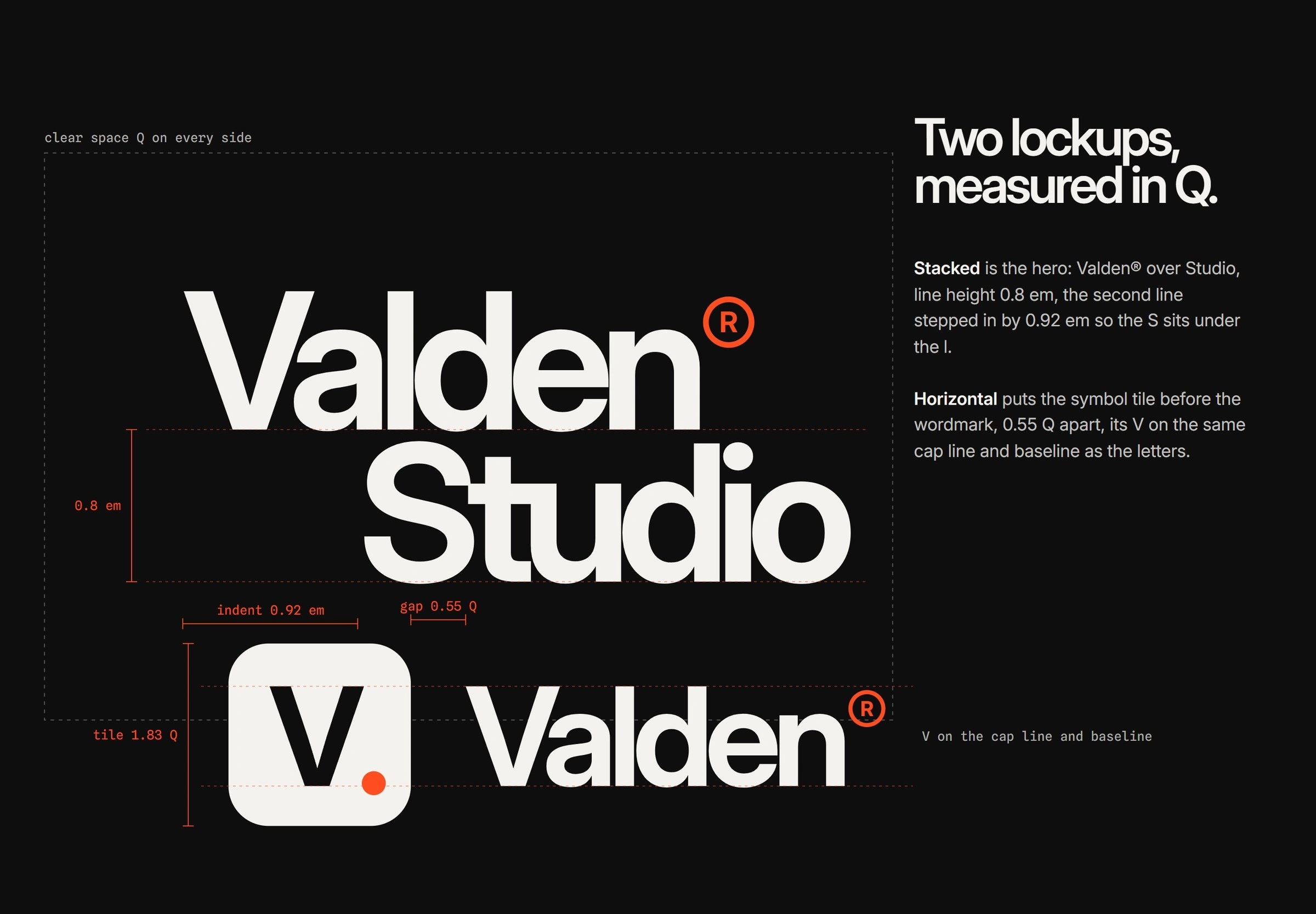
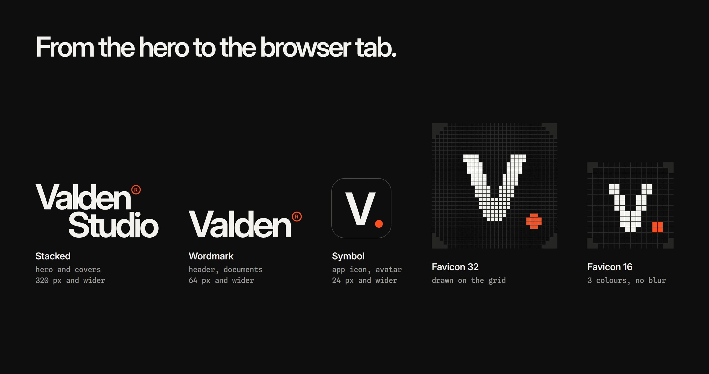
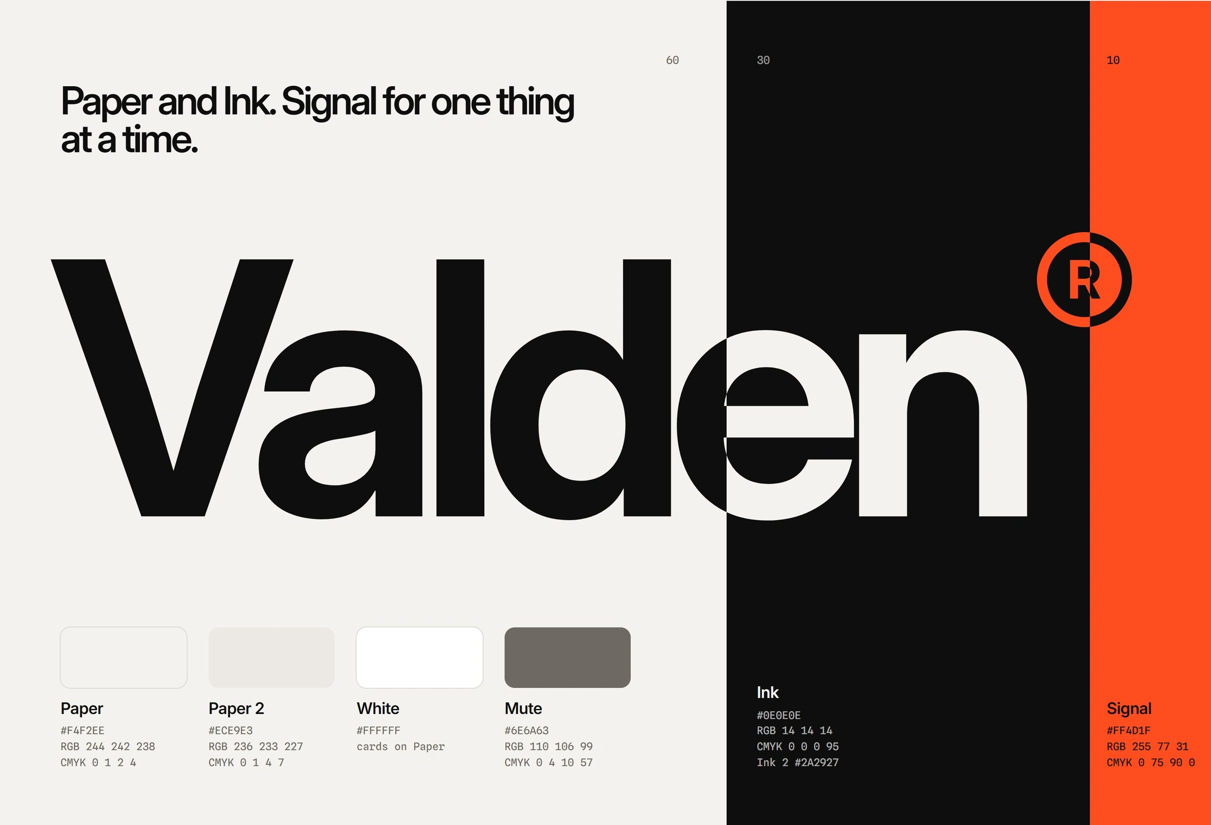
Inter Variable for everything, set with the width fixed. Paper, Ink and Signal at 60/30/10, with Signal kept for the one thing that matters on a page. The V. symbol, the grid and the interface components all follow the same rule.
The work
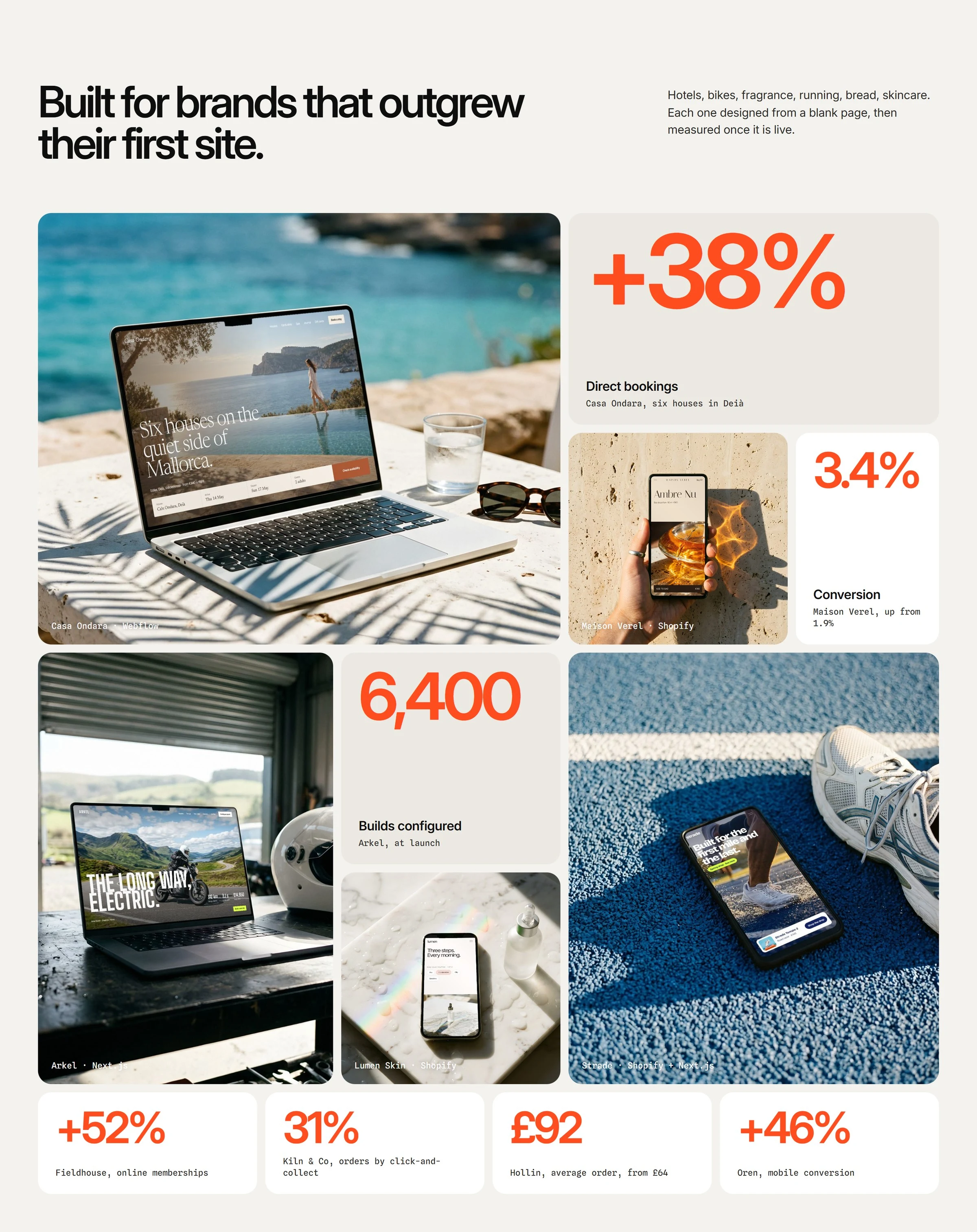
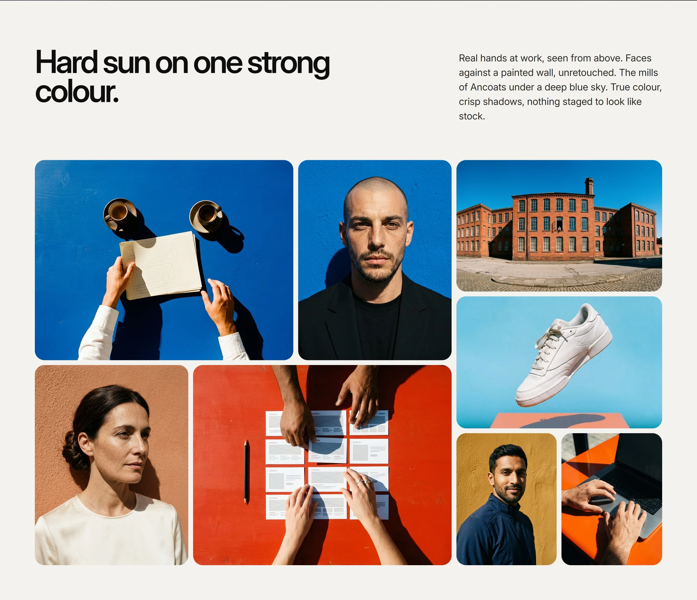
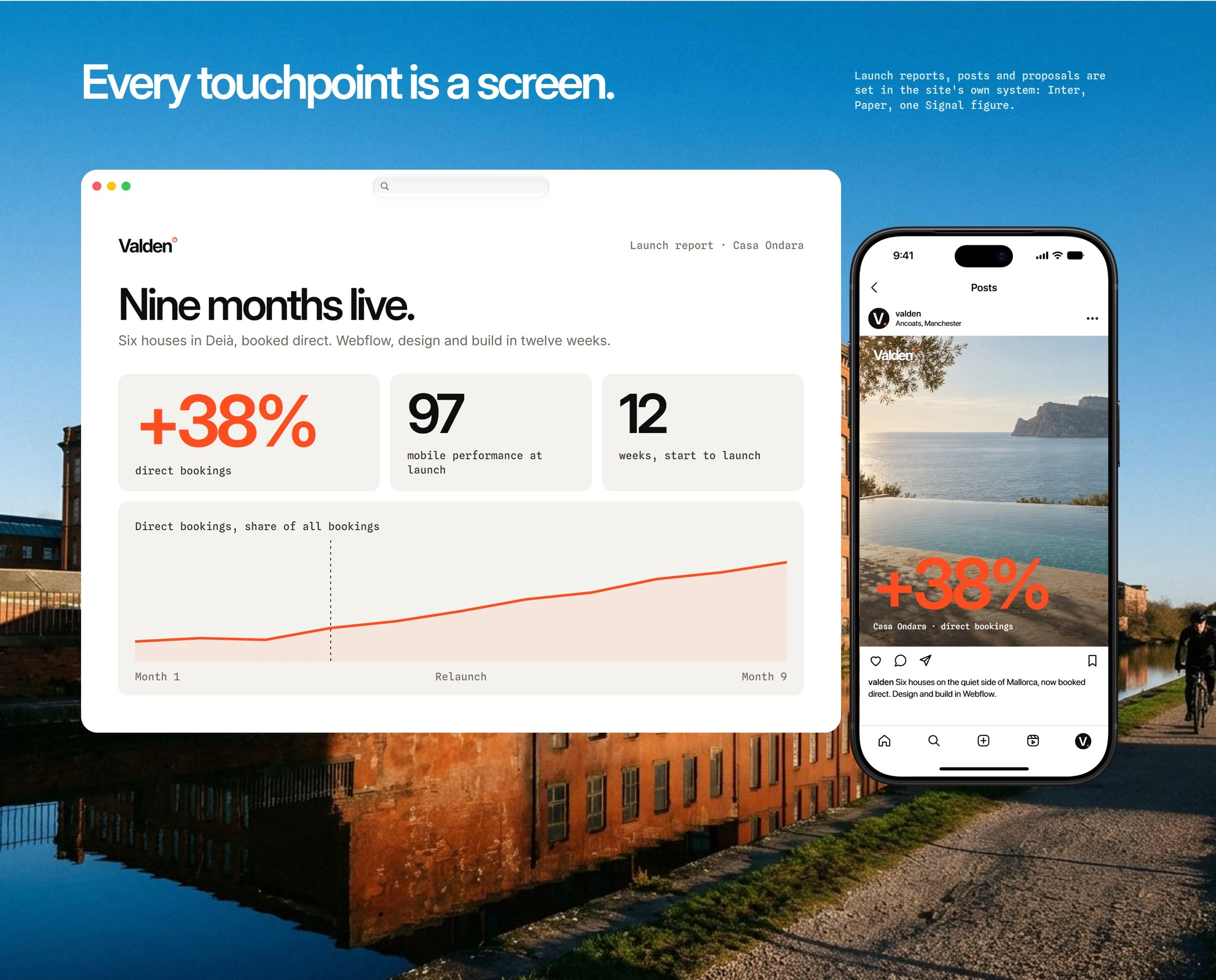
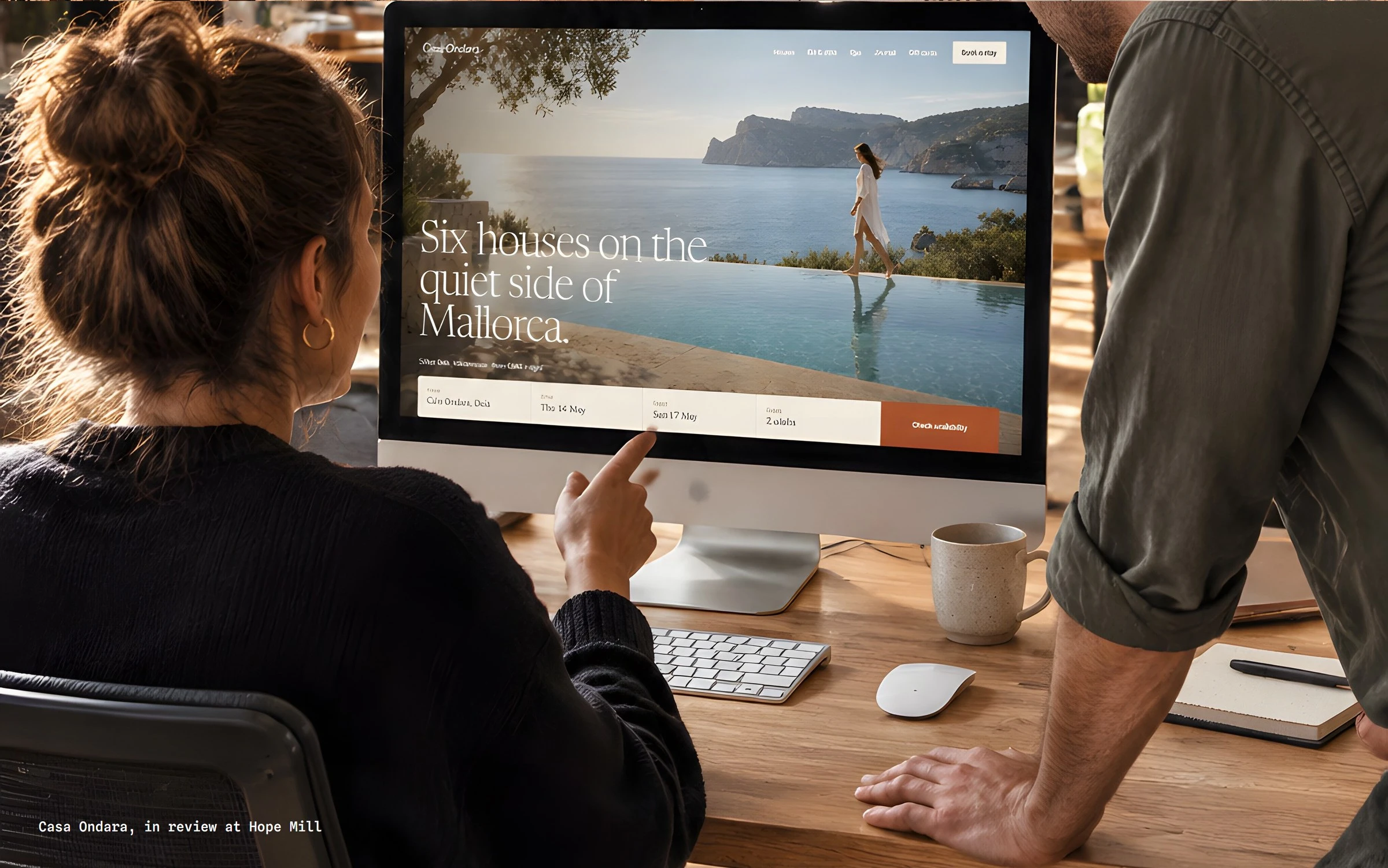
Daylight chapters show client sites in browser windows and on phones, so the brand is always seen carrying the work rather than talking about it.
In use
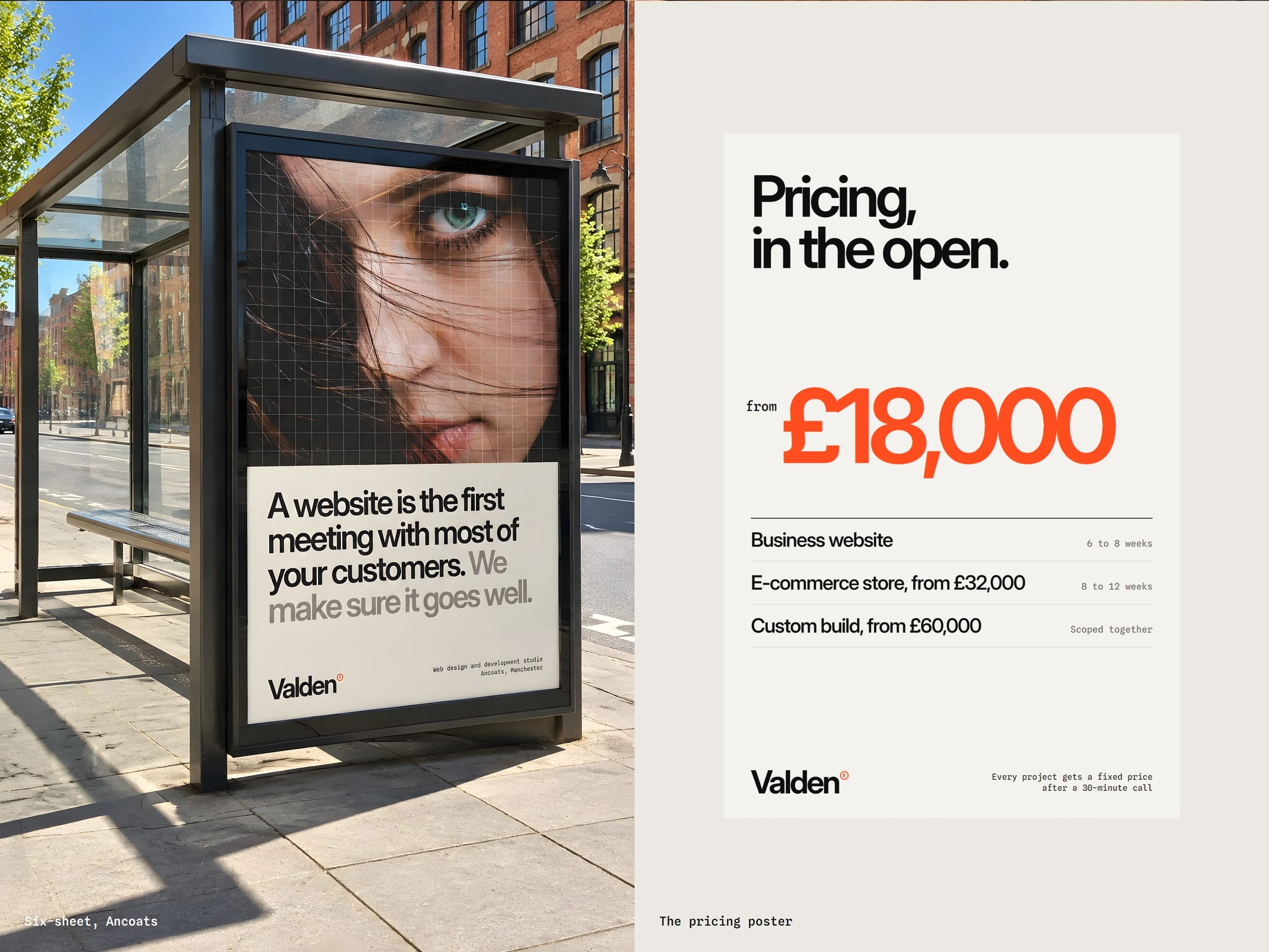
A pitch deck, social posts, the website and a few printed pieces. Dark digital chapters and daylight work chapters share one grid, so the whole system reads as one studio.
0 likes · 0 views · Nov 16, 2026
A self-initiated identity for Valden, a Manchester web design studio. The name gains weight, never width, and carries more of the client work as it grows.

