Web Designs
Sumayya Maya
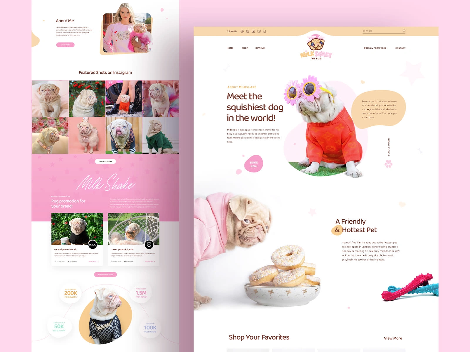
Milkshake the Pug
Client Need: A popular pet influencer (Milkshake the Pug) and their owner needed an engaging, fun, and e-commerce-ready website to capitalize on Milkshake's social media fame. The goal was to sell branded merchandise, showcase Milkshake's personality, and provide a hub for fans.
Design Goal: Create a vibrant, playful, and user-friendly website that captures Milkshake's adorable and quirky personality, appeals to pet lovers, and facilitates easy shopping for merchandise.
Key Design Choices & Rationale:
Color Palette: Predominantly soft pinks and whites, with pops of brighter colors. This creates a cheerful, friendly, and approachable atmosphere, perfectly suited for a pet-focused brand.
Typography: Playful, rounded fonts for headings, complemented by clean, readable fonts for body text. This balance ensures fun while maintaining clarity.
Layout: Features large, engaging imagery of Milkshake prominently. The layout is somewhat whimsical but maintains clear sections for navigation and content.
Imagery: High-quality, professional, and personality-filled photos of Milkshake are central to the design. These images are the primary way the brand connects with its audience.
Interactive Elements: Clear "Shop Now" buttons are highlighted. Social media integration is prominent, encouraging cross-platform engagement. Product showcases are designed to be appealing.
Content Strategy: Emphasizes Milkshake's "squishiest dog in the world" persona, includes "Featured Shots on Instagram" to leverage social media content, and a blog section for fan engagement.
Outcome (Intended): A highly engaging and visually appealing website that successfully translates Milkshake's online persona into a branded platform for merchandise sales and community building.
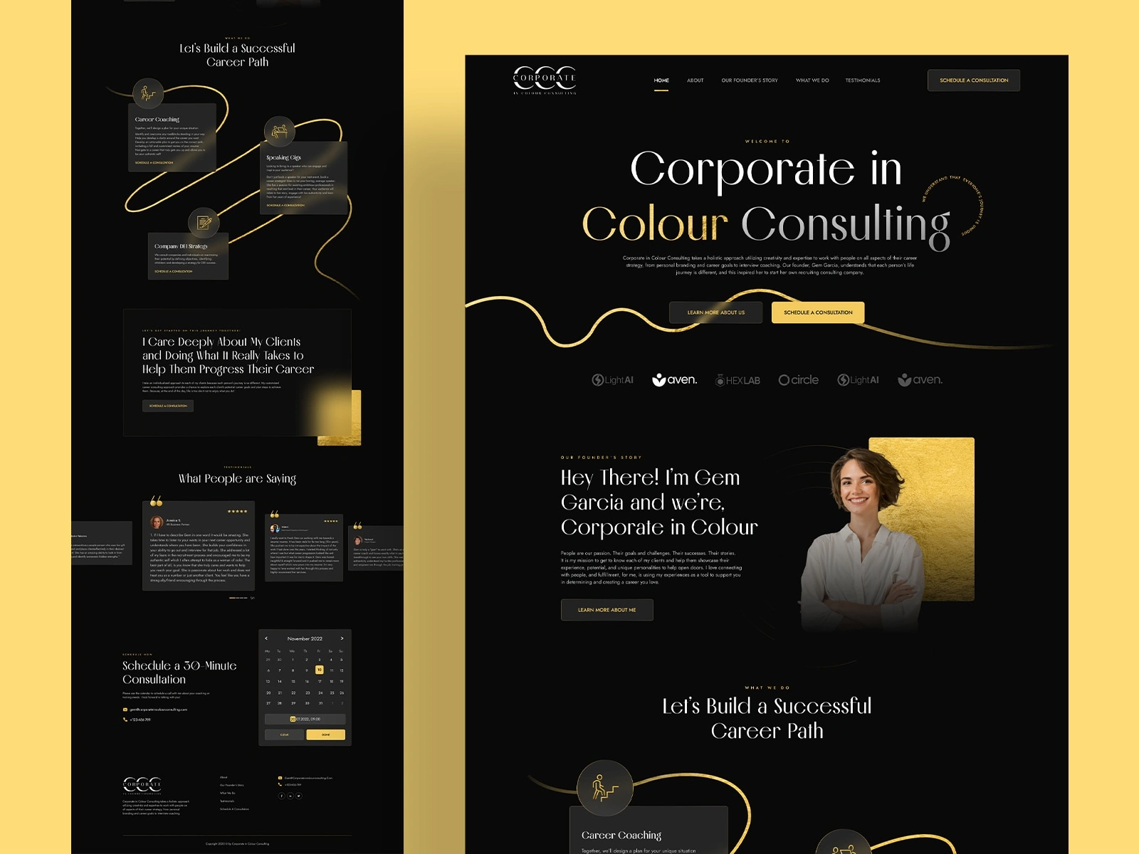
Corporate Colour Consulting
Client Need: A professional consulting firm specializing in career development and "colour consulting" needed a sophisticated online presence to establish credibility, showcase their services, and attract high-value clients. They wanted to convey expertise, trust, and a personalized approach.
Design Goal: Create a clean, modern, and elegant website that reflects professionalism, warmth, and the unique brand identity of "Corporate in Colour." The site needed to clearly outline services, highlight the founder's expertise, and provide a clear call to action for consultations.
Key Design Choices & Rationale:
Color Palette: Dominated by deep black/charcoal backgrounds with striking gold/amber accents. This choice instantly conveys luxury, sophistication, and a sense of value, aligning with high-end consulting services. The gold can also subtly represent "colour" in the brand name.
Typography: A mix of clean, modern sans-serif fonts for headings and body text, ensuring readability while maintaining an upscale feel. The elegant script font for "Colour" in the main heading adds a distinctive, personalized touch.
Layout: Utilizes ample white (or in this case, dark) space to give content room to breathe, preventing overwhelm and emphasizing key information. Sections are clearly delineated with strong headings.
Imagery: Professional headshots and abstract gold textures are used to reinforce the brand's premium feel. The image of the founder in a professional, approachable pose builds trust.
Interactive Elements: Clear "Schedule a Consultation" buttons are prominent. Graphical elements (like the yellow lines illustrating a career path) provide visual interest and help explain the service offering intuitively.
Content Strategy: Includes an "Our Founder's Story" section to build personal connection and testimonials to build social proof.
Outcome (Intended): A website that effectively positions Corporate in Colour as a leading, trustworthy, and sophisticated consulting firm, encouraging potential clients to engage and book services.
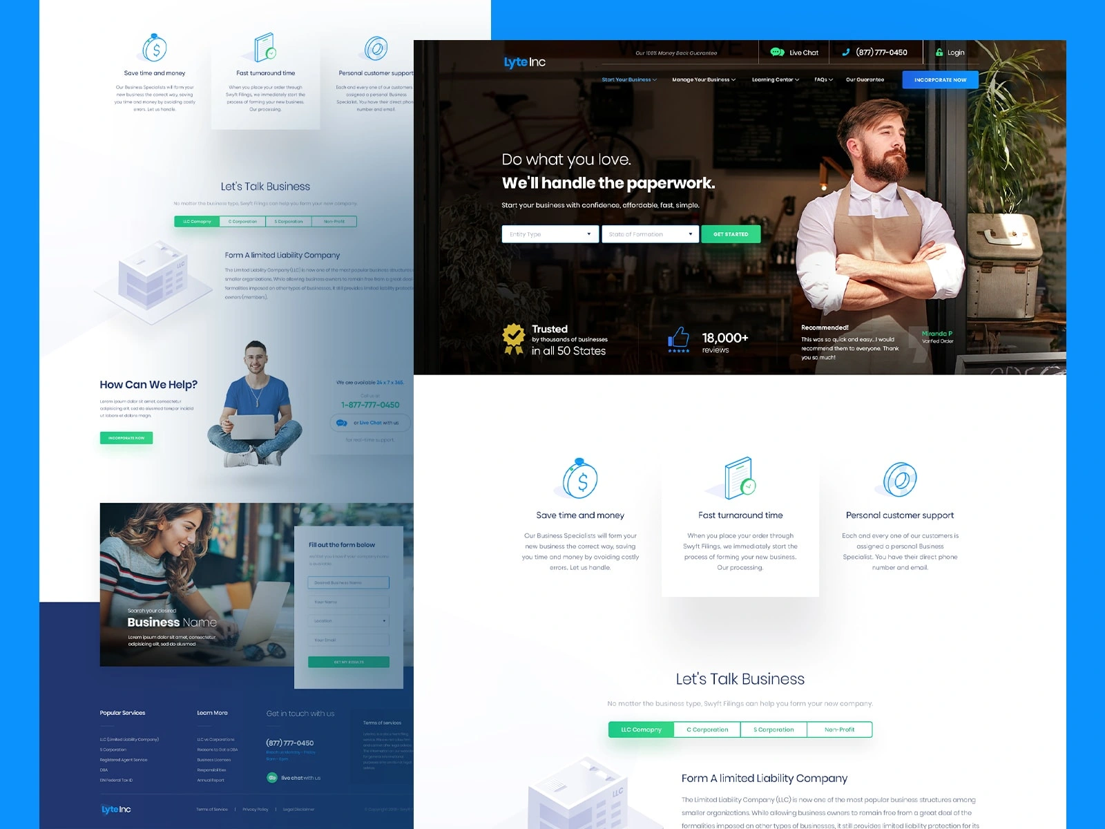
Lyte Business Formation
Client Need: A service provider specializing in assisting individuals with business formation (LLC, S-Corp, etc.) needed a website that conveyed trustworthiness, simplicity, and efficiency. The goal was to demystify the legal process and encourage users to utilize their services for business setup.
Design Goal: Design a clean, professional, and highly conversion-focused website that makes complex legal processes seem straightforward and accessible. Emphasize speed, support, and reliability.
Key Design Choices & Rationale:
Color Palette: Primarily uses shades of blue and white, which are traditionally associated with trust, reliability, and professionalism in business contexts. Green accents are used for calls to action, signifying "go" or positive action.
Typography: Clean, sans-serif fonts are used throughout, ensuring excellent readability and a modern, no-nonsense feel.
Layout: Features a structured, grid-based layout that organizes information clearly. Key information is presented in digestible blocks and bullet points. The hero section immediately introduces the main value proposition.
Imagery: Professional stock photography of diverse business owners and office environments helps relate to the target audience. A prominent image of a friendly, approachable representative builds trust.
Interactive Elements: Clear "Start Your Business" and "Get Started" CTAs are strategically placed. Interactive elements like the business type selector simplify the user journey.
Content Strategy: Highlights benefits like "Save time and money," "Fast turnaround time," and "Personal customer support." Includes a "Trusted by thousands of businesses" section with social proof (reviews, states served). Features a clear form for inquiries.
Outcome (Intended): A highly functional and trustworthy website that effectively guides potential business owners through the process of formation, converting visitors into clients by emphasizing ease and reliability.
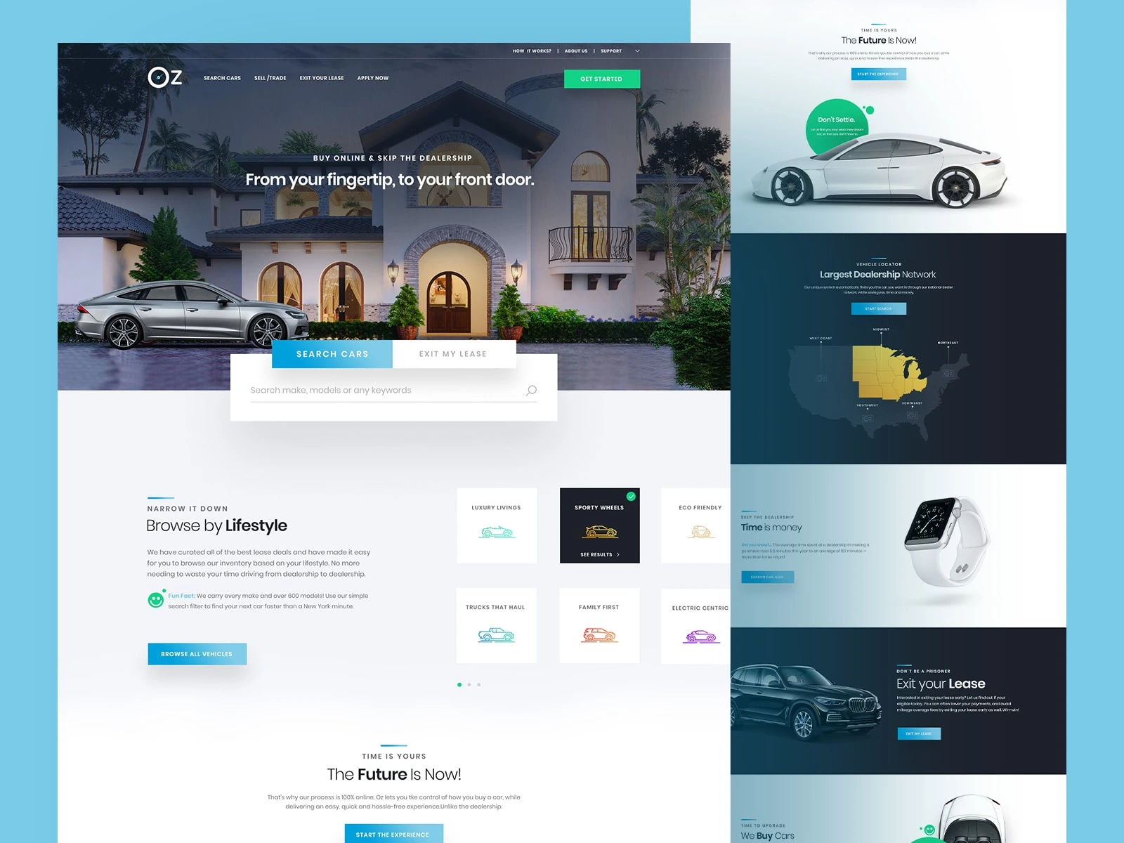
OZ Car Leasing
Client Need: A modern online platform for buying and leasing cars required a sleek, user-friendly website that conveyed convenience, transparency, and a vast selection. The goal was to disrupt traditional car dealerships by offering an "online, delivered to your door" experience.
Design Goal: Create a cutting-edge, minimalist, and highly visual website that showcases premium vehicles, simplifies the car shopping process, and builds trust in an online-only model.
Key Design Choices & Rationale:
Color Palette: Dominated by cool blues, whites, and grays, with vibrant green accents for calls to action. This palette evokes modernity, technology, sophistication, and a sense of freshness and ease.
Typography: Utilizes clean, contemporary sans-serif fonts for a sleek and modern aesthetic, ensuring excellent readability.
Layout: Features large, impactful hero images of cars. Content is well-spaced with clear sections. The layout is designed to be highly visual, allowing the cars to be the stars of the show.
Imagery: High-quality, professional photography and 3D renders of cars are central. Lifestyle imagery (e.g., watch, house) subtly suggests the aspirational lifestyle associated with the vehicles.
Interactive Elements: A prominent search bar for cars is a key feature. Clear "Search Cars," "Exit My Lease," and "Get Started" CTAs are strategically placed. Visual categories like "Browse by Lifestyle" enhance user exploration.
Content Strategy: Emphasizes convenience ("From your fingertip, to your front door"), selection ("Largest Dealership Network"), and benefits ("Time is Money," "Exit Your Lease").
Outcome (Intended): A sophisticated and highly functional e-commerce platform that redefines the car buying/leasing experience, attracting customers seeking a convenient and modern alternative to traditional dealerships.
Like this project
Posted Aug 27, 2025
Crafting responsive and engaging web designs that bring brands to life while prioritizing usability and visual impact.
Likes
0
Views
14