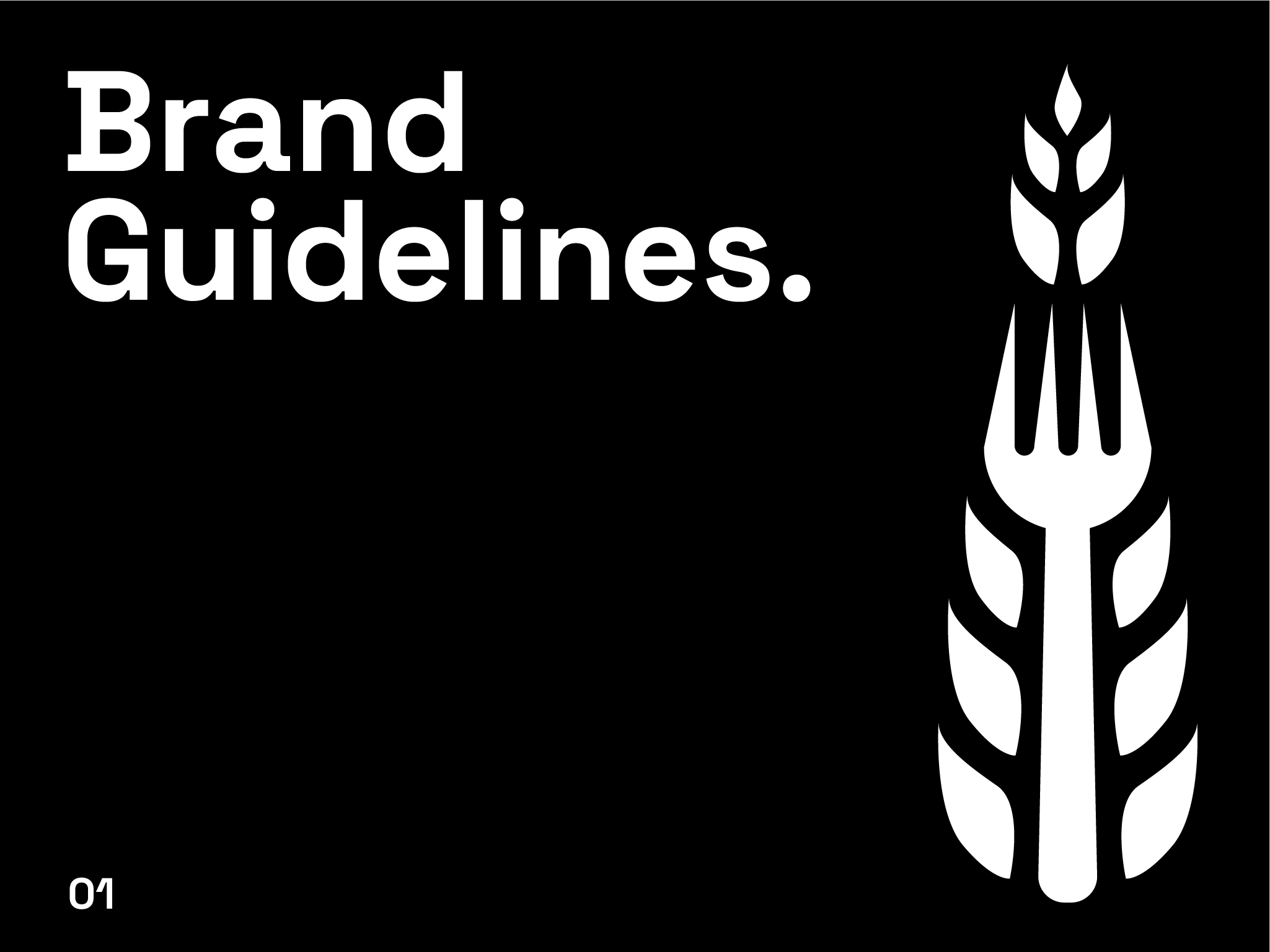
Brand Design for "The Harvest Fork".
Avijit Dutta
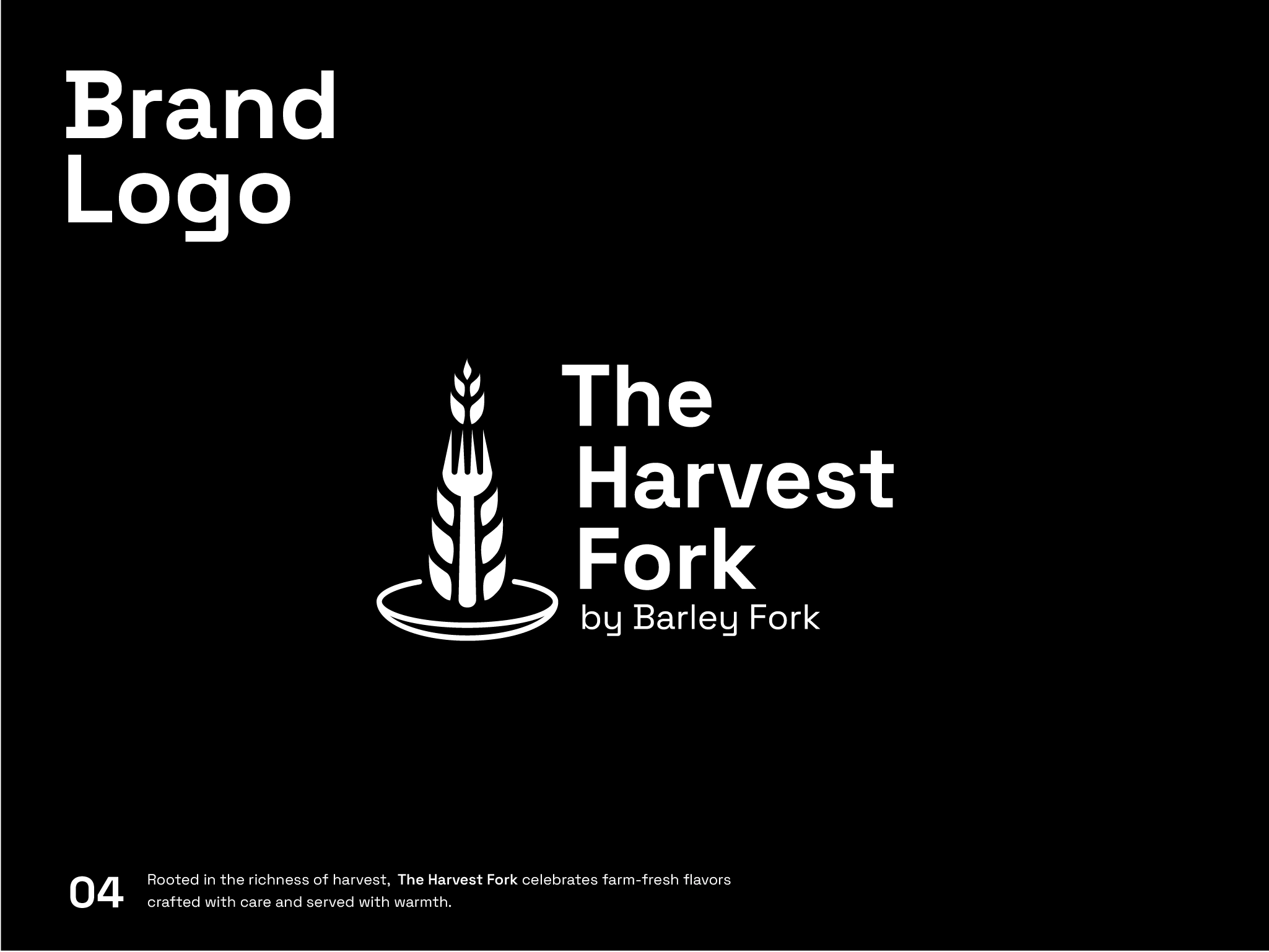
Logo & Brand Design for "The Harvest Fork".
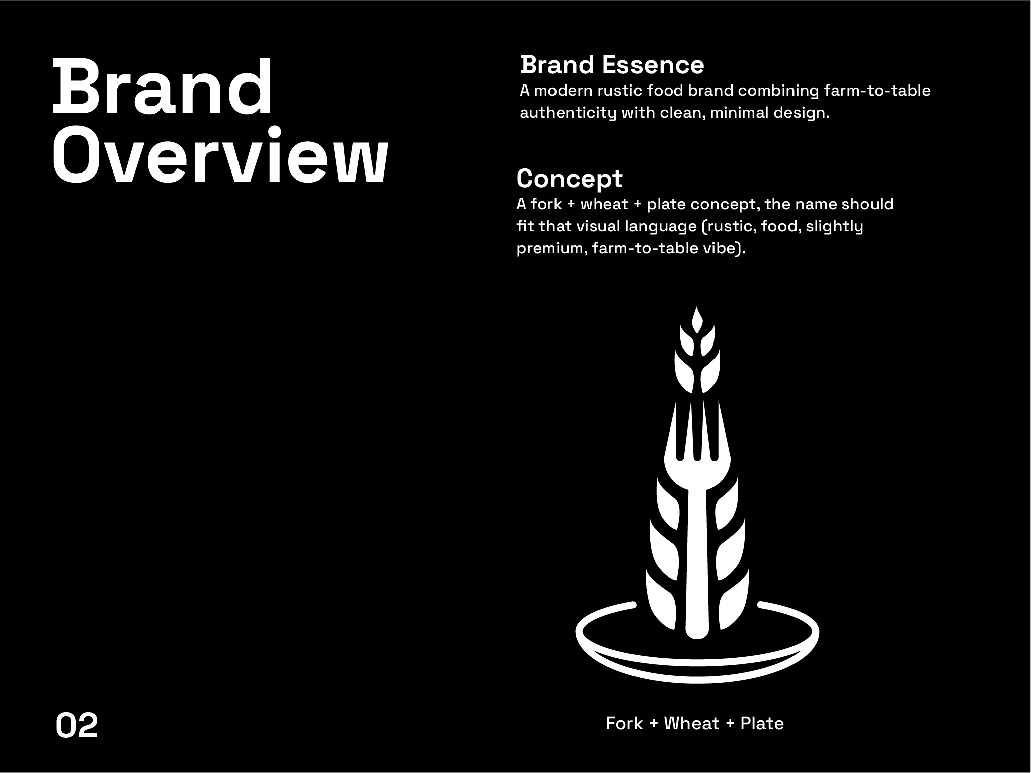
The Harvest Fork is a modern food brand inspired by the farm-to-table concept. The goal was to create a visual identity that reflects freshness, simplicity, and a connection to natural ingredients while maintaining a clean and premium aesthetic.
Logo Design, Research & Concept
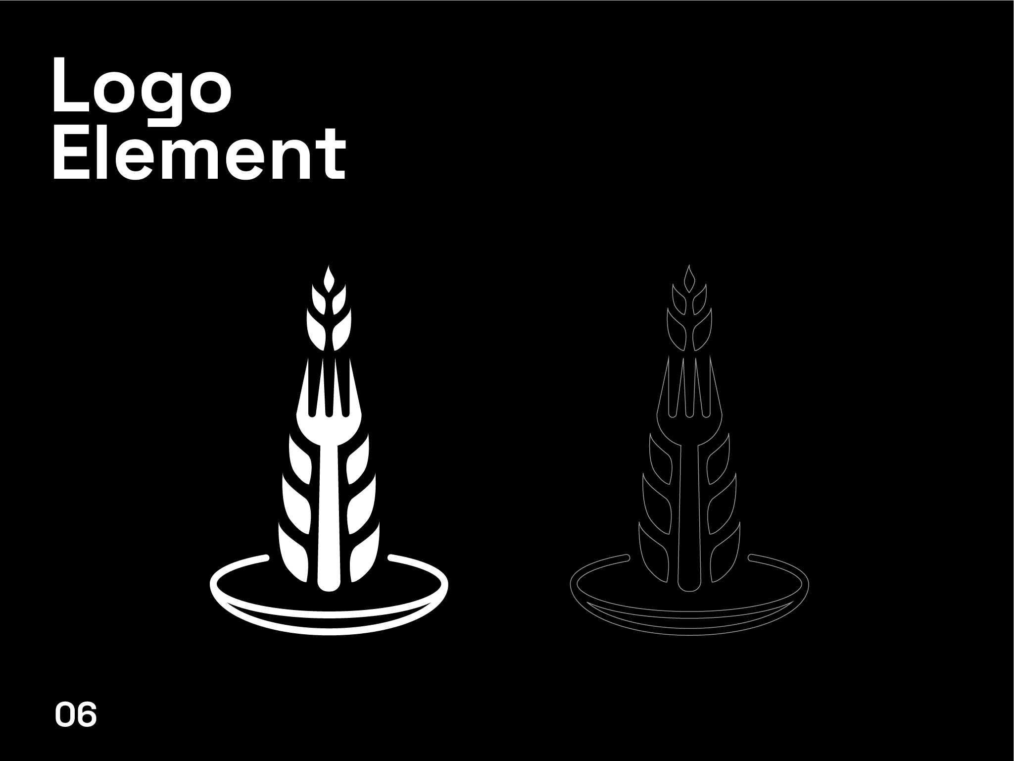
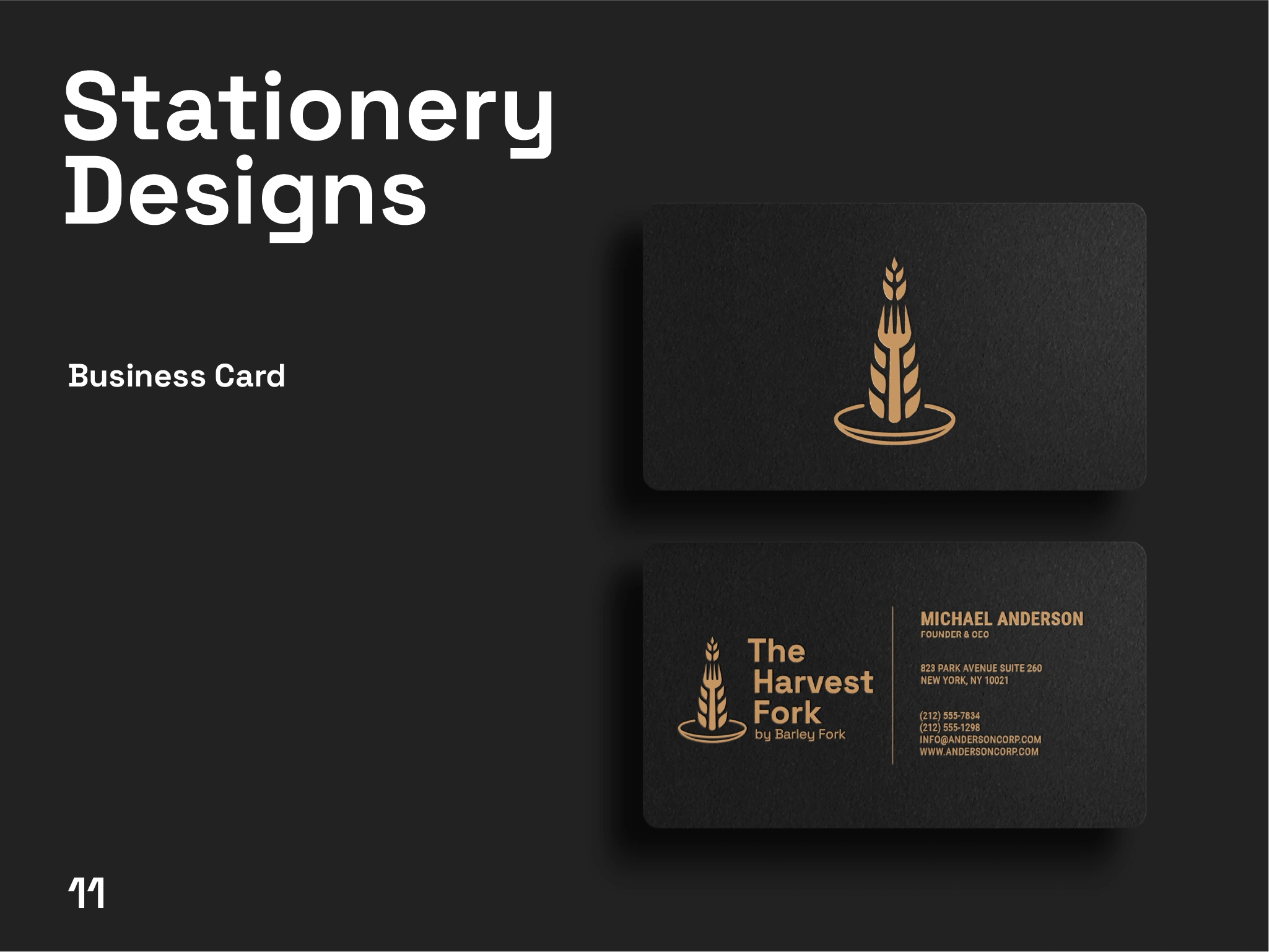
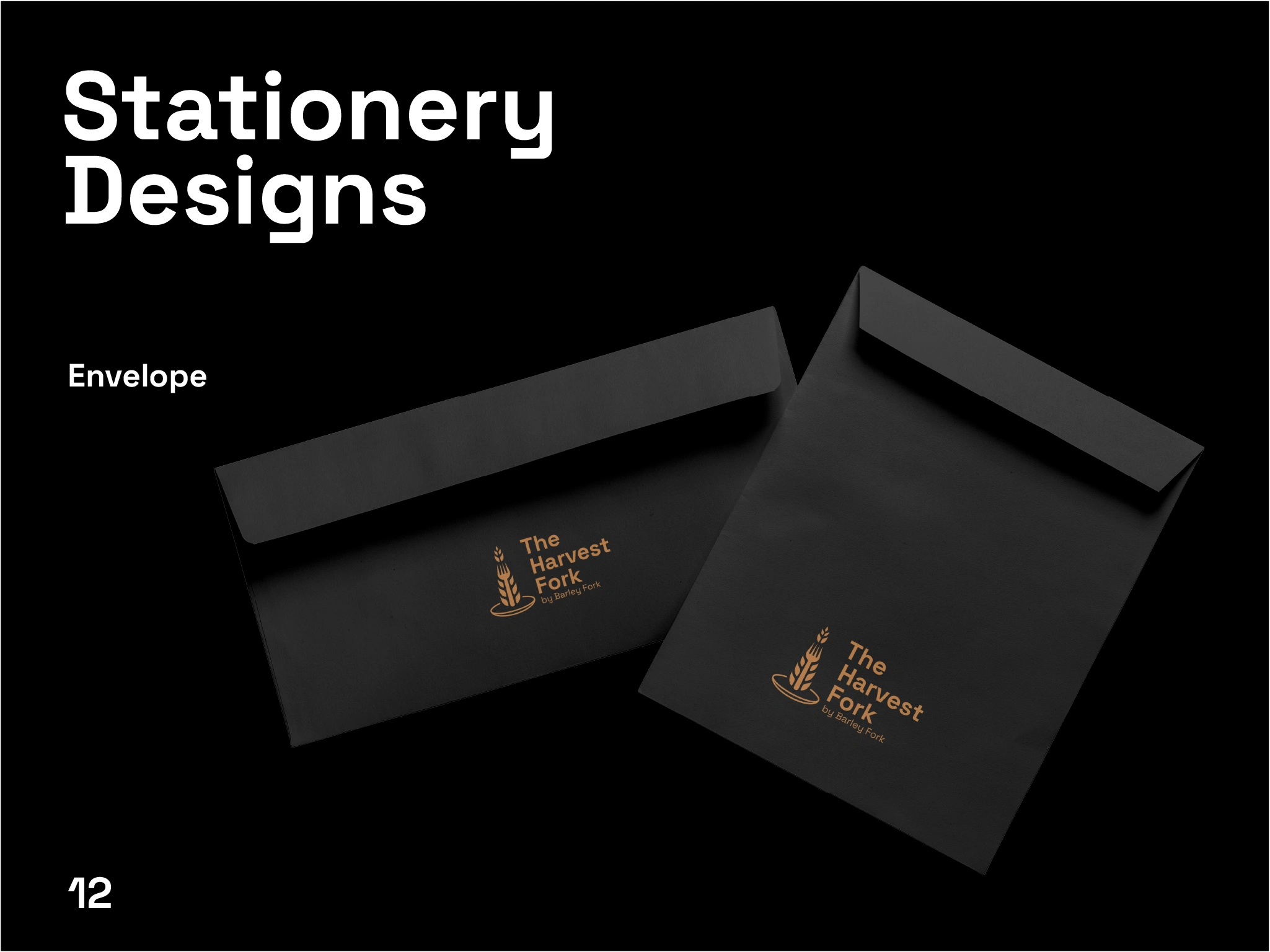
The logo merges a fork with wheat elements, placed on a subtle plate shape. This creates a balanced composition that is both symbolic and visually clean. The typography complements the icon with a modern and bold style, ensuring readability and brand presence.
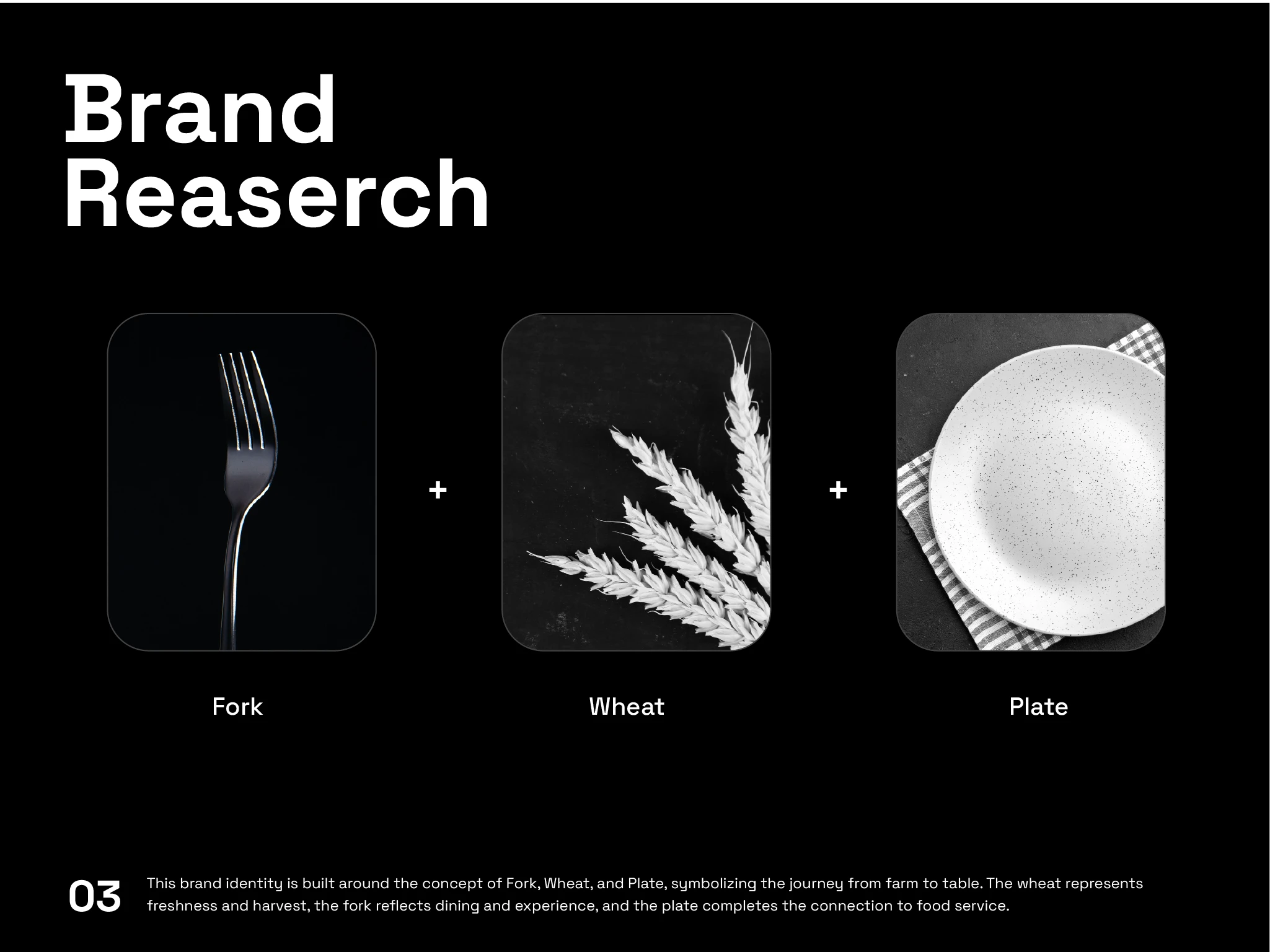
The design is based on three core elements:
Fork → symbolizes dining and experience
Wheat → represents harvest and freshness
Plate → completes the food journey
These elements were combined into a single, minimal form to communicate the brand story clearly and effectively.
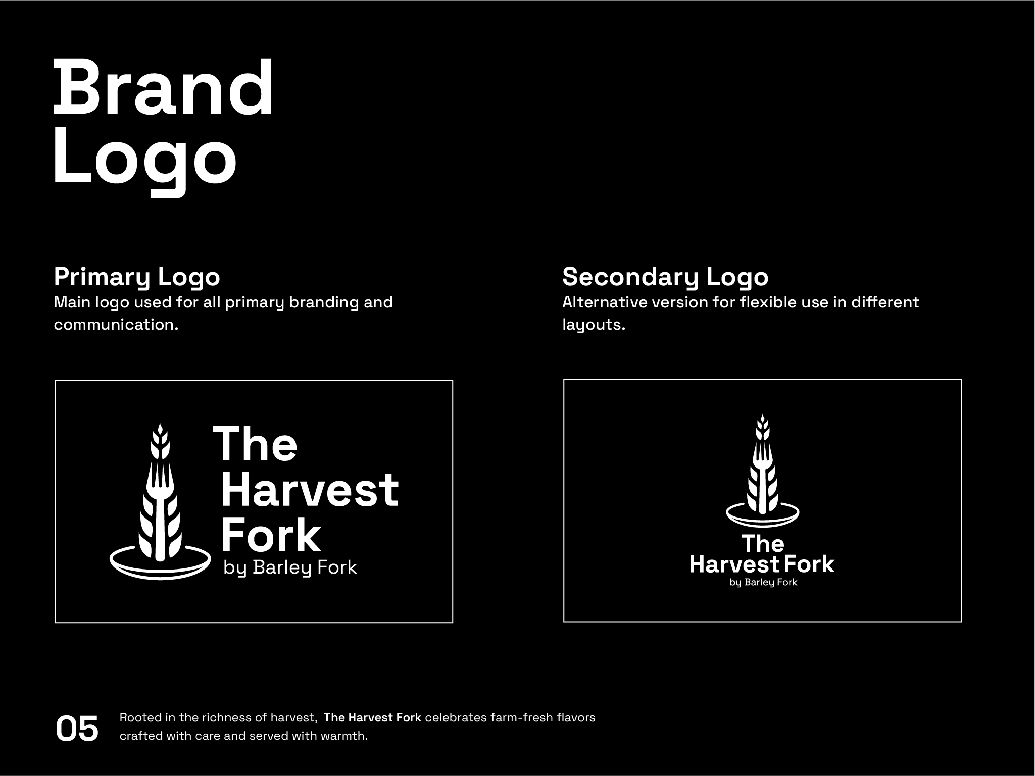
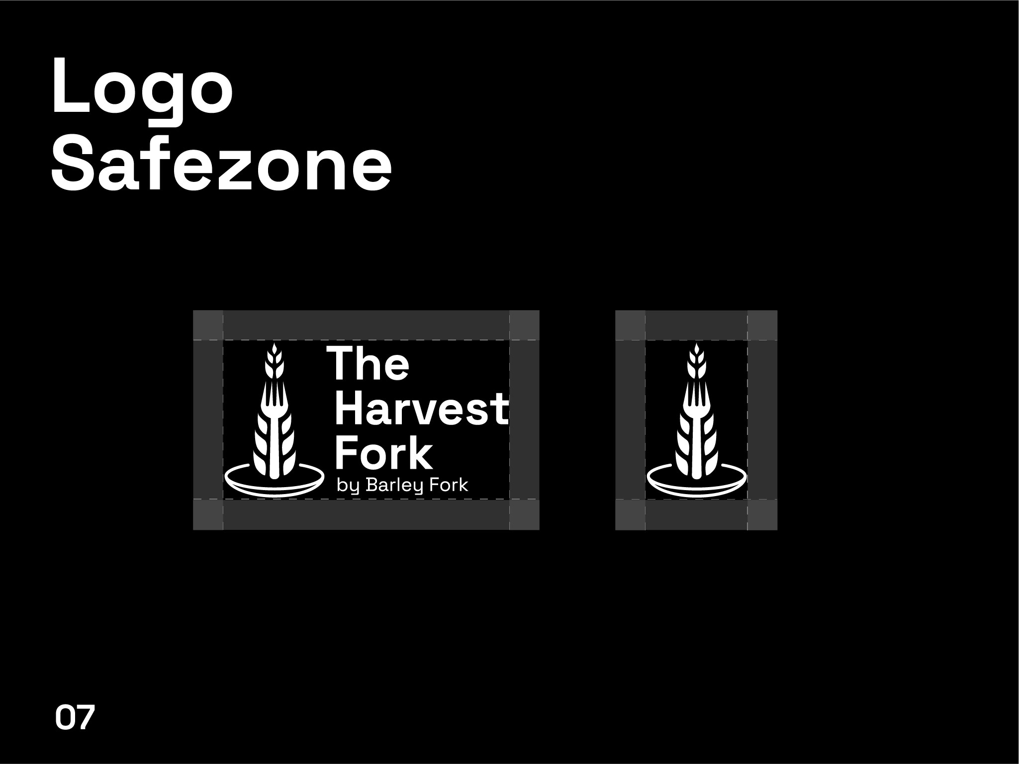
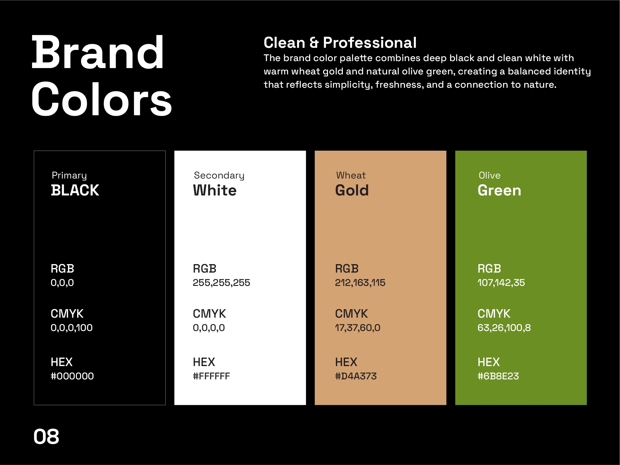
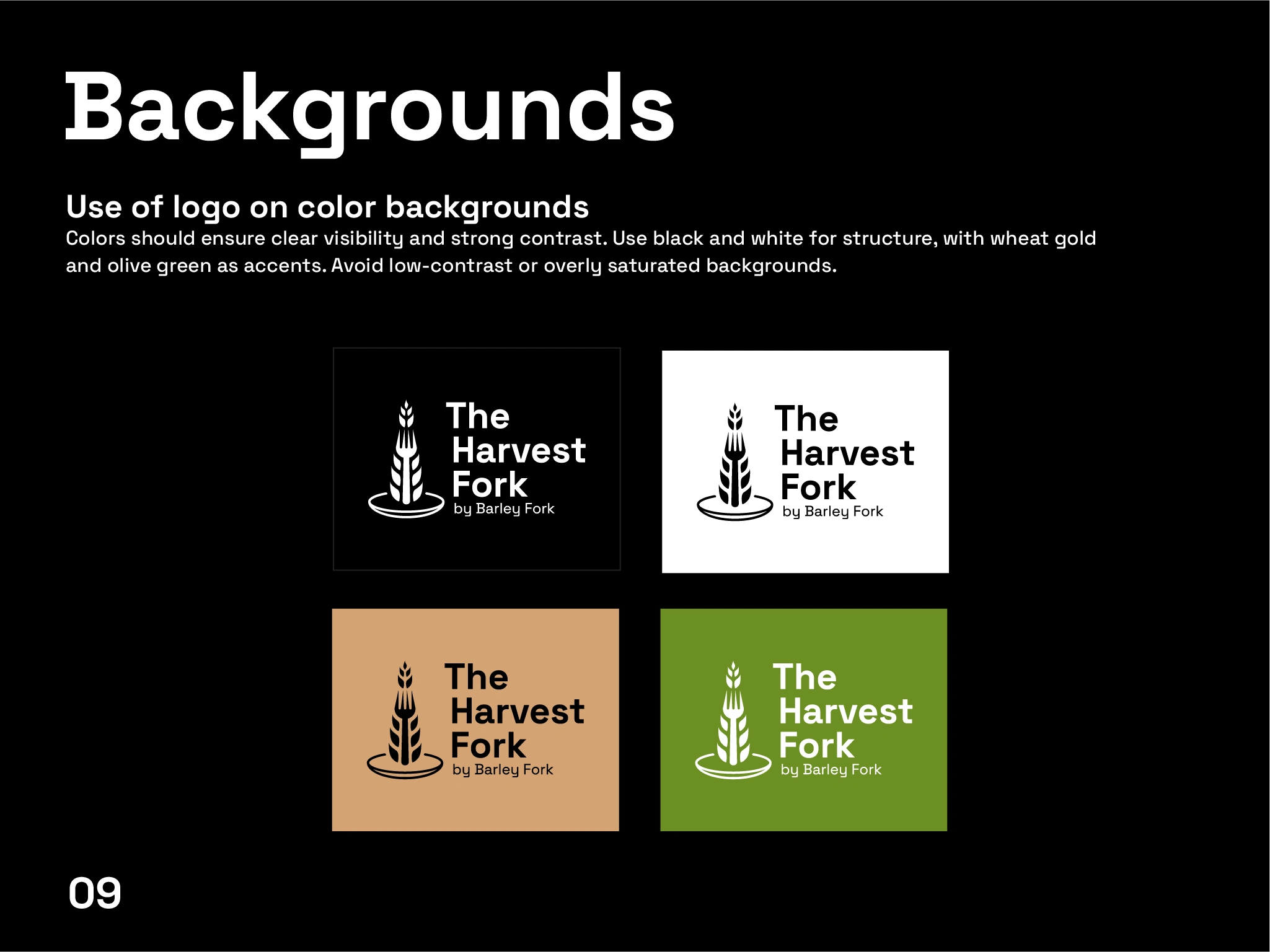
Brand Guidelines
A complete set of brand guidelines was developed to ensure consistency across all platforms. This includes:
Logo usage and variations
Color application rules
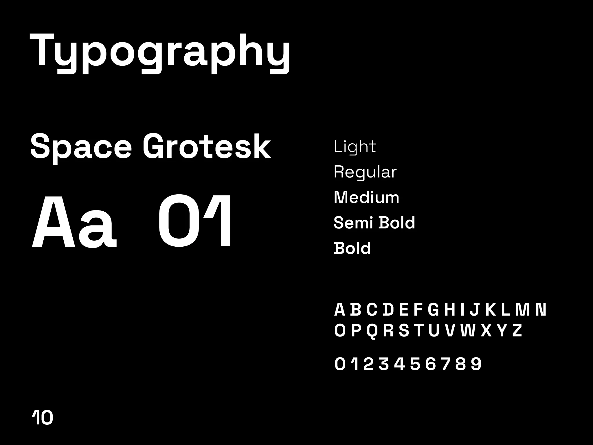
Typography hierarchy
Visual and layout principles
The final identity for The Harvest Fork successfully communicates a modern farm-to-table brand. It balances simplicity with meaning, creating a strong and memorable visual presence.

“Love what you see? Let’s bring your vision to life.” Feel free to reach out me!
Get in Touch ➔
Like this project
Posted Mar 19, 2026
The Harvest Fork is a modern food brand inspired by farm-to-table living, combining fresh ingredients with simple, honest cooking.
Likes
0
Views
3
Timeline
Jan 15, 2026 - Jan 30, 2026