Athletix - sportswear | Brand Identity Design
⭐ About The Brand
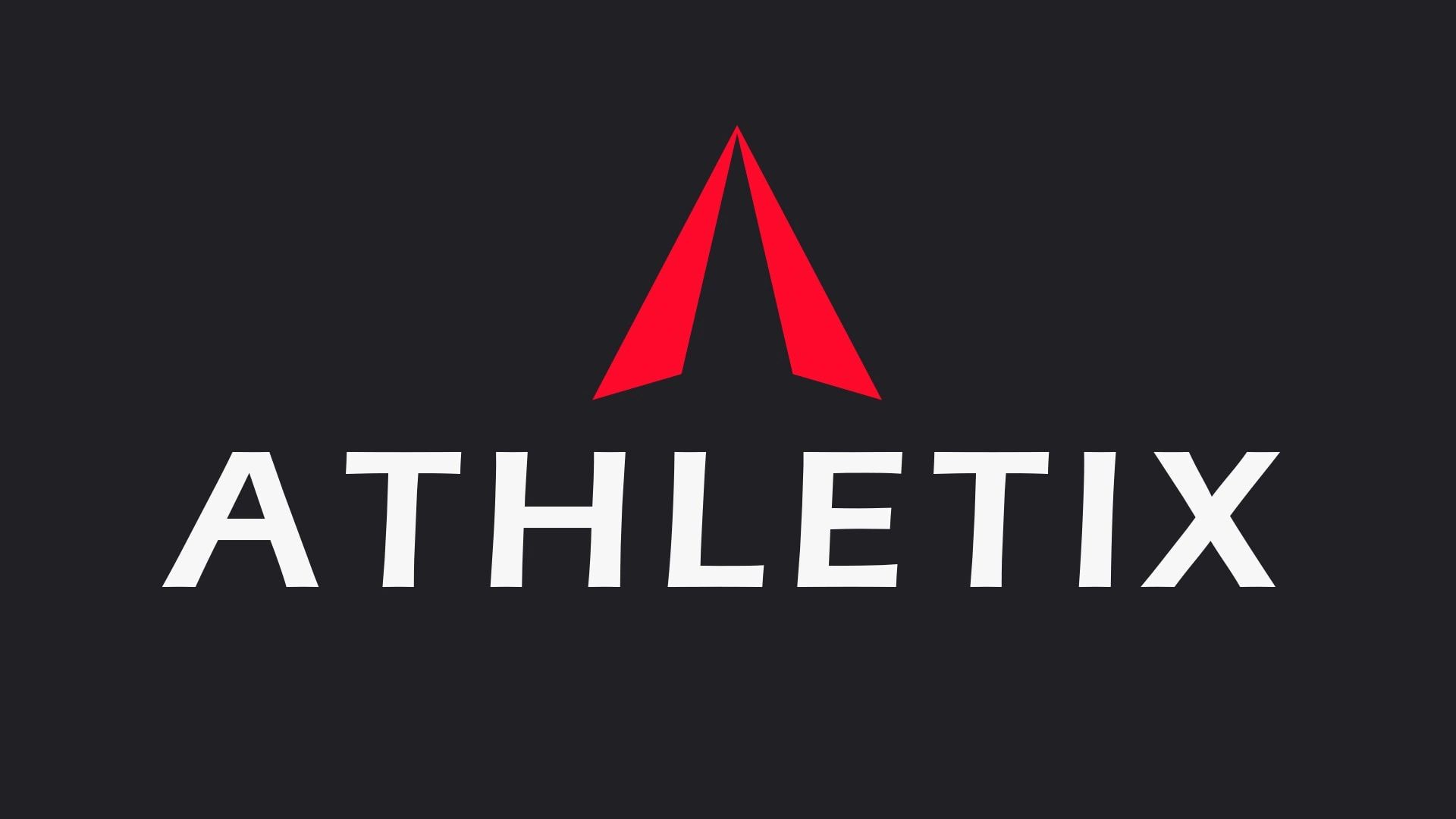
Athletix is a sportwear brand made for professionals to allow them to focus only on performance. The brand convays action and effort.
📋 The Brief
Athletix is a sportswear brand designed for modern athletes and passionate sports enthusiasts. Our brand embodies the spirit of performance, determination and victory. We believe the right equipment can turn a simple workout into an inspiring and rewarding experience.

Logo concept
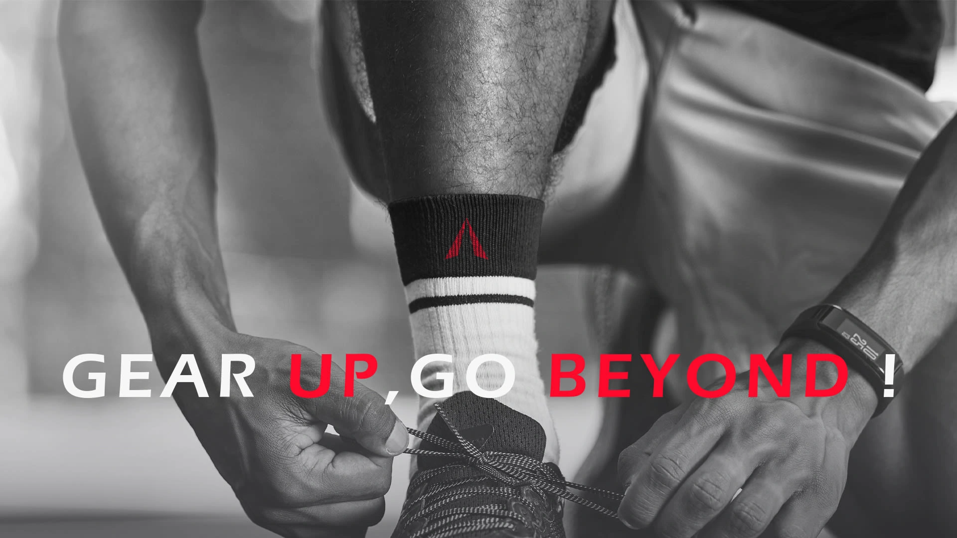
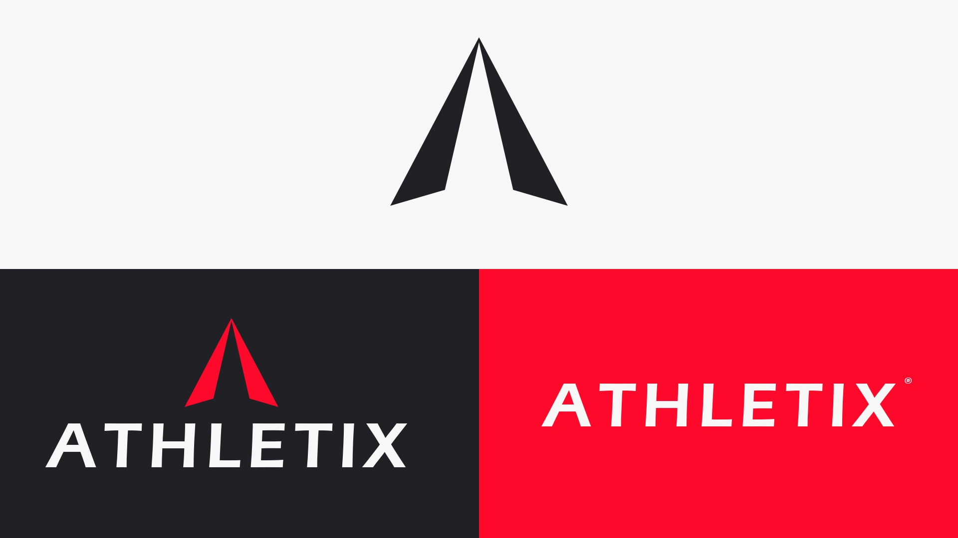
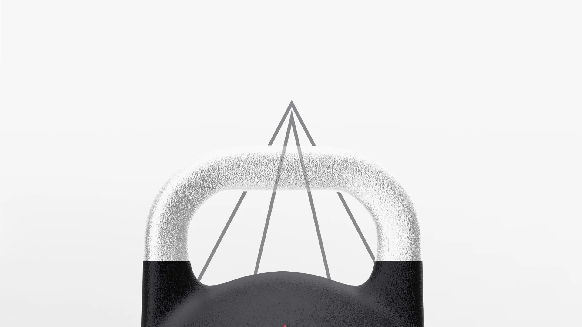
The logo is a pictogramme of the first letter "A" that is shaped to point to the top signifying ascencion and sharpeness. Just like peak performing athletes
Logo lockups
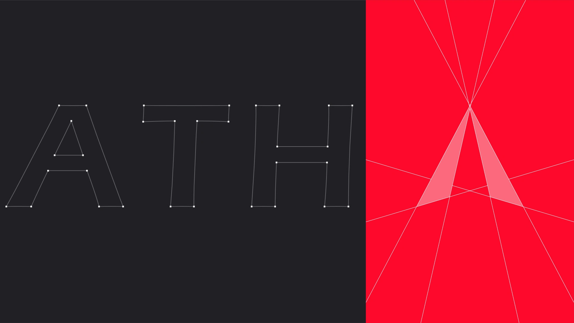
It included all variations of the logo.
Brand assets
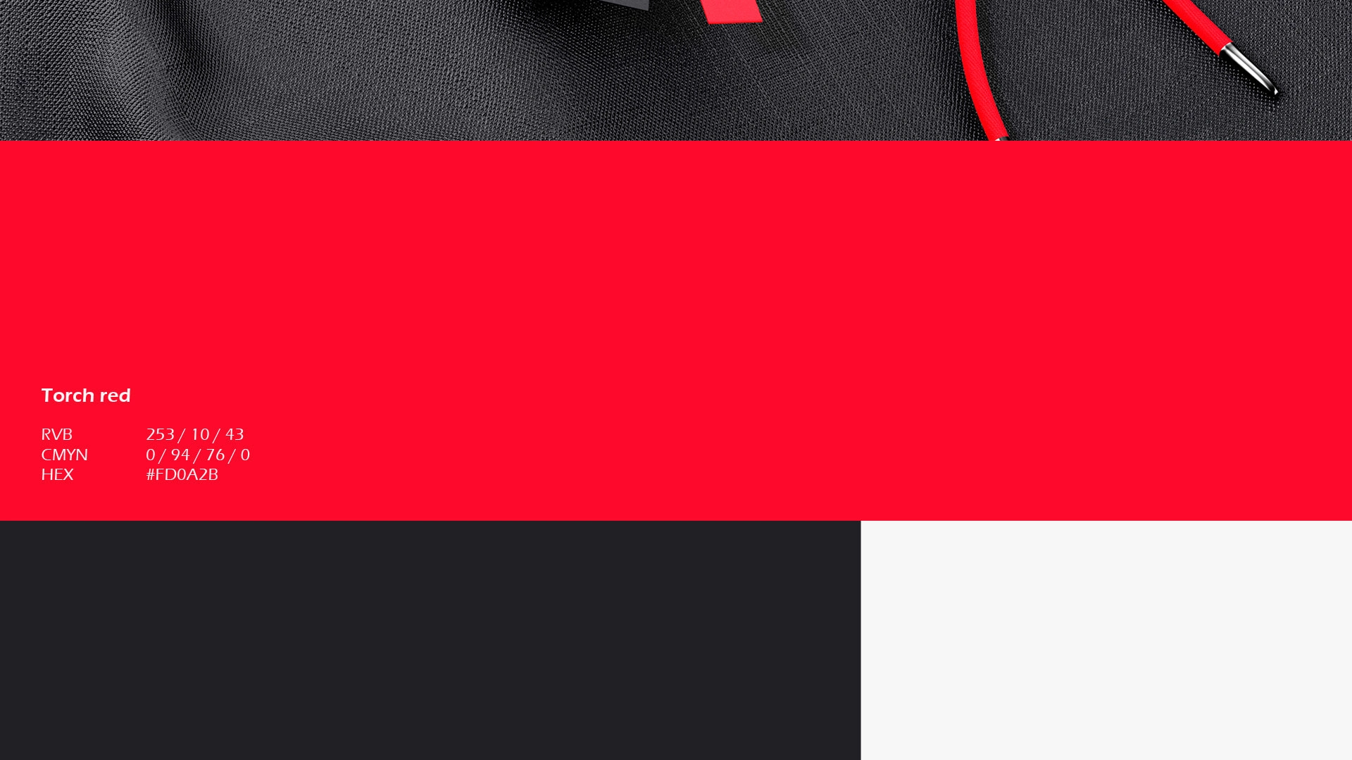
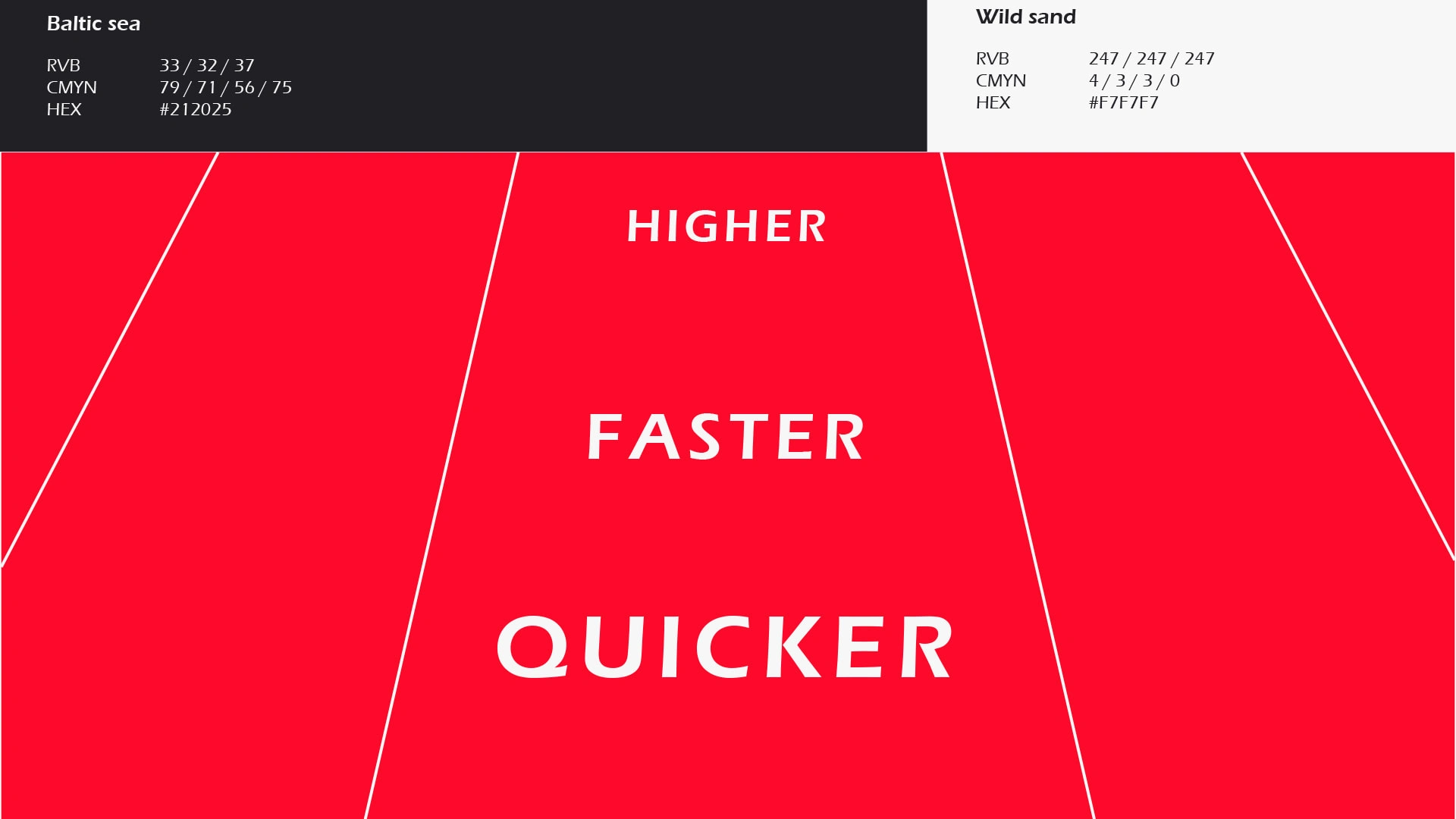
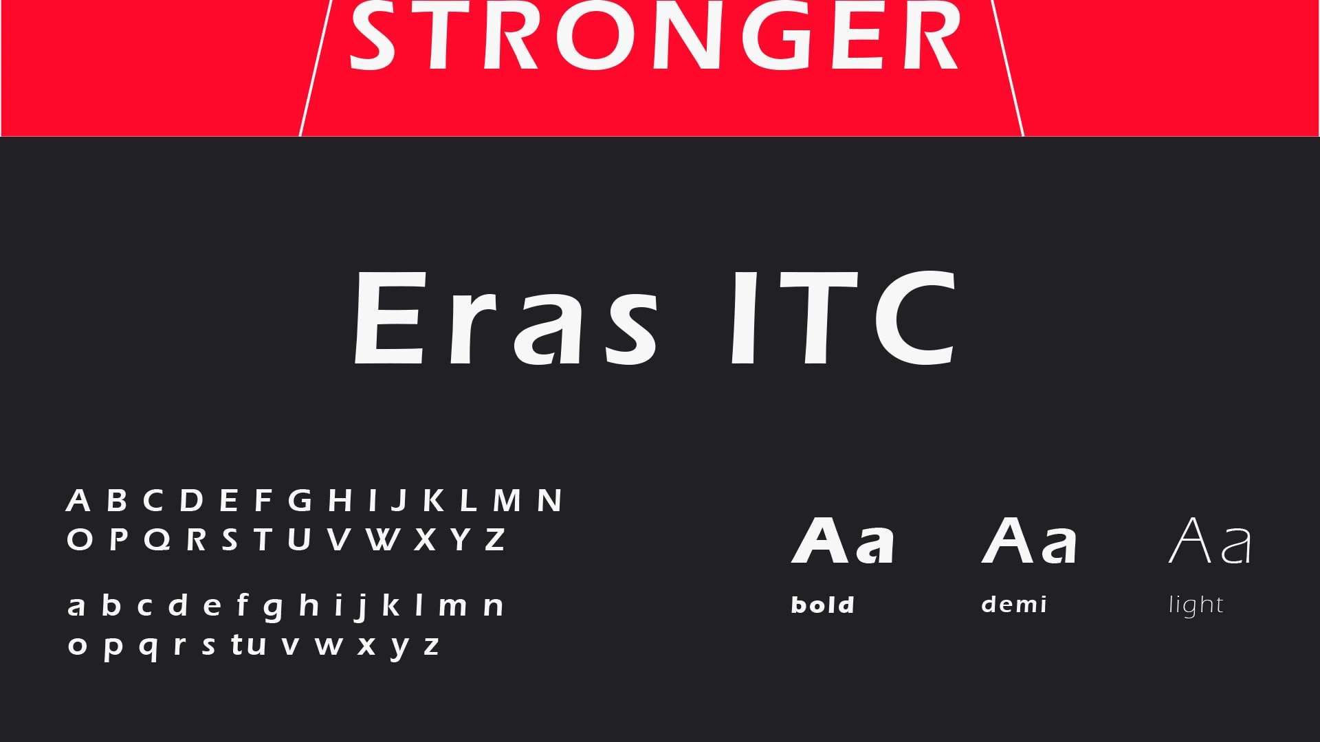
About the color palette and the typography, i aimed at creating a high contrast between an accent color, the torch red, for action/energy and complementary ones, black and white. And for the typography we selected ERAS ITC, for the boldness and we put it in italic to give it some dynamism.
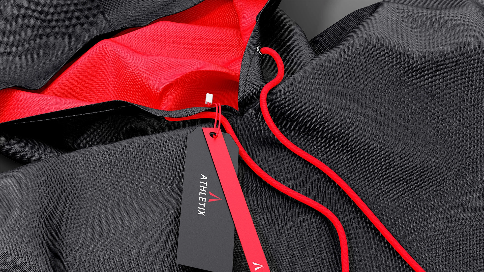
Brand application
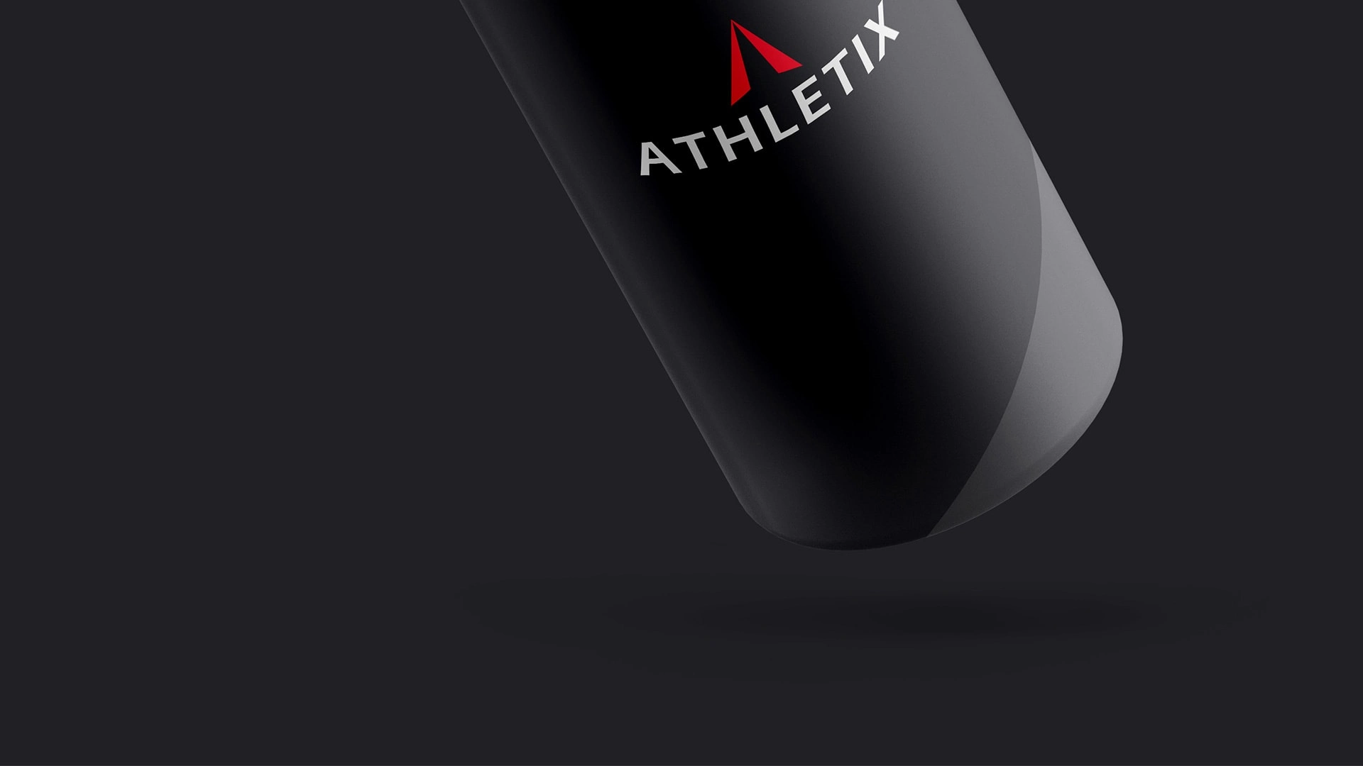
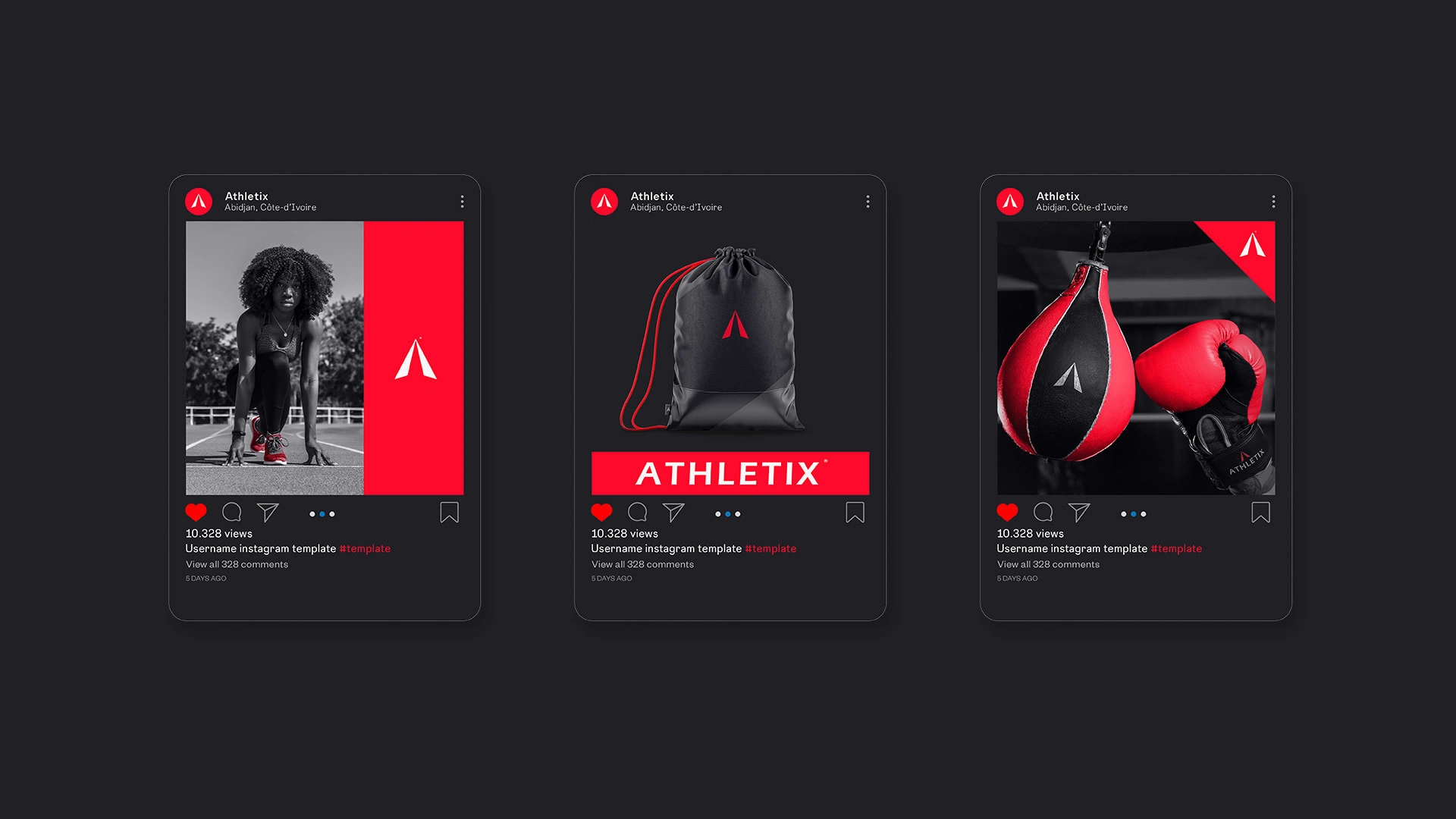
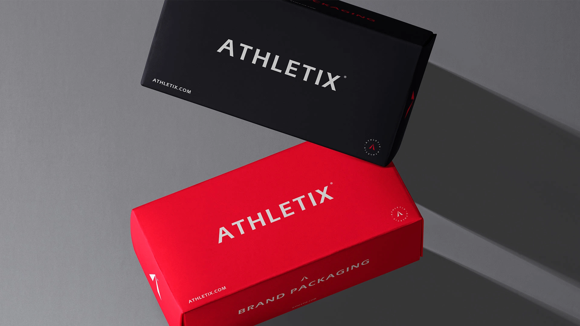
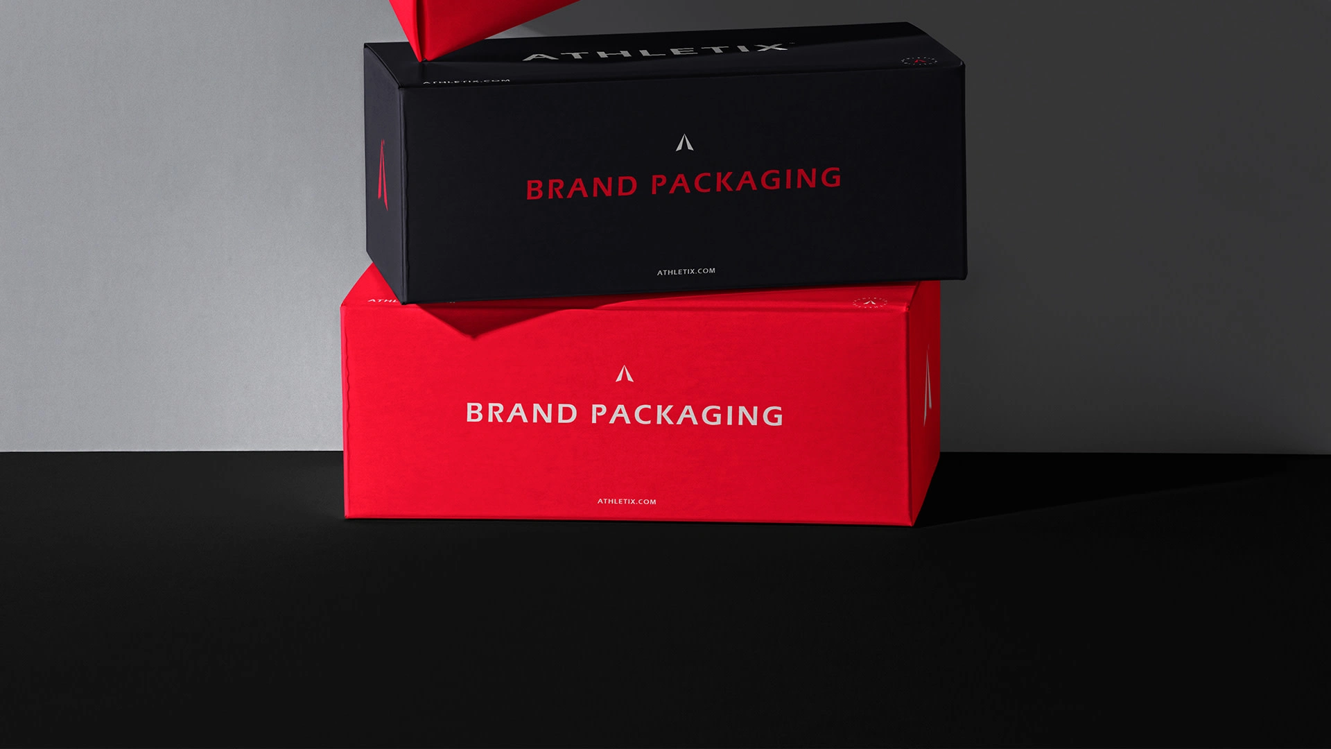
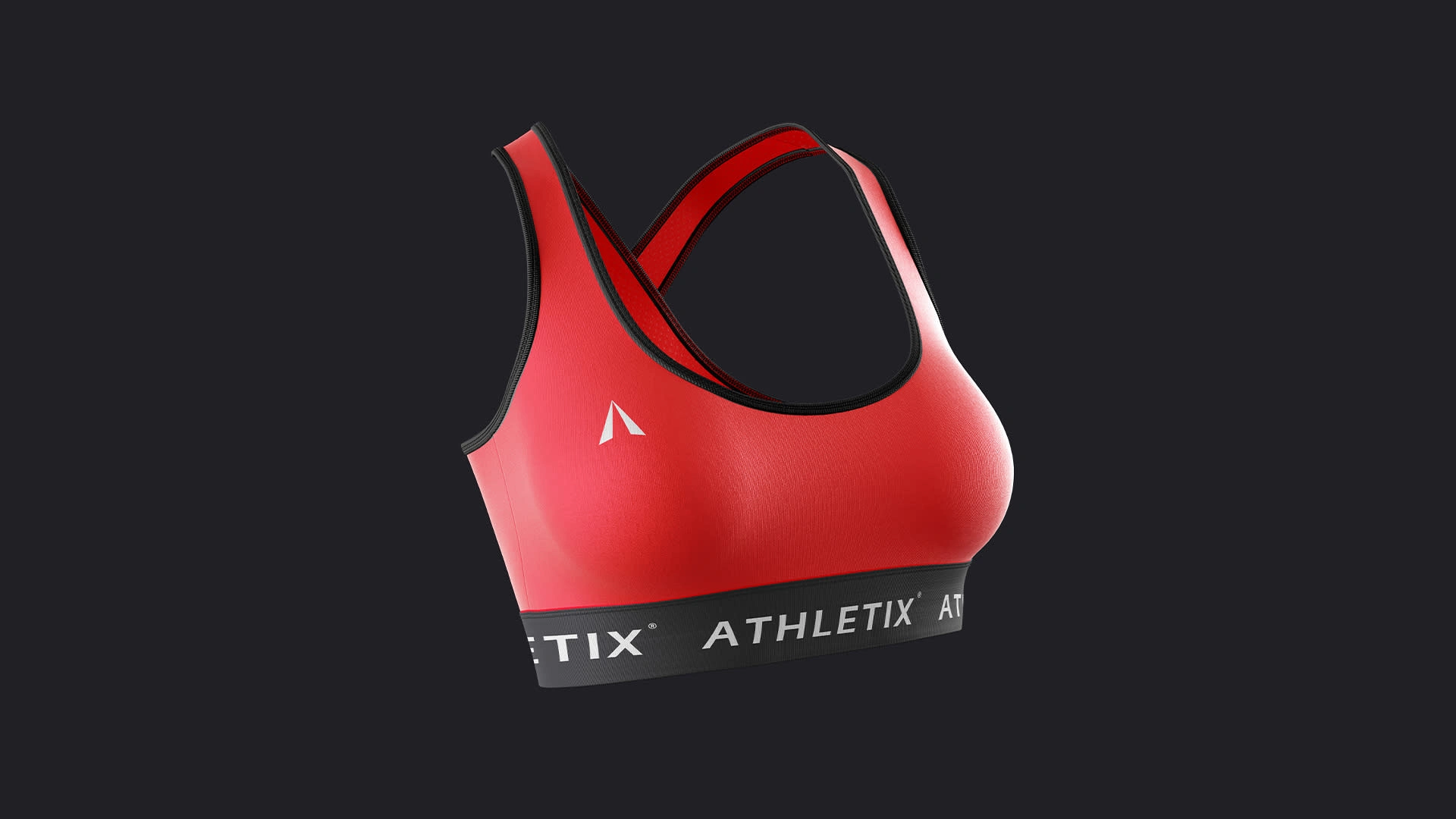
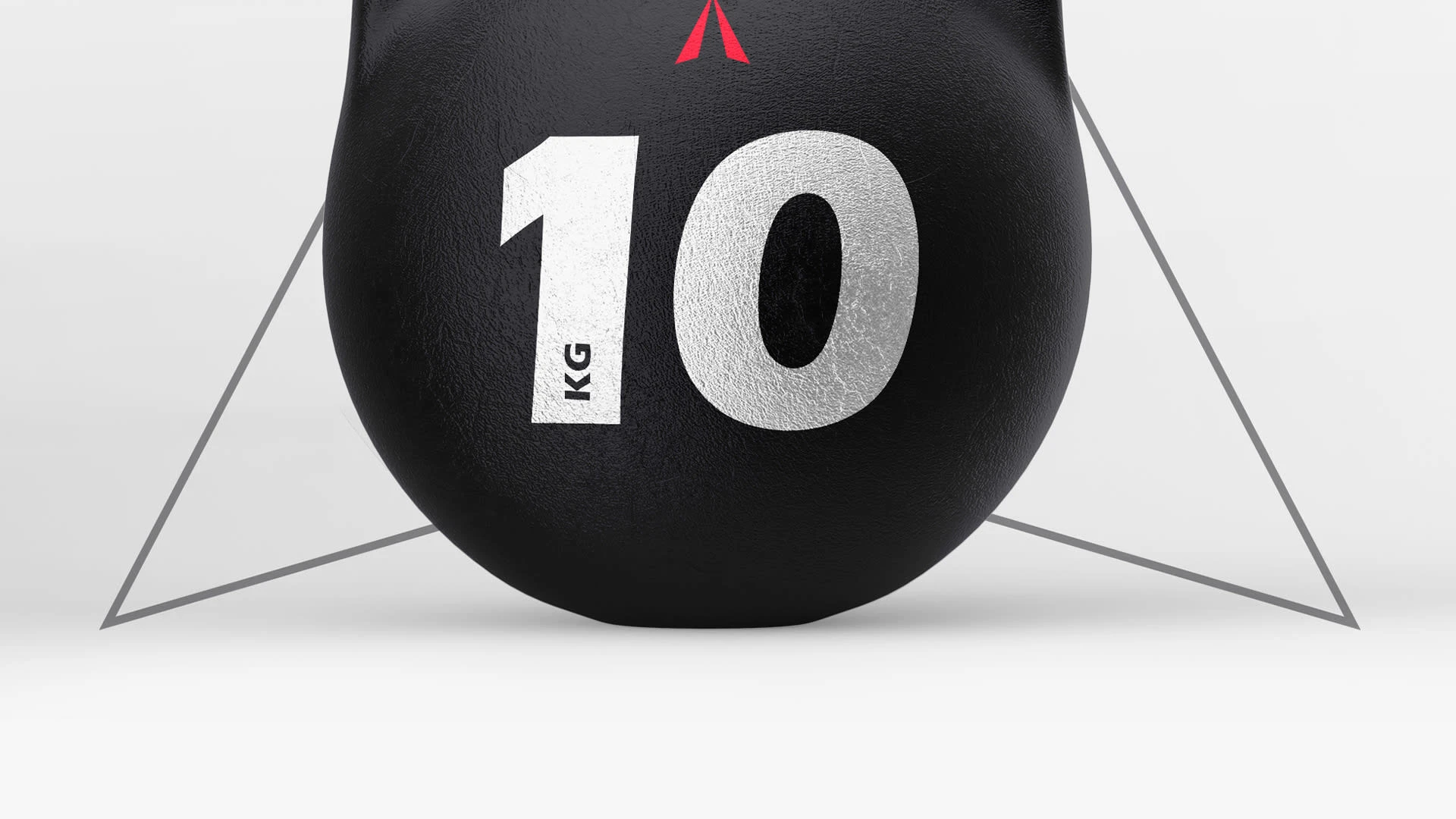
Let's get an overview of the brand in action.


Thank you !
Like this project
Posted May 9, 2024
Full brand inentity design for Athletix a brand designed for modern athletes and passionate sports enthusiasts.

