NEVRAE - Knowledge-Led Pest Control Brand Identity

Caden


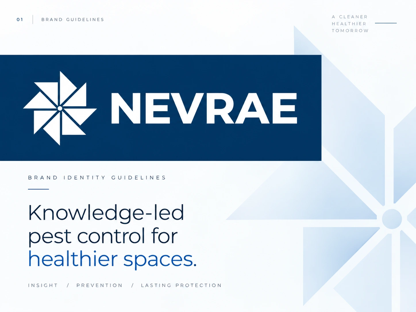
NEVRAE brand book
NEVRAE — Knowledge-Led Pest Control Brand Identity
Project Overview
NEVRAE is a modern pest control brand built around a simple idea: better pest control starts with better knowledge.
The goal was to move away from the aggressive, overly tactical visual language commonly associated with pest control companies and create an identity that felt intelligent, trustworthy, professional, and contemporary.
I developed a cohesive visual identity system designed to position NEVRAE as a credible, knowledge-led service brand while remaining flexible enough to work across digital platforms, service vehicles, stationery, packaging, signage, and future customer touchpoints.
The Challenge
The pest control industry is often filled with brands that rely on insects, warning symbols, harsh colors, and highly functional visual communication.
NEVRAE needed to feel different.
The brand had to communicate:
Expertise without feeling overly technical
Trust without looking generic
Professionalism without becoming corporate or cold
Prevention rather than fear
A modern service experience that could appeal to both residential and commercial customers The challenge was to build a visual identity that immediately felt credible while giving the company a distinctive presence within a highly competitive category.
The Brand Strategy
The creative direction was built around three core ideas:
Knowledge. Prevention. Healthier Spaces.
Instead of presenting NEVRAE simply as a company that removes pests, the identity positions the brand as a knowledgeable partner helping customers understand, prevent, and manage pest problems more intelligently.
This gave the brand a stronger foundation for communicating expertise and created a visual system that could grow beyond individual services.
Brand attributes
Intelligent • Trustworthy • Precise • Modern • Professional
Typography
Color Palette
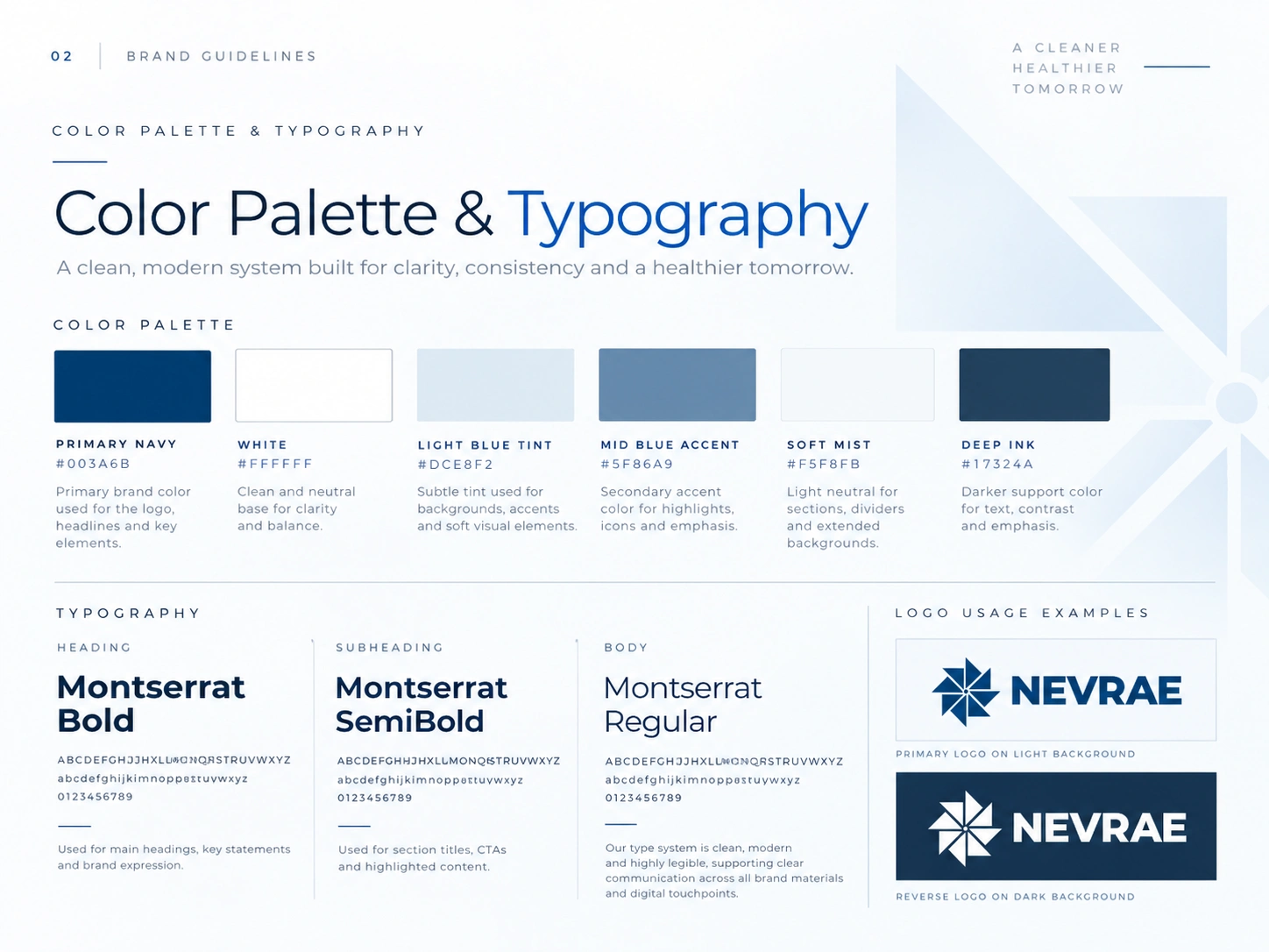
A refined blue-and-white palette was developed to reinforce trust, expertise, cleanliness, and professionalism.
Primary Navy
#003A6B
The primary brand color establishes authority and credibility while giving the identity a distinctive corporate foundation.
White
#FFFFFF
Creates clarity, space, and a cleaner visual experience.
Light Blue Tint
#DCE8F2
Used for subtle backgrounds, patterns, visual hierarchy, and geometric brand elements.
Supporting Tones
Additional cool blue and neutral tones extend the visual system while keeping the overall identity consistent and restrained.
The palette was deliberately kept simple so the brand could remain highly recognizable across both physical and digital applications.
Typography
The typography system uses a clean, modern sans-serif approach to support clarity and professionalism.
A strong typographic hierarchy allows the identity to work across everything from large marketing headlines to informational service content.
Heading style
Bold, confident, and highly legible.
Supporting typography
Clean and structured for subheadings, navigation, calls to action, and service information.
Body typography
Designed for readability across websites, printed materials, proposals, and educational content.
The result is a type system that feels modern while supporting the knowledge-focused nature of the business.
Brand Applications
Brand Applications
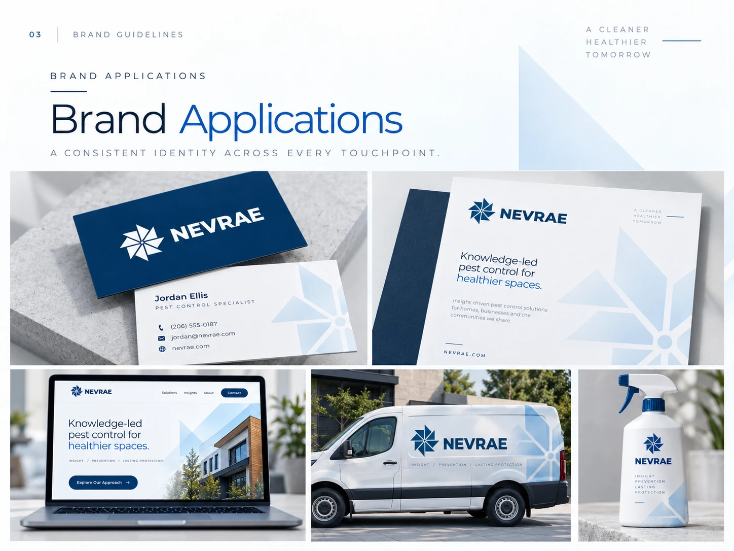
The identity was designed as a complete system rather than a standalone logo.
I explored how NEVRAE could appear across realistic customer touchpoints, including:
Business Cards
A clean and professional first impression with strong brand recognition.
Letterhead & Stationery
A structured system suitable for proposals, client communication, reports, and educational materials.
Website Experience
A digital direction focused on clarity, expertise, and simple navigation around the brand's knowledge-led approach.
Service Vehicle Branding
A highly visible application designed to turn vehicles into recognizable mobile brand assets.
Product / Service Packaging
A clean extension of the identity into pest-control products and customer-facing materials.
Environmental Signage
A strong physical brand presence that maintains the same visual language at larger scales.
Digital Direction
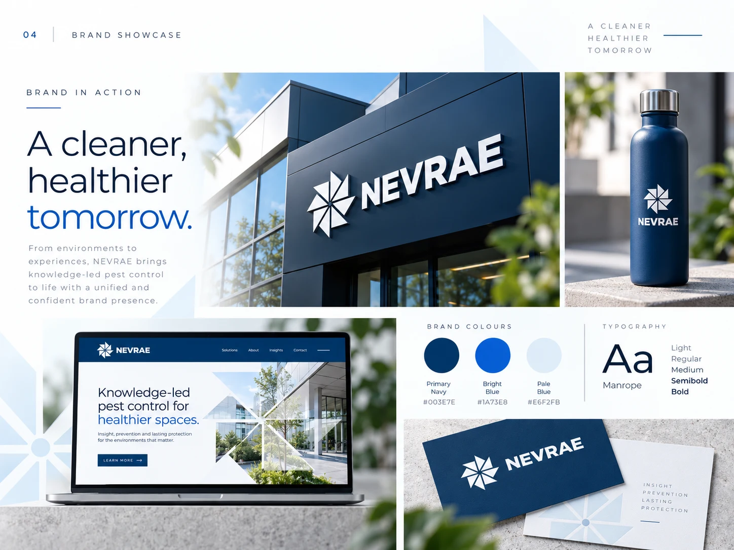
The website concept translates the visual identity into a clear digital experience.
Messaging such as:
“Knowledge-led pest control for healthier spaces.”
helps communicate the brand's positioning immediately.
The interface combines generous whitespace, strong typography, architectural imagery, geometric brand elements, and focused calls to action.
The result is a digital presence that feels closer to a modern professional service brand than a traditional pest control website.
Building a Scalable Brand System
One of the main objectives was to ensure NEVRAE could remain consistent as the business grows.
The identity was therefore designed to work across:
Digital → Print → Vehicles → Packaging → Signage → Marketing
Rather than creating individual assets with different visual styles, every application follows the same fundamental principles of color, typography, geometry, spacing, and tone.
This gives the company a recognizable foundation for future marketing and brand expansion.
Project Outcome
NEVRAE emerged with a distinctive and scalable visual identity that helps position the company as a modern, knowledge-led alternative within the pest control industry.
The final system gives the brand:
Stronger visual recognition
Clearer positioning
Greater consistency across customer touchpoints
A more professional and premium market presence
Like this project
Posted Oct 6, 2026
NEVRAE now has a distinctive, scalable identity that builds trust, sharpens positioning, and creates a consistent premium presence across every touchpoint.