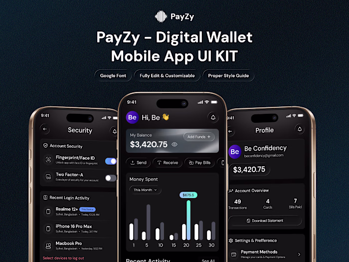
Real Estate Mobile App UI/UX | Modern, Clean & High-Conversi...
Be Confidency
Real Estate Mobile App UI/UX | Modern, Clean & High-Conversion
Lately, UI/UX is moving towards cleaner layouts, softer shadows, meaningful spacing, and micro-interactions that actually guide the user, and honestly, I’m loving this direction.
So here’s something fresh I designed recently:
A Real Estate Mobile App | Report Flow that keeps everything simple, fast, and human-friendly. From selecting the issue → adding details, → submitting the report, the whole experience stays smooth and confident.
(If you check the screens, you’ll notice neat spacing, rounded cards, calm typography, soft color feedback, and that modern “Apple-feel” we all love.)
Like this project
Posted Nov 23, 2025
Real Estate Mobile App UI/UX | Modern, Clean & High-Conversion Lately, UI/UX is moving towards cleaner layouts, softer shadows, meaningful spacing, and micro...
Likes
0
Views
2