Vitalis Clinical - Mobile app UX/UI
Donata Santos
A mobile clinical documentation app for primary care physicians and nurses.
PT: Um app mobile de documentação clínica para médicos e enfermeiros de consultórios de atenção primária.
Overview
I designed Vitalis Clinical around a real problem: most electronic health record systems are bloated, desktop-only, and full of unnecessary steps. Doctors and nurses lose precious time navigating confusing interfaces instead of focusing on the patient. The goal was to create a mobile experience that makes clinical documentation fast, clear, and less stressful.
PT: Projetei o Vitalis Clinical pensando em um problema real: a maioria dos sistemas de prontuário eletrônico é pesada, feita pra desktop e cheia de etapas desnecessárias. Médicos e enfermeiros perdem tempo precioso navegando por interfaces confusas em vez de focar no paciente. O objetivo foi criar uma experiência mobile que tornasse a documentação clínica rápida, clara e menos estressante.
The Problem
Primary care clinics have their own rhythm, short appointments, many patients, little time. Existing systems weren't built for that. They're slow, require too many clicks, and rarely work well on mobile. I identified three critical pain points: difficulty finding records quickly, repetitive data entry, and a lack of real mobile support.
PT: Consultórios de atenção primária têm um ritmo próprio, consultas curtas, muitos pacientes, pouco tempo. Os sistemas existentes não foram feitos pra isso. São lentos, exigem muitos cliques e raramente funcionam bem no celular. Identifiquei três pontos críticos: dificuldade em localizar registros rapidamente, entrada repetitiva de dados e falta de suporte mobile real.
Research
I conducted interviews with healthcare professionals to understand their real workflow. What became clear is that speed of access mattered far more than having everything on one screen. They needed quick navigation between patient history, exam results, and prescriptions, and a visual status system for triage that didn't require reading.
PT: Conduzi entrevistas com profissionais de saúde para entender o fluxo real de trabalho deles. O que ficou claro é que velocidade de acesso era muito mais importante do que ter tudo disponível numa tela só. Precisavam de navegação rápida entre histórico do paciente, resultados de exames e prescrições, e um sistema de status visual pra triagem que não exigisse leitura.
Design Decisions
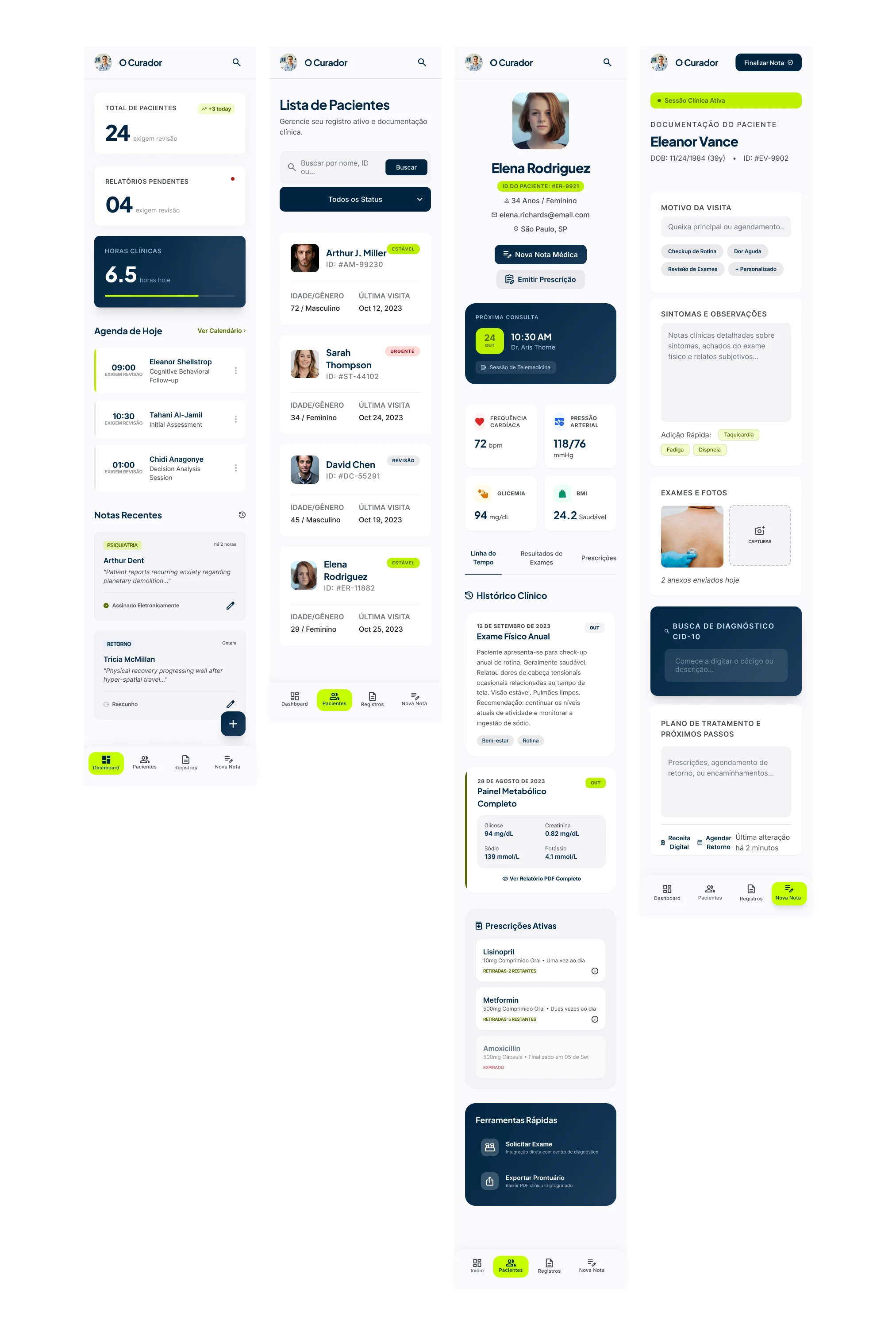
The app has four core screens. The dashboard delivers a daily summary right away: schedule, pending reports, and recent notes. The patient list uses status tags, Stable, Revision, Urgent, for instant triage without opening any record. The patient record is organized in tabs to separate timeline, exams, and prescriptions without overwhelming the screen. And the new note screen has quick-add symptom tags, integrated ICD-10 search, and photo capture directly from the session.
PT: O app tem quatro telas principais. O dashboard entrega um resumo do dia logo de cara: agenda, relatórios pendentes e notas recentes. A lista de pacientes usa tags de status, Estável, Revisão, Urgente, pra triagem instantânea sem precisar abrir nenhum registro. O prontuário é organizado em abas pra separar linha do tempo, exames e prescrições sem sobrecarregar a tela. E a tela de nova nota tem tags de sintomas pra adição rápida, busca de CID-10 integrada e captura de foto direto da sessão.
Visual System
I chose a palette of deep navy, acid lime, and warm white. The navy communicates authority without feeling cold. The lime appears only at action points, never as decoration. The status system uses green, amber, and red semantically, meaning the user processes the information before even reading it. Typography combines DM Sans for interface legibility and DM Serif Display in headings for editorial weight.
PT: Escolhi uma paleta de azul marinho escuro, verde limão e branco quente. O marinho transmite autoridade sem ser frio. O limão entra só nos pontos de ação, nunca como decoração. O sistema de status usa verde, âmbar e vermelho de forma semântica, ou seja, o usuário processa a informação antes mesmo de ler. A tipografia combina DM Sans pra legibilidade na interface e DM Serif Display nos títulos pra dar peso editorial.
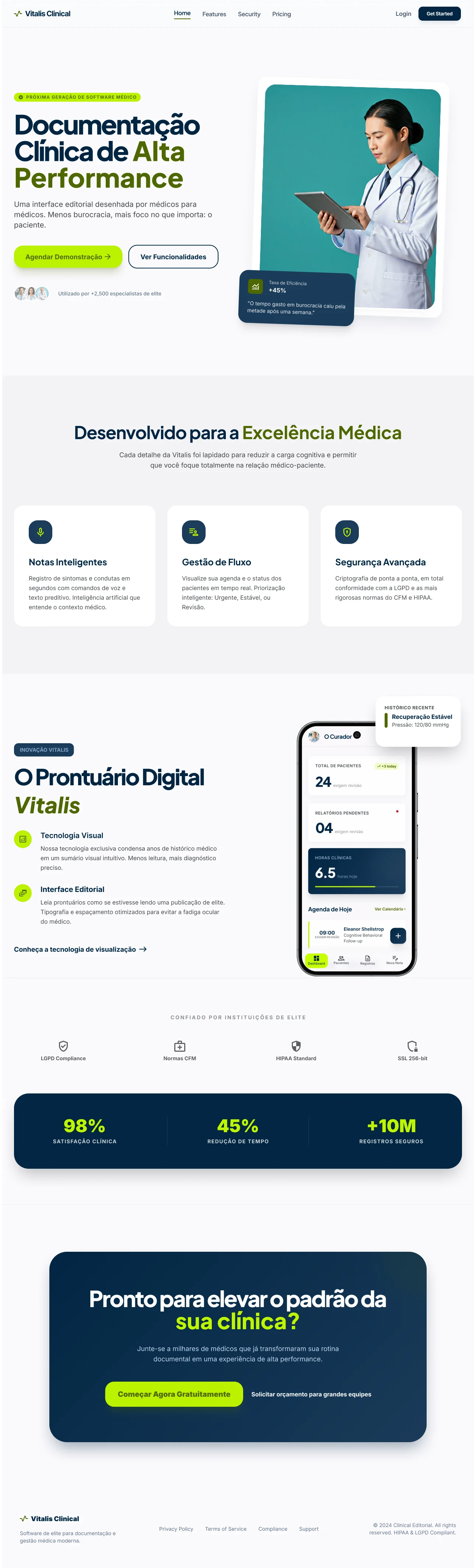
Landing Page
Alongside the app, I also designed the Vitalis Clinical landing page, aimed at clinic administrators and decision-makers. The visual language is the same as the app: same palette, same typography, same hierarchy. The idea was that anyone who saw both would immediately understand they're part of the same product.
PT: Além do app, também projetei a landing page do Vitalis Clinical,voltada para administradores de clínicas e tomadores de decisão. A linguagem visual é a mesma do app: mesma paleta, mesma tipografia, mesma hierarquia. A ideia era que qualquer pessoa que visse os dois entendesse que fazem parte do mesmo produto.
Learnings
This project taught me that in high-pressure contexts, hierarchy matters more than completeness. Clinicians don't read,they scan. Every element needs to justify its presence on screen. I also learned that terminology is part of design: the choice of a single word affects how the user mentally models the entire system. And that any friction in a medical interface has a real human cost, that changes how you make design decisions.
PT: Esse projeto me ensinou que em contextos de alta pressão, hierarquia importa mais do que completude. Médico não lê, escaneia. Cada elemento precisa justificar sua presença na tela. Aprendi também que terminologia é parte do design: a escolha de uma palavra afeta como o usuário modela o sistema inteiro na cabeça. E que qualquer atrito numa interface médica tem um custo humano real, isso muda a forma como você toma decisões de design.
Like this project
Posted May 15, 2026