GitHub Pull Request Usability Study
Lakshmi Narayana

GitHub Pull Request Usability Study
Helping developers collaborate better
Overview
In collaboration with GitHub, my team and I conducted a usability study to evaluate the effectiveness and intuitiveness of their recently updated Pull Request interface, with a focus on the newly introduced UI enhancements. The study aimed to assess experienced GitHub users' learning curve, their ability to efficiently navigate the platform and complete code review tasks, and to gather valuable feedback for improving the overall developer experience.

ROLE
Primary Point of Contact
Usability Analyst
User Researcher
A/B Testing (remote)
System Usability Scores (SUS)
10 Weeks (Jan.2024 - Mar.2024)
TOOLS
Figma
Zoom
Microsoft Excel
Problem
To ensure a smooth transition for existing users, GitHub recognized the importance of testing the usability and learning curve of their upcoming updated Pull Request feature. But firstly…
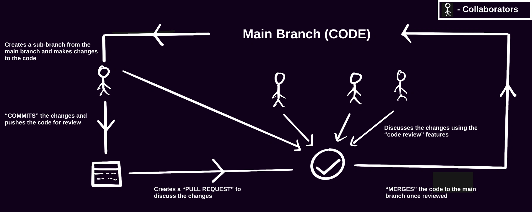
What is a “Pull Request”?
This study primarily focused on evaluating the ease of use and adaptability of the new feature for current GitHub users, aiming to identify potential challenges and gather insights to refine the user experience before the official release.
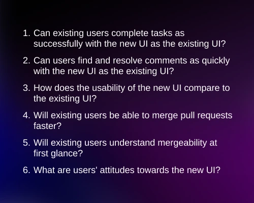
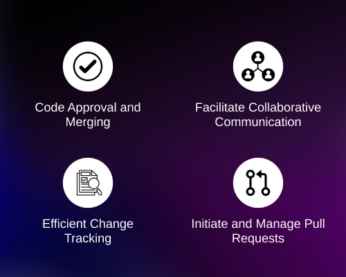
To thoroughly evaluate the usability of the updated Pull Request feature, the study aimed to address the following:

Methods and Procedures
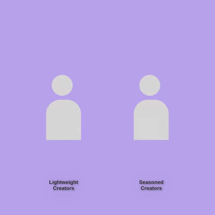
To gain unbiased insights we split our participant pool into two categories during the study:
I was the primary point of contact with the GitHub Client and was responsible for ensuring timely progress reporting at designated intervals. I also played a major role in moderating the interviews and data analysis.
Challenges in Study Design and Iteration
1.
2.

GROUP 1
Time on Tasks

Think aloud
Creating a “realistic” GitHub Repository
Qualitative Data
Overview - Quantitative
HOW?
Remote A/B Testing (within-subject design)
Predefined tasks
Post-test questionnaire (SUS)
Data Analysis
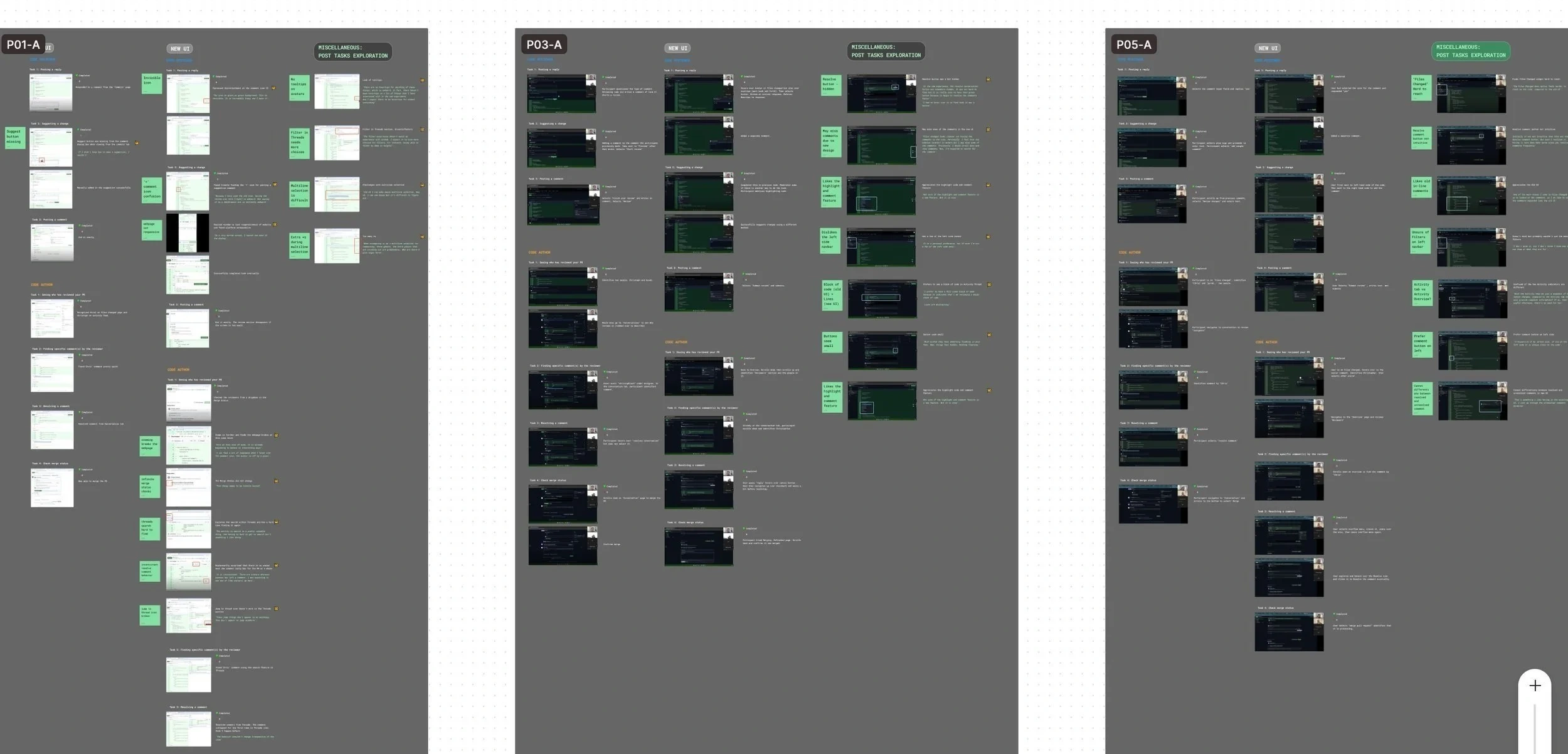
We performed insight analysis based on the user feedback and observations during the test. We then coded the data and came up with high-, medium-, and low-priority findings.
High Priority Insights
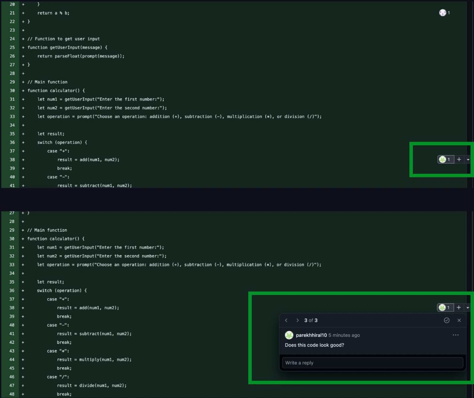
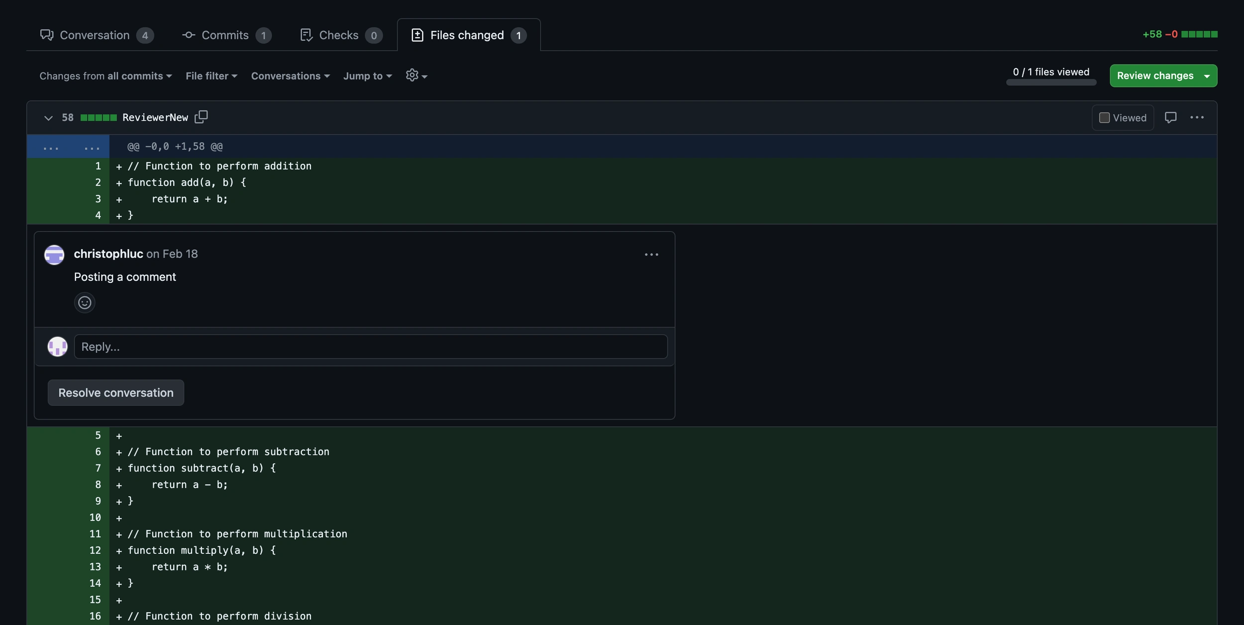
Finding and posting a comment
3/6
Participants faced difficulties in locating the comment widget in the new UI:
On larger screens, the visibility of comments becomes compromised, affecting usability
Avatar colors were camouflaging with the background green, contributing to the difficulty in locating the option to post a comment
Recommendation:
Maintain comments on the left side of the interface for intuitive commenting
Consider flexibility for the user in how the comment box is viewed.
Ensure high contrast between avatars and background colors to enhance accessibility.
Resolving a comment
4/6
Participants found it difficult to resolve comments:
Although, it utilizes a clear and well-labeled button for comment resolution, the button color being gray potentially indicates disabled functionality
Quantitative Data
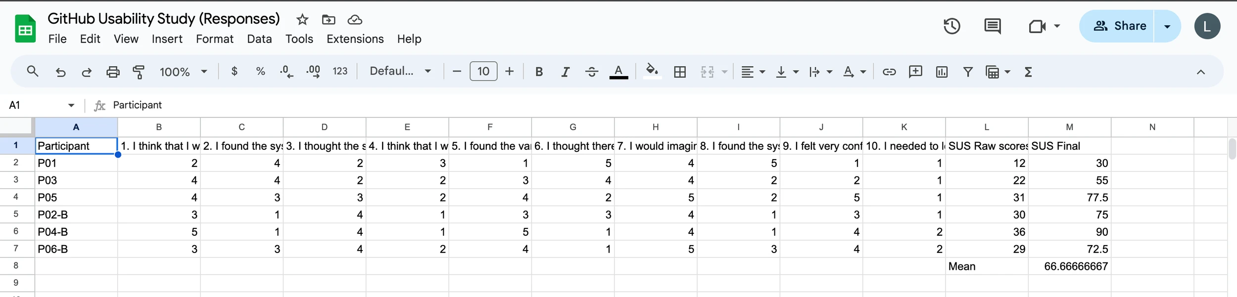
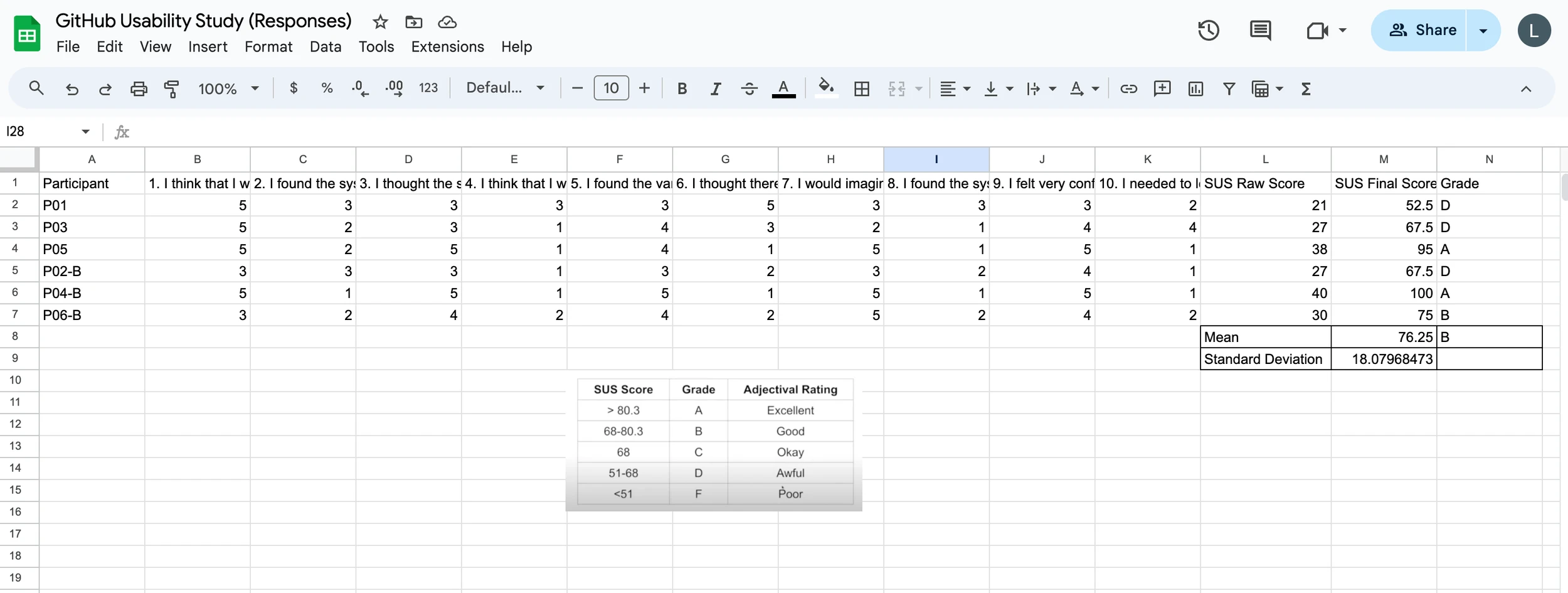
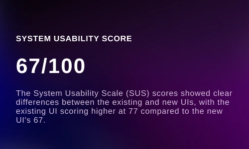
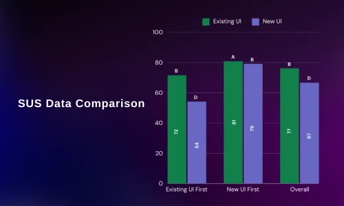
To quantify our data, I also measured the SUS scores of the participants in both conditions and compared the scores to understand the learnability.
Findings and Recommendations
“I’d like it if I can add the comments from this side (left side) and not that very end, having it this side (left side) is so much easier”- Participant 2
Current UI
New UI
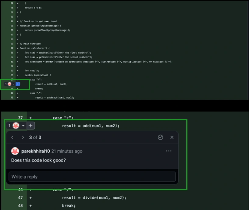
“I think this is the button, but I expected to see the resolve button somewhere under the comment”- Participant 3
WHAT? (DATA)
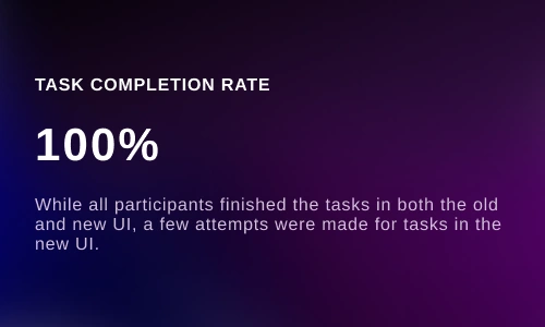
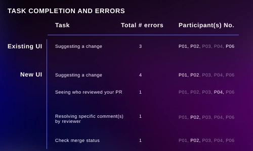
Task errors
Task completion
Participant feedback
System Usability Scale (SUS) scores
Group 1 interacted with the new UI before the existing UI.
Initially, our intention was to include time-on-task measurement as a success metric. However, due to the existing users' familiarity with the current UI, making comparisons with the new UI proved impractical. As an alternative, we implemented a think aloud approach during testing.
Given that our participants were software developers, it was imperative to recreate a "realistic" environment akin to their daily experiences. Consequently, I created multiple repositories with diverse code branches to mirror this environment accurately.
6 Software developers (SD)
3+ years of SD experience
+1 years of GitHub experience
Group 1 interacted with the existing UI before the new UI.
Recommendations:
Enhance visibility by using a distinct color (like green) for the resolve button/icon to indicate its active state and improve user engagement
Maintaining text in the button to assist users in understanding the functionality of each interface element
Medium and Low Priority Insights

Current UI
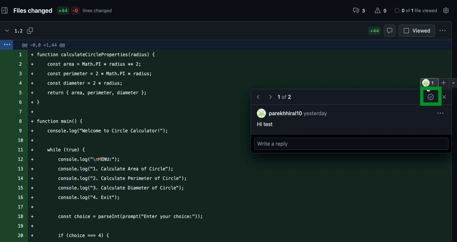
New UI
The Importance of Transparent Collaboration with Client
Clear collaboration with the client proved to be crucial. By constantly keeping the client in the loop, we were able to navigate the study smoothly. Working closely with the GitHub Pull Request team allowed us to better understand the complexity of the project, enabling us to develop a comprehensive and detailed study plan.
Like this project
Posted May 21, 2026
Usability study for GitHub's Pull Request interface to improve user experience.
Likes
0
Views
0