Brand Identity Development for ARCQ

achu chidera


What is ARCQ?
ARCQ is a premium consumer gadget brand built around one simple belief, that technology should feel natural in your life, not like an interruption to it.
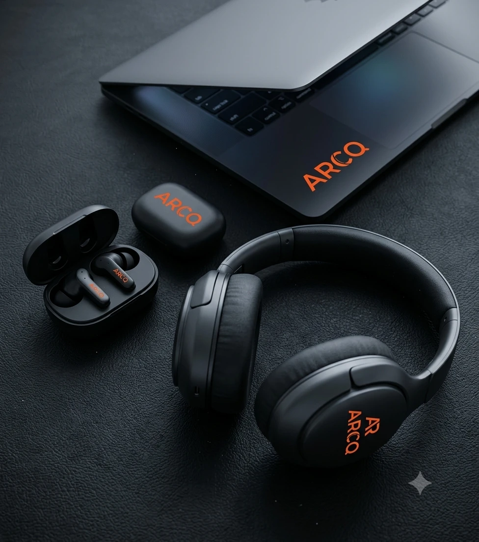
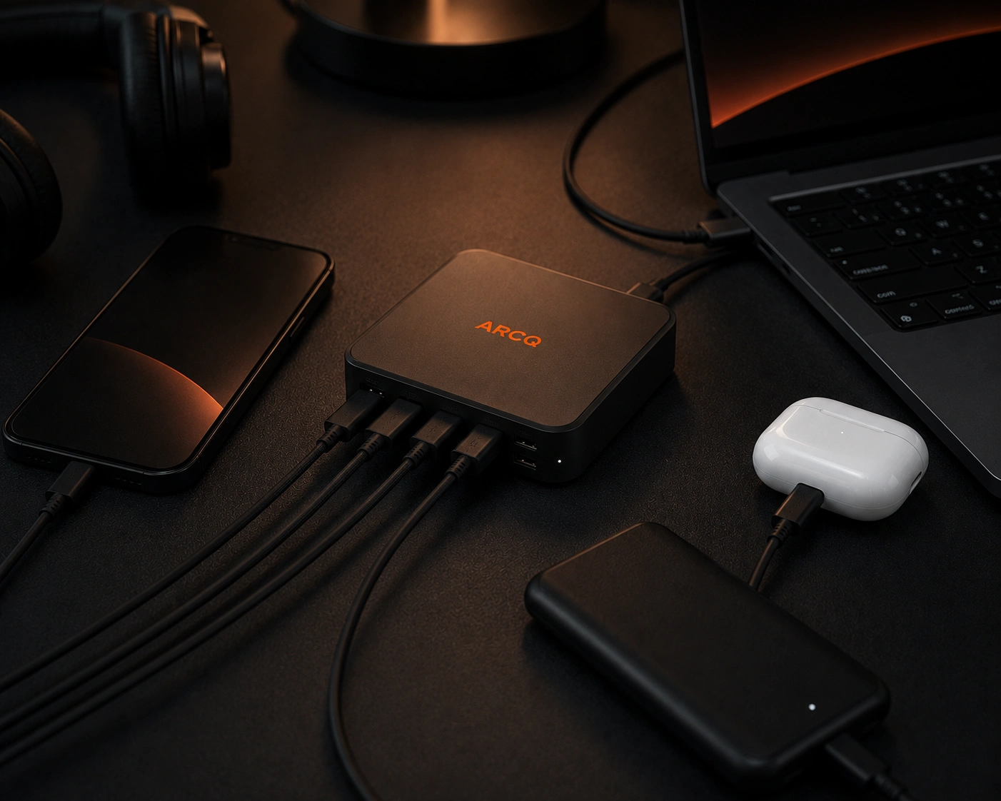
The brand covers everyday carry products: wireless earbuds, a magnetic power bank, a Laptop, a Headphone and a compact multi-port charging hub. Five products. Five moments in a person's day. Each one designed to belong exactly where it's used.
The tagline says it best: "Technology, in its element."
The target audience? Tech-forward millennials and Gen Z creatives who care just as much about how something looks on their desk as how well it actually works.
The Problem
Here's something that's easy to overlook in the tech space, most brands pick a lane and stay there.
Some brands go all in on performance. Specs, benchmarks, technical language. The product works brilliantly but feels cold and forgettable.
Other brands go all in on aesthetics. Beautiful packaging, great photography, but the product feels shallow once you actually use it.
ARCQ needed to be neither of those things.
The real challenge was building a brand that could hold both worlds at the same time, one that felt precise and premium, but also warm, useful, and genuinely connected to the way people live. A brand that could make technology feel less like something you manage and more like something you enjoy.
What We Built
The solution started with a positioning idea: technology with a place.
Rather than presenting ARCQ's products as gadgets in a catalogue, we gave each one a context, a moment it was built for.
The earbuds belong in the commute.
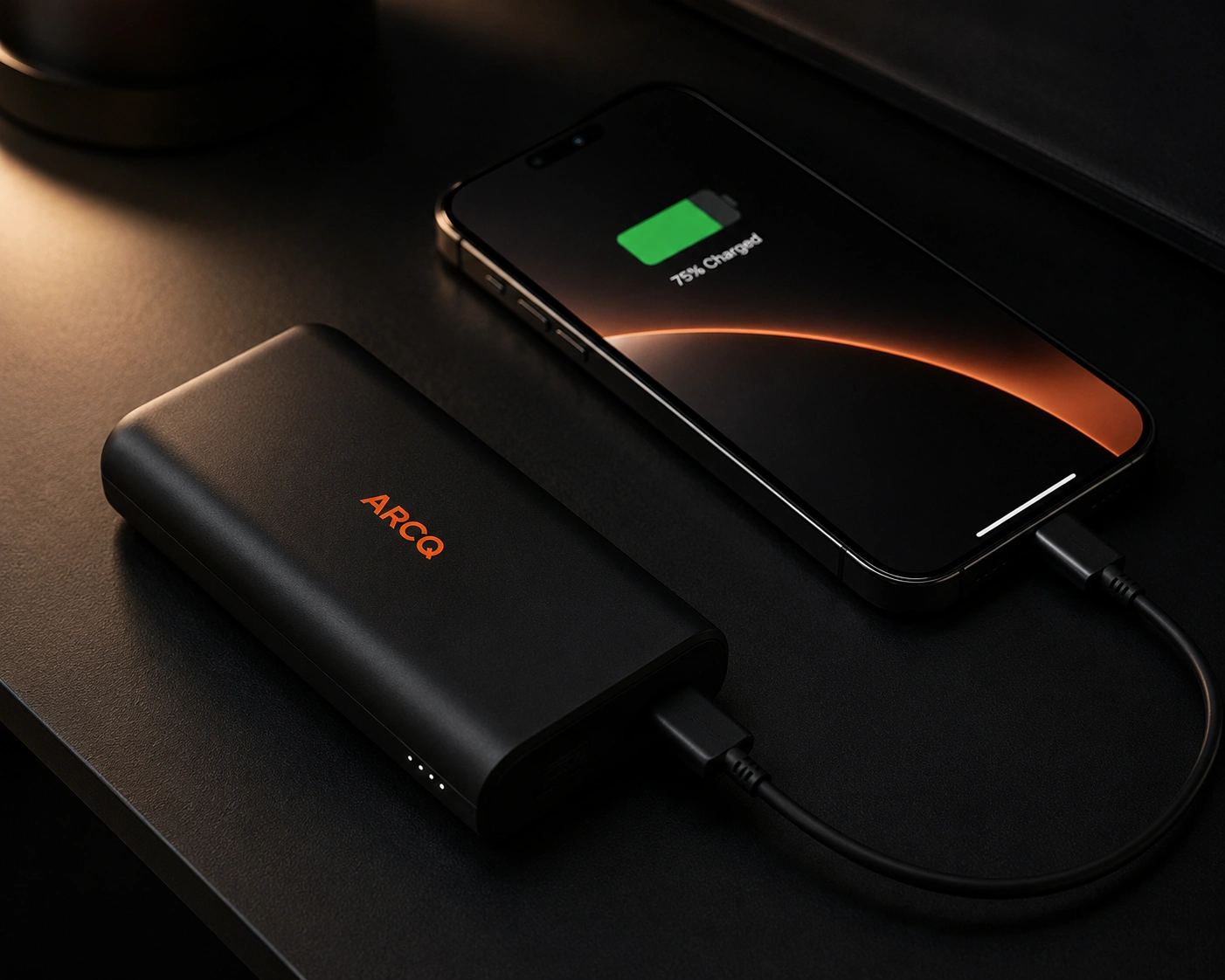
The power bank belongs in the bag.
The laptop belongs for your work.
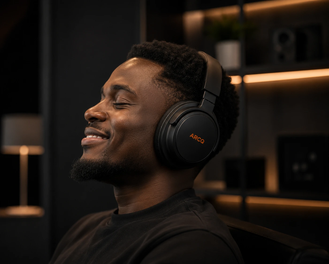
The headphone belongs for your quite time.
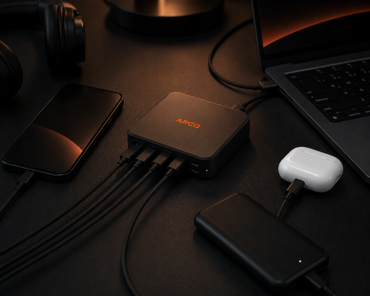
The hub belongs in the setup.
That thinking shaped everything, the visual direction, the photography style, the typography, and how the brand speaks.
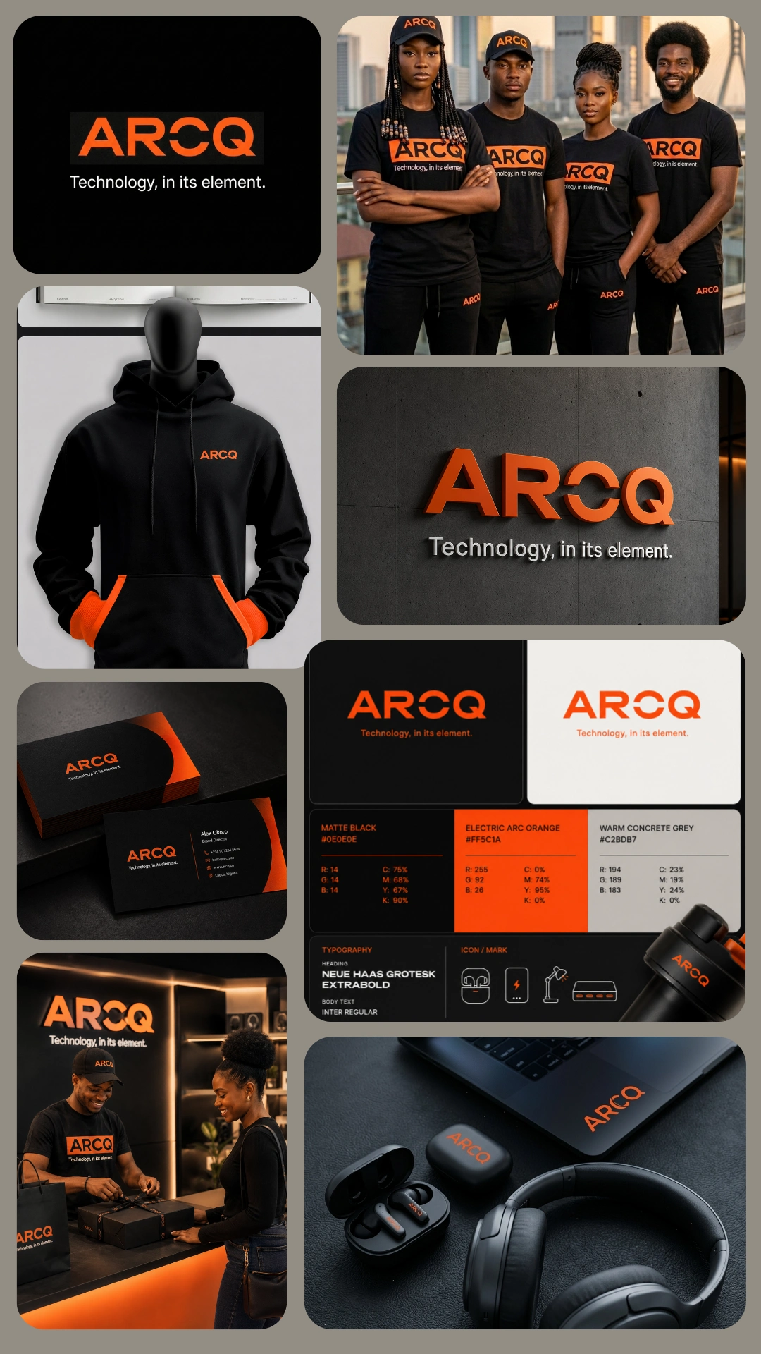
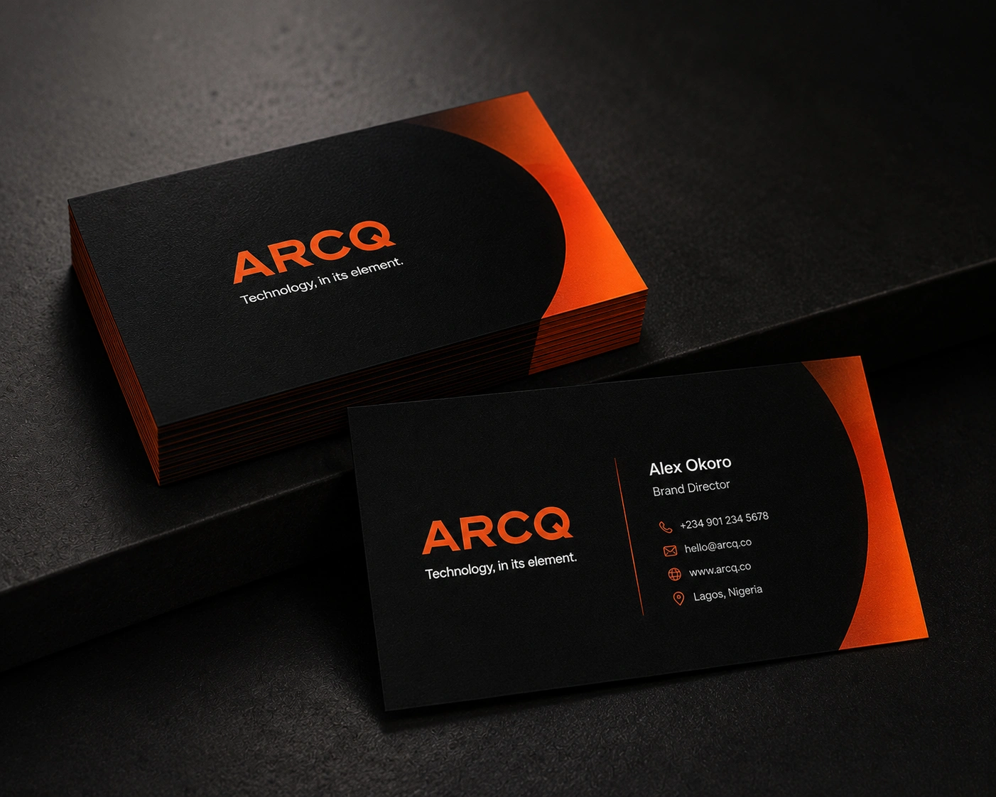
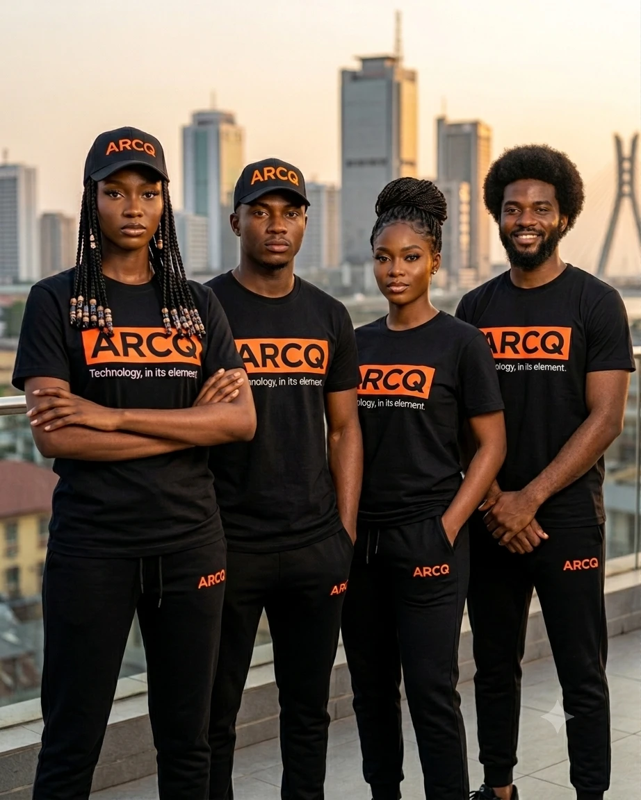
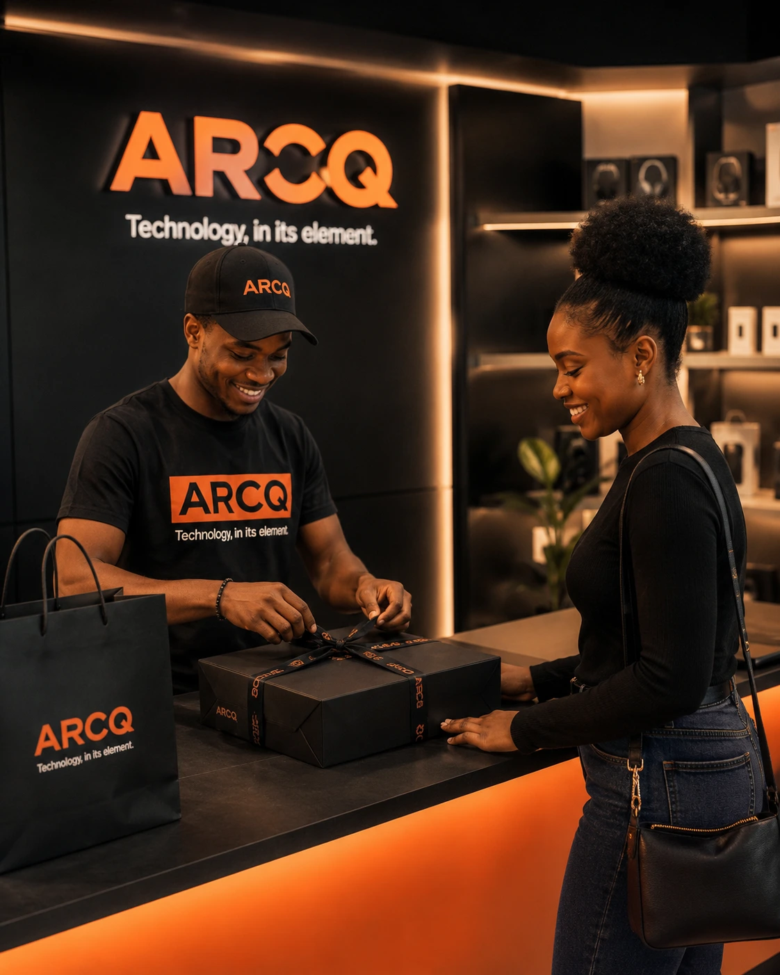
For the look, we went dark, minimal, and intentional. Dark studio photography. Strong geometric typography. Clean layouts with room to breathe. And a carefully controlled use of Electric Arc Orange present on every design, but never overwhelming. The orange doesn't shout. It just shows up in the right place, every time.
The ARCQ wordmark itself carries the brand's signature, a tight geometric uppercase with a subtle arc cut-out detail in the C. Small detail. Big personality.
What It Communicates
The brand direction gave ARCQ something most gadget brands don't have; a feeling.
Not just "this product has great specs." More like, this is the kind of gear that makes your setup look exactly the way you want it to.
The key ideas the brand now communicates clearly:
Products designed for real life, not just spec sheets
A premium experience that doesn't feel intimidating
Strong balance between how something performs and how it looks
A visual identity that's instantly recognisable across every touchpoint
Technology that feels like it belongs in modern, creative lifestyles
The Outcome
ARCQ came out of this process as a brand that feels like it's been around for years even though it was built from scratch.
The dark premium visual system, the Electric Arc Orange accent, the geometric wordmark, and the "technology in its element" philosophy all work together to say one thing clearly:
This is technology that was thought about.
Not just engineered. Not just styled. Thought about from the product to the packaging to the post on your feed.
That's what ARCQ is.
And that's the kind of brand work this case study represents.
ARCQ. Technology, in its element.
Like this project
Posted Jul 22, 2026
Developed a premium brand identity for ARCQ, merging performance and aesthetics.
Likes
2
Views
11