Empowering small businesses through responsive web design
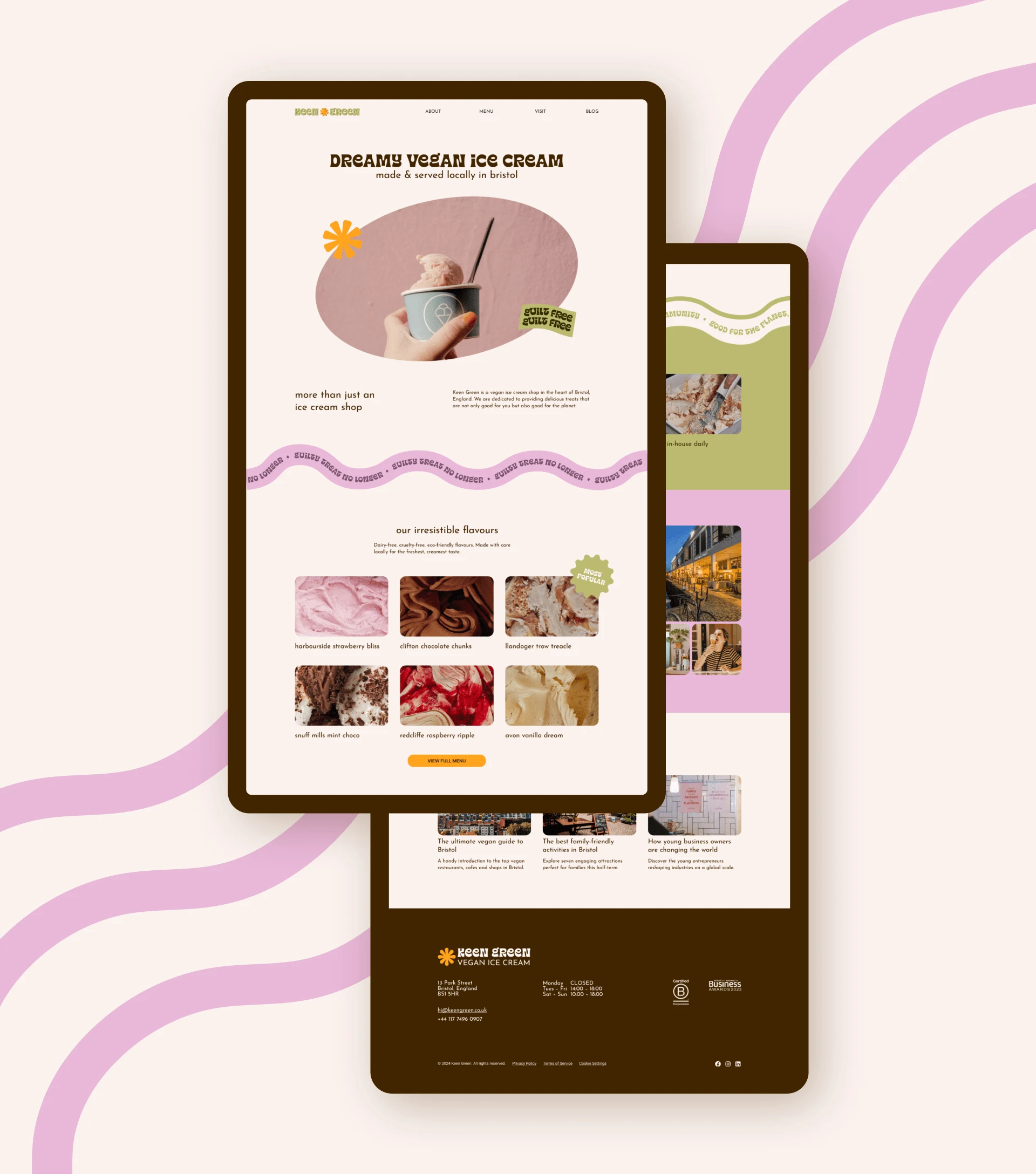

The client and the project
Keen Green is a (fictional) ice cream shop that makes and serves its vegan ice cream locally in Bristol. They are committed to supporting their community and to running their business in a sustainable way.
Keen Green's brand has a warm, playful and retro vibe, with fun ice cream flavours that are named after places in the Bristol area.
Keen Green approached me to design and build their first website. Up until this point, they had been relying on their Google Maps listing to capture their online traffic, but they eventually realised they wanted to create a touchpoint that they had more control over.
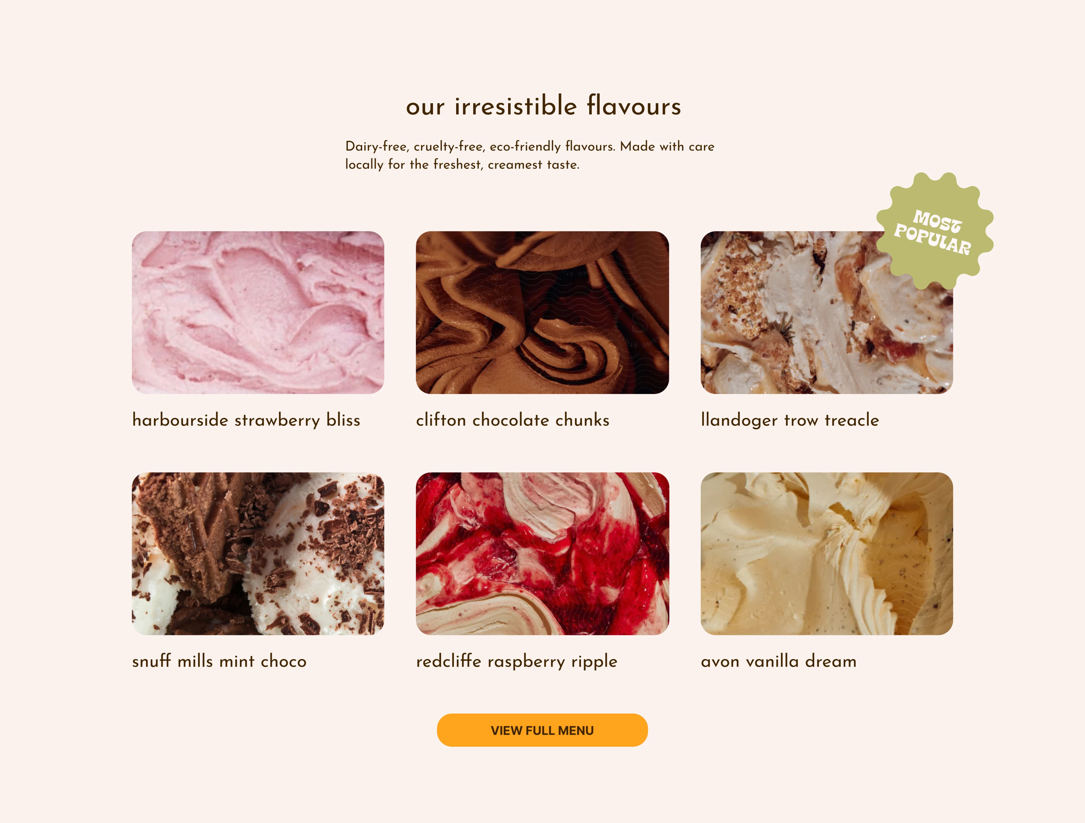
Keen Green's ice cream flavours are named after places in Bristol
Discovery
I started by getting to know Keen Green—its mission, its history and its target customers.
Then I conducted market research to better understand the local area and other nearby businesses, both direct and indirect competitors.
I also did my own audience research to make sure Keen Green's website would be designed to effectively serve as many people as possible.
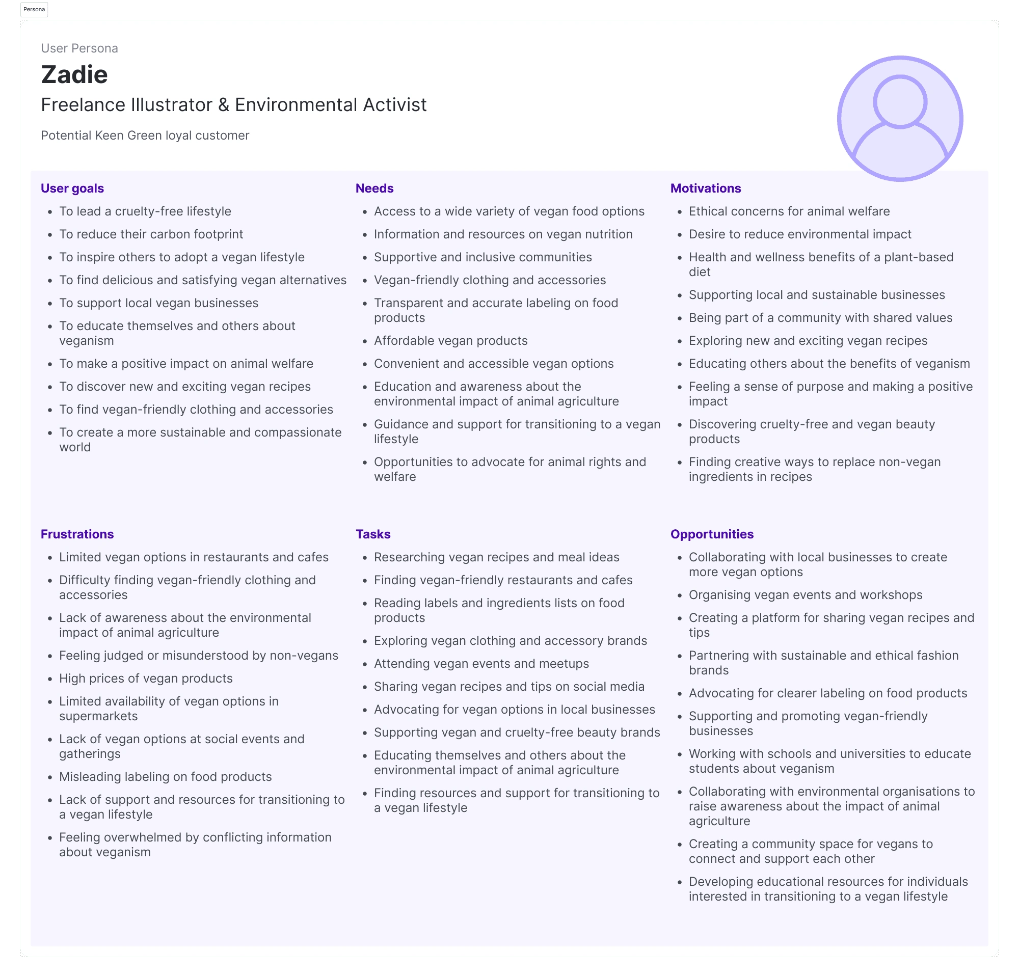
Example persona for Keen Green
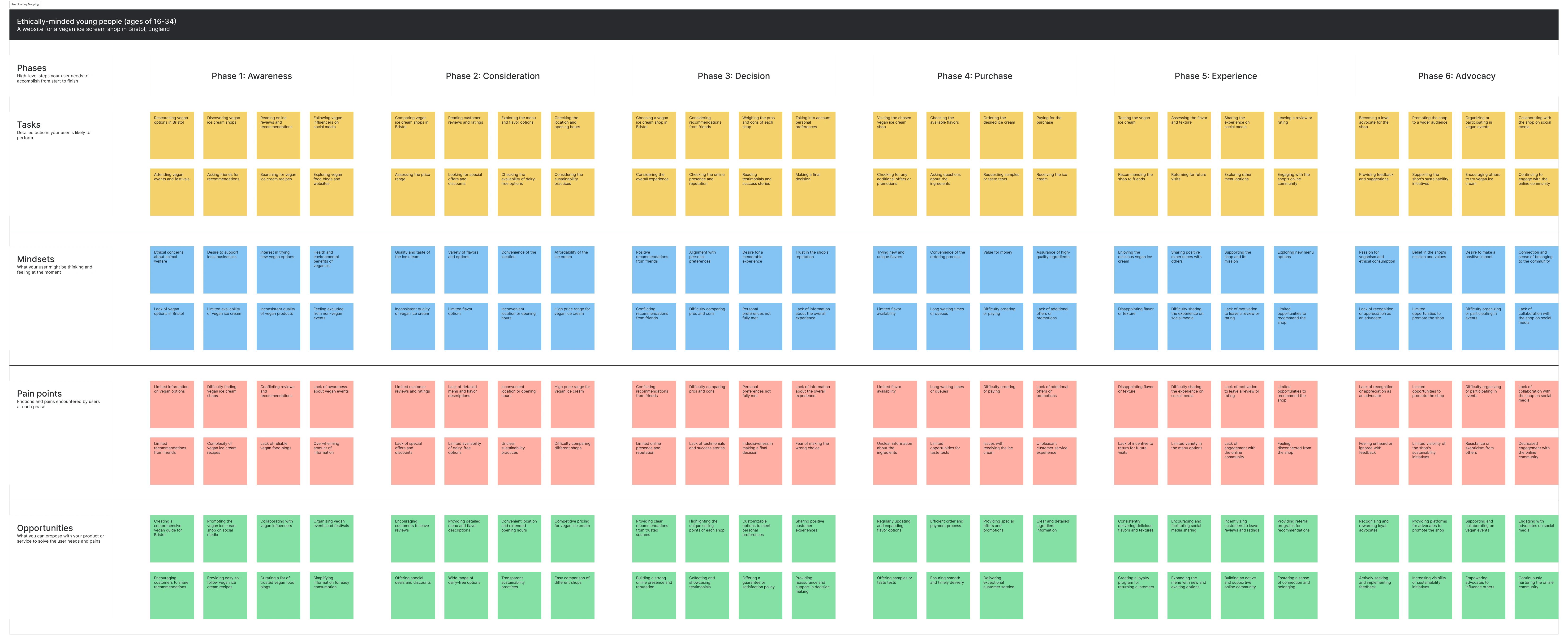
User journey map covering user tasks, pain points and opportunities
Designing
After understanding the business, the target audience and the local area, it was time to start designing Keen Green's website.
I began by creating a sitemap and content maps for each page.

An early sitemap for Keen Green's new website
Then it was time for the fun part—putting together the puzzle pieces and creating wireframes.
I then created a minimal prototype to test with users using Maze. I used the results from user testing to further iterate on the wireframes.
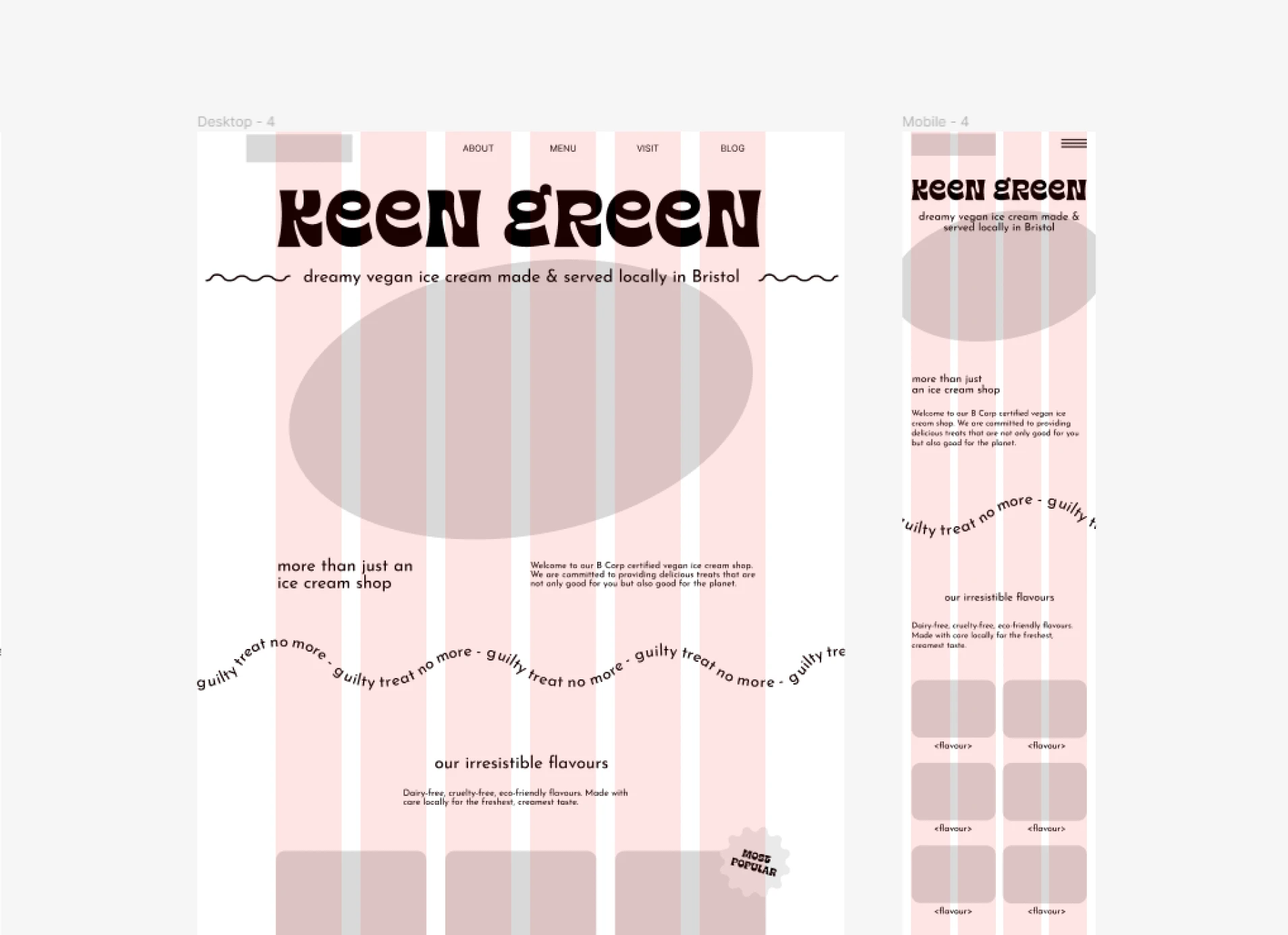
An early wireframe of the homepage
Once I was happy with the wireframes, I started playing around with the visual design.
I wanted the website to be colourful and playful, to mirror Keen Green's branding. I also wanted the website to have a slightly imperfect feel to it, to reflect the approachable, handmade vibe of Keen Green.

Keen Green's brand colours: Strawberry Gelato, Creamy Pistachio, Orange Sorbet, Vanilla Frosting and Chocolate Fudge

I added additional tones to use in the visual design
The final homepage design

Like this project
Posted Feb 29, 2024
Redesigned and optimised websites for small businesses to improve their online presence, resulting in increased traffic and customer engagement.
