Green Lake Cosmetic Dentistry Logo Design & Brand Guide

Hristomir Todorov
Brand Designer
Logo Designer
Web Designer
Cosmetic Dentistry Logo Design & Branding
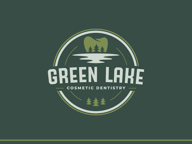
A boutique dentist office with a target age 30s-60s. Considering the region they are located in and the brand name, we've determined that the primary color palette will be dark forest greens that will resonate with the location and target audience.
Main Logo
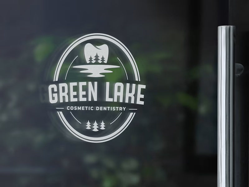
Additional versions of the logo have been created so the brand can be more flexible and use the variations accordingly with the media it is to be used on.
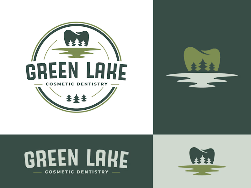
A detailed Brand Guide has been created to provide the client with the best practices to follow in order to stay consistent with the branding, its colors, typography, and possible use cases.


