Drummoyne Creative - Digital & Creative Agency - Full Branding

Hristomir Todorov
Brand Designer
Graphic Designer
Logo Designer
Adobe Illustrator


Adobe Photoshop

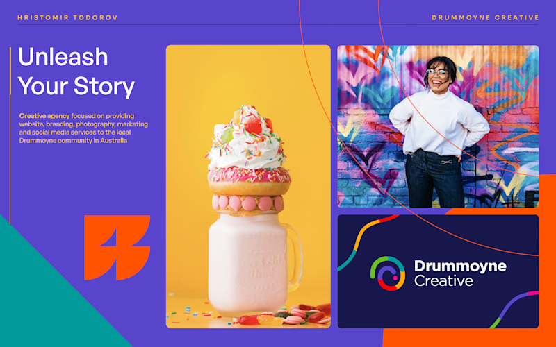
A creative agency focused on providing a website, branding, photography, marketing, and social media services to the local Drummoyne community in Australia.
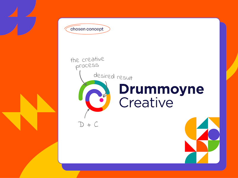
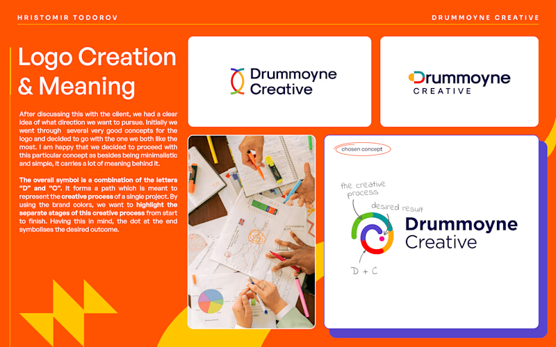
After discussing this with the client, we had a clear idea of what direction we wanted to pursue. Initially, we went through several very good concepts for the logo and decided to go with the one we both liked the most. I am happy that we decided to proceed with this particular concept as besides being minimalistic and simple, it carries a lot of meaning behind it.
The overall symbol is a combination of the letters “D” and “C”. It forms a path that is meant to represent the creative process of a single project. By using the brand colors, we want to highlight the separate stages of this creative process from start to finish. Having this in mind, the dot at the end symbolizes the desired outcome.
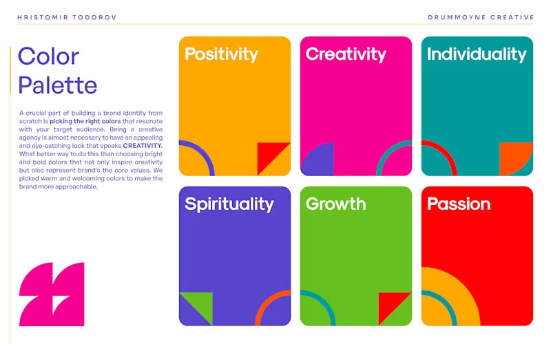
A crucial part of building a brand identity from scratch is picking the right colors that resonate with your target audience. Being a creative agency is almost necessary to have an appealing and eye-catching look that speaks CREATIVITY. What better way to do this than choosing bright and bold colors that not only inspire creativity but also represent brand’s the core values. We picked warm and welcoming colors to make the brand more approachable.
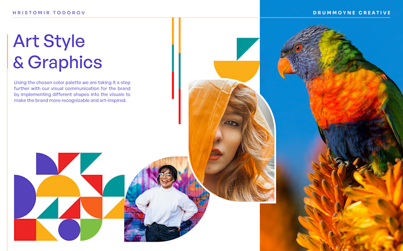
Using the chosen color palette we are taking it a step further with our visual communication for the brand by implementing different shapes into the visuals to make the brand more recognizable and art-inspired


