Vinson Agency — Logo & Website Development
Task 🔎
a marketing agency with a wide range of services came with the task to design and build a website for the opportunity to demonstrate its services, expertise and, as a result, i
Step 1. Naming & Logo
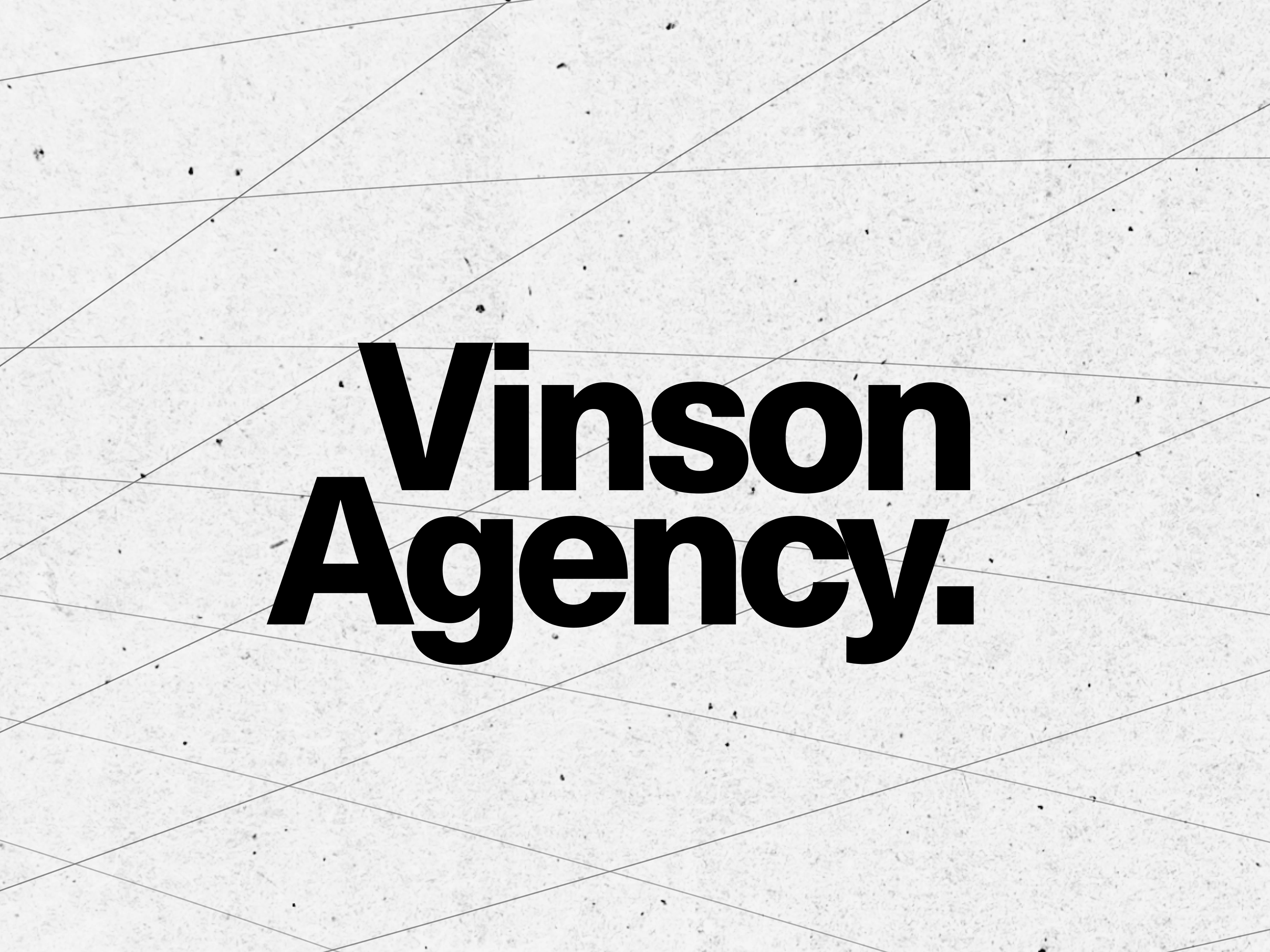
The agency already had a name, it only remained to come up with a logo that would reflect the progressiveness and reliability of the company. To do this, we decided to use only typography in the logo. We chose a modern grotesque and created an unusual, asymmetrical composition in the logo, which became the starting point in the creation of the site.
Step 2. Website
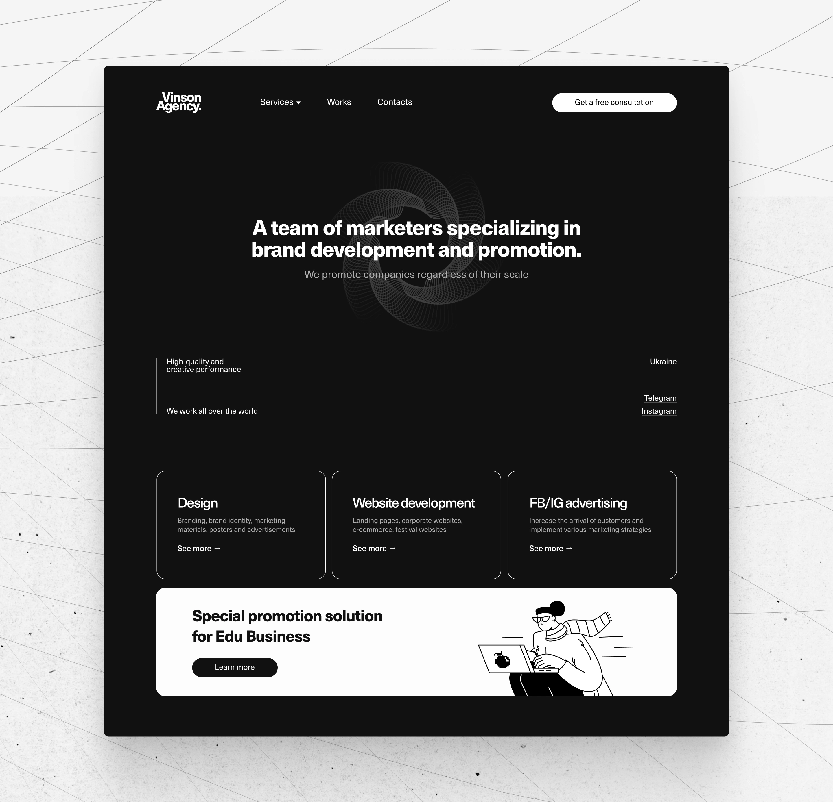
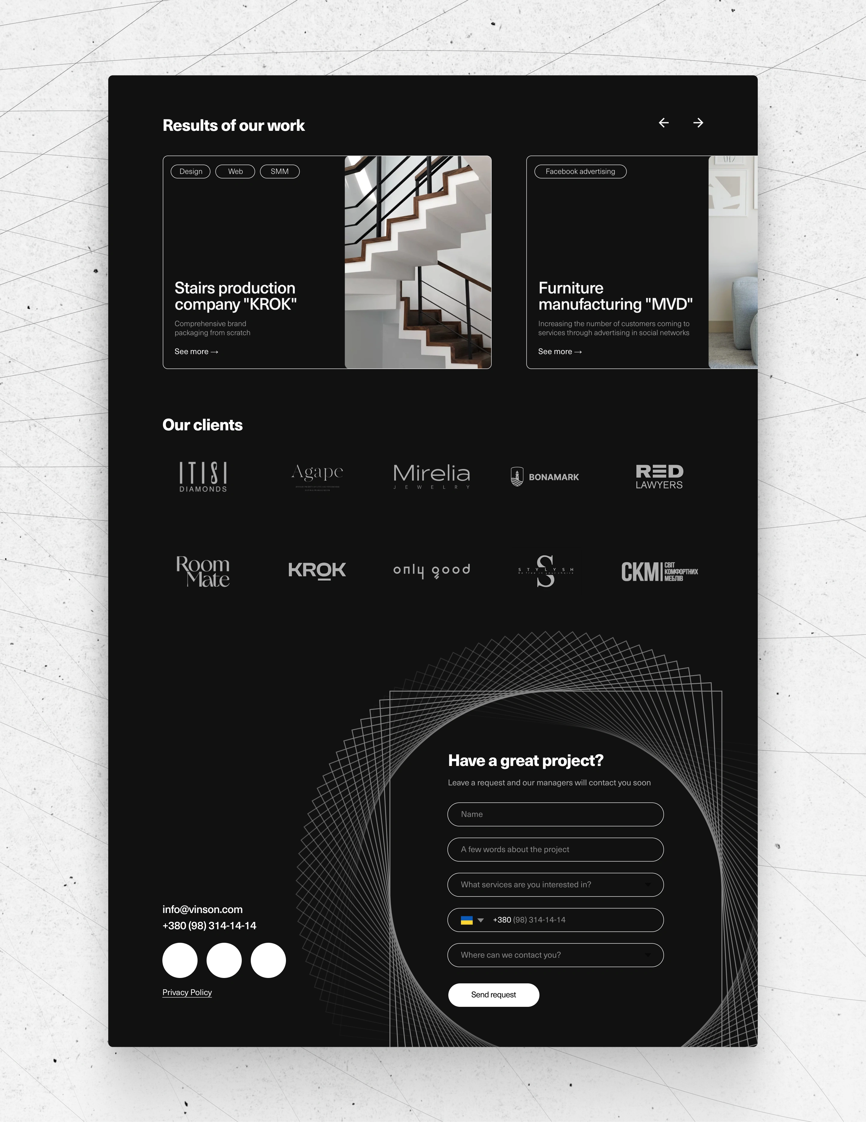
On the agency's website, it was important to present all types of services provided and not let the user get bored. After making the logo, we roughly understood which way we wanted to move, so we added blended elements and soft dies to the corporate identity.
Results 🎁
As a result of our cooperation, the agency has increased the loyalty of its audience, was able to show its latest works and attracted new customers using the site.
Like this project
Posted Jan 9, 2023
LOGO AND WEBSITE DESIGN & DEVELOPMENT FOR MARKETING AGENCY "VINSON AGENCY"
