Built with Jitter
Fitbot Brand Identity & Website Redesign
Fitbot – Shaping the Future of Fitness: Brand Identity & Website Design
Project overview
Fitbot is a nationwide fitness brand located in the Heart of Toronto. It blends tech‑driven experiences with real‑world fitness classes, giving members smart workouts in modern studios. To support the company’s expansion and reflect its hybrid fitness model, SquidX Agency partnered with the Fitbot team on a brand identity refresh and a high‑converting website. The goal was to create a clean, bold, friendly and trustworthy brand system that motivates, educates and activates users. As the Behance project introduction notes, Fitbot wanted a redesigned identity and high‑converting website “that motivates, educates, and activates,” with every element crafted to inspire movement and make fitness more accessible.

overview
Challenge
Fitness technology brands often look cold or intimidating, while traditional gyms can feel dated. Fitbot needed an identity that could convey energy, optimism and accessibility across physical studios and digital experiences. Key challenges included:
Differentiation – Stand out in a crowded fitness market while aligning with Fitbot’s smart‑gym positioning.
Consistency – Build a visual language that works at scale: on signage in 10+ studios, mobile devices, social media and physical merchandise.
Conversion – Design a website that converts visitors into members, guiding them through sign‑up, class discovery and account management.
Accessibility – Make fitness feel approachable; avoid jargon and overwhelm; support members at different fitness levels.
Landing page
Research & insights
The team started by interviewing Fitbot stakeholders and members. Insights included:
Users value clarity and simplicity - People feel intimidated by complex equipment and confusing interfaces; they want technology that “just works.”
Community matters - Fitbot members enjoyed group classes and the supportive culture in the studios. They wanted the same sense of community online.
Time is limited - Busy professionals need quick sign‑ups, easy booking and flexible notifications.
We also audited competitors brand identities and found that many fitness‑tech brands rely on dark, tech‑heavy aesthetics. We saw an opportunity to adopt a bright, optimistic colour palette paired with clear typography to make Fitbot stand apart.
logo
Color & typography
Brand identity design
Visual Concept
The new brand identity expresses movement, energy and optimism. Core elements include:
Logo – A simplified symbol inspired by the human form in motion. The mark features rounded shapes suggesting strength and flexibility, paired with a clean wordmark.
Colour palette – Bold yellows and dark neutrals evoke energy and warmth while maintaining a high‑contrast look suitable for digital interfaces. The yellow accent became a signature that stands out on signage, apps and merchandise.
Typography – A modern sans‑serif typeface conveys clarity and friendliness. Secondary weights provide hierarchy across headings, body text and labels.
Iconography and illustrations – Custom icons represent exercises, membership tiers and app functions. Illustrations use rounded shapes and gradients to communicate motion and inclusivity.
Slogan
Components
business card
component
Brand personality
Fitbot’s tone of voice is friendly, motivating and trustworthy. Taglines and microcopy avoid jargon; they emphasise progress (“Keep moving forward”) and community (“Train together”). Brand guidelines document the proper use of logos, colours and typography to ensure consistency across digital and physical touchpoints.
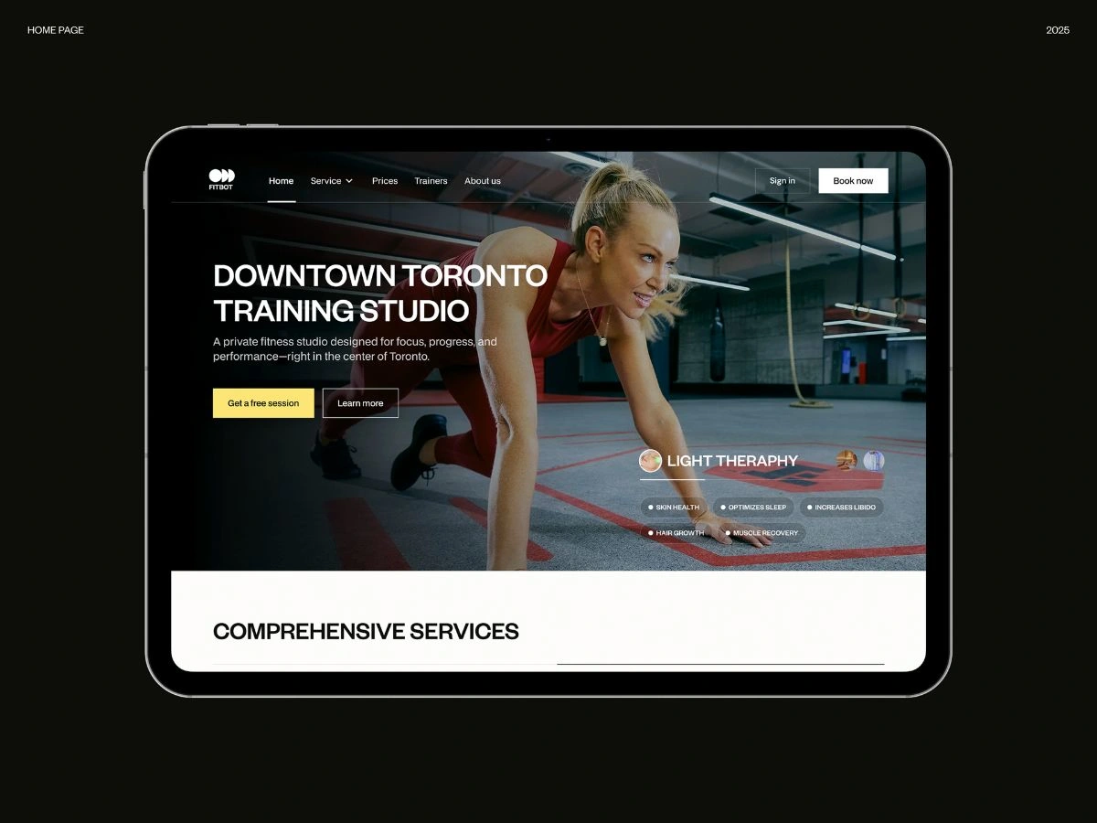
home page
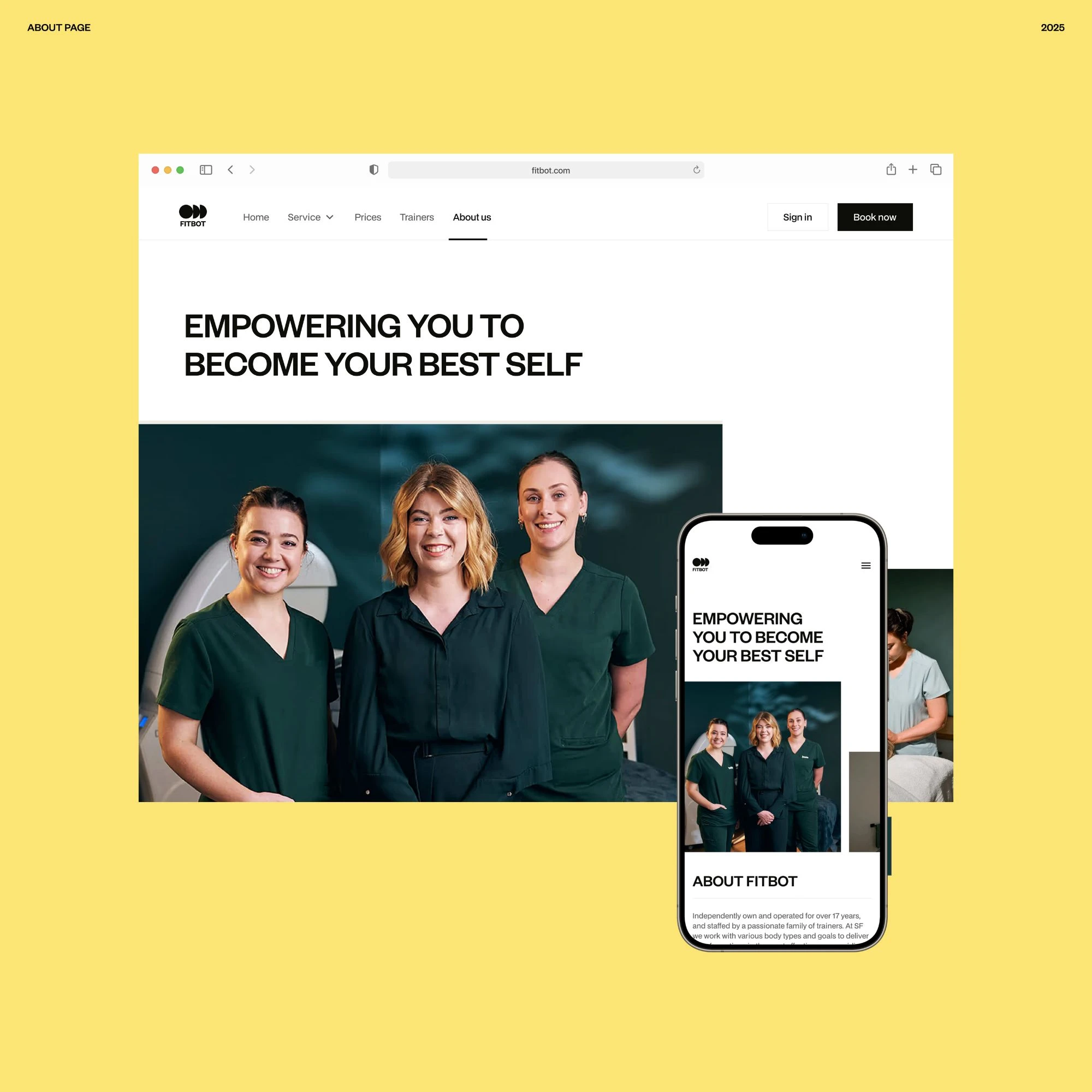
about page
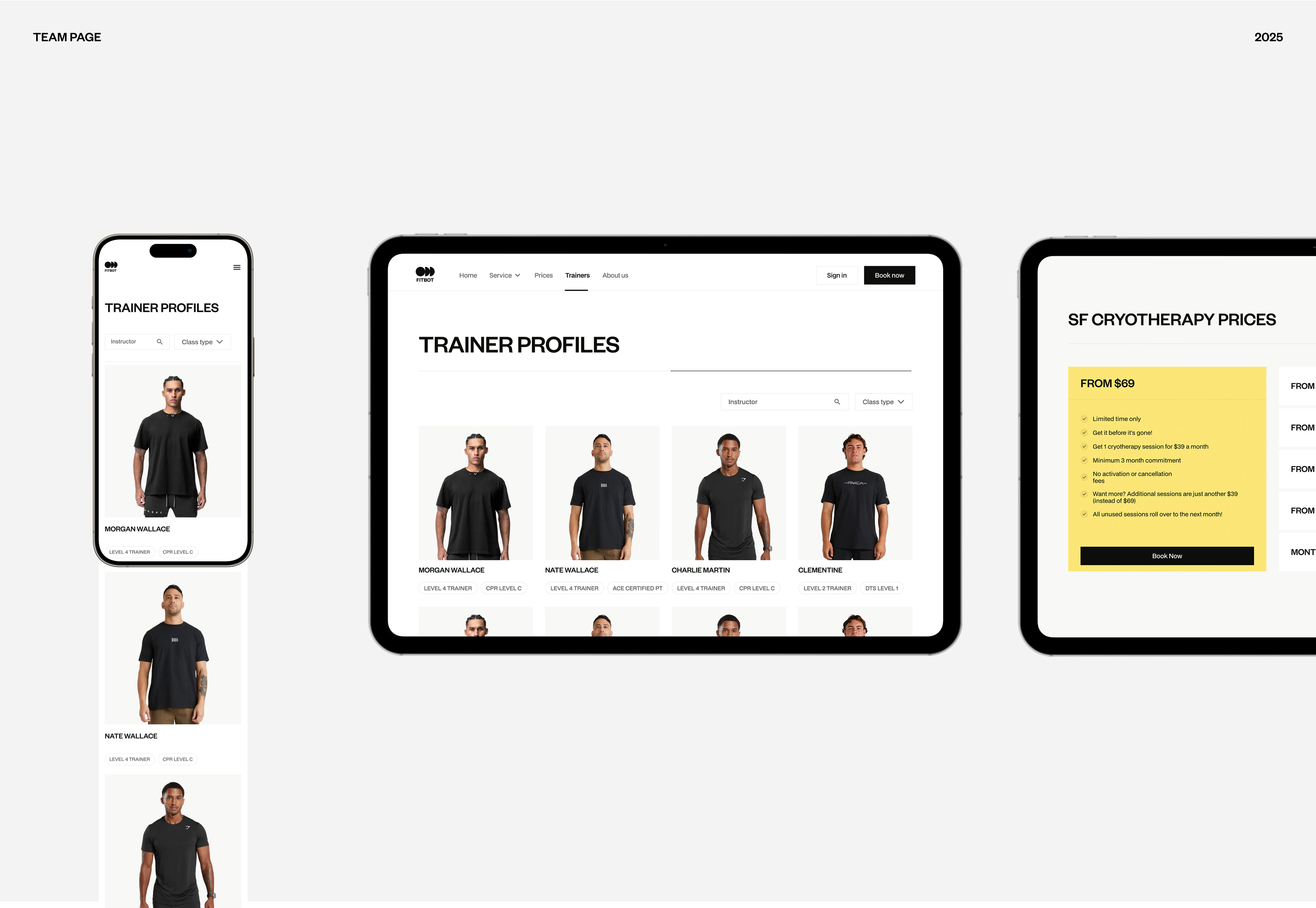
team intro
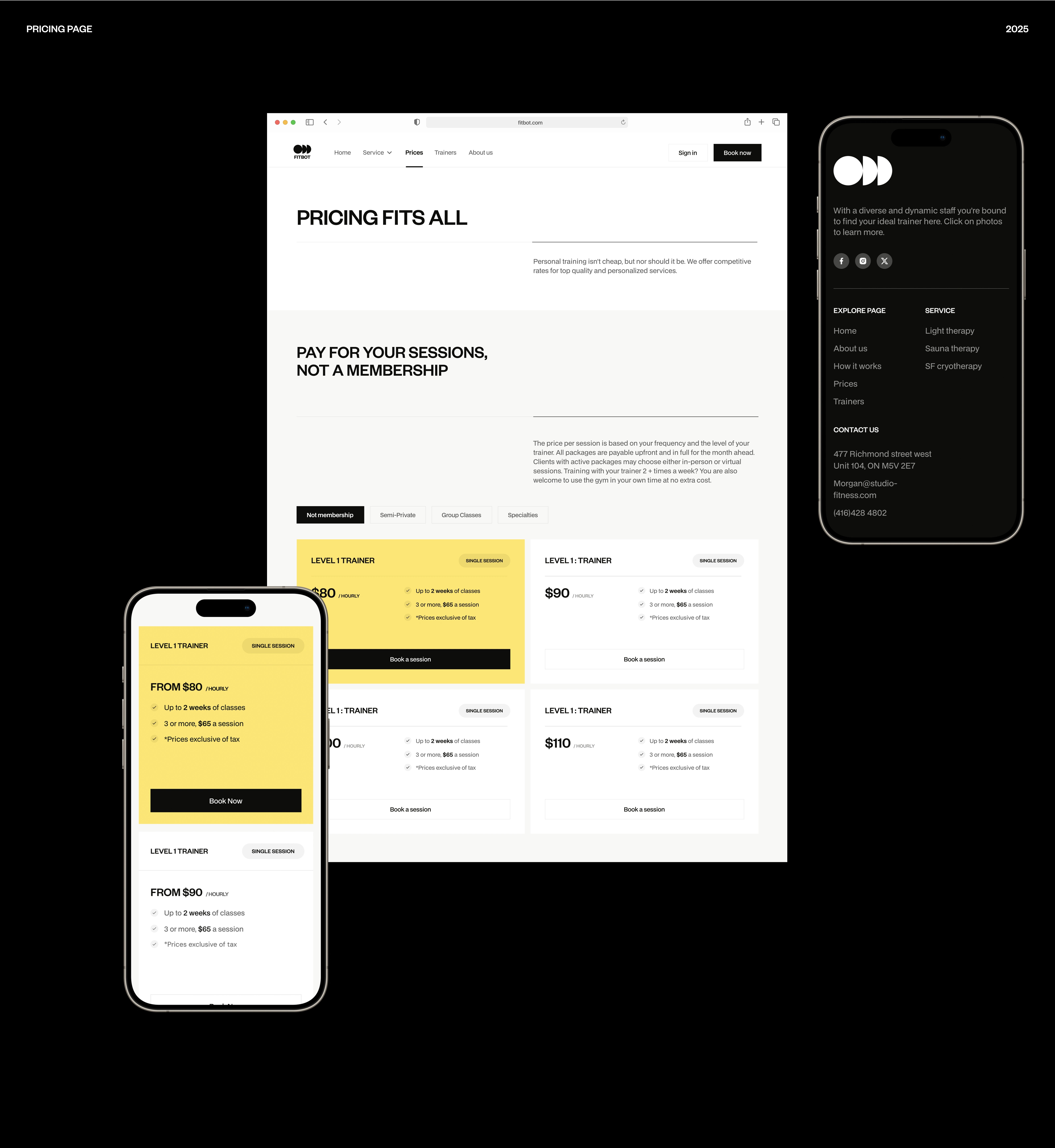
pricing section responsive
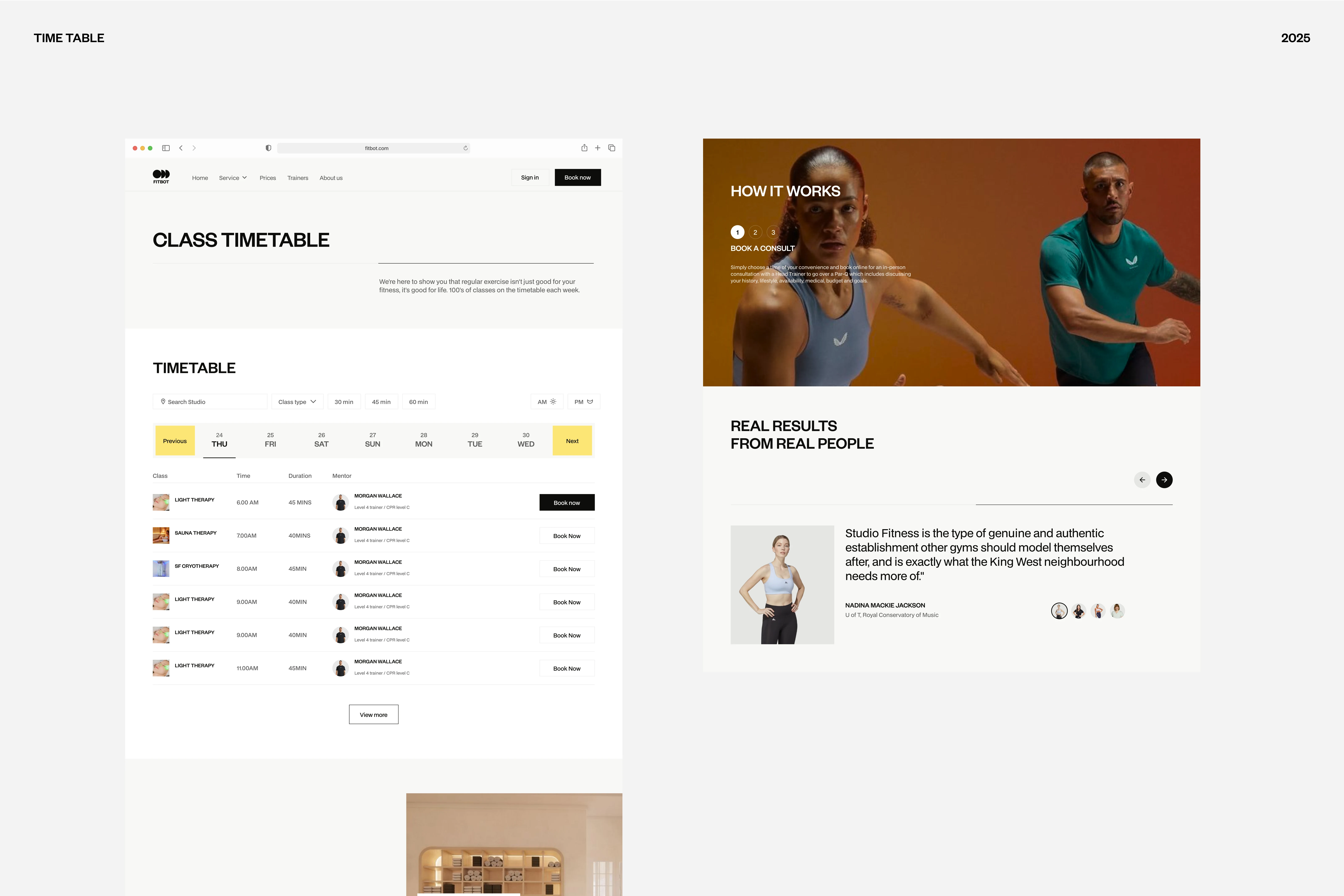
Booking section
Website design
Mobile‑first responsive experience
Given the client’s broad user base and the need for accessibility, the website was designed mobile‑first, scaling gracefully up to desktop screens. Key features include:
Homepage hero – High‑contrast visuals and concise copy explain what makes Fitbot unique. The call‑to‑action invites visitors to find a class or start a membership.
Locations search – An interactive map allows users to locate nearby studios quickly. Filters help them choose class types and times.
Membership sign‑up flow – A simplified sign‑up form reduces friction. Progress bars and friendly copy reassure users along the way.
Class schedule and booking – Users can browse upcoming classes, view instructor profiles, and book slots directly. Real‑time availability ensures accuracy.
Account dashboard – After logging in, members access their schedule, membership status, workout history and payment information. They can manage bookings, update personal details and purchase add‑ons.
Interaction design
Motion played an important role in the website. Subtle animations, such as card transitions and micro‑interactions that create feedback without distracting from core tasks. Real‑time notifications keep members informed about class reminders and wait‑list confirmations.
Accessibility and performance
The team prioritised fast loading, clear contrast and keyboard navigation. The design system uses scalable vector graphics and responsive typography. Colours and sizes were tested for readability on small screens. The result is an interface that feels light and trustworthy even on slower connections.
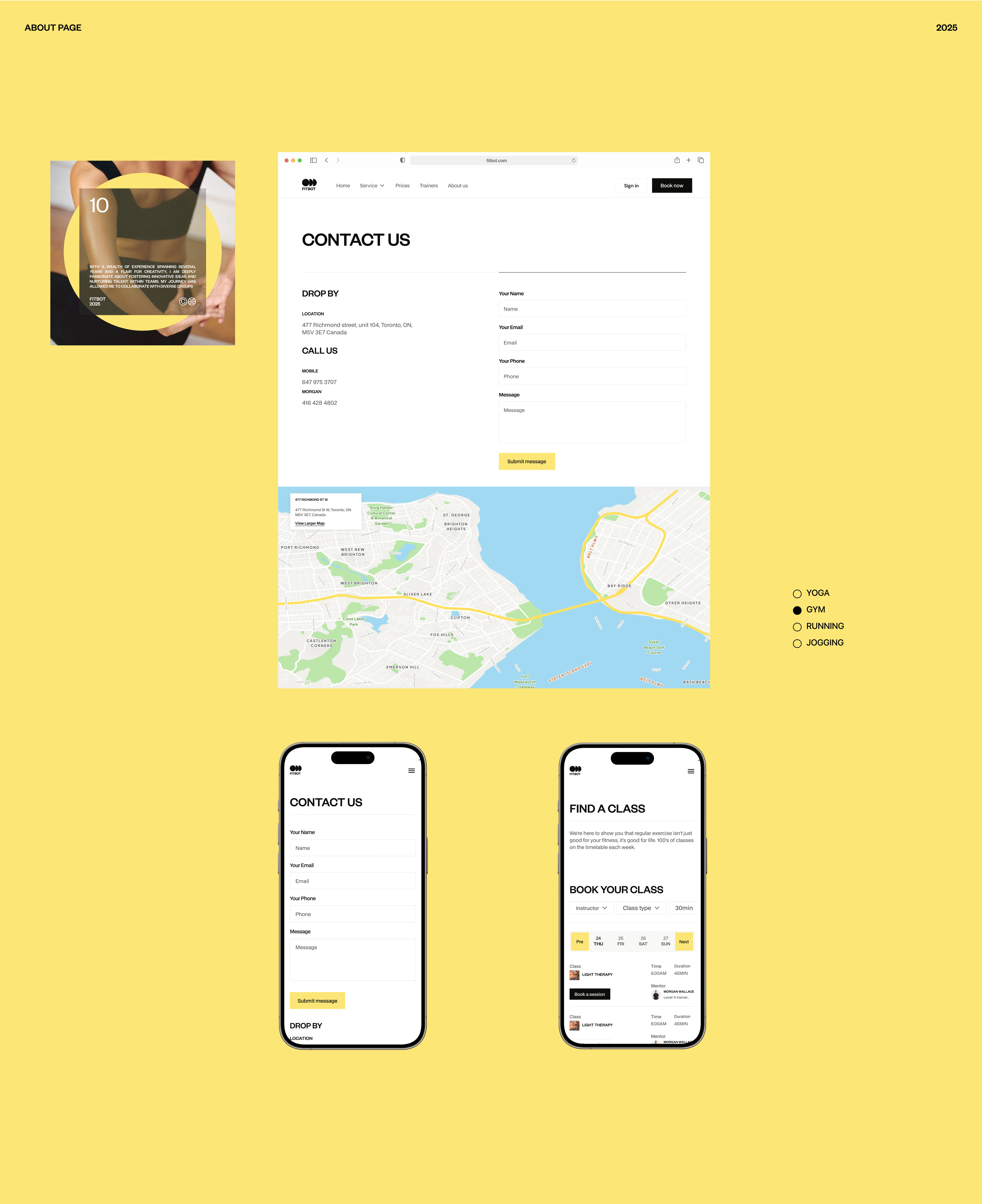
footer
grid system
Deliverables and implementation
The project delivered:
A comprehensive brand guideline outlining colour usage, typography, logo variations, iconography, tone of voice and imagery principles.
Website wireframes and prototypes tested with users to refine flows.
A responsive website built with modern web technologies, with integrated real‑time notifications and payment processing.
Asset kits for social media, in‑studio signage, merchandise and marketing campaigns.
social post
social
feature card
Impact and results
By unifying physical and digital touchpoints under a bold, approachable identity, Fitbot strengthened its position as a leader in smart fitness. Though exact metrics remain confidential, early feedback indicated:
Increased membership sign‑ups on the new website compared with the previous site.
Positive user sentiment about the brand’s friendly tone and modern look.
Streamlined onboarding, with fewer drop‑offs during account creation.
Like this project
Posted Nov 4, 2025
Brand Identity & Website Design For Fitbot – Shaping the Future of Fitness
Likes
3
Views
6

