
What makes you want to open a menu: watching the cook finish a dish, or seeing it arrive at your table? I explored that question with Sfoglia, a concept for an Italian pasta kitchen. I designed and built two versions of its homepage, keeping the dishes, copy and interactions the same so the visual direction could do the talking.
A — At the Pass
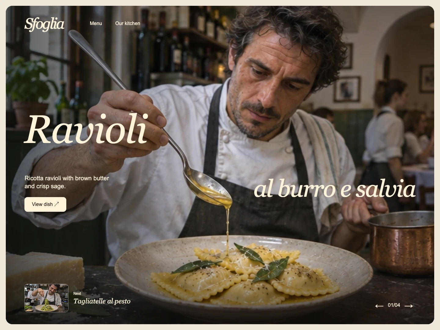
A cook spoons brown butter over ricotta ravioli. I split the ivory serif headline around that gesture, leaving room for the eye to follow the butter from spoon to plate. The next dish appears as a small green pesto thumbnail in the corner.
B — At the Table
The same ravioli arrive in a sunlit bowl. This time, the viewpoint belongs to the guest. I kept the full dish name on the left and brought the bowl close to the right edge, with pale stone, folded linen and the shadow of a water glass giving the table a sense of depth.
From first look to first click
Both versions are working, responsive websites. Guests can browse four dishes with arrows on desktop or a swipe on mobile, jump to a dish through the visual menu, and open View dish for a close-up and a tasting note. That detail mattered most for the ravioli: the hero shows the brown butter and sage, while the close-up reveals the ricotta inside.
0 likes · 1 view · Nov 18, 2026
Watch a cook spoon brown butter over ravioli, or take a seat at a sunlit table. I designed two ways into the same four-dish pasta menu.


