Menin Creative Studio Website
Company Background
As a dynamic duo, my sister and I have always shared a passion for creativity and exceptional design. Together, we co-founded Menin Creative Studio (MCS), our former design studio that specialised in branding and website development.While we're currently on pause, undergoing an exciting rebranding process to reinvent the studio's identity, I'm excited to share the story of our journey in creating our own website. Join me as we explore how we brought our vision to life and crafted a website that we're truly proud of!
Getting ready
To kick start the project, we dived into our mood board with inspiring visuals, colours, and typography that perfectly aligned with our vision. That helped us create the style tile, which served as a basis for all things visual in the project.
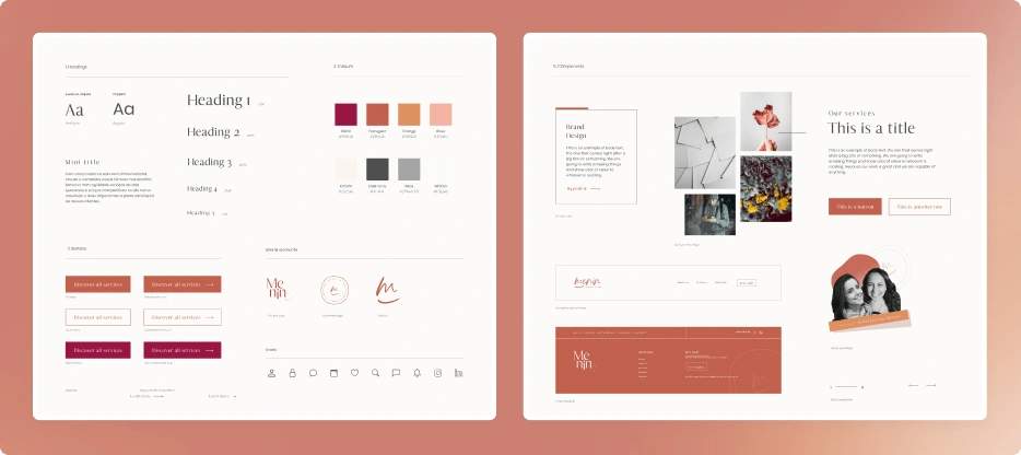
After a few iterations, this is our final style tile, serving as the foundation for the website design.
Structure & Content
Next, we created wireframes to guide us in establishing the website's structure and creating the final content. We came up with a basic skeleton, working together to refine and iterate until we had a solid foundation, ensuring everything was in the right place before adding the creative touches.
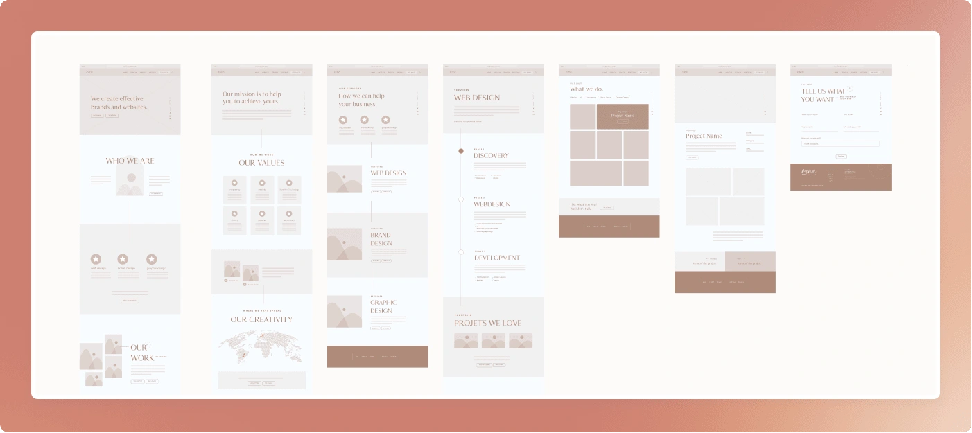
Our first set of wireframes. To speed up the process and have something live as soon as possible, we decided to simplify the wireframes and opted for a one-page website design.
Design
Time to do some Figma magic! We took our pre-established colours, typography, and other design elements and translated the wireframes into polished designs. To make the process even better, we created styles and reusable components, bringing those neat, organised vibes to the file that I cherish so much. Through great collaboration and idea exchanges, we got to the final design that reflected our studio's unique style and vision.
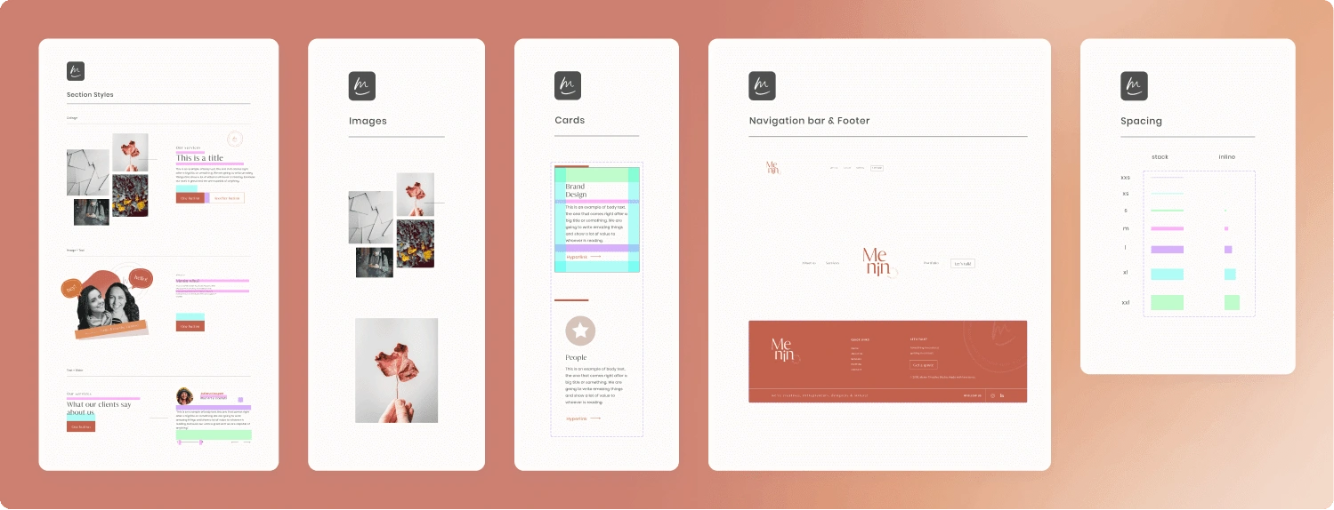
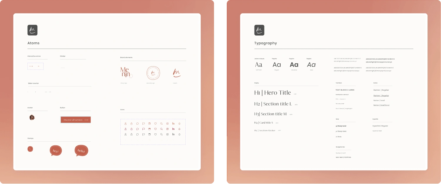
Our library of components and styles.
Development
Confession time: I had just as much fun developing the website on Webflow as I did designing it. We did a great job ensuring the website looked good on any device. After finishing the design, we added delightful interactions and took care of the SEO settings. From start to finish, the website development was a smooth and enjoyable process.
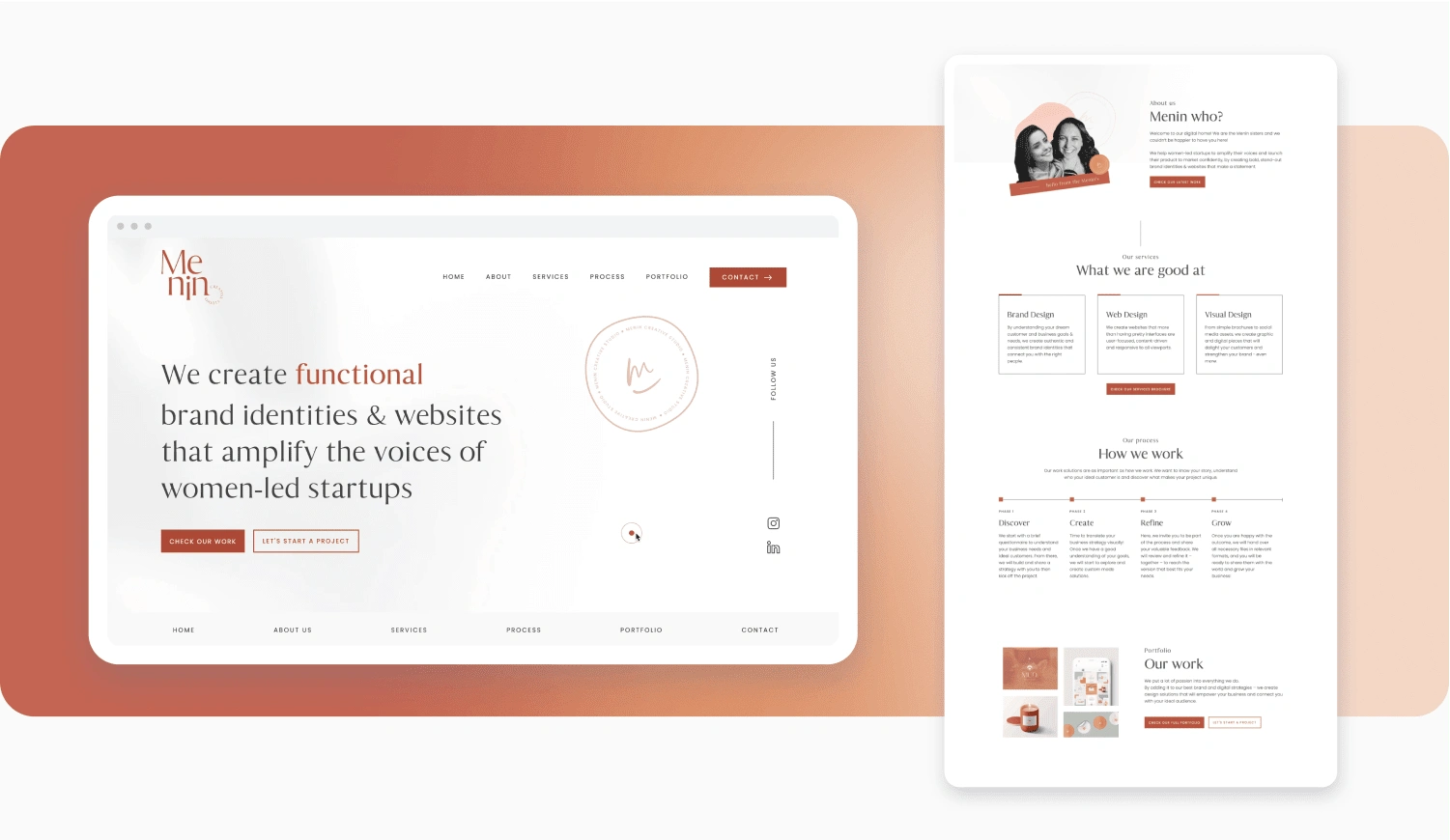
And there it is: the final result!
Our website is up and running! Curious to see it in action? Come on over and check it out for yourself 😉
Like this project
Posted Aug 30, 2023
A journey in designing and developing our former studio's website 💻✨
Likes
0
Views
11

