LeonardoUI – Expo UI Components
LeonardoUI – Expo UI Components
Welcome to LeonardoUI, a growing set of React Native components built specifically for Expo applications. This repository is based on Expo and created with
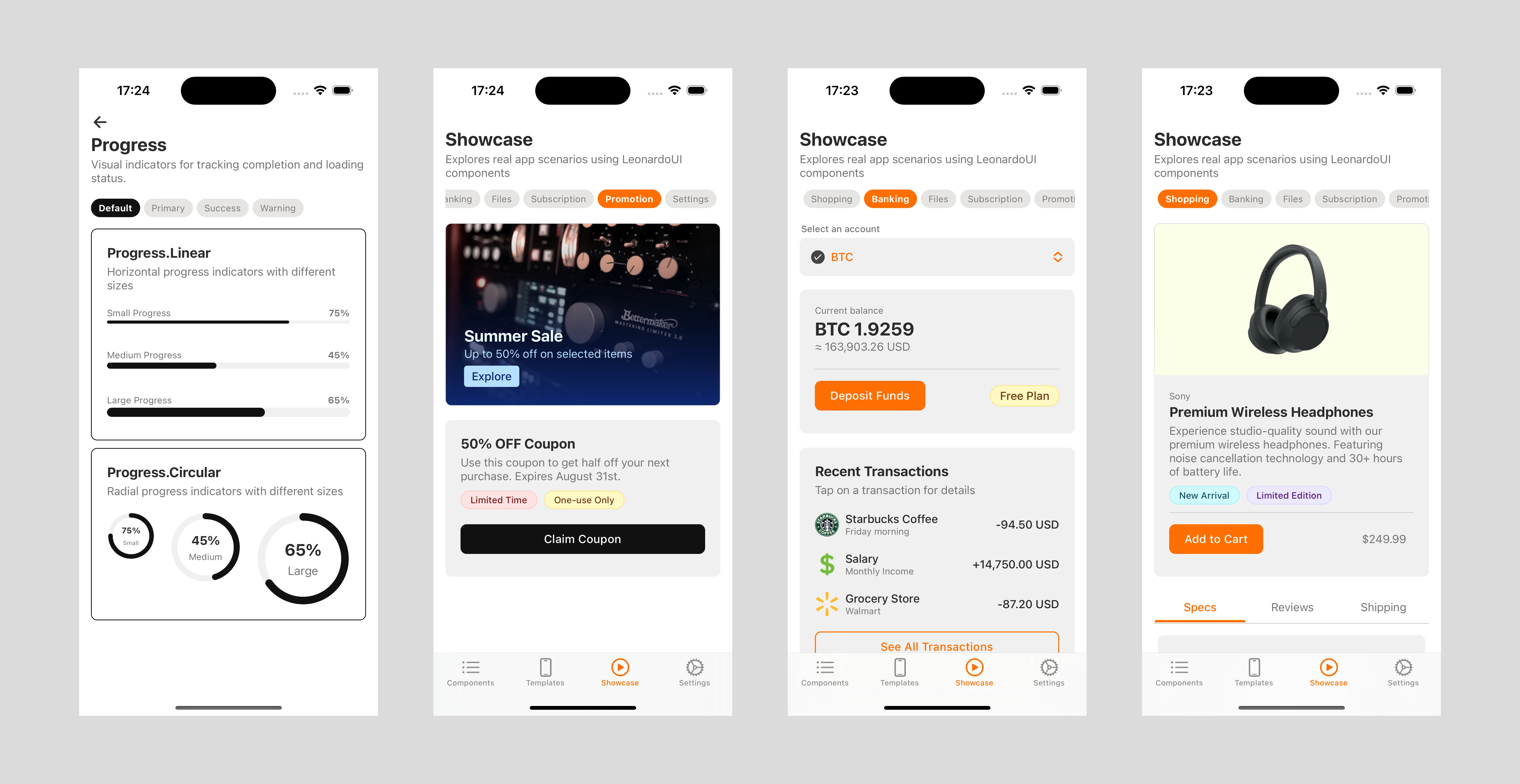
create-expo-app.Light Mode Screenshots

Light mode screenshots
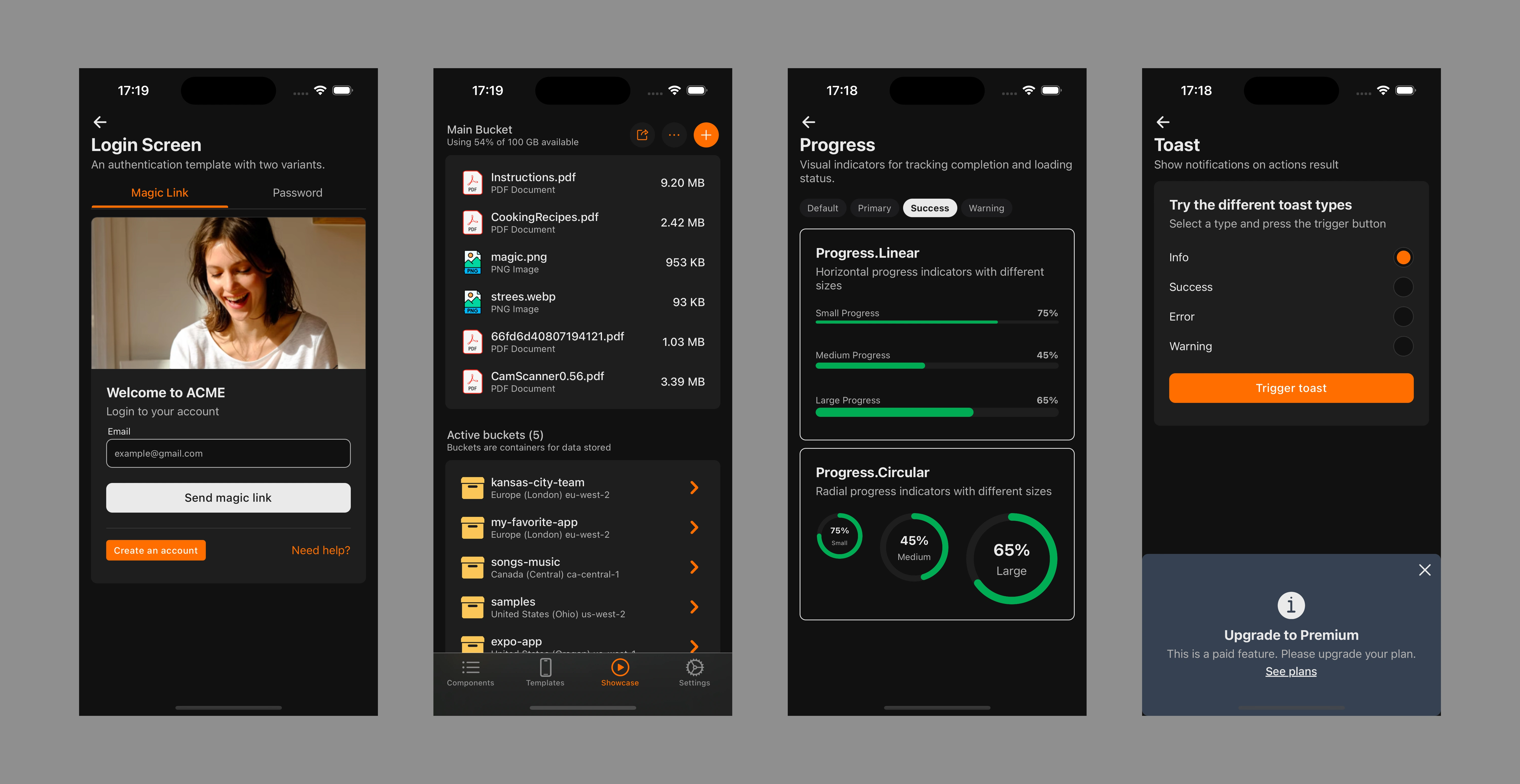
Dark Mode Screenshots

Dark mode screenshots
🚀 Quick Start
Install dependencies
Start the app In the output, you'll find options to open the app in:
Expo Go, a limited sandbox for trying out app development with Expo
You can begin developing by editing files in the app directory. This project uses file-based routing.
⚙️ About LeonardoUI
LeonardoUI is a collection of reusable, themeable UI components designed for Expo apps. While the code is set up with Yarn, you can use npm if you prefer.
✨ Features:
Customizable: Built to adapt to your app’s branding.
Expo-first: Optimized for Expo’s environment.
Minimal Dependencies: Focus on performance and easy maintenance.
Theming: Simple approach to custom colors, typography, and more.
📚 Current Components
Below is a list of existing components and their statuses:
Action: A compact, interactive button with an icon for quick actions (share, save, etc.).
Button: A tappable element that triggers an action, with multiple styles and states.
Card: A versatile container grouping related content and actions (summaries, previews).
Chip: A small, interactive UI element for filters, categories, or short info.
Dialog: A modal overlay requiring user interaction, e.g., confirmations, alerts.
Featured: A visually prominent section highlighting key content, e.g., promotions or articles.
Filter: A pill-shaped control for filtering or refining content, often in a horizontal scroll.
Header: A structured title bar providing screen context, navigation, or descriptions.
Input: A text field for user input, with validation and flexible styling.
List: A structured collection of items, common in menus, settings, or data displays.
Options: A grouped set of selectable items or settings, often used in preference panels.
Radio Button: A circular selector for picking a single option among many.
Switch: A toggle component switching between two states, e.g., on/off.
Text: A configurable component for consistent text styling across the app.
Tabs: A navigational component organizing content into panels.
Toast: A brief, non-intrusive notification providing feedback or status messages.
If you don’t see a component you need, feel free to contribute or open an issue!
🏆 Best Practices & Tips
Use Expo Router to manage navigation.
Keep components composable (compose them into screens or smaller sections).
🏗️ Contributing
LeonardoUI is MIT licensed and open for contributions. If you like this library, consider helping out:
Open an Issue: Suggest a feature or report a bug.
Submit a Pull Request: Implement a new component or fix existing issues.
Improve the Docs: Clarify usage, add examples, or share best practices.
Local Development
Clone the repo:
Install dependencies:
Start the Expo dev server:
Learn More About Expo
Expo documentation for fundamentals and advanced guides.
Learn Expo tutorial for step-by-step tutorials.
Expo on GitHub for open-source contributions.
Discord community to chat with other Expo developers.
License
Tip: If you like what I’m building, please ⭐ the repo and spread the word!
Like this project
Posted Mar 28, 2025
LeonardoUI is an open-source UI components project primarily for Expo apps. Visit the demo app on the web: https://leonardo-ui-gamma.vercel.app/


