Dashboard in Looker Studio
Shoaib Sajid
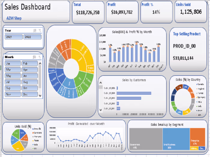
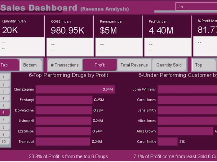
For a recent project, I created an interactive dashboard in Looker Studio (formerly Google Data Studio) to streamline data visualization and analysis. This dashboard centralizes key performance indicators (KPIs), allowing users to filter data dynamically across multiple dimensions such as time, region, and product category. The design includes various chart types like bar graphs, line charts, and pie charts, providing a comprehensive overview and making complex data trends easier to interpret. Additionally, I incorporated calculated metrics and drill-down features to enhance the dashboard’s depth, enabling stakeholders to make informed, data-driven decisions efficiently.
Like this project
Posted Oct 30, 2024
Designed an interactive Looker Studio dashboard with dynamic filters, KPIs, and drill-downs for clear, data-driven insights, streamlining performance tracking.
Likes
0
Views
2