Professional SaaS Landing Page UX redesign
alexis pilon
Tymelinx Hero Section Redesign
This redesign focused on improving the first impression of the Tymelinx landing page. The original hero section explained the product, but it did not immediately communicate enough authority, clarity, or confidence for a scheduling platform that needs users to trust it quickly.
The goal was to redesign the hero so it felt more professional, more credible, and easier to understand at a glance. Since this is a product that solves team scheduling across time zones, the hero needed to make the value proposition instantly obvious while also looking polished enough to feel dependable.
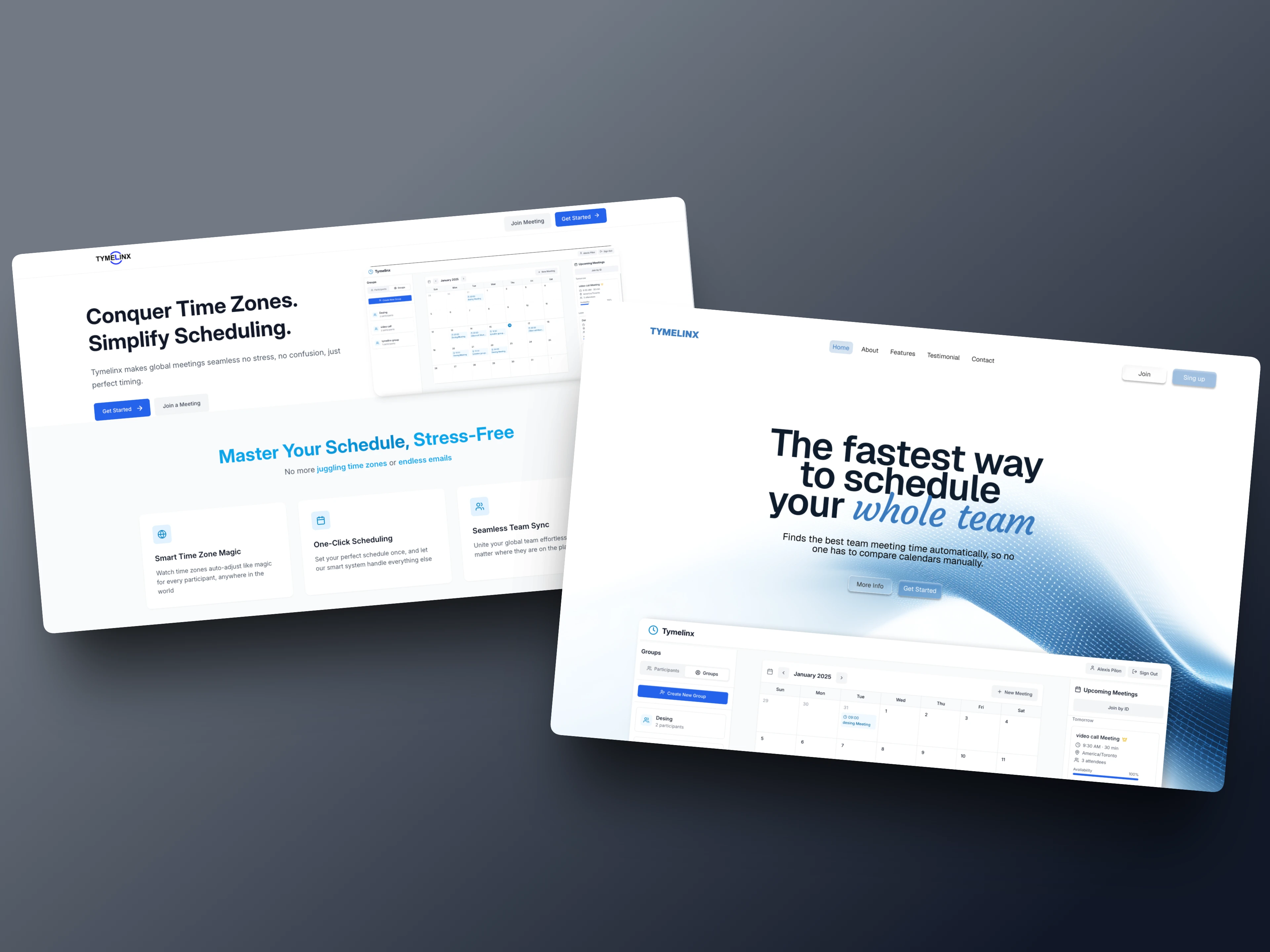
Original Tymelinx hero section.
The Problem
In the original version, the hero section had a clean structure, but it felt generic and slightly disconnected from the product’s core promise.
A few issues stood out right away:
The headline was understandable, but it did not feel very differentiated. “Conquer Time Zones. Simplify Scheduling.” communicates the space, but it still sounds broad and doesn't give you a good idea of the . It hints at the problem without making the product feel like the fastest or smartest solution.
The visual hierarchy also split attention. The left side had the headline and CTA, while the product UI sat off to the right with a lot of empty space around it. That made the experience feel more like a standard SaaS template than a focused product story.
The product itself also did not feel central enough. For a scheduling tool, trust comes from showing both clarity and system intelligence. The original hero showed the UI, but it did not create a strong connection between the promise and the product.
The section underneath the hero added useful information, but because the hero itself lacked a stronger emotional and visual anchor, the whole page started a bit flat.

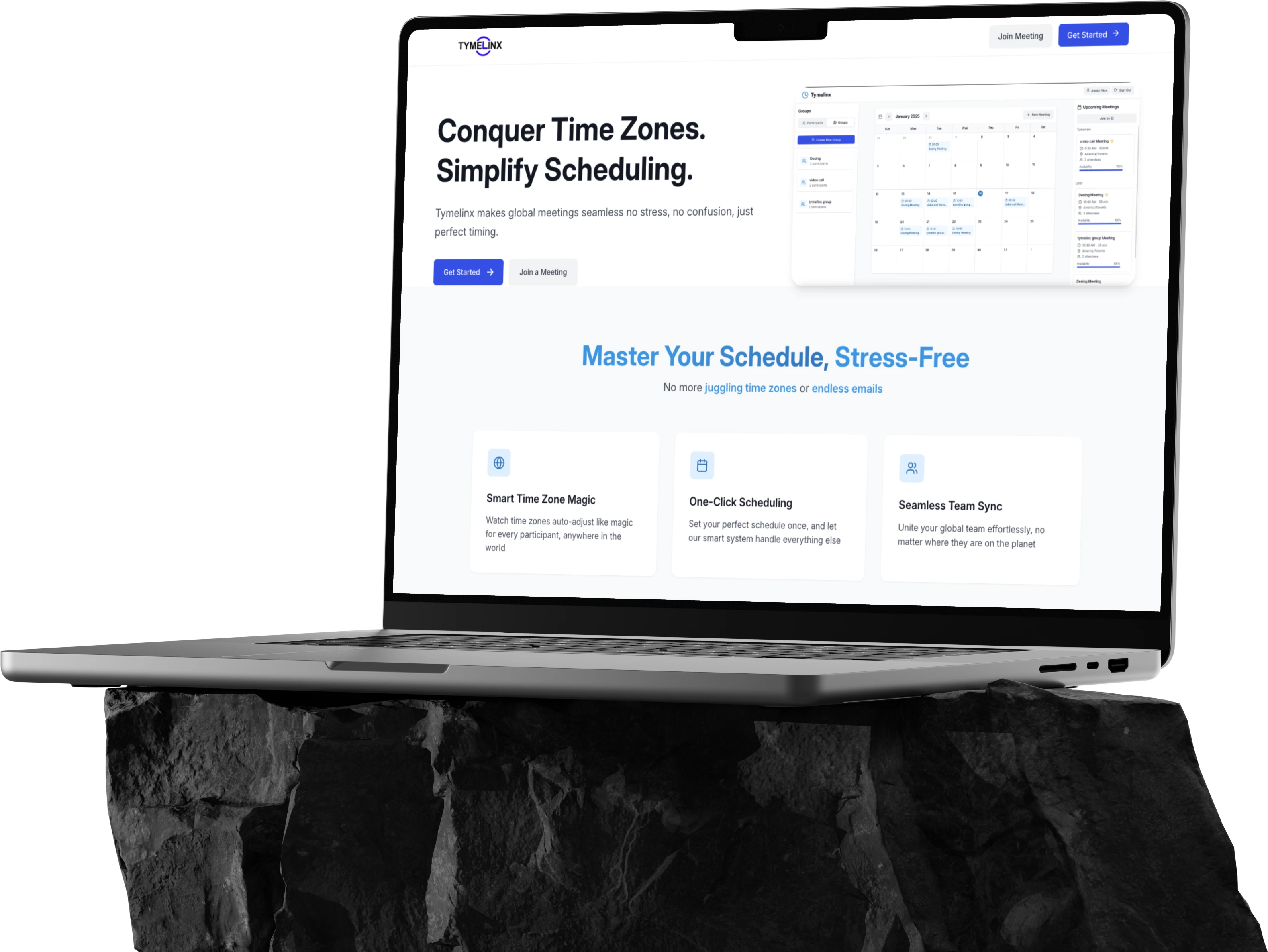
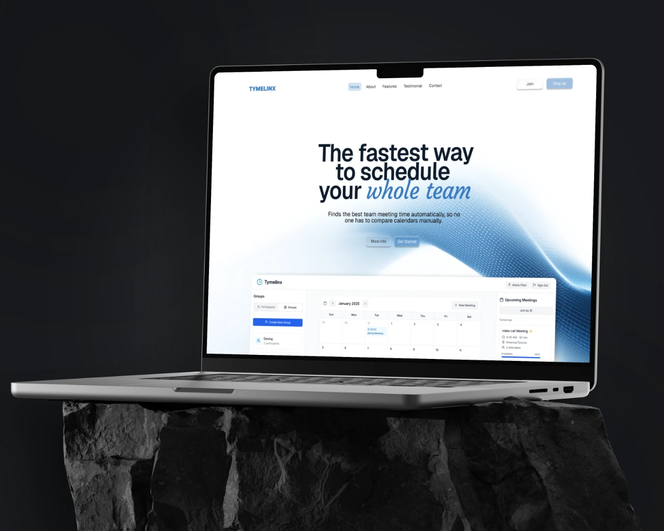
Redesigned Tymelinx hero section.
Redesign Goals
The redesign aimed to make the purpose of the product instantly obvious while giving the brand a more polished and trustworthy look. To do that, I rewrote the messaging around a stronger and more direct value proposition, centered the composition to create a clearer reading flow, and introduced a more refined visual system to make the page feel more premium. I also made the product UI feel more connected to the message so users could immediately understand both the promise and the tool behind it.
Outcome
The final redesign gives Tymelinx a stronger first impression and makes the product easier to understand at a glance. The updated hero feels more modern, more intentional, and more trustworthy, with a clearer headline, better hierarchy, and a stronger connection between message and interface. Instead of simply presenting a scheduling app, the new hero positions Tymelinx as a focused solution for helping teams schedule meetings faster and with less friction.
Like this project
Posted Mar 8, 2026
A hero section redesign for Tymelinx focused on improving clarity, trust, and visual hierarchy to create a more professional SaaS landing page.
Likes
0
Views
29
Timeline
Mar 2, 2026 - Mar 8, 2026