Increasing Digital Revenue for Distrelec’s E-Commerce Platform

Aneeta Kumari

Project Overview
Role: UX/UI Designer
Duration: 6 Months
Team: Collaborated with 1x Head of Digital Product, 1x Project Manager, 1x Business Analyst, 1x User Researcher, 1x Scrum Master, 4x Developers, 2x Test Analysts
Client Overview
Distrelec, a leading distributor of electrical components and electronics, aimed to enhance the shopping experience for their UK customers by refining their basket and checkout processes.
Outcome & Impact
Achieved a €18.2M year-over-year increase in digital sales.
Improved registration completion rates by 6.7% with UX enhancements.
Increased checkout conversion rates from +0.43% (Q2 to Q3) to +1.4% (Q3 to Q4) in 2021.
Problem
Despite their continued success, Distrelec's UK e-commerce platform needed an update. High basket abandonment rates and a cumbersome checkout process highlighted the need for a revamp to align with best practices.
Objective
Our team's mission was to research, strategise, and design improvements for Distrelec's UK e-commerce platform. This involved optimising the basket and checkout process, reducing basket abandonment rates, streamlining the checkout experience, and ensuring adherence to industry best practices.
Solution & Process
I approached the project in three main phases: Empathise, Conceptualise, and Design.
1. Empathise
Goals
We needed to get into the shoes of our customers by understanding their pain points, needs, and expectations.
Actions
Started with a comprehensive audit of the existing webshop, involving 5 participants from the German market.
Conducted a competitor and SWOT analysis, identifying RS Components and Mouser as key competitors and noting missed opportunities, such as express or guest checkout options.
Analysed web analytics to pinpoint where users were dropping off in the basket and checkout process.
Shared insights with stakeholders.
2. Conceptualise
Goals
With a clear understanding of our users, it was time to shape a strategy to improve their experience.
Actions
Gathered and organised data from our primary research.
Categorised these insights and presented our findings to stakeholders.
Created a customer journey map to highlight pain points and opportunities in the basket, registration, checkout, and payment steps.
Created a customer journey map highlighting pain points and opportunities within the basket, registration, checkout, and payment steps.
Prioritised customer pain points and opportunities with stakeholders, identifying key areas for improvement:
3. Design
Goals
Develop and test prototypes for a seamless checkout experience.
Actions
Clarified project requirements, including the need for advanced prototypes, responsive designs, and a design system.
Created high-fidelity wireframes and prototypes for the entire checkout journey, covering basket, customer registration, and guest checkout.
Conducted user testing on the redesigned checkout redesign.
Developed Distrelec’s Design System to ensure consistency and efficiency, laying the groundwork for high-fidelity wireframes and prototypes.
Redesigned basket experience to show line-level delivery dates, product availability, and improved accessibility.
Reduced drop-off rates and increased registration completion by implementing inline validation, reducing input fields, and enhancing accessibility.
Lowered checkout abandonment rates by redesigning the checkout process for new B2B & B2C, returning B2B & B2C, and guest users, following industry-standard UX best practices.
Conducted A/B testing to validate the success of the guest checkout and preferred designs, recommending Design A for its clean and familiar pattern.
Tools and Techniques
Used Figma, Miro, Adobe & Google Analytics, and Hotjar, also collaborated with third-party user research parties for usability tests, MVT, and A/B testing.
Project Takeaways & Challenges
Collaboration during the research stage was both enjoyable and productive. It also provided visibility across other workstreams, ensuring consistency throughout the project.
Regularly bringing the product team together enhanced UX maturity and improved ways of working within the business.
Assisting with MVT helped us evaluate CTA terminology, improve the visual hierarchy of the Terms and Conditions acceptance box, and provide guided help for password resets. This optimisation led to better user comprehension and interaction.
Signing off most accessibility changes proved difficult as stakeholders wanted to test and ship fast. Therefore, accessibility improvements (e.g. button colours) were put into the backlog along with the design system, which was handed off to the permanent team to further iterate. Sometimes I pushed back by collaborating with developers to see if it feasible to ship as part of the sprint and relay this back to the stakeholders in the teams retro sessions.
UI Designs
The team worked agile meaning we were able to test and ship iterations fast.
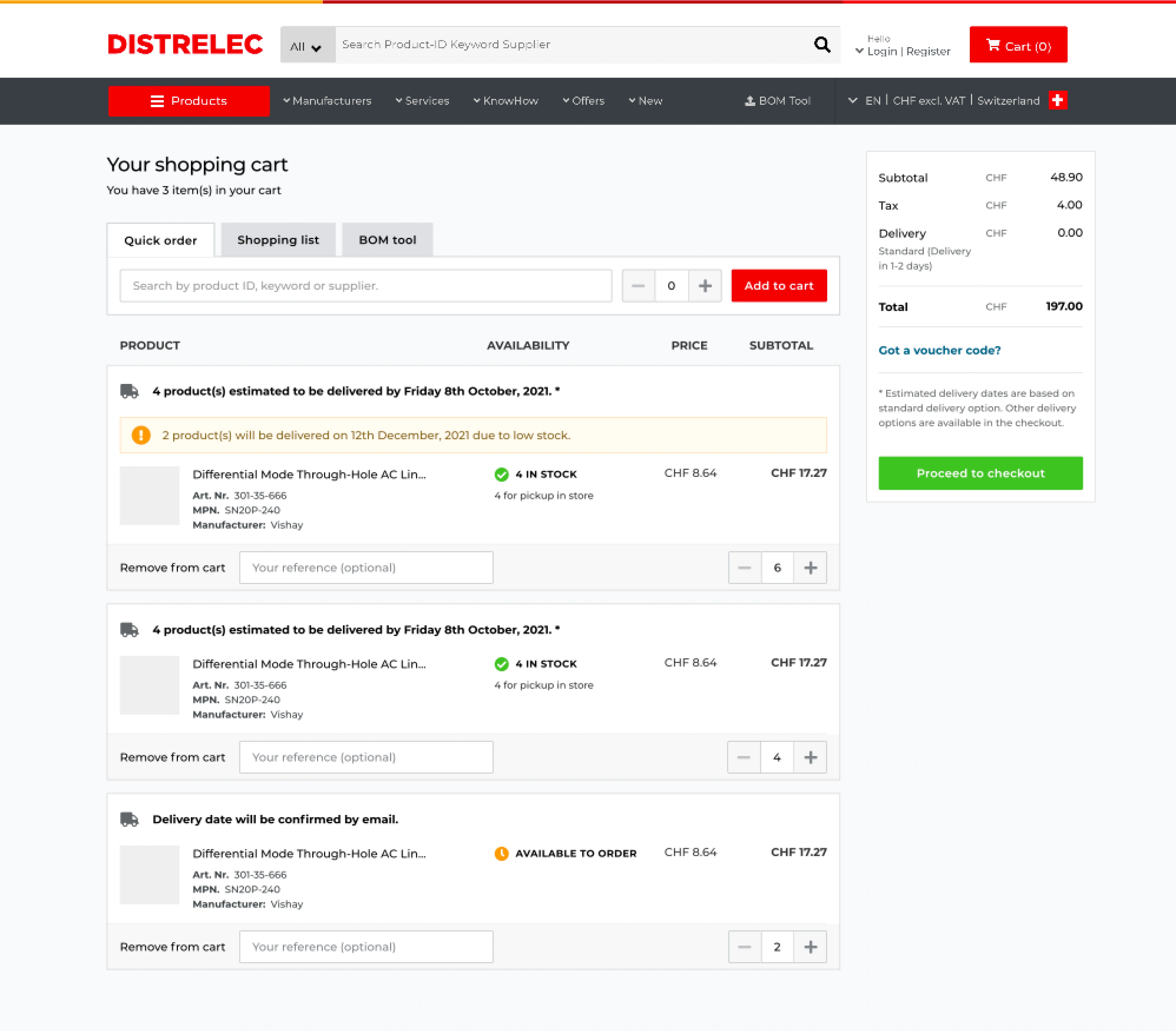
Shopping Cart (Before)
Basket (Before)
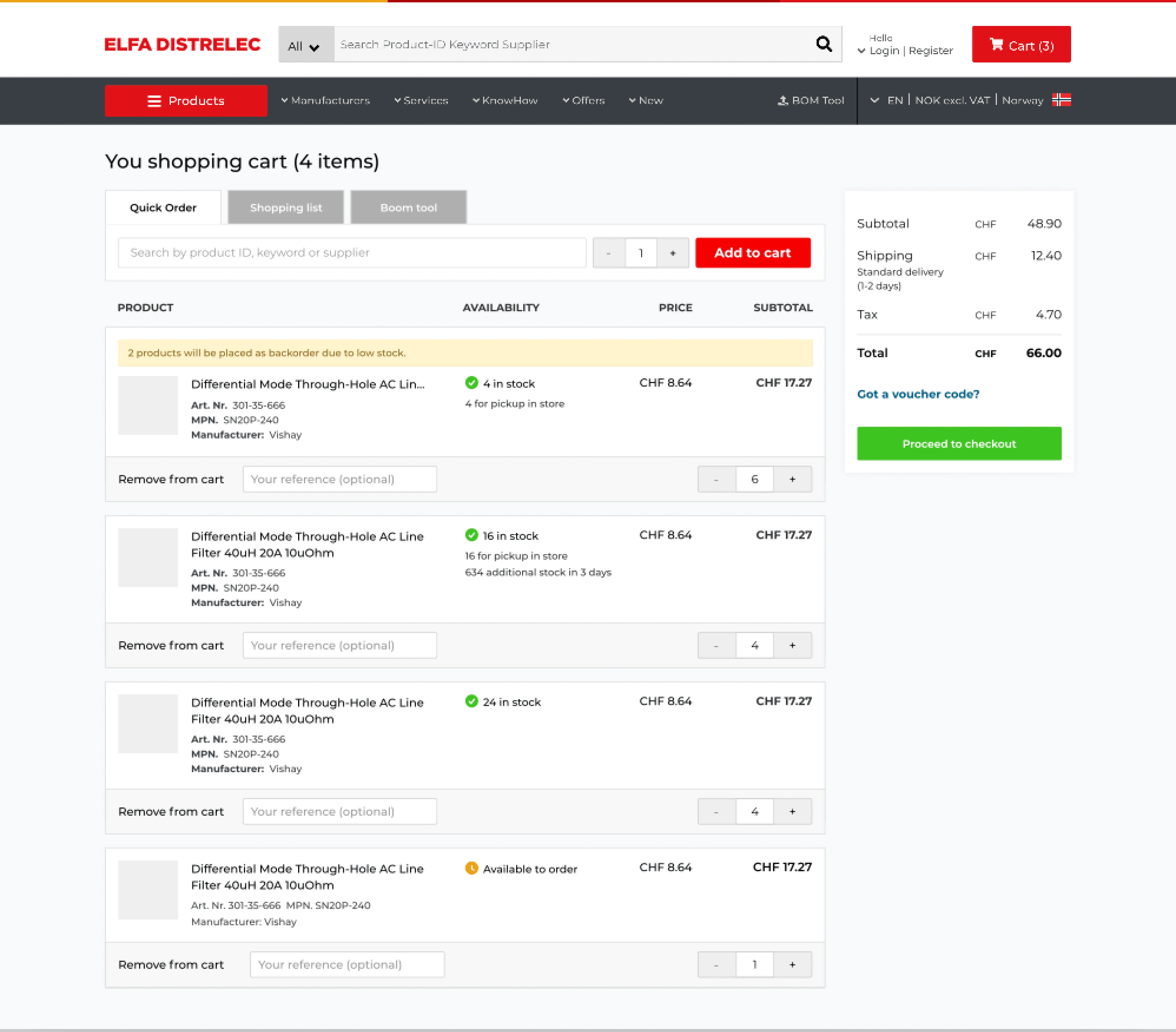
Shopping Cart (After)
Show the line level delivery date for each item.
Show product availability and back ordered items.
Improve accessibility.
Basket (After)
Customer Registration (Before)
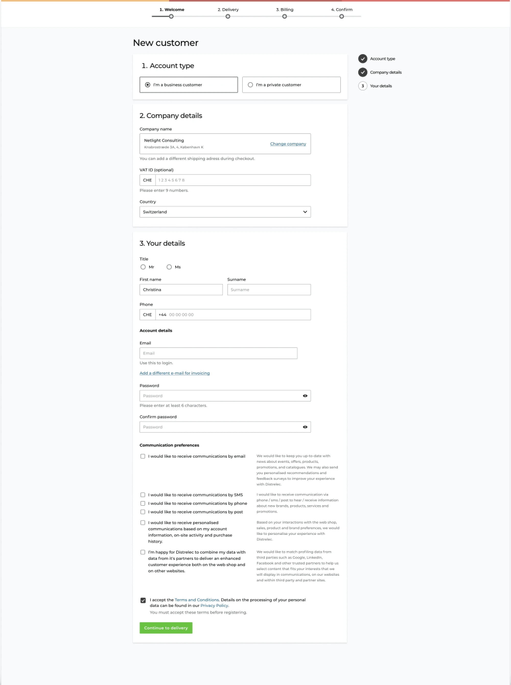
Account Creation (Before)
Customer Registration (After)
Show in-line validation.
Reduce input fields.
Used initial checkout styling.
Improve accessibility.
Account Creation (After)
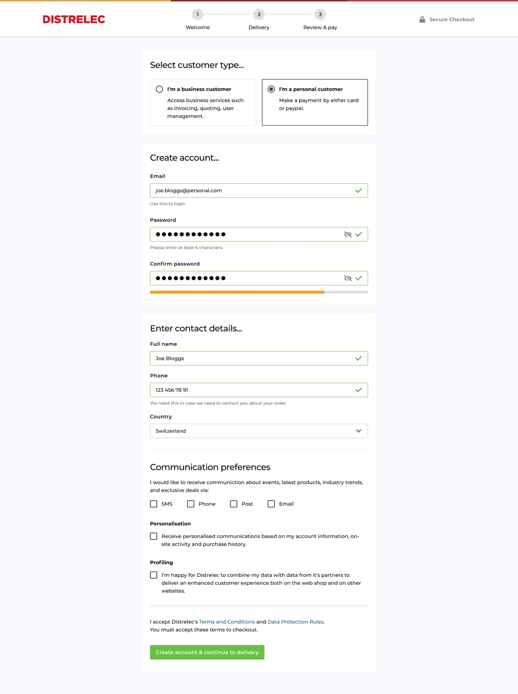
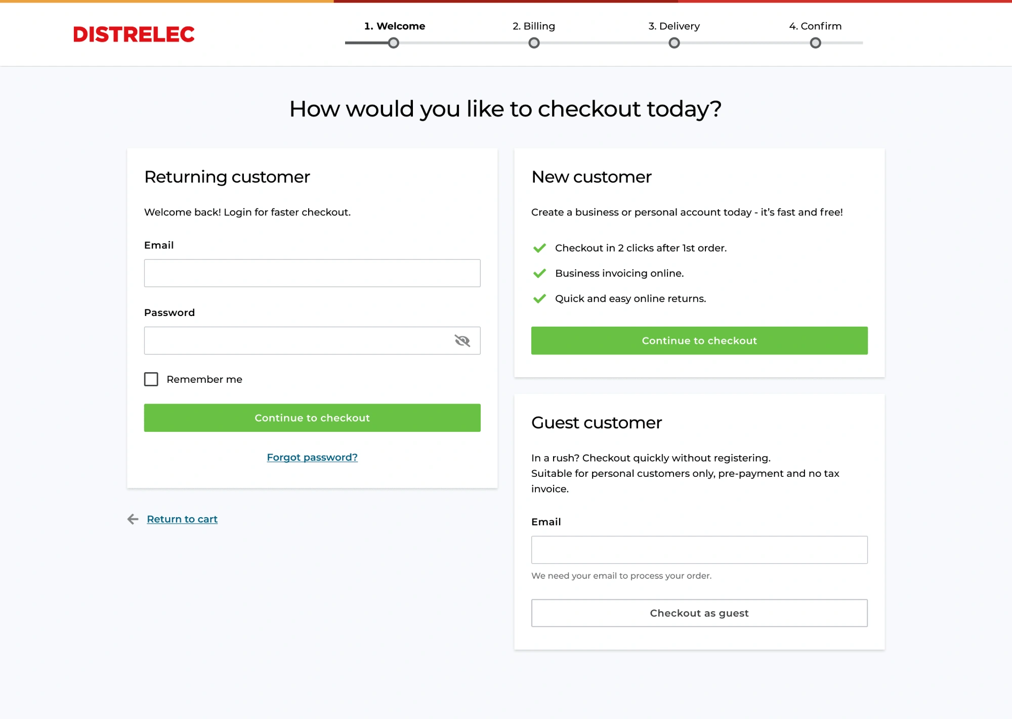
Checkout Login (Before)
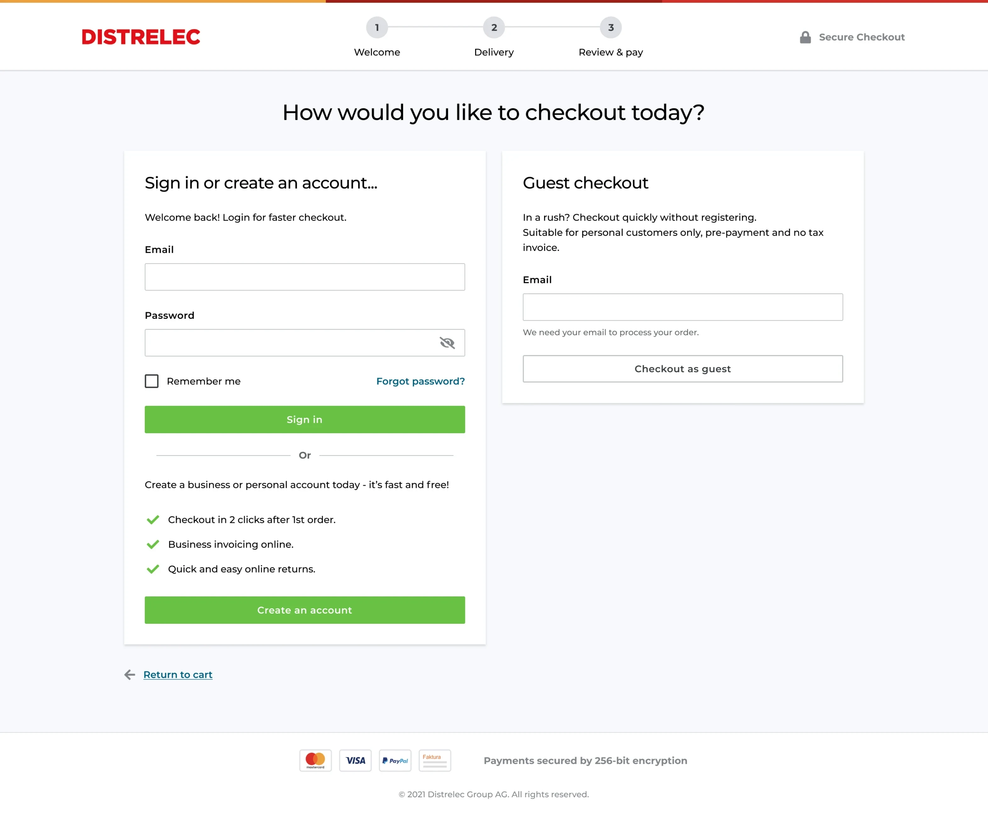
Checkout Login (After)
Conducted A/B testing to see which design is preferred by customers.
To help increase conversion for first-time buyers.
To help increase conversion for B2C customers.
Recommended Design A, as it was a more common and clean pattern to present users with checkout options.
Design A
Future State (After)
Design B
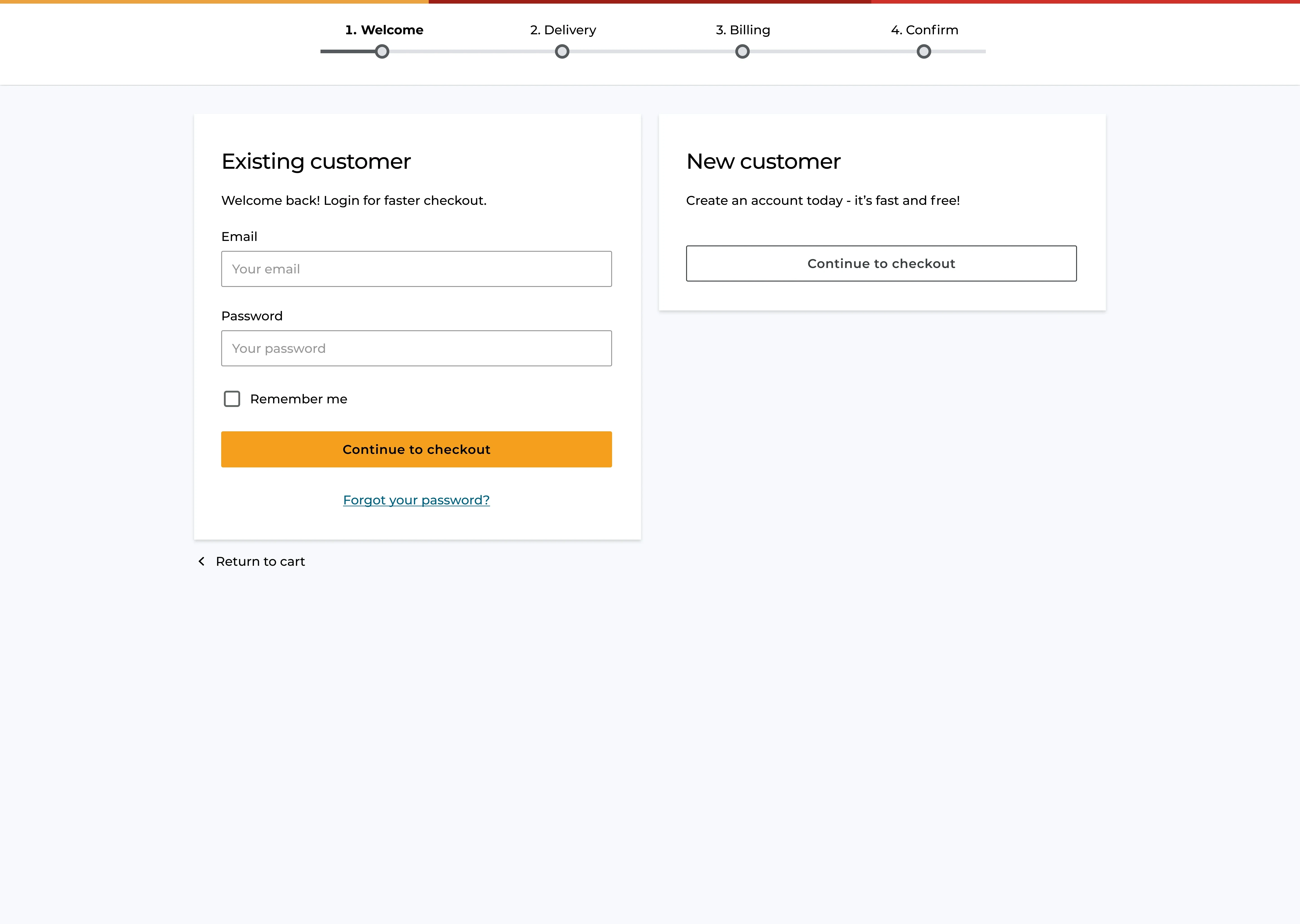
Checkout (Before)
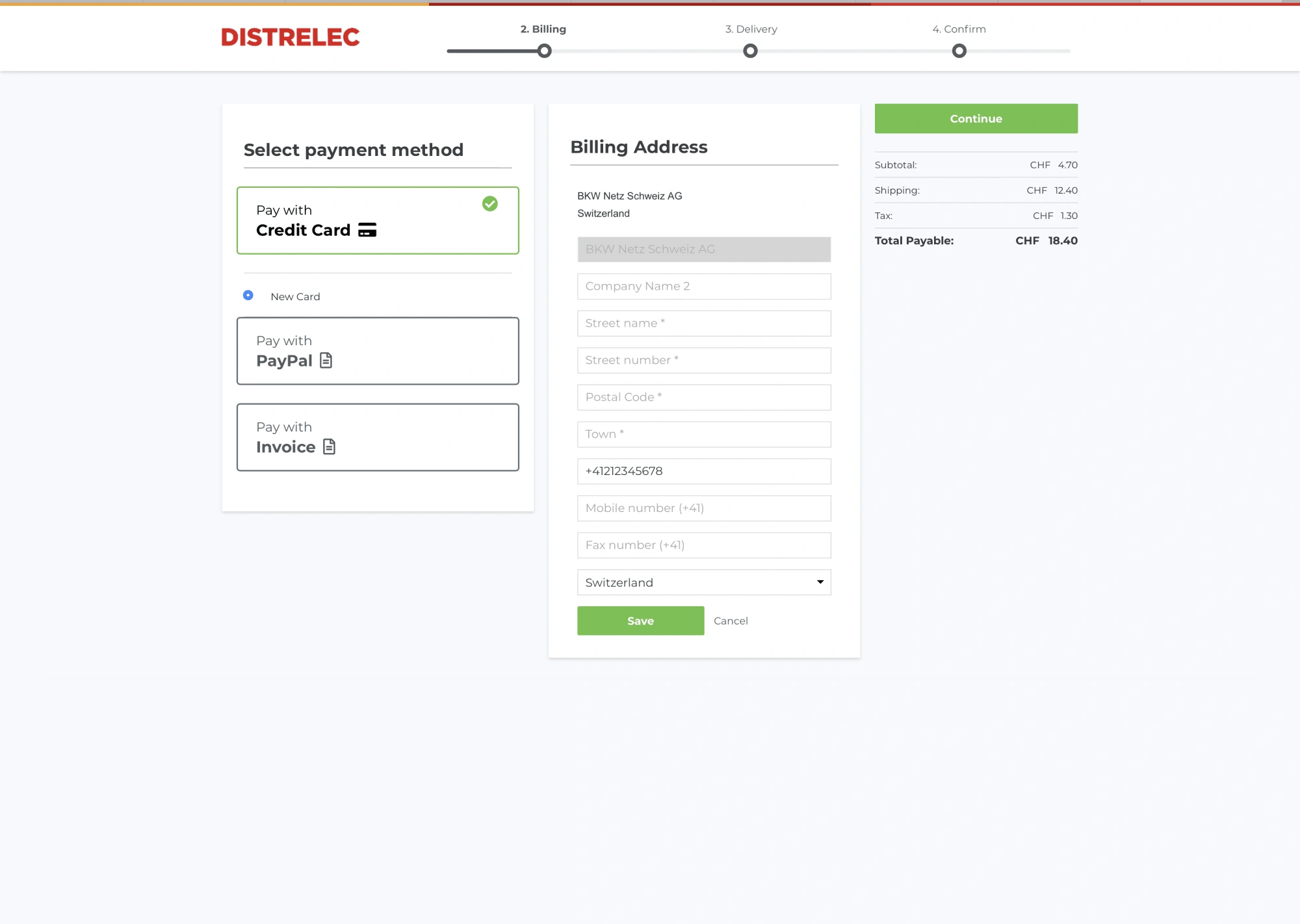
Checkout (Before)
Checkout (After)
Iterated designs on all user flows, new B2B & B2C, returning B2B & B2C, and guest.
Used industry standard UX best practises.
Show mini basket and access.
Improve accessibility.
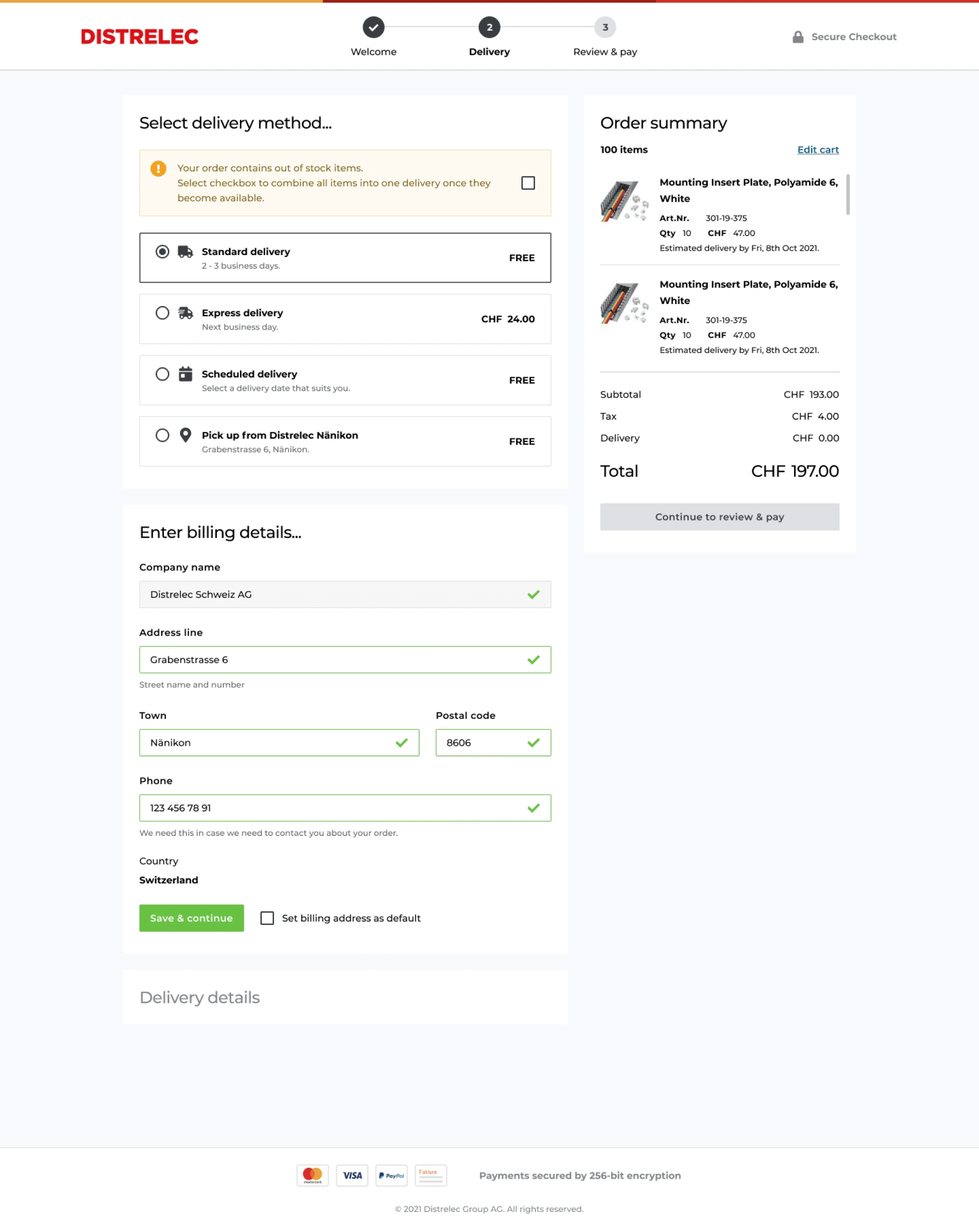
Checkout (After)
Like this project
Posted Sep 16, 2025
One of Europe’s leading technical components distributors, Distrelec needed my expertise to streamline checkout flows and enhance the registration process.
Likes
0
Views
20
Clients
Distrelec