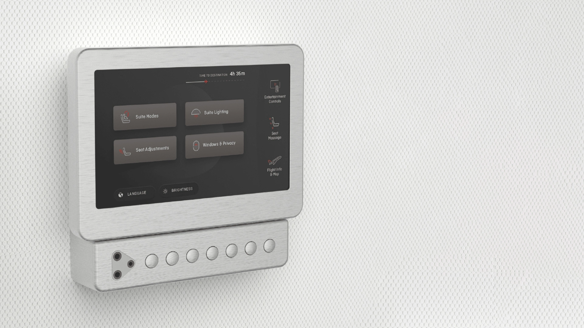
Qantas 787 Controllor

Project Overview
The project's goal was to design a control panel interface that was intuitive, aesthetically pleasing, and functional, providing passengers with a seamless way to interact with their environment during flights.
Research
We began by collaborating with Qantas stakeholders, staff, and cabin crew to understand the needs and pain points of using on-board control panels. This research was crucial in planning out every on-screen interaction. Even got invited to climb aboard a brand new plan to experience it all

Design Challenges
The design team faced several challenges, including:
Ensuring the interface was intuitive for first-time users.
Organizing content in a way that was easy to navigate.
Incorporating animations that guide the user without overwhelming them.
Design Process
Prototyping
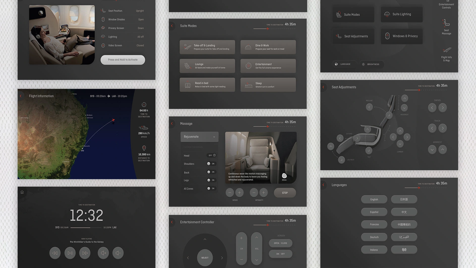
Developed wireframes to map out the user journey, focusing on flow and ease of use. This stage involved detailed planning of each interaction within the control panel. Then creating a simple prototyping to validate these flows
Visual Design
The visual design phase aimed to create a premium look and feel that aligned with Qantas' brand. It included the selection of color schemes for light and dark modes and the design of simple graphics to enhance content comprehension.
Animation
Subtle animations were introduced to guide users through their interactions, ensuring that the interface was engaging and informative.
Solution
The final design featured:
A user-friendly interface with easy-to-use chair controls.
A choice between light and dark mode for passenger comfort.
Animated elements that provide feedback and direction to the user.

Conclusion
The approach to the Qantas 787 Controller project demonstrates the importance of user-centered design in aviation. By focusing on the end-user experience, we delivered a product that not only meets the functional needs of passengers but also enhances the overall brand experience of Qantas.
Like this project
Posted Jan 11, 2024
Tasked with creating an on-screen experience for the control panels in the Business Class section of Qantas' first 787 aircraft.


