B2B Health tech rapid iteration to find product market fit

Led design and product efforts that grew to serve
100+ clinics, 1300+ providers and 8000+ members
AI-enabled Health Service in Medication Tapering and Pain Reduction
The opioid epidemic is a complex problem. Lucid Lane’s vision is to reduce medication and substance dependance through personalized data insights with a evidence-based clinical program.
We use a ML platform to analyze data from a variety of sources: clinical trials, drug interactions and side effects, prescription databases and patient’s self-reported health signals and send patient-specific insights to doctors in real-time.
To help members cope with pain, we have built an AI-enabled counseling program where members can get personalized pain coaching in a scalable way.
Are We Building the Most Impactful Thing for the Business Right Now?
While my title was Director of Design, I was hands on with a lot of the work, bringing a user-centered perspective to both the product and design direction. It’s hard to tell the story of a Series A startup, we were running a million miles a minute with constantly shifting priorities. Despite this, I kept my work grounded by keeping close to the business priorities while laser focused customer needs.
The products we built, at its core, used the power of data and technology to give doctors, patients and therapists a dynamically learning system that adapts to changing needs in real time.
For Providers - Doctors Who See Patients at Pain and Surgery Clinics
Doctors have precious few minutes to review a patient’s record before their appointment. They need to know:
• Is this patient at risk?
• How is their dosage strength trending over time?
• Are they prescribed benzos on top of opioids, and when?
• What class of drugs have they been prescribed, when and by whom?
My design approach was to convey all this information at a glance. Keeping the colors muted except for pertinent information, doctors can scan the page from top to bottom and all of these questions can be answered without reading any words on the page.
Patient profile on the provider view shows, at a glance, the patient’s the level of risk, the strength and type of drugs prescribed and prescription details
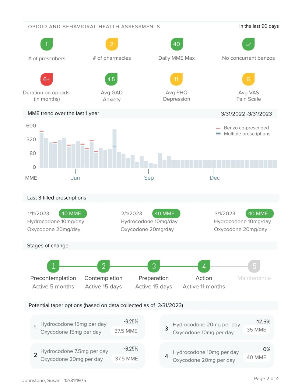
Our taper recommendations were sent via fax to the doctor’s EHR. One consistent challenge is deploying technology solutions in a ‘fax and paper’ environment. In this example, the recommendations came from ML technology but we delivered it to doctors on paper.
For Members - The Patients Who Came to Us to Manage Their Pain and Medication Dependance
The mobile app is the primary way our members managed their time with Lucid Lane. The design goals on the app was to make it consumer friendly and easy to use, and tap into the intrinsic motivation members have to reduce pain and live a full life.
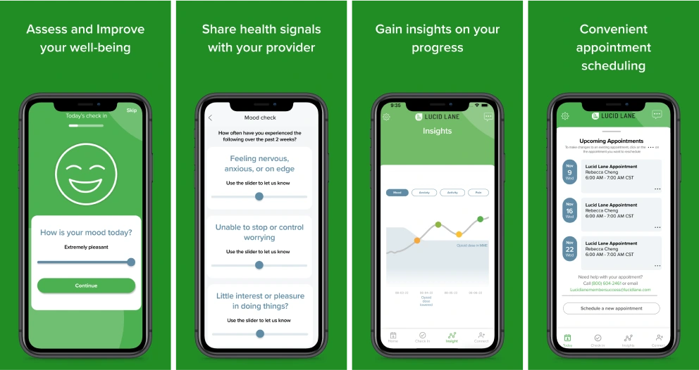
Daily Check-in
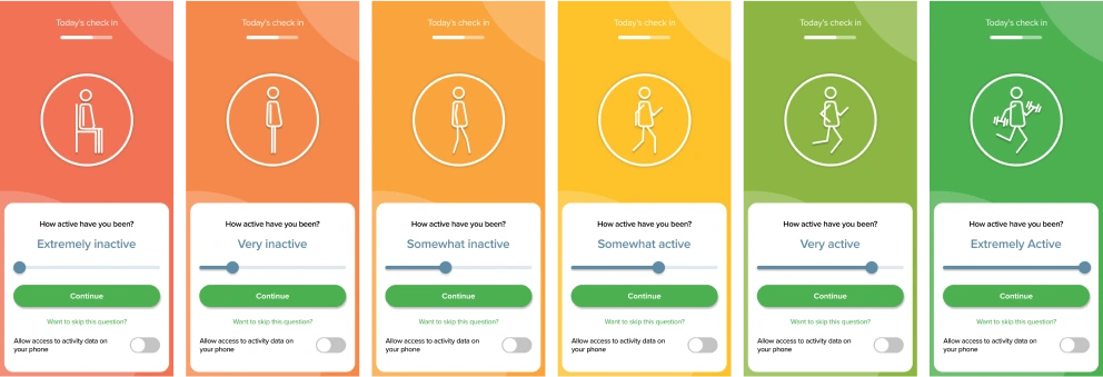
A member’s health signals are an important part of the equation for both the ML prescription recommendation and their one-on-one counseling. Design for the Daily Check-In focused on simplicity, bold colors and fun graphics. The gradient as you moved the slider acknowledged a member’s wellbeing is on a spectrum and changes continuously.
Counselors - The Service We Offered to Bridge the Gap Between Doctor’s Visits
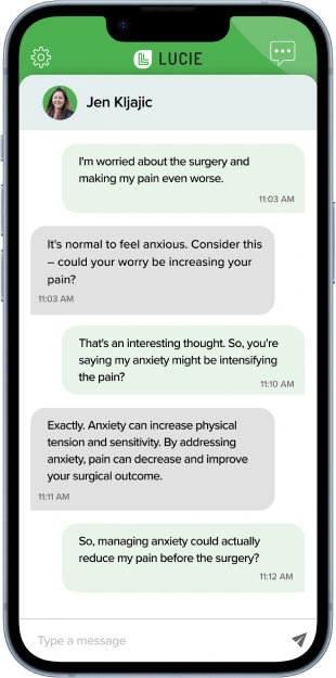
LUCIE™ - AI-enabled, daily access to therapists for advice, support, counseling and exercises
Lucid Lane counselors run a evidence-based pain-coaching program that teaches members skills on chronic pain management. We built an bespoke EHR and an AI-enabled chat that scaled our therapy program beyond the one-on-one sessions.
Clinical Portal - A Custom Electronic Health Record (EHR) for Chronic Pain Management
I designed the EHR from the ground up - From the information architecture to every single feature.
The two most impactful features are Counselor Availability and Clinical Notes. Counselor Availability decreased referral-to-onboarding time by 30% and Clinical Notes reduced the hours counselors needed to complete notes after a session by 67% YOY and decreased late submissions by significantly.
I went through many iterations to simplify the scheduling process. The design goal for Counselor Availability was to create an easy ‘search then click-to-book’ tool that can all be done all on one page.
Scheduling is complex. It’s not just finding availability - we have to match for state licensing, insurance (not every counselor takes every insurance), timezones and service type (not every counselor supports every service we provide). Additionally, multiple people are booking off the calendar at a time so appointments change and move constantly.
This scheduling tool updates in real-time to show the current status in each time slot, and can be book by clicking on any ‘Free’ space with the green accent. For slots that are not available, a hover state shows additional details that admissions can use to ‘trade slots’ if they wanted.
The hardest puzzle to solve was resolving conflicts in recurring meetings. I designed this conflict resolution widget for the most commonly used options. With the launch of this widget, the time it took from ‘benefit verification’ to ‘scheduled’ decreased by 30%. Anecdotally, Admissions had high praise, saving them from having to use Slack to check with each other to manually resolve conflicts.
During a one-on-one session with a member, a counselor is doing multiple things: checking the service type, reviewing health signals, confirming diagnosis and medications, looking up patient information and most importantly, taking clinical documentation. Before this feature was built, everything you see on this page was found in different places. A counselor would be jumping from one page to another, and required and extra 30 minutes after each session to complete their notes in a third-party tool.
I put everything a counselor needed for pre-, during- and after-session all on one page. Counselors could focus on the member while in session and needed less time to complete their notes after. Post launch, we saw a 140% YoY increase in referral conversion and a 67% reduction in post-session note completion time.
Impact
This was just a few products I designed that scaled the company from an idea to 100+ clinics and 1300+ providers. We had tangible evidence through clinical trials and reduction in opioid use in our patient population that we made an impact on the 8000+ members we served. Taken all together, we had a 41% YoY increase in Net Promoter Score (NPS)
Like this project
Posted Feb 13, 2024
Foundational design for Electronic Health Records, AI-enabled therapy chat, patient engagement and care plan adherence, provider data visualization.
Likes
0
Views
19

