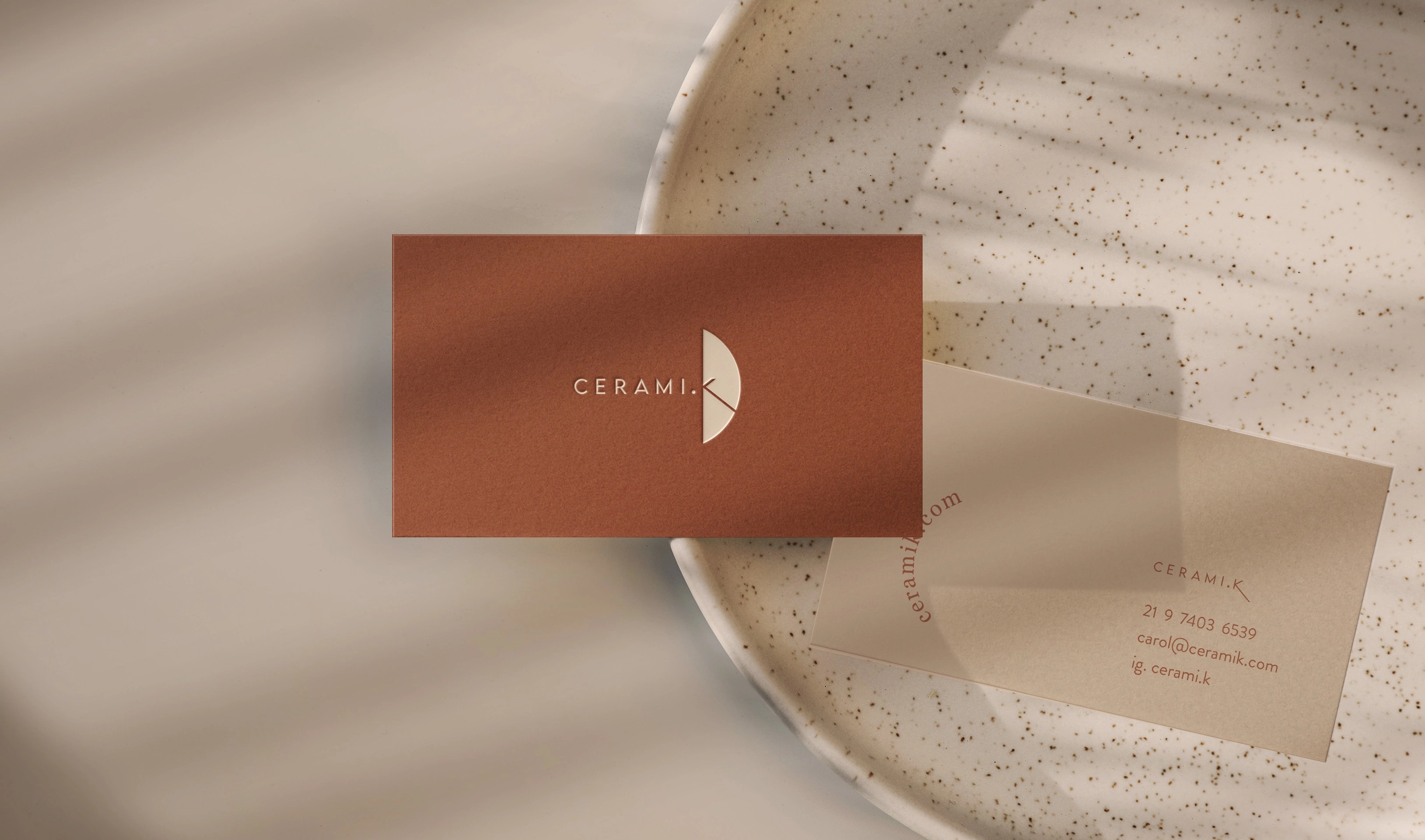
Ceramik | Brand Design 🤲🏽
Luna Uaná
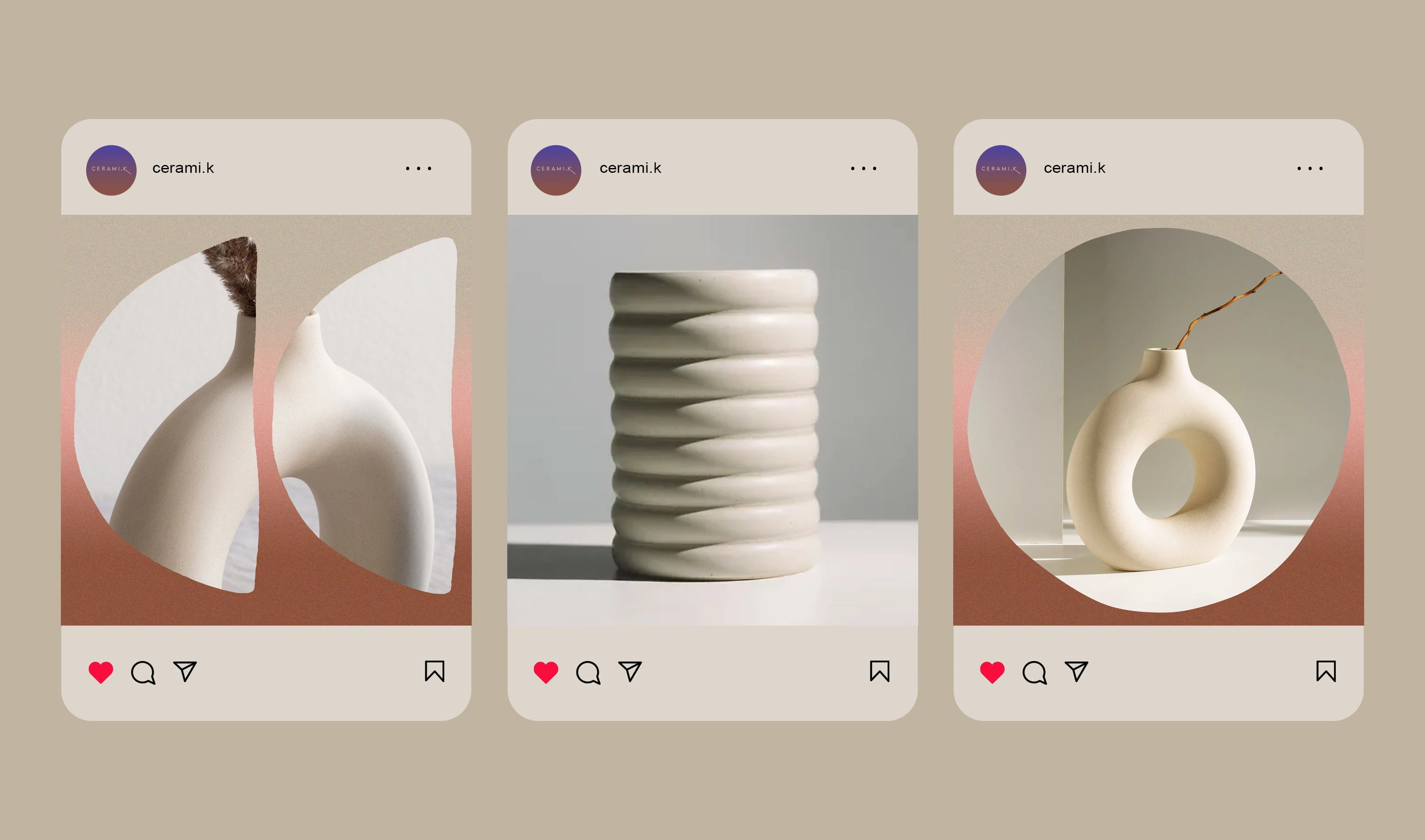
Brand design for a ceramics studio in Rio de Janeiro, Brazil.
When developing this visual identity, I aimed to highlight the elements that breathe life into the beautiful process of shaping clay with hands.
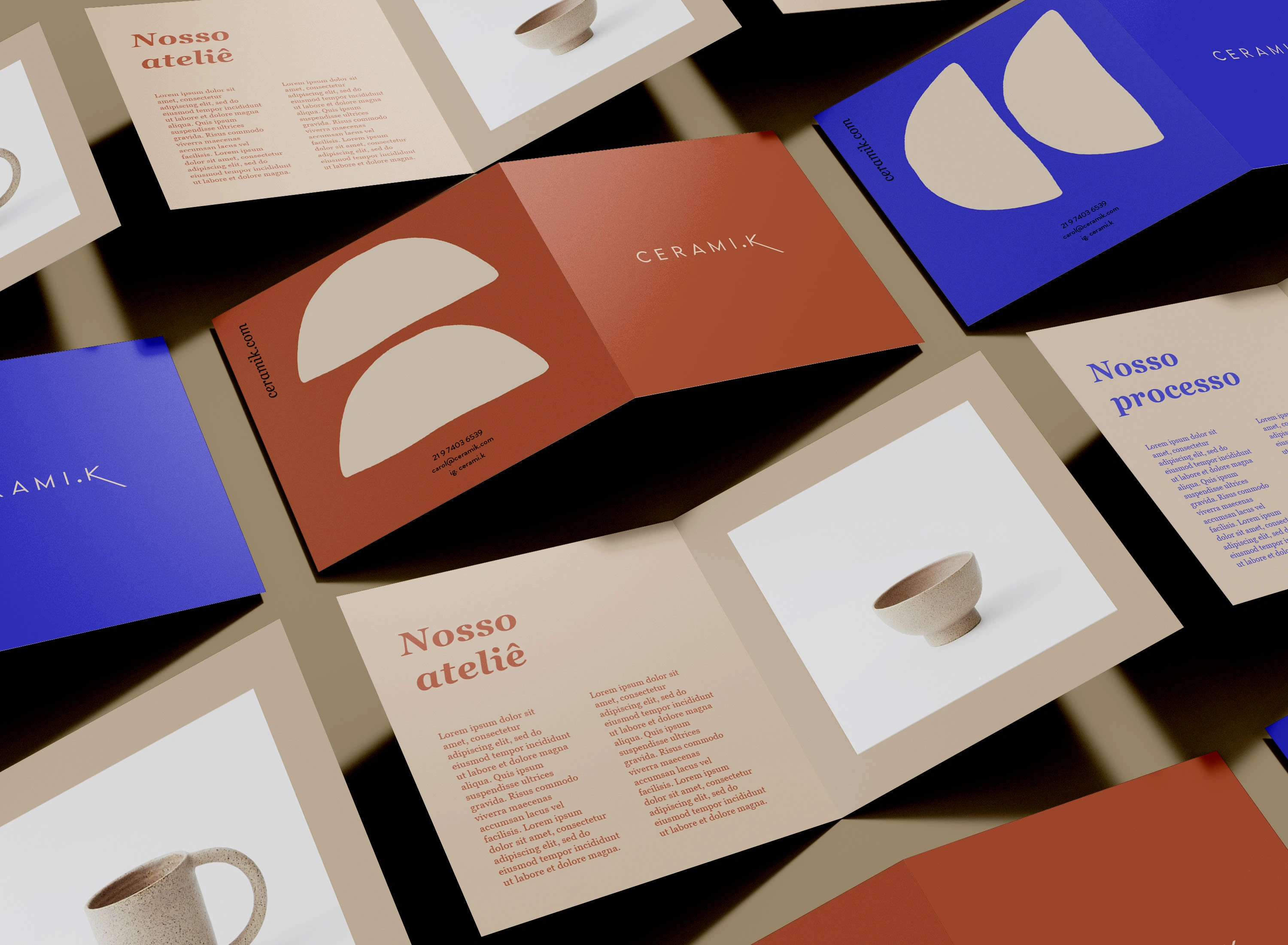
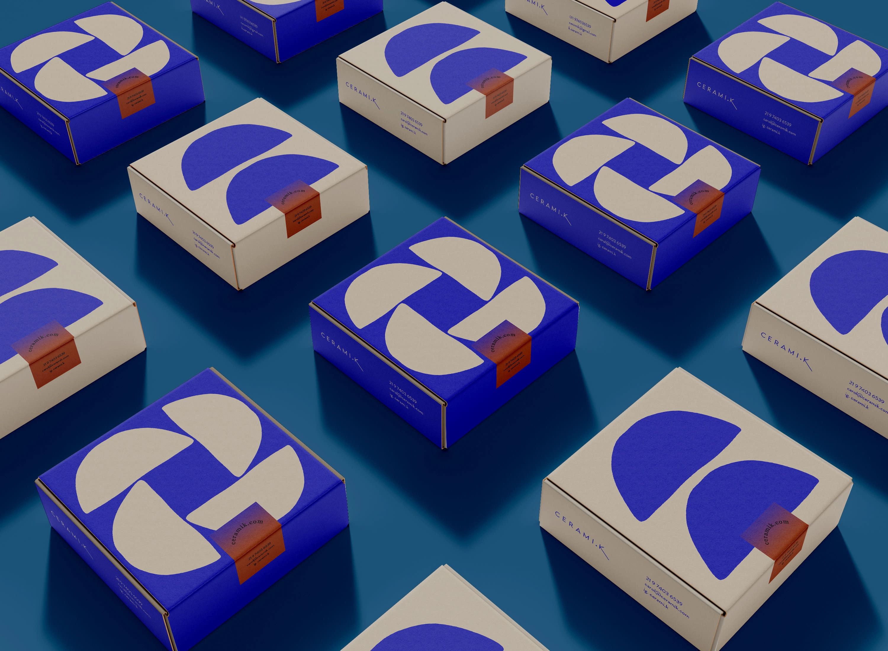
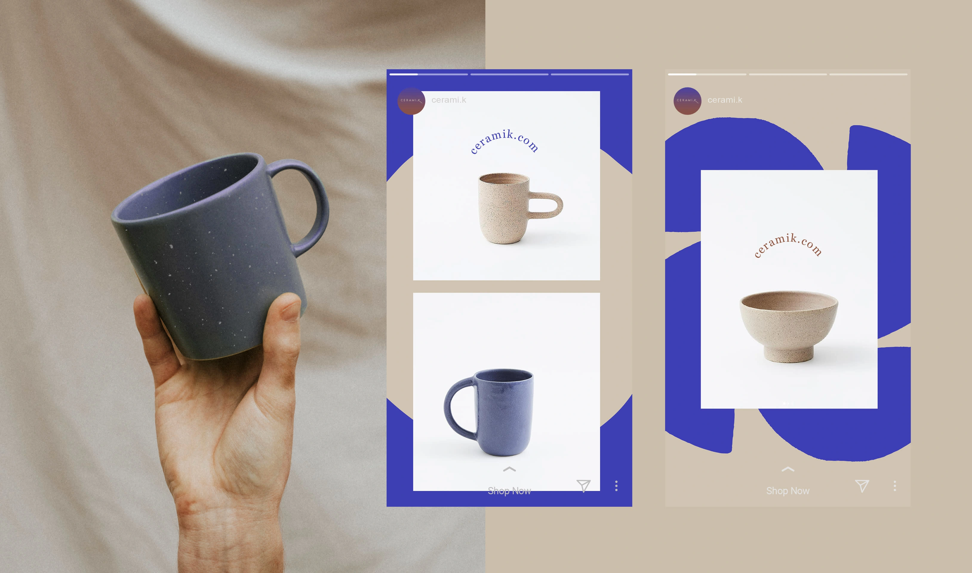
The color palette is inspired by the steps of the processes - from clay to the final piece.
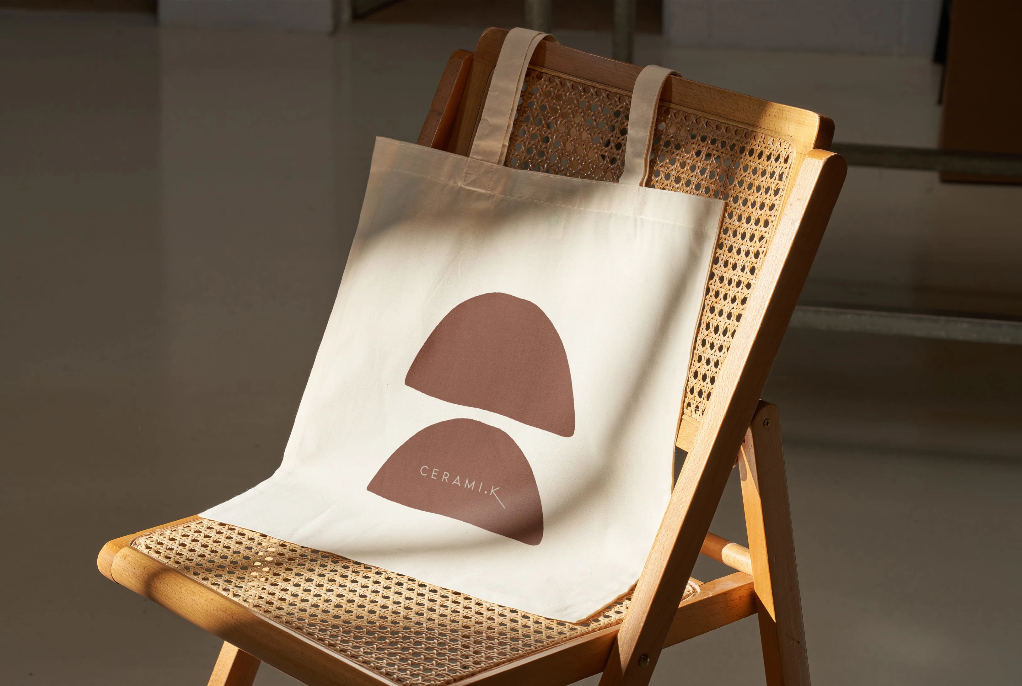
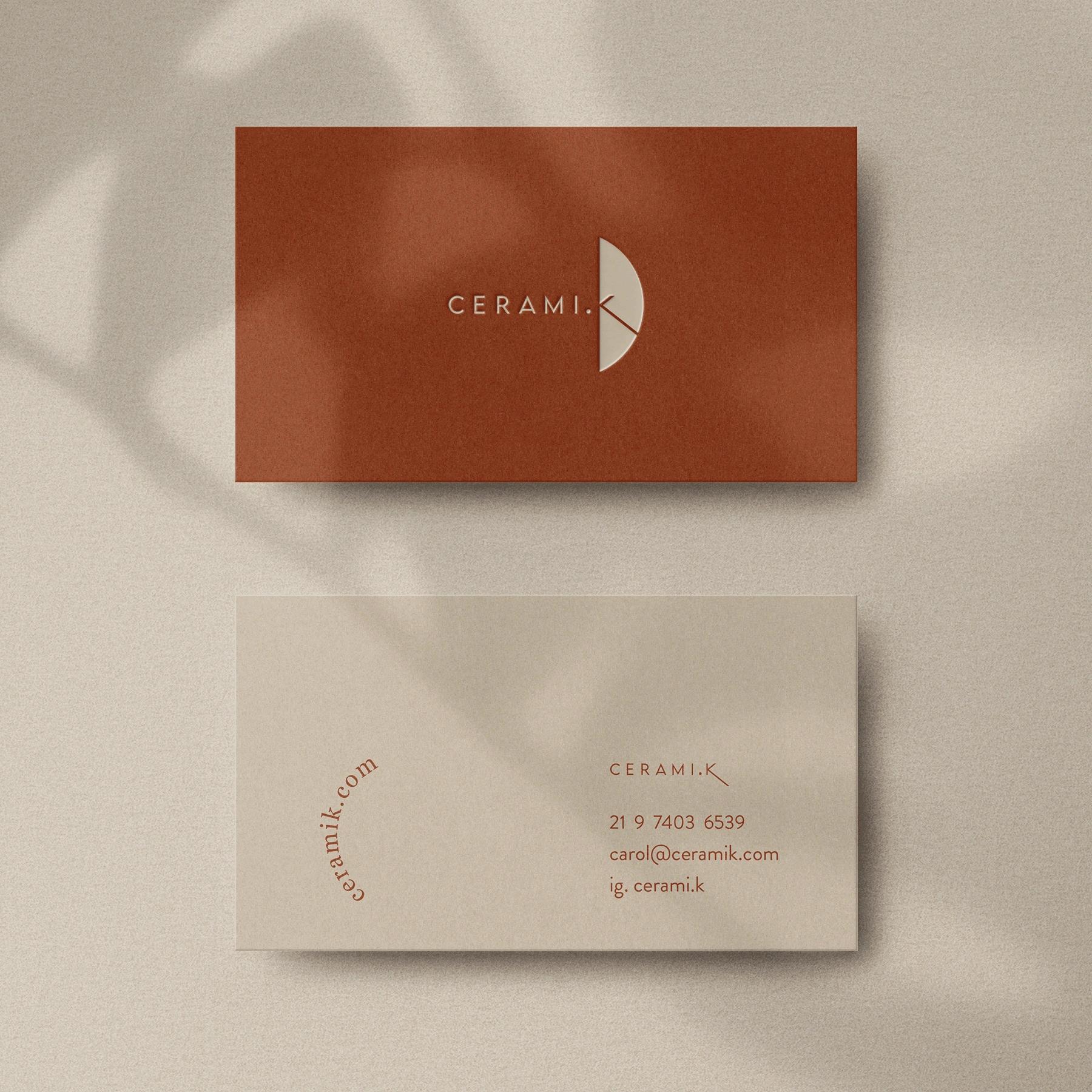
In terms of shapes, I incorporated the imperfect circle of clay, representing the origin of every single piece - the creation. The semi-circle symbolizes the piece that broke during firing but was not discarded - the act of repurposing.
After all, creating ceramics is more than just taming the elements; it's also embracing the beauty of its unexpected outcomes.
This is the result ✨
I would love the opportunity to help bring your vision to life and make your brand shine.
✨ Contact me here ✨
Like this project
Posted Feb 29, 2024
Brand design for a ceramics studio.