Riga International Film Festival 2017

Edgars Zvirgzdins


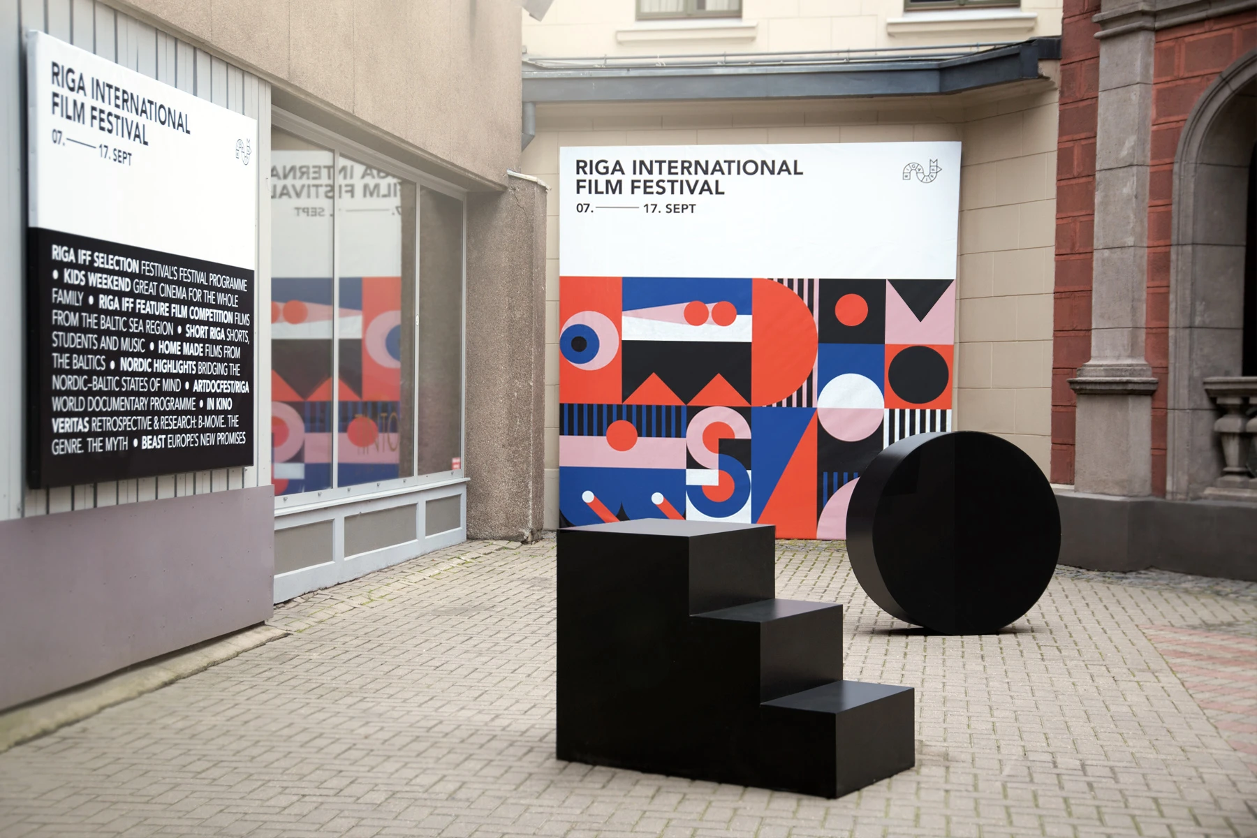
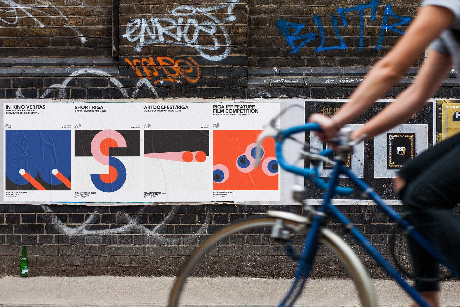
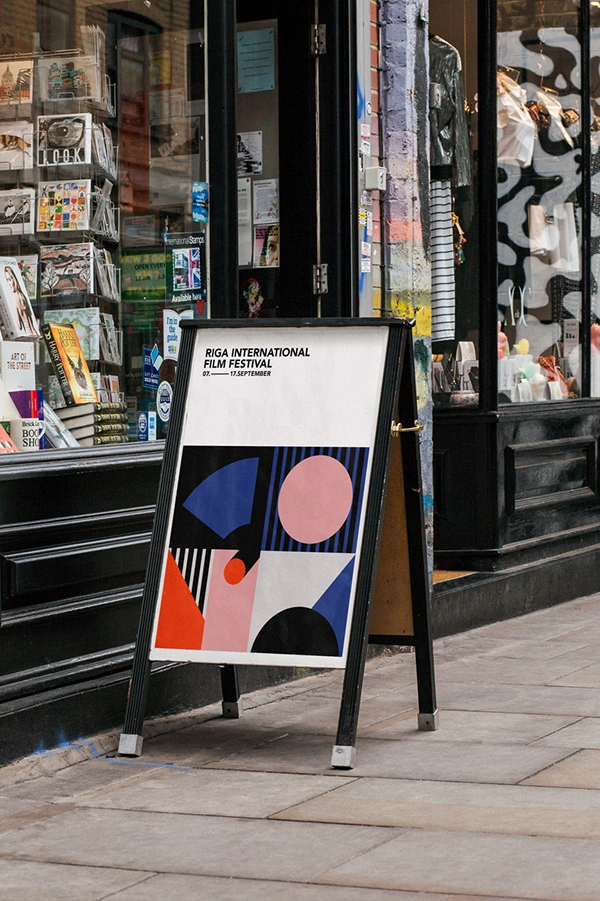
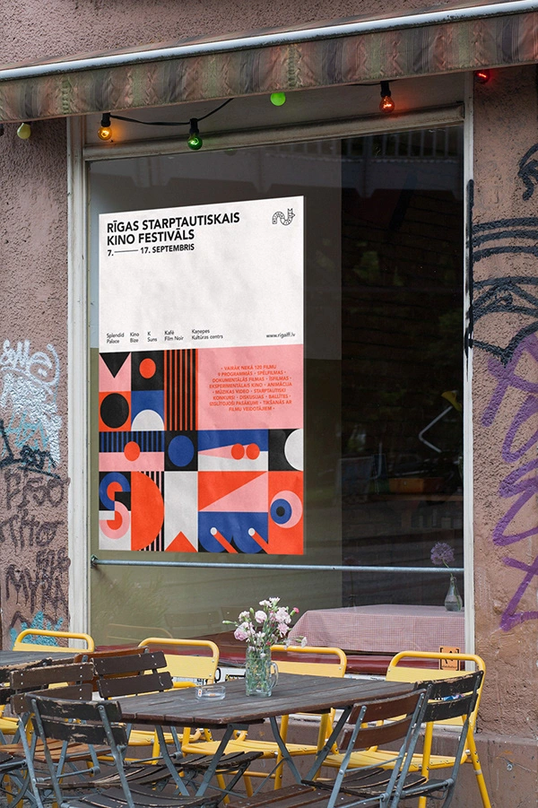
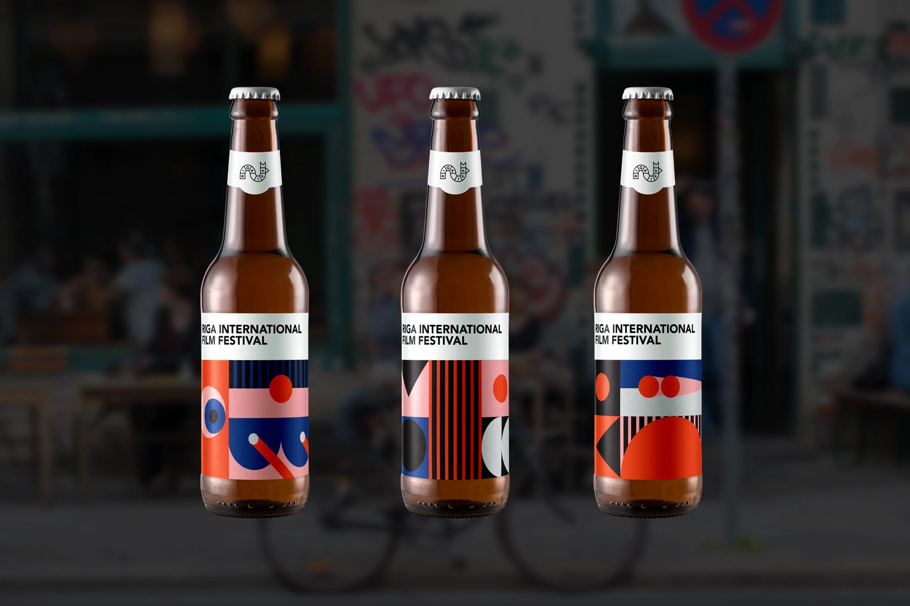
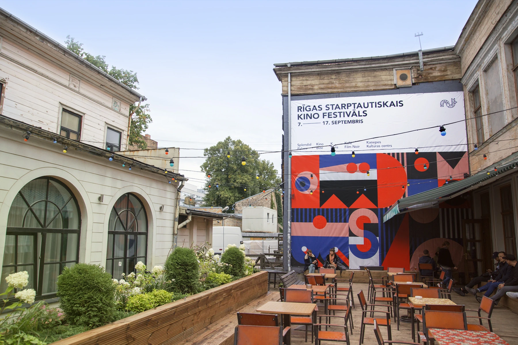
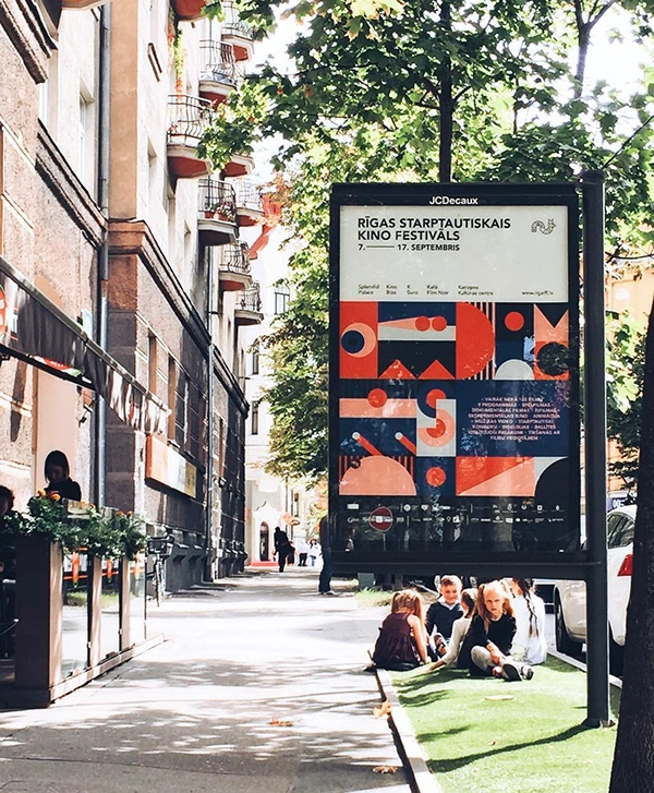
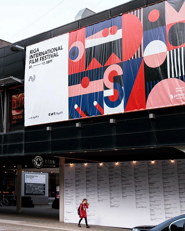
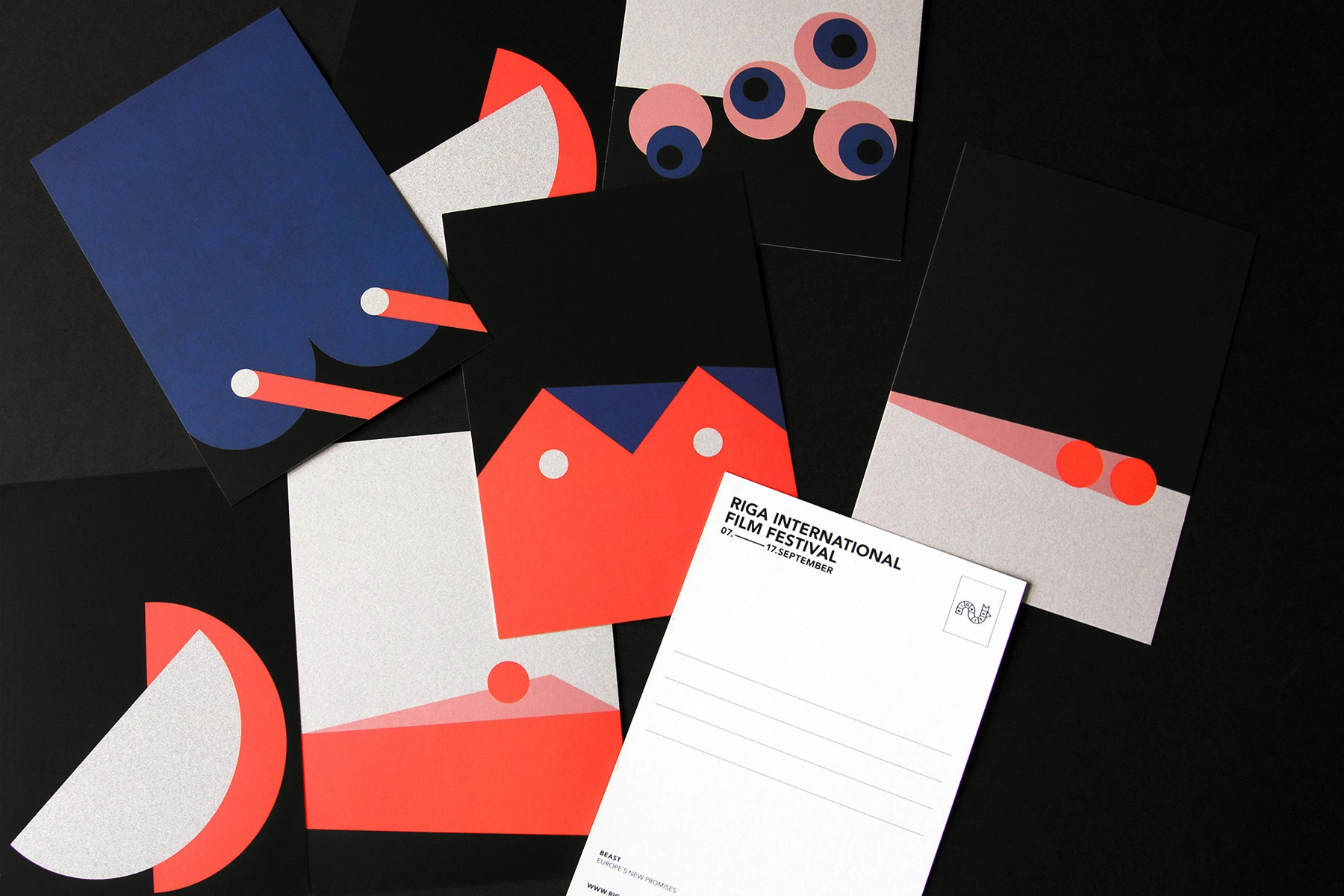
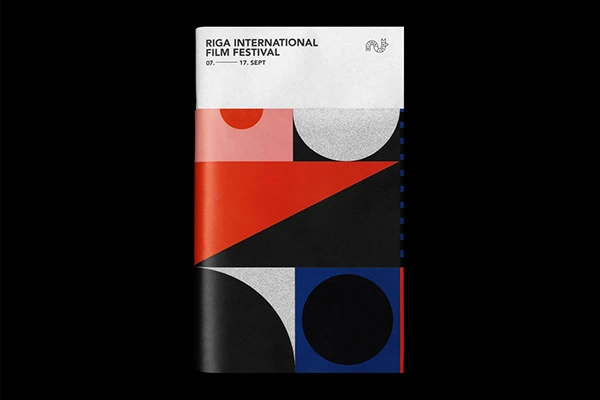
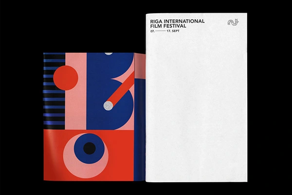
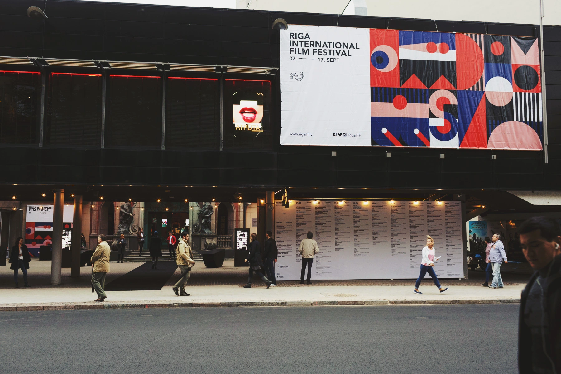
Visual identity for the Riga International Film Festival (RIGA IFF). We based the visual language of RIGA IFF 2017 on the already existing logotype, created by designer Zigmunds Lapsa.
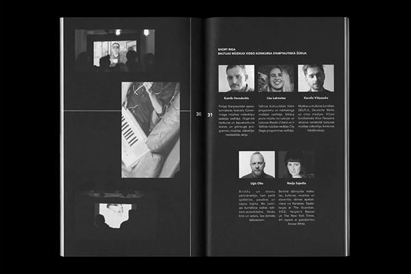
Our goal was to communicate the idea of the festival as a significant and very diverse event in which many different subcategories live within. Dismantling the logo into separate shapes and lines gave us the possibility to use them as the basic ingredients to create modules and patterns that would translate the story behind the festival and each of its nine different programmes. This approach also created the perfect circumstances in which the visual identity started to form its own visual language — a colourful, vibrant and very playful language, allowing to explore dozens of layouts and graphical combinations.
RIGA IFF 2017 brand identity received the Latvian Design Awards Grand Prix in 2018!
Associates, Partners et Sons, 2017
Follow us on Instagram:
Team:
Like this project
0
Posted Apr 16, 2025
Visual identity for the Riga International Film Festival (RIGA IFF). We based the visual language of RIGA IFF 2017 on the already existing logotype.


Leg&Go Balance Bike

«I (aswell) am a Latvian» Exhibition

Survival Kit 9

Riga International Film Festival 2020