Shopzy Multi-brand E-commerce Website Design

Ahmad S. Afandi
$4K+ earned

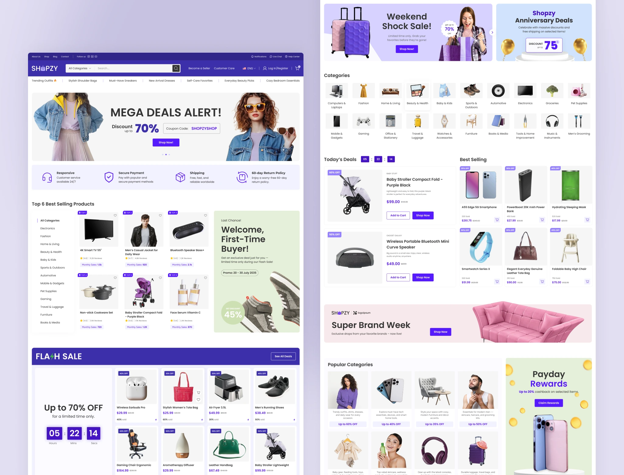
Shopzy - Multi-brand E-commerce Website Design
Most multibrand e-commerce sites end up feeling cluttered, boxy, and cramped, too many products, categories, and brand identities fighting for space in a template that wasn't built to hold them. Shopzy needed the opposite: room to breathe, without losing the clarity shoppers rely on to actually find what they want.
The approach
We threw out the usual padding-and-margin playbook and designed edge-to-edge at 1400px. It sounds like a small decision, but it changes how the whole site feels, hero banners stretch fully across the screen, product grids feel more open, and browsing feels closer to flipping through an editorial spread than scrolling a template.
The bigger challenge was structure. A multibrand catalog can get messy fast, so the mega menu and category system were built to scale from day one, meaning new brands and product lines can slot in later without breaking the layout or confusing shoppers.
What's included
12 pages, covering the complete customer journey from first click to checkout:
Homepage (3 variations), About, Shop, Categories, Single Product, Cart, Checkout, Blog, Single Post, Contact.
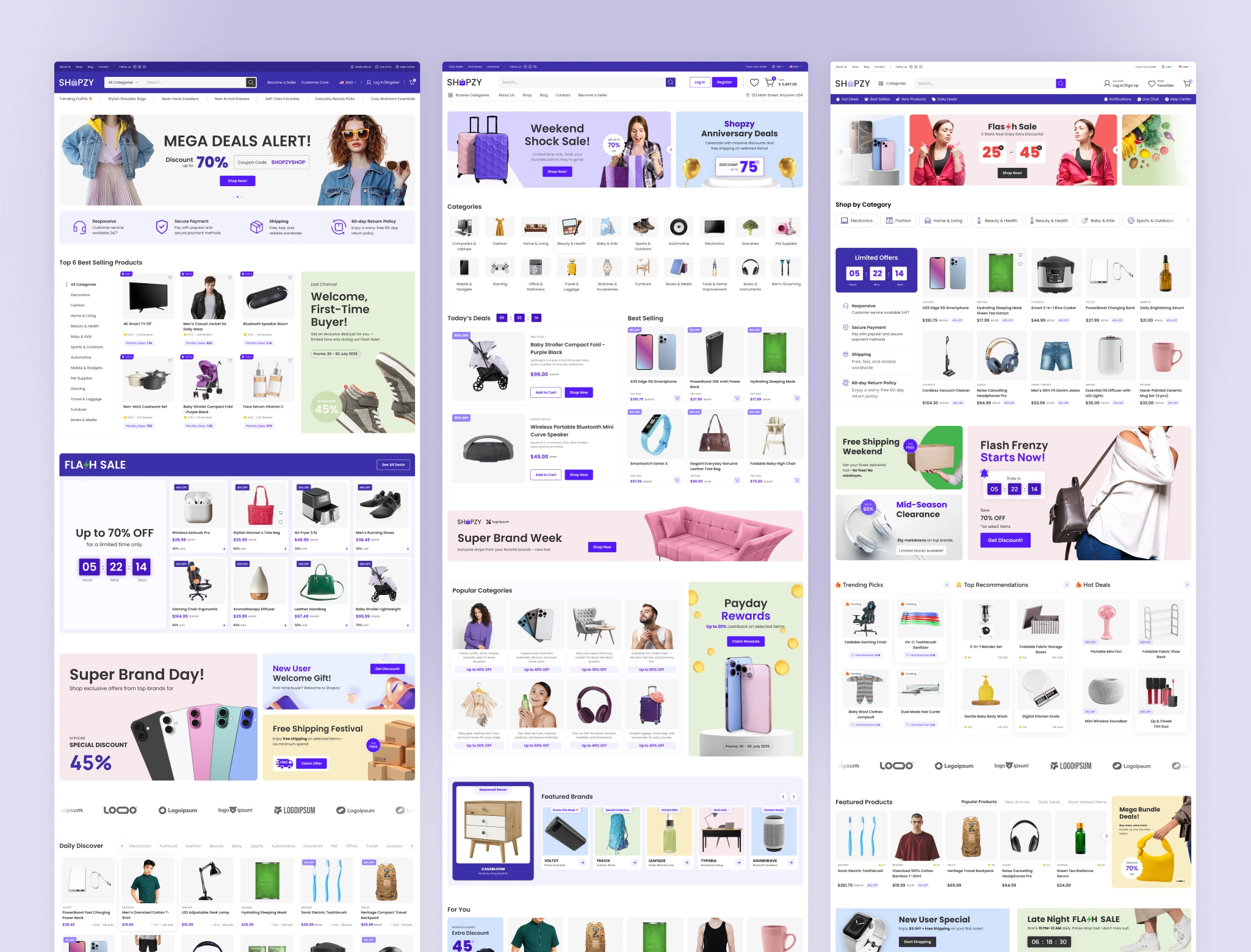
3 Homepage variations
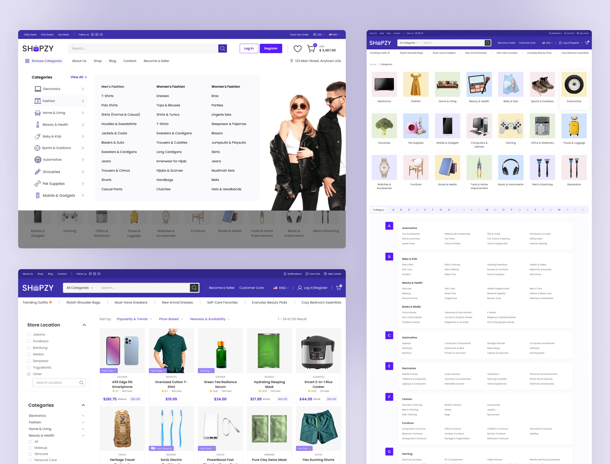
Mega menu, Product categories, and Product listing page
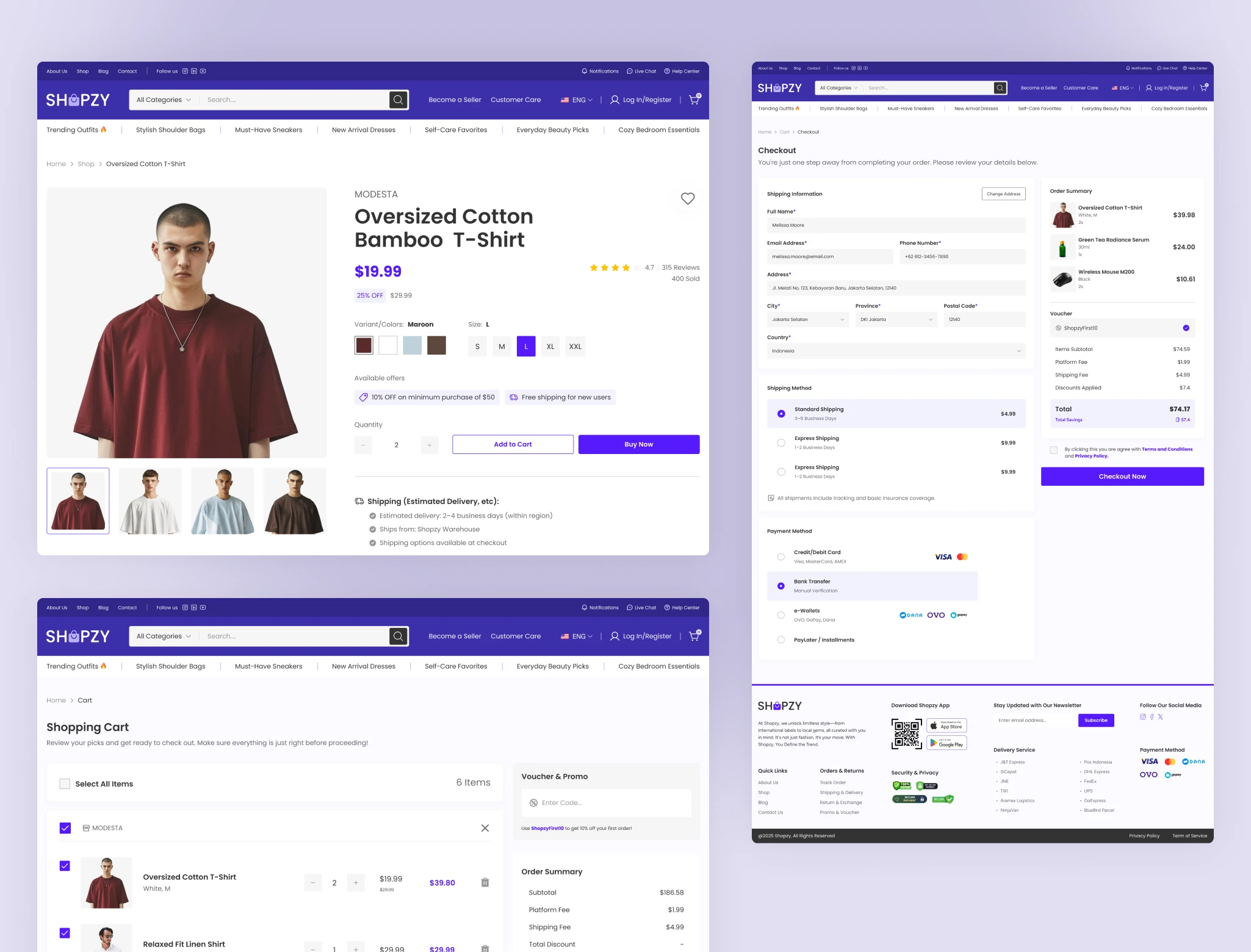
Product detail, Shopping cart, and Checkout page
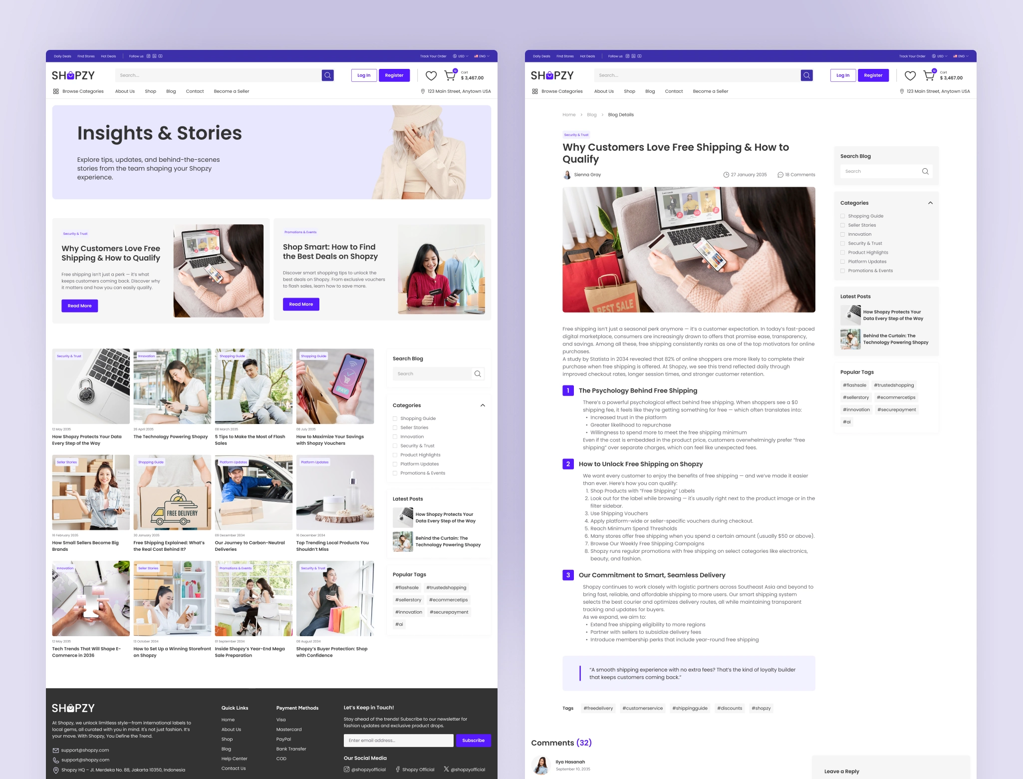
Blog and blog detail page
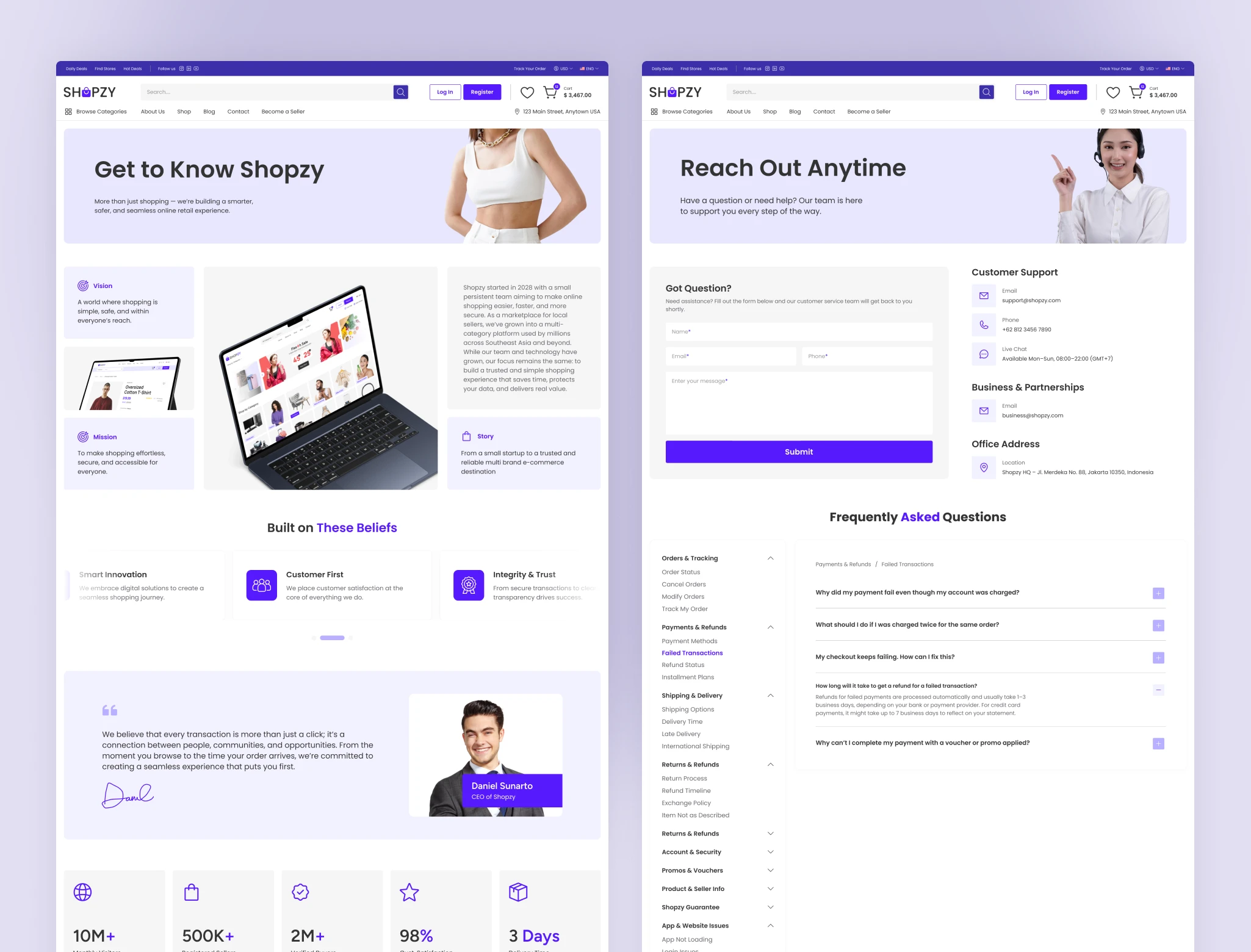
About and contact page
The result
A consistent, scalable design system that gives the client room to grow their catalog without needing a redesign every time a new brand or category is added, while keeping the shopping experience simple and familiar for customers throughout.
Let's get in touch!
Peterdraw Studio
Bring ideas come alive
UI/UX Design | No-code development | Framer Expert
Yogyakarta, Indonesia
Like this project
Posted Aug 10, 2026
A multibrand e-commerce site designed edge-to-edge at 1400px, built to feel spacious and premium while scaling with a growing catalog.
Likes
0
Views
21
Earned
$4K+
Timeline
Jun 16, 2025 - Jul 14, 2025
Clients
MadrasThemes