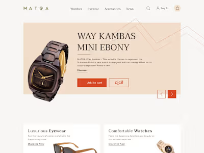
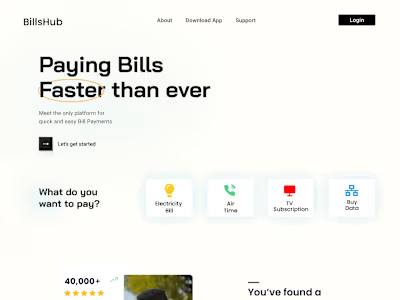
Course Landing Page
Who doesn't likes to read from a cool website?
This is one of my favorite recent projects where I have to design a landing page for a company(I'm not allowed to disclose the name) that writes blogs around the user interface. A well-established agency that was looking to redesign their blog page.
Challenges:
A well-established agency always want a perfect UI, they can't compromise on minor mistakes
UI has to be very modern and good-looking for the next 5-10years.
They are going to build this using a no-code tool that means I have limited animations to add life to this website, I have to overcome this with pleasing alignment.
The deadline, they gave me only 7days(1 week) to complete the whole design part.
Check out the deisgn process at the bottom👇

Landing page
With only 7 days to create a professional website that should serve for at least the next 5 years and making sure I follow all deisgn principles. I started my design by checking out their portfolio and some of the previous websites they built to get a sense of the deisgn taste the company has.
I started answering few questions. Like...
Who is this website targetting?
What is the purpose of landing on this website?
What will the user know before landing on this website?
What should be the first thing that the user has to understand after landing?
and many more
After finding answers to my questions I started mood boarding, putting all of my ideas, colors, and fonts together.
I moved onto wireframing from here. I have to make it look simple yet present my idea in a very classic way.
The client won't want to have any vectors or heavy animations on the website so I tried avoiding using vectors. I did add few slight interaction animations, which can be achieved with no-code tools.
I had an amazing time working with this client, it was a challenging yet rewarding project.
If you like my work and want me to deisgn a website for you you can take services from here: https://contra.com/workwithram/services
Like this project
Posted Jul 8, 2021
Likes
0
Views
47


