Braun Notes Brand Refresh

brijesh patel



The Brand
Braun Notes is an established Parisian specialty coffee brand known for its craftsmanship, quality, and distinctive café experience. With a decade of experience behind it, the brand is evolving to connect with a new generation of coffee lovers while preserving the character and identity that made it what it is today.
The Challenge
The challenge was to evolve Braun Notes into a more contemporary brand while preserving the identity and brand equity it had built over the years. The goal was to attract a new generation of coffee lovers without losing the familiarity and character that existing customers already connected with.
The Solution
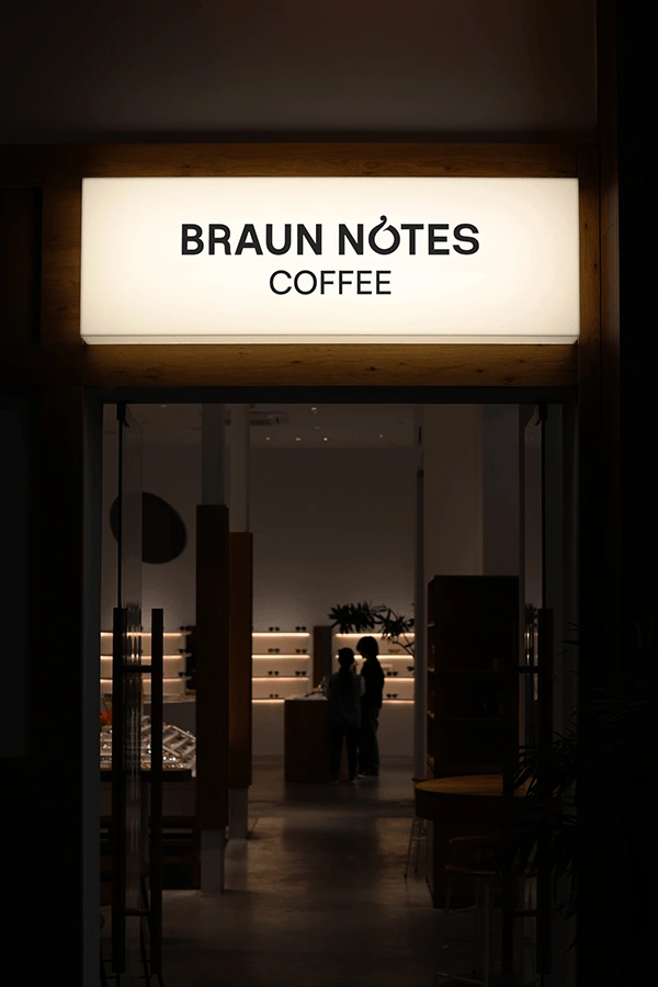
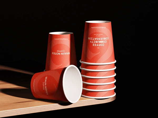
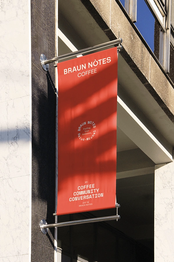
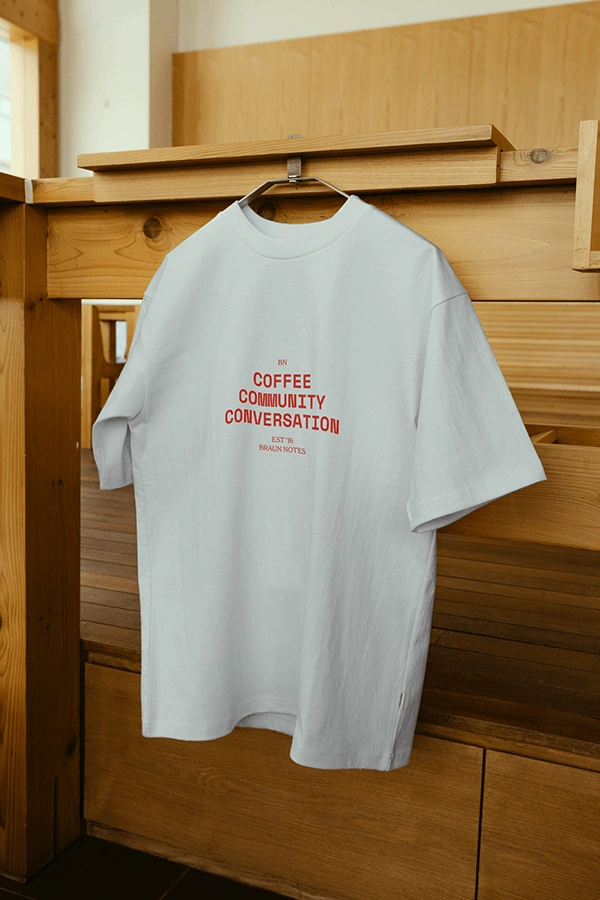
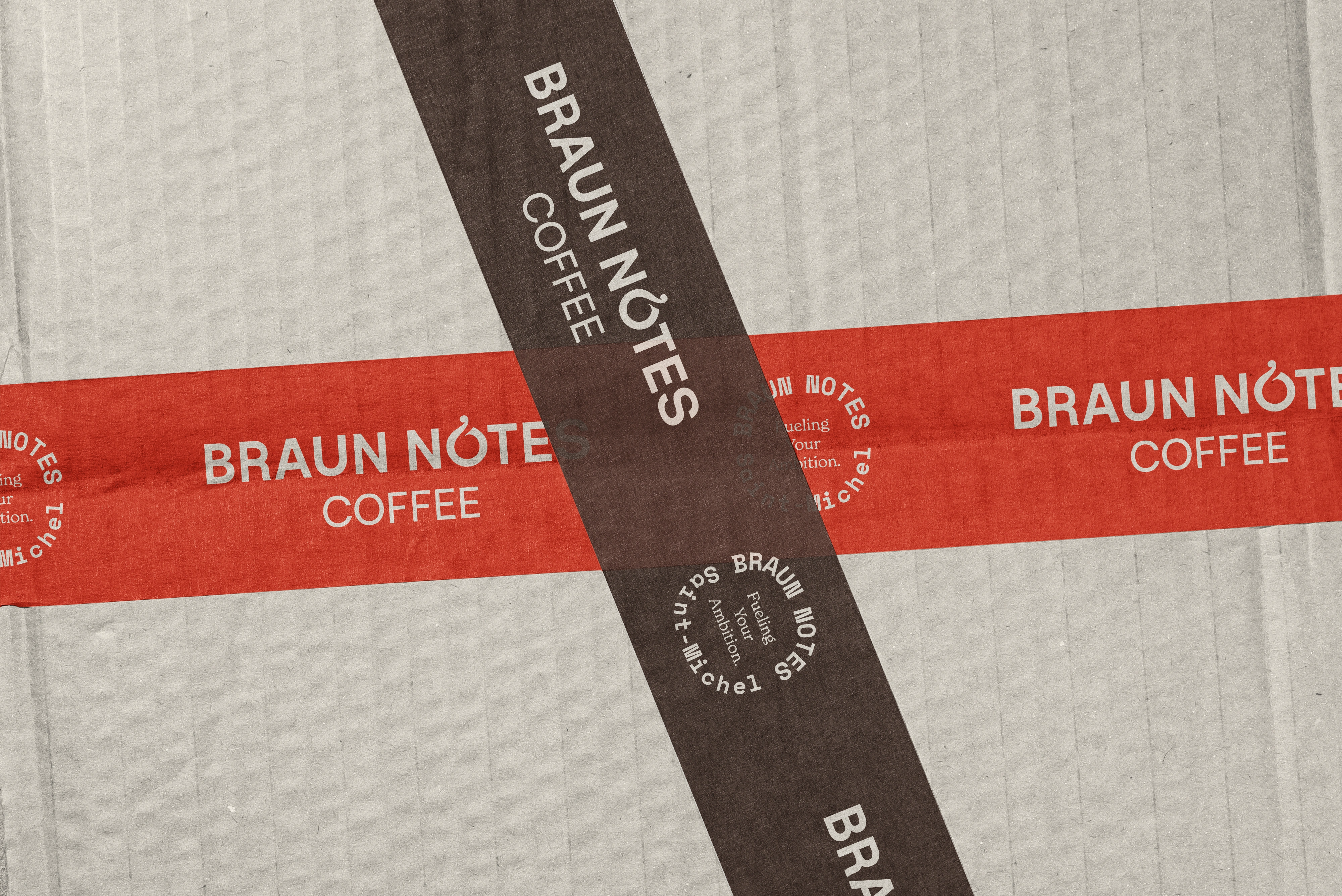
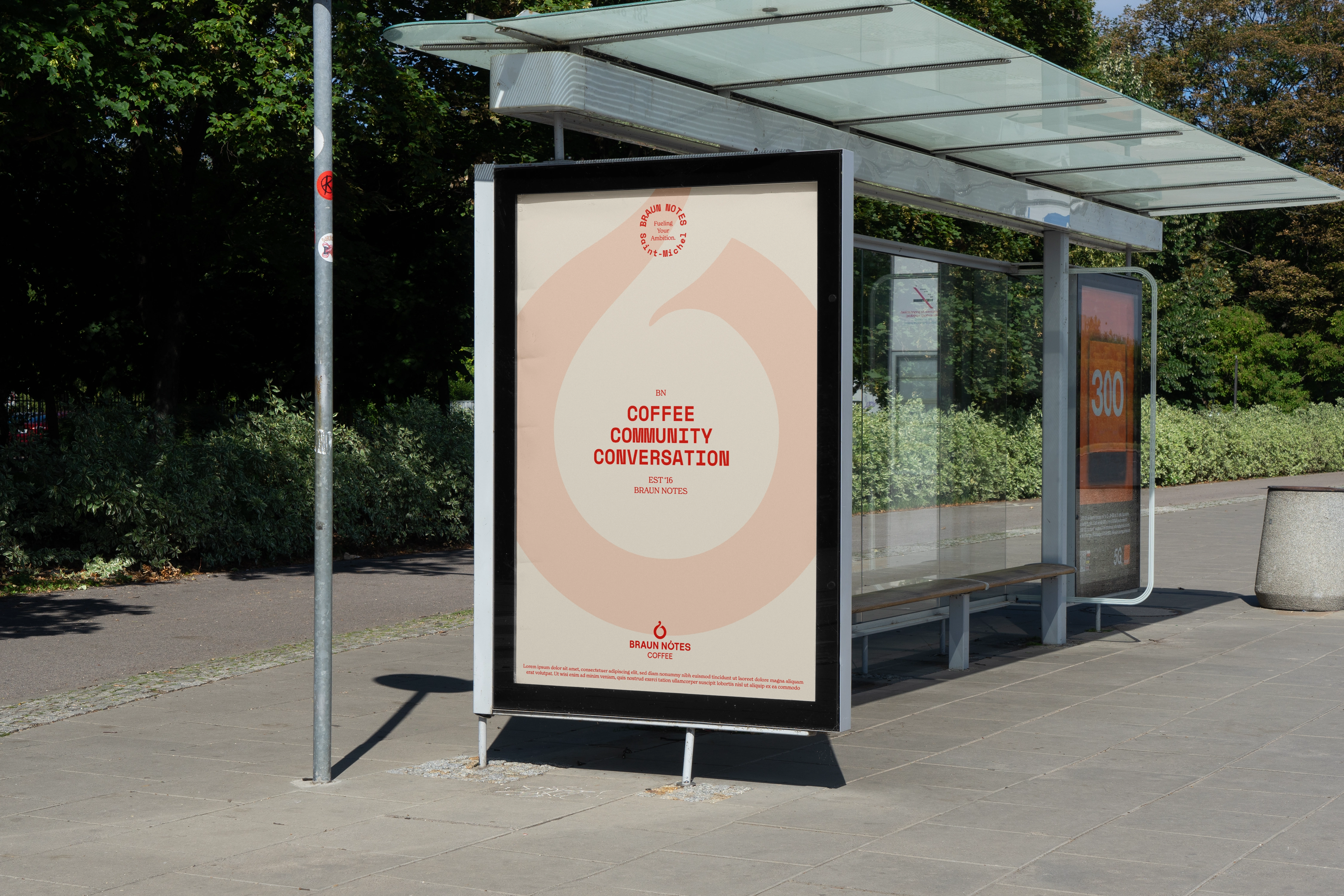
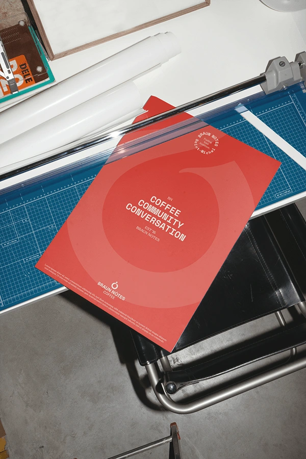
The solution was to refine the existing identity rather than start from scratch. Through research and exploration, I made subtle improvements to the logo and visual language while preserving the elements that made Braun Notes recognisable. The refreshed identity was then brought together through updated cup designs, packaging, brand guidelines, and supporting digital assets, creating a more cohesive brand experience for both existing and new customers.

THANK YOU
Scope of Work
Brand Strategy · Brand Identity Refresh · Logo Design · Packaging Design · Brand Guidelines · Digital Assets
Designed by
Brijesh Patel
@whatbrij
Creative Direction & Design
Brijesh Patel
Project
Braun Notes — Brand Refresh
Get in touch
Instagram · @whatbrij
othersidedesignstudio.com
Like this project
Posted Oct 19, 2026
Evolved Braun Notes' brand while preserving character, attracting a new audience.