SOMARIS Brand Book and Visual Identity System

Caden


SOMARIS — Premium NeuroSomatic Recovery Brand Book & Visual Identity System
Project Overview
SOMARIS is a NeuroSomatic Recovery brand centered around calm, regulation, embodiment, restoration, and a more authentic sense of self.
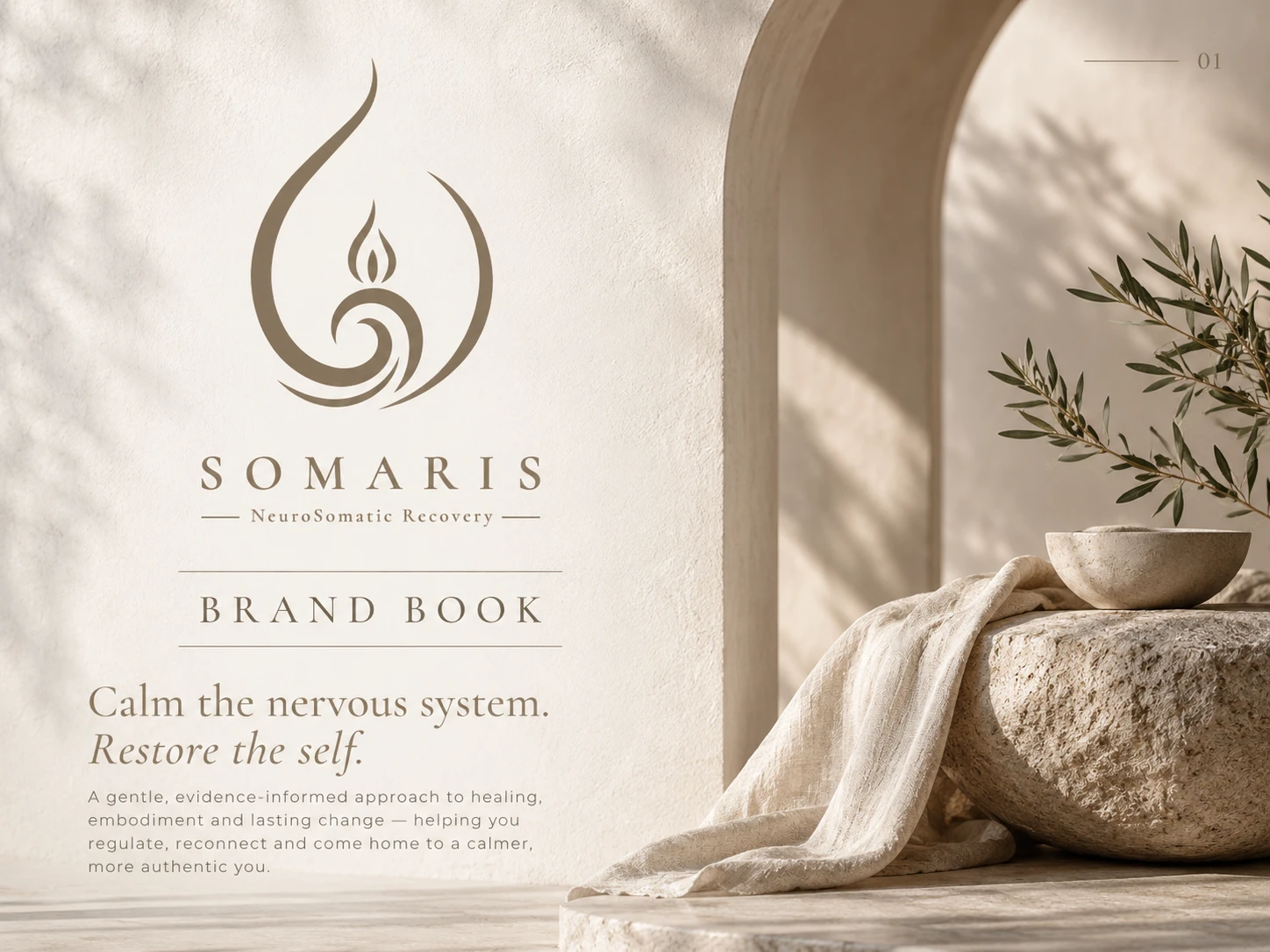
The goal of this project was to transform the existing SOMARIS logo into a complete high-end visual identity system and premium brand book—without altering the original logo. The challenge was to create a brand experience that felt credible and professional while avoiding the cold, overly clinical visual language often associated with health and recovery services.
The resulting identity combines luxury minimalism, organic materials, editorial typography, warm neutral colors, natural light, and calming photography to create a visual world that feels safe, grounded, refined, and deeply human.
The Challenge
SOMARIS needed more than a beautiful logo. It required a cohesive brand system capable of communicating the emotional experience behind NeuroSomatic Recovery.
The visual identity needed to express:
Calm without feeling passive.
Professionalism without feeling clinical.
Luxury without feeling inaccessible.
Warmth without losing sophistication.
Every visual decision had to reinforce the idea of creating a safe space for regulation, reconnection, embodiment, and restoration.
Creative Direction
The creative concept was built around the idea of:
“Calm the nervous system. Restore the self.”
I developed an understated, editorial visual language inspired by natural environments and tactile materials.
Soft architectural forms, warm daylight, stone, linen, plaster, paper textures, organic foliage, and spacious compositions create a feeling of stillness and physical ease.
Rather than relying on conventional wellness imagery, the identity was designed to feel more elevated, intentional, timeless, and emotionally grounded.
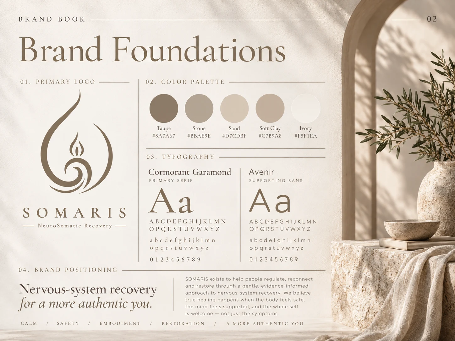
Foundation
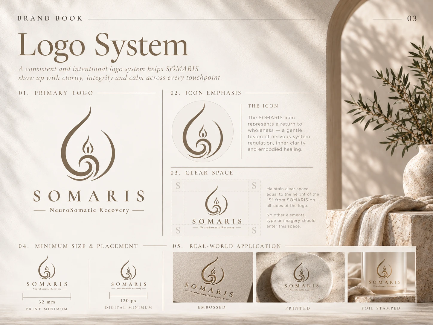
Logo system
Logo System
The supplied SOMARIS logo remained the foundation of the entire identity.
The brand book explores how the original mark can live consistently across different environments, including:
Primary logo presentation
Symbol-focused applications
Clear-space principles
Minimum-size guidance
Print and digital usage
Embossed applications
Foil stamping
Premium material applications The intention was to protect the integrity of the logo while creating enough flexibility for the identity to scale across future brand touchpoints.
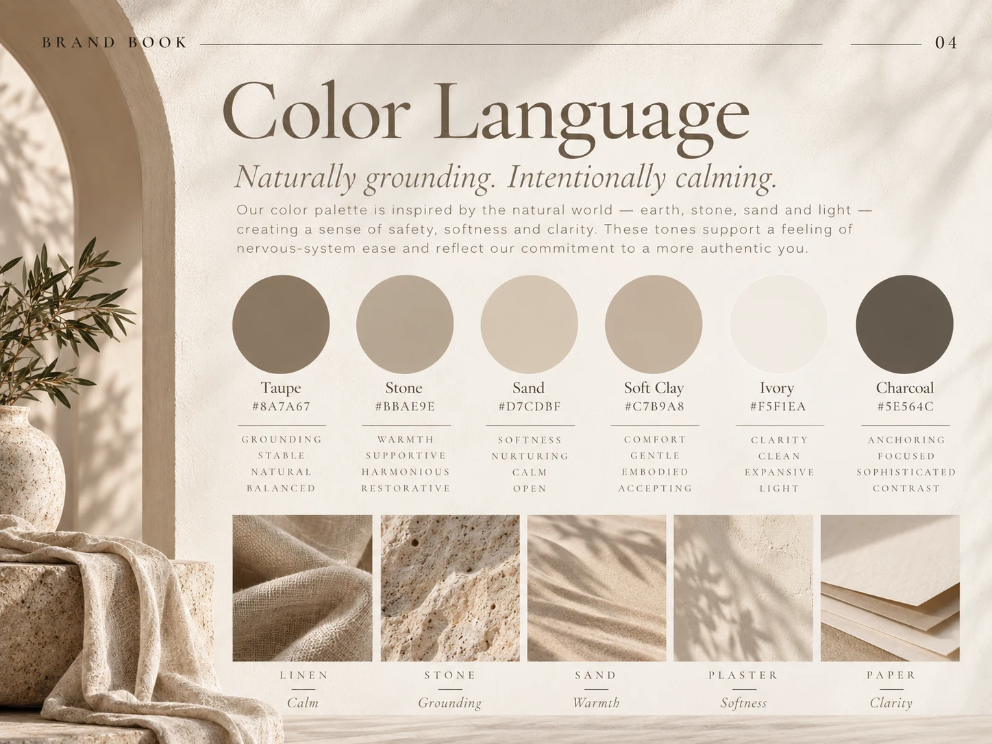
Colors
Color Strategy
The color system takes inspiration from earth, stone, sand, clay, linen, and natural light.
The palette includes warm neutrals such as:
Taupe · Stone · Sand · Soft Clay · Ivory · Charcoal
These tones create a visual environment that feels calming and grounded while maintaining enough contrast for professional communication.
The colors were selected to support key emotional associations including:
Grounding · Warmth · Softness · Comfort · Clarity · Stability
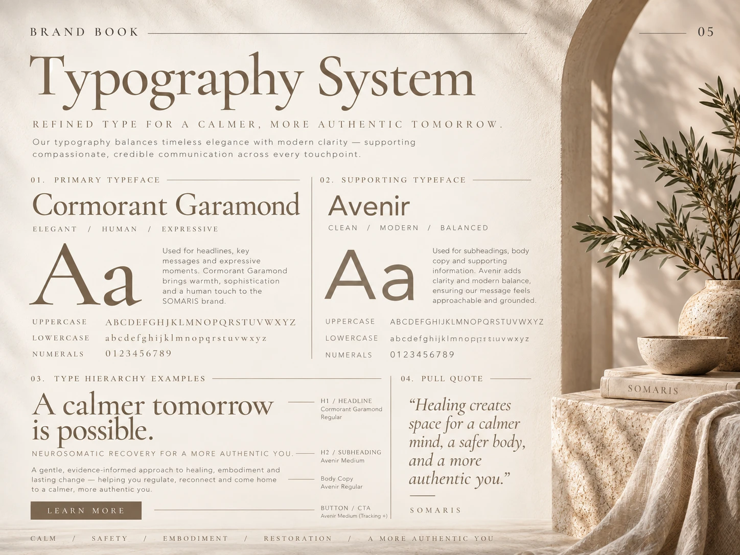
Typography
Typography
Typography plays a major role in establishing SOMARIS as an elevated recovery and wellness brand.
Cormorant Garamond
Used for expressive headlines, brand statements, and editorial moments.
Its elegant proportions bring warmth, sophistication, and a human quality to the identity.
Supporting Sans Serif
A clean contemporary sans-serif supports body copy, digital communication, navigation, and informational content.
Together, the typography system creates a balance between emotional storytelling and modern clarity.
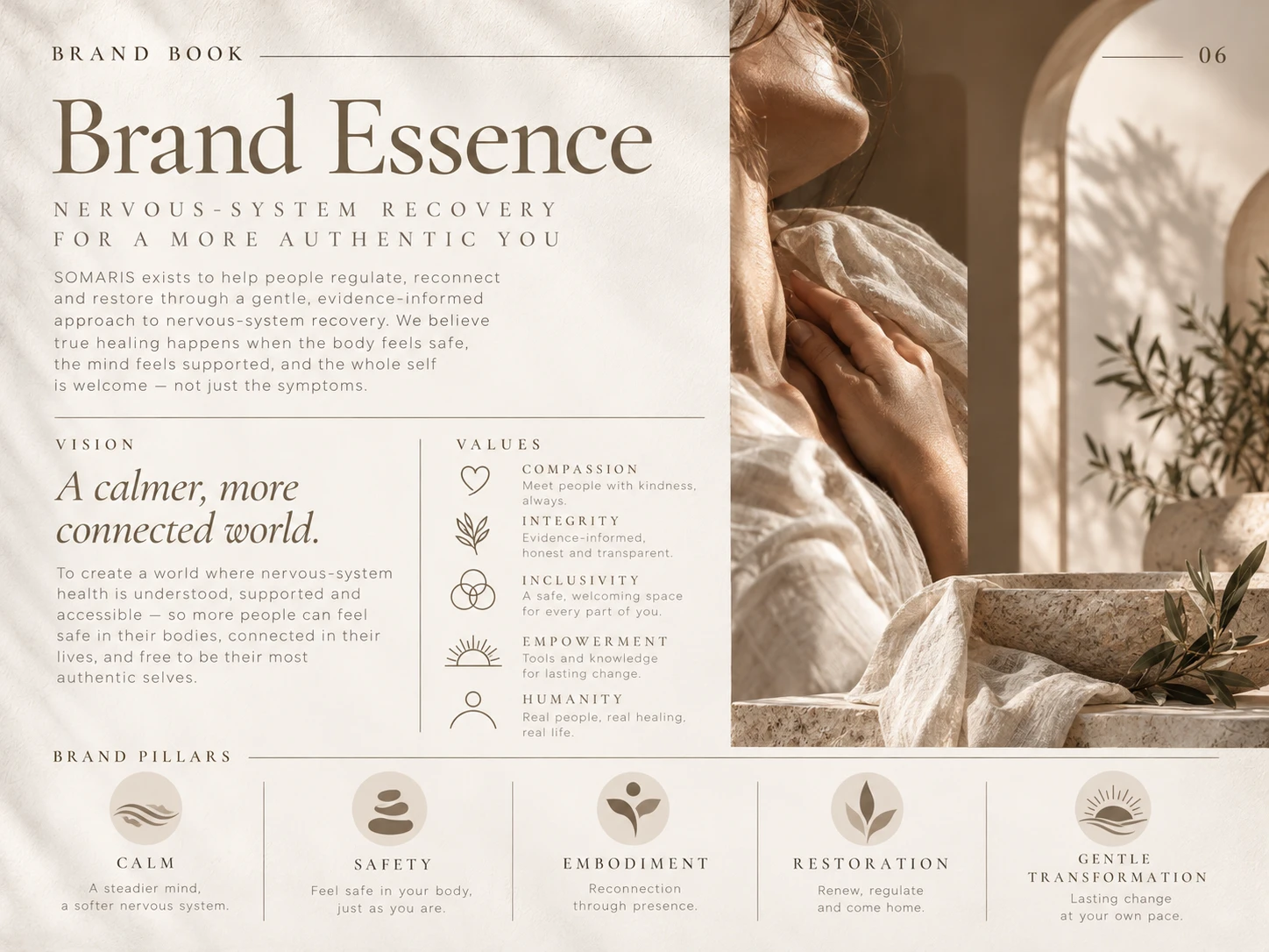
Brand Essence
Brand Essence
The identity was developed around several core principles:
Calm — creating visual breathing room and nervous-system ease.
Safety — communicating warmth, trust, and stability.
Embodiment — reconnecting people with their physical and emotional experience.
Restoration — creating a visual sense of renewal and returning to balance.
Gentle Transformation — supporting meaningful change without aggressive or overly clinical messaging.
These principles guided the full brand system, from typography and photography to applications and environmental styling.

Photography Direction
The photography system focuses on real, tactile, quiet moments rather than staged wellness imagery.
The visual direction includes:
Soft natural light
Organic textures
Human touch and body awareness
Warm architectural environments
Linen and natural materials
Stone and earth textures
Olive branches and subtle botanical elements
Reflective moments
Gentle movement
Spacious landscapes The result is imagery that feels restorative, intimate, premium, and authentic.

Brand Applications

Brand Applications
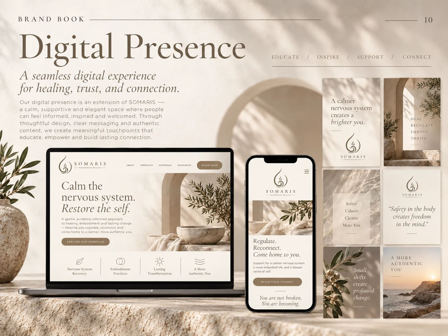
Digital Presence
Digital Presence
The identity was also translated into a modern digital experience.
Website and social-media concepts use generous whitespace, soft neutral surfaces, natural imagery, elegant typography, and simple user journeys to create an online experience that feels just as calm as the physical brand.
The digital system was designed around four principles:
Educate · Inspire · Support · Connect
This allows SOMARIS to communicate complex recovery concepts in a way that remains welcoming, refined, and easy to understand.
Project Outcome
The final visual system gives SOMARIS a distinctive, premium, and scalable brand foundation for both physical and digital growth.
Instead of looking like a conventional wellness or healthcare brand, SOMARIS now has a visual language that communicates its deeper philosophy through calm sophistication, sensory detail, thoughtful typography, and human-centered art direction.
The identity can scale consistently across:
Brand communications · Website · Social media · Client materials · Wellness products · Packaging · Signage · Editorial content · Future services
The result is a brand experience designed to feel safe, intentional, restorative, and unmistakably SOMARIS.
Like this project
Posted Oct 7, 2026
Transformed SOMARIS logo into a high-end brand identity system.