Probyte Consulting - Web Redesign
Kevin Kwok
Overview
I redesigned Probyte's website, a Belgium-based legal automation company. The client wanted an elevated redesign and dynamic animations for their website.
The Problem
Old Website
Some of the problems I noticed from their old website:
Inconsistent line spacing, no typographic scale
Overly complex icons with intricate lines, not universally recognizable
Spacing, margin, and padding are inconsistent, no grid system
Inconsistent CTAs, some use black and others use blue
Poor contrast for texts and backgrounds which doesn't meet accessibility requirements
Too many colors used for primary CTAs, blue, white, black, and green.
Proposed Solution
Revamp the whole site's aesthetics first, including the style guides.
Put a typographic scale system in place to ensure proper hierarchy and consistency across pages
Retouch the design system, use soft corner buttons with consistent color across pages
Reserve main brand color for primary call to actions only
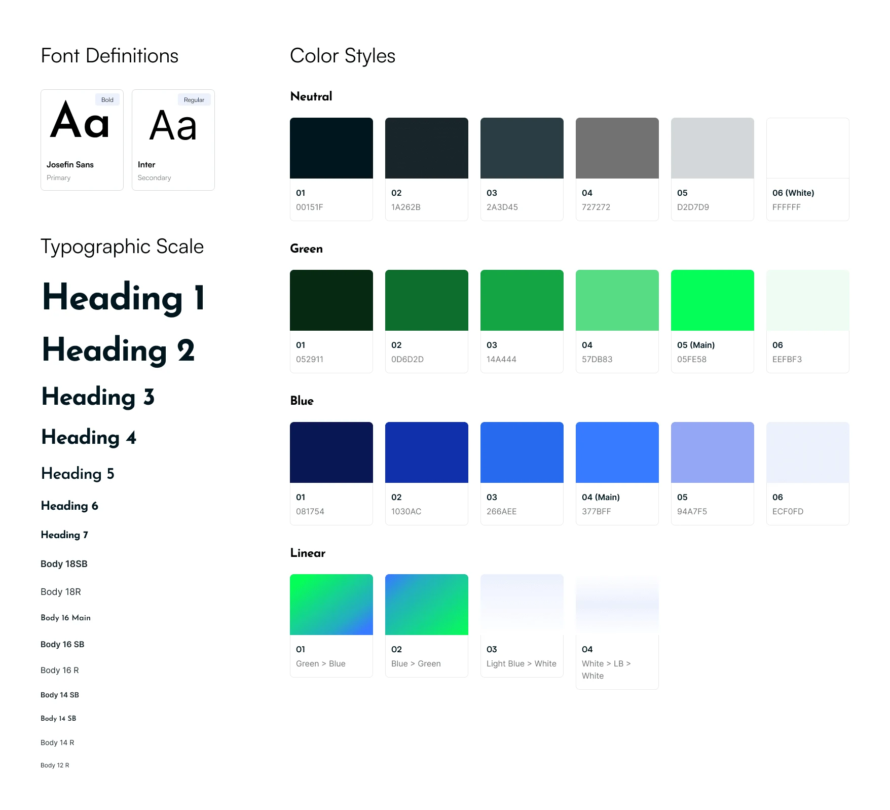
Tweaking the Style Guide
Here's a refined style guide I created for the brand before jumping on to redesign the pages. This is done to maintain consistency for all the pages. I stripped down some colors and focused on the brand (logo) color to elevate the minimalist yet professional feel.
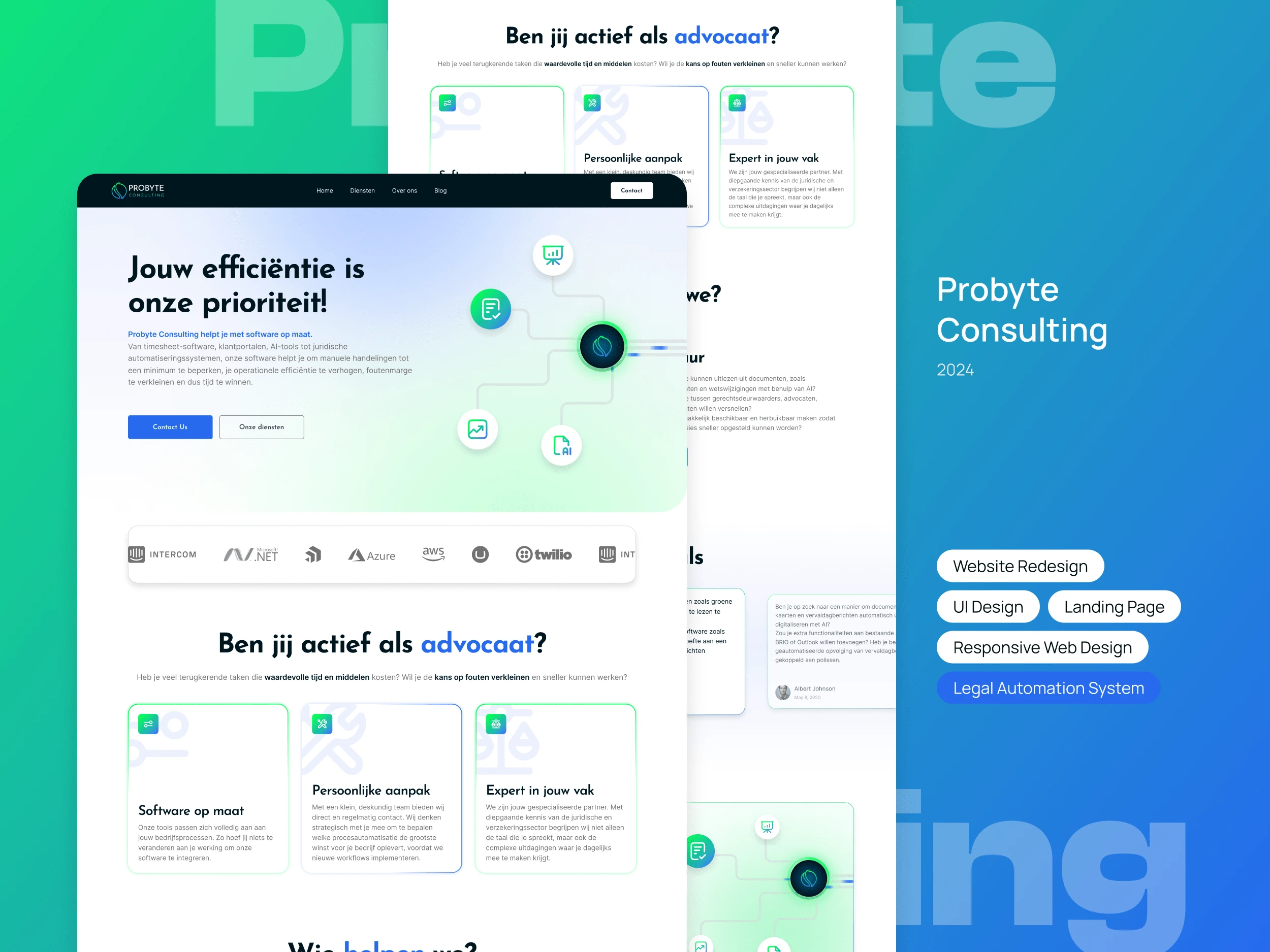
Redesign
There were 6 main pages to be redesigned. Started off with the home page, I refined all the elements preset from the heading texts, nav bar, the main visuals, button styles, and logo carousel. Here's a before-and-after comparison for the main page:
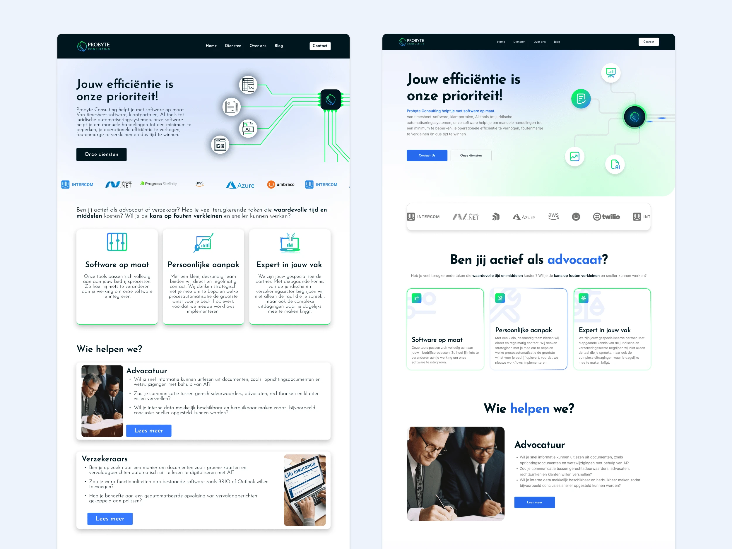
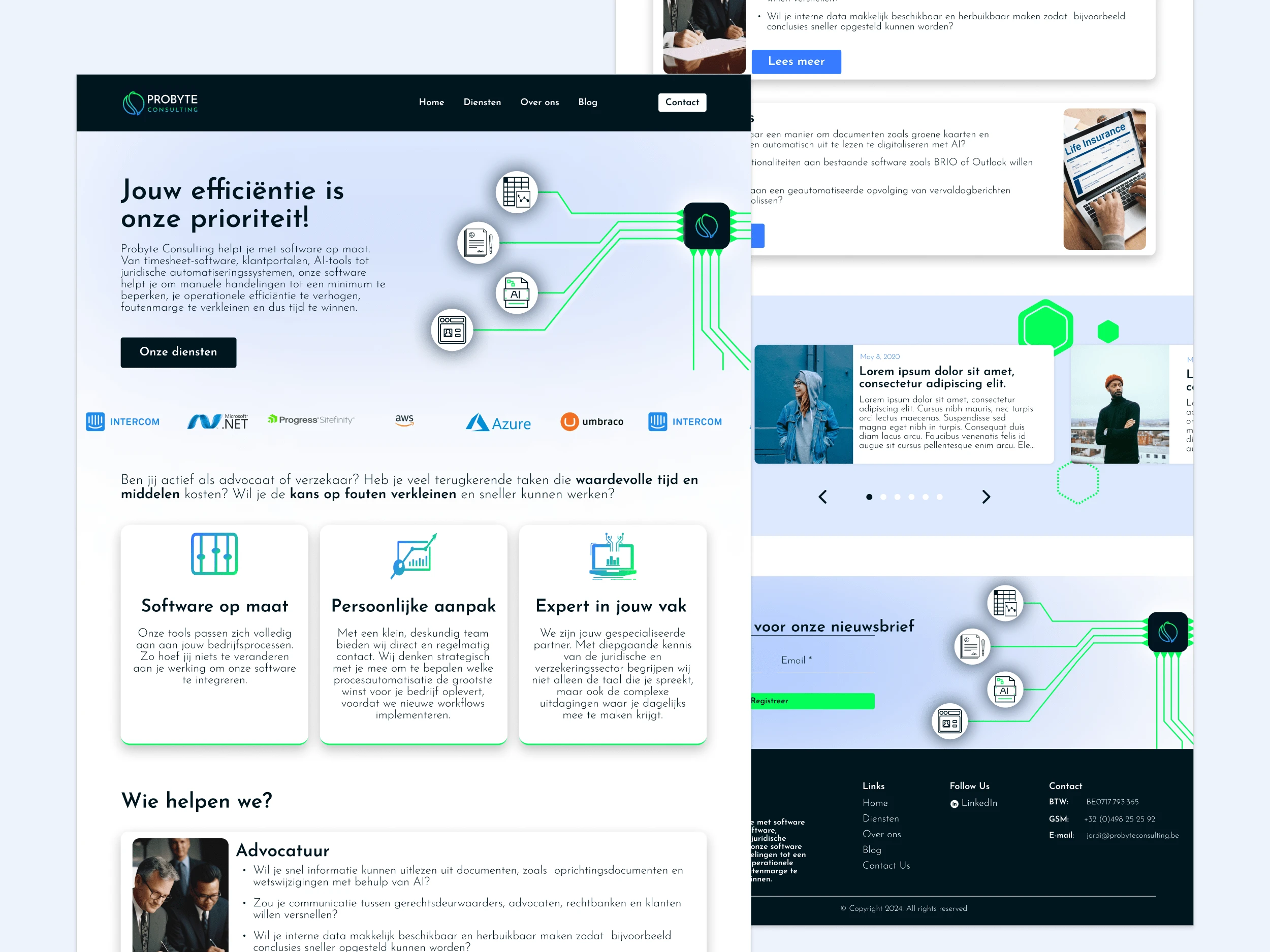
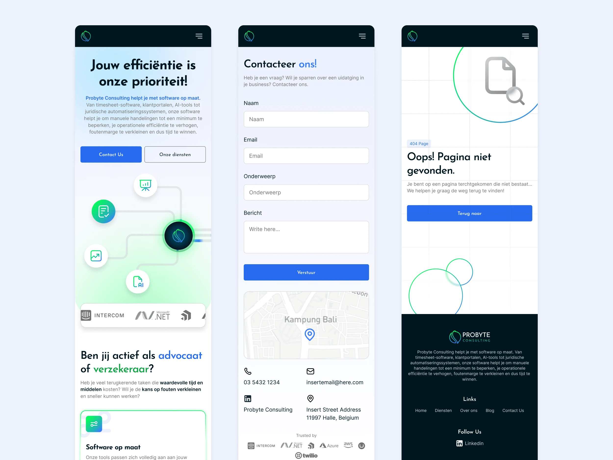
Moving on to the rest of the pages, I made sure to apply the same styling to all of the pages, using a 12-column grid system for desktop and 4 columns for the mobile version of the pages.
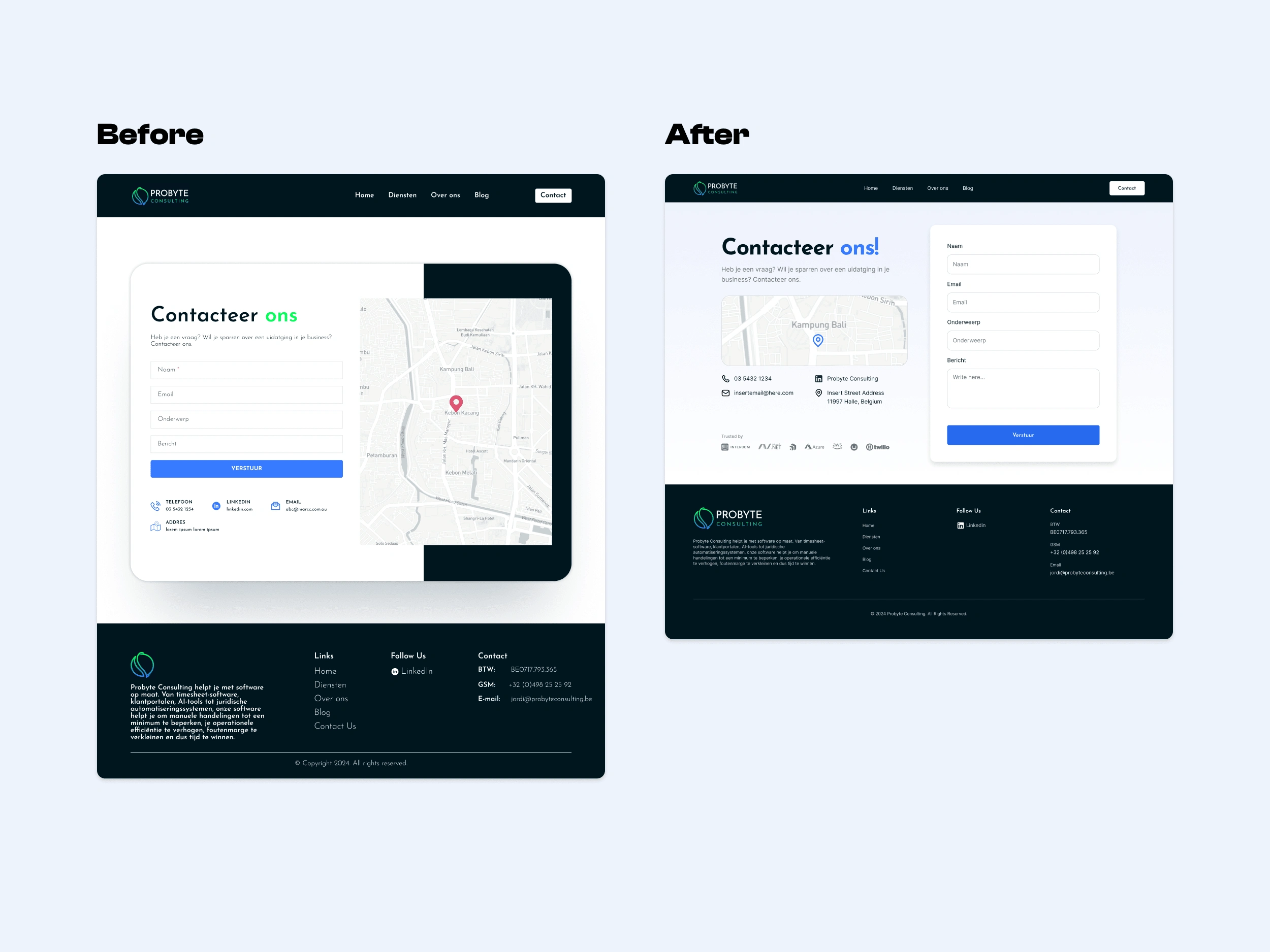
Above is the contact page redesign, I removed all overly saturated bright green from the heading texts and replaced it with blue which suits the brand feel. I also tidied up the footer which is crucial for directing users to any links that may not be included in the pages.
Responsive Design
After wrapping up with the pages, I also need to make sure that the pages work well on mobile devices, since most users use their mobile phones to access websites more often than their laptops.
Summary
Redesigning these web pages was another fun project that I enjoyed. The client had already have a proper site structure which quickens up the process, although experimenting with creative design decisions was a little bit of a challenge since there wasn't much room to explore new ideas such as color combinations and typefaces. The client was satisfied with the result, and I realized that taking up these kind of projects is never really about creating what I want to see, but what is best for users and the business.
Like this project
Posted Jan 24, 2025
I redesigned a legal automation website and implemented responsiveness for the freshly created pages.
Likes
0
Views
4