SOREIA® Branding & Packaging
Creavora Studio
About The Project
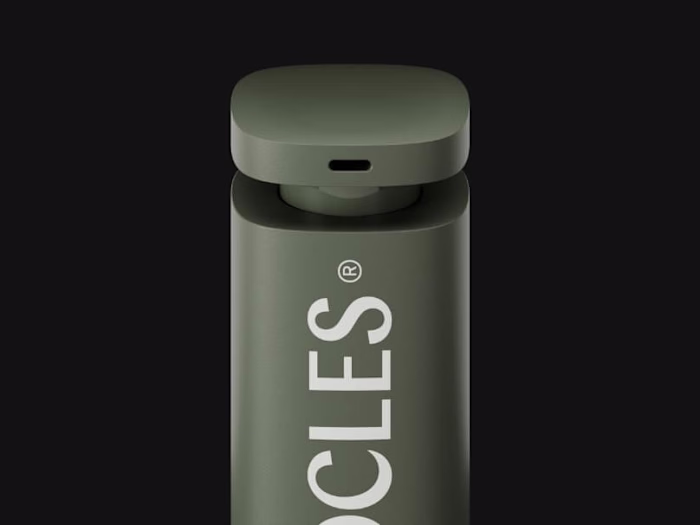
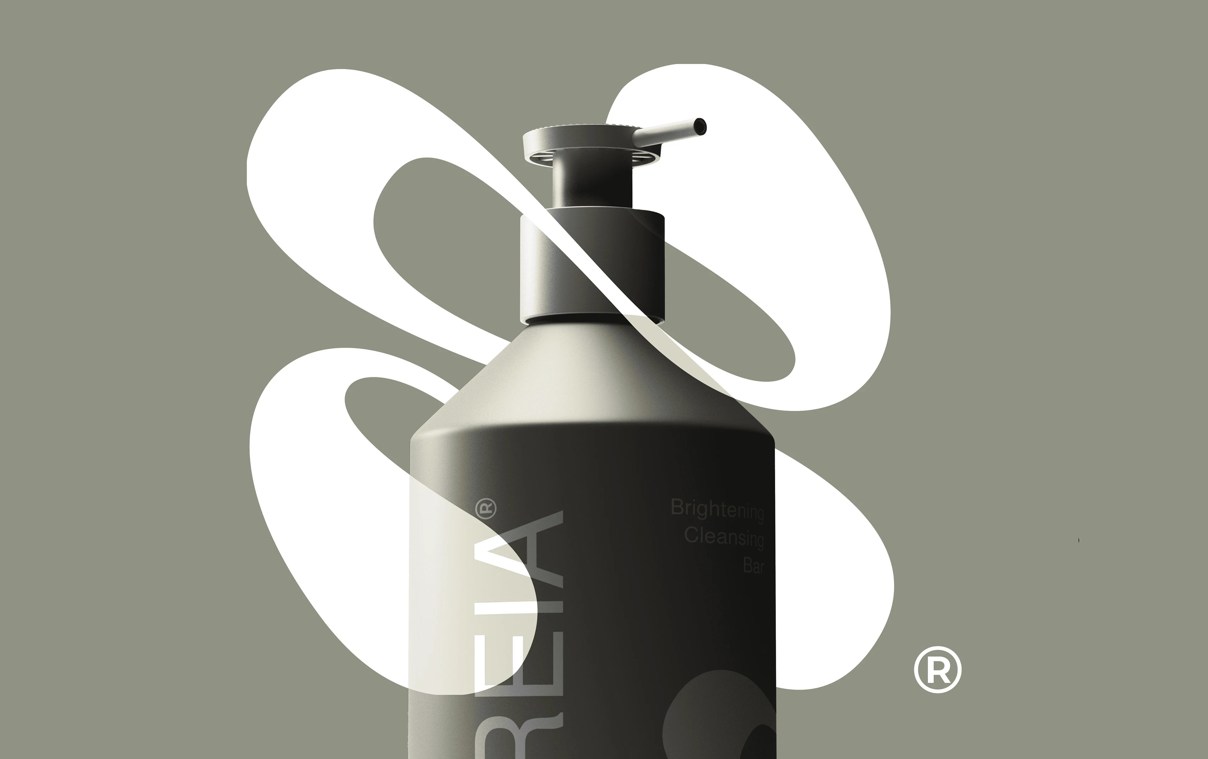
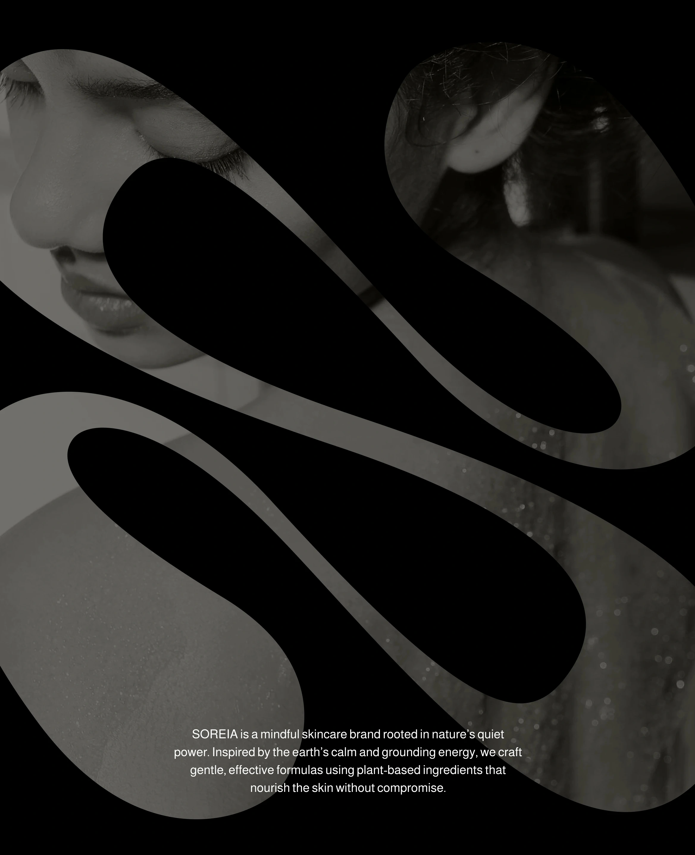
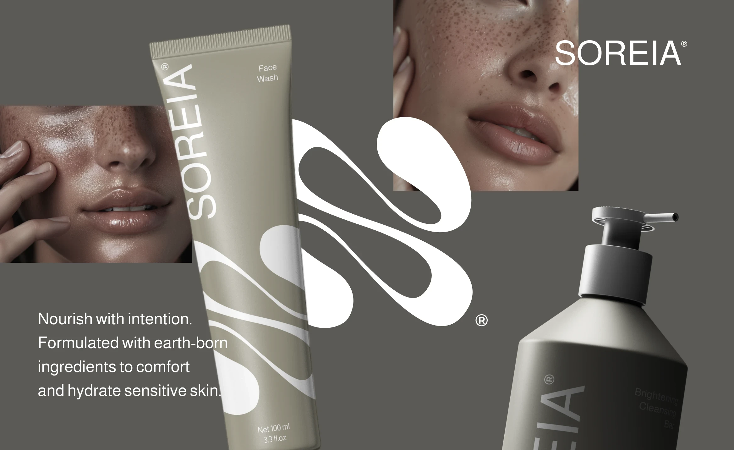
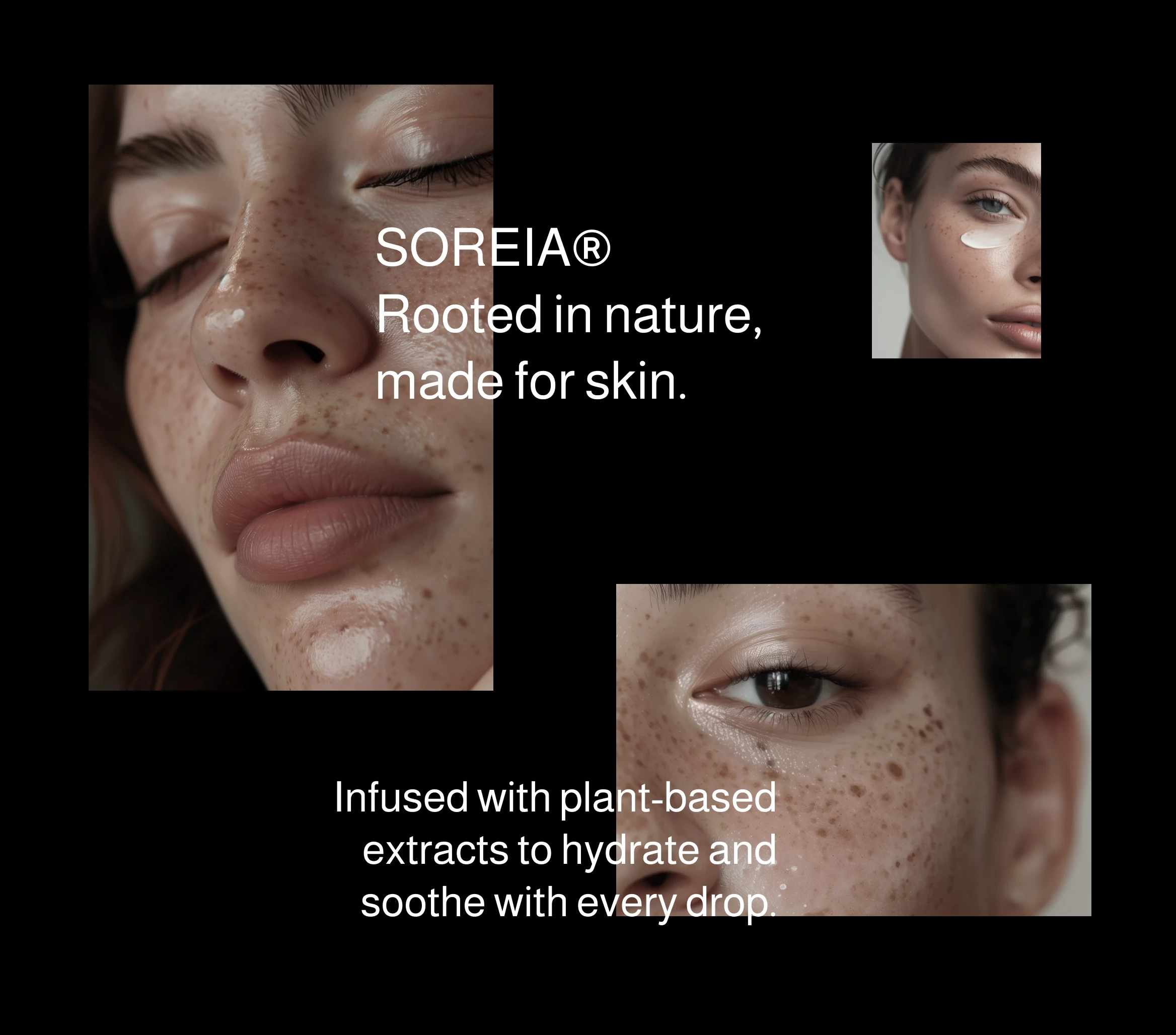
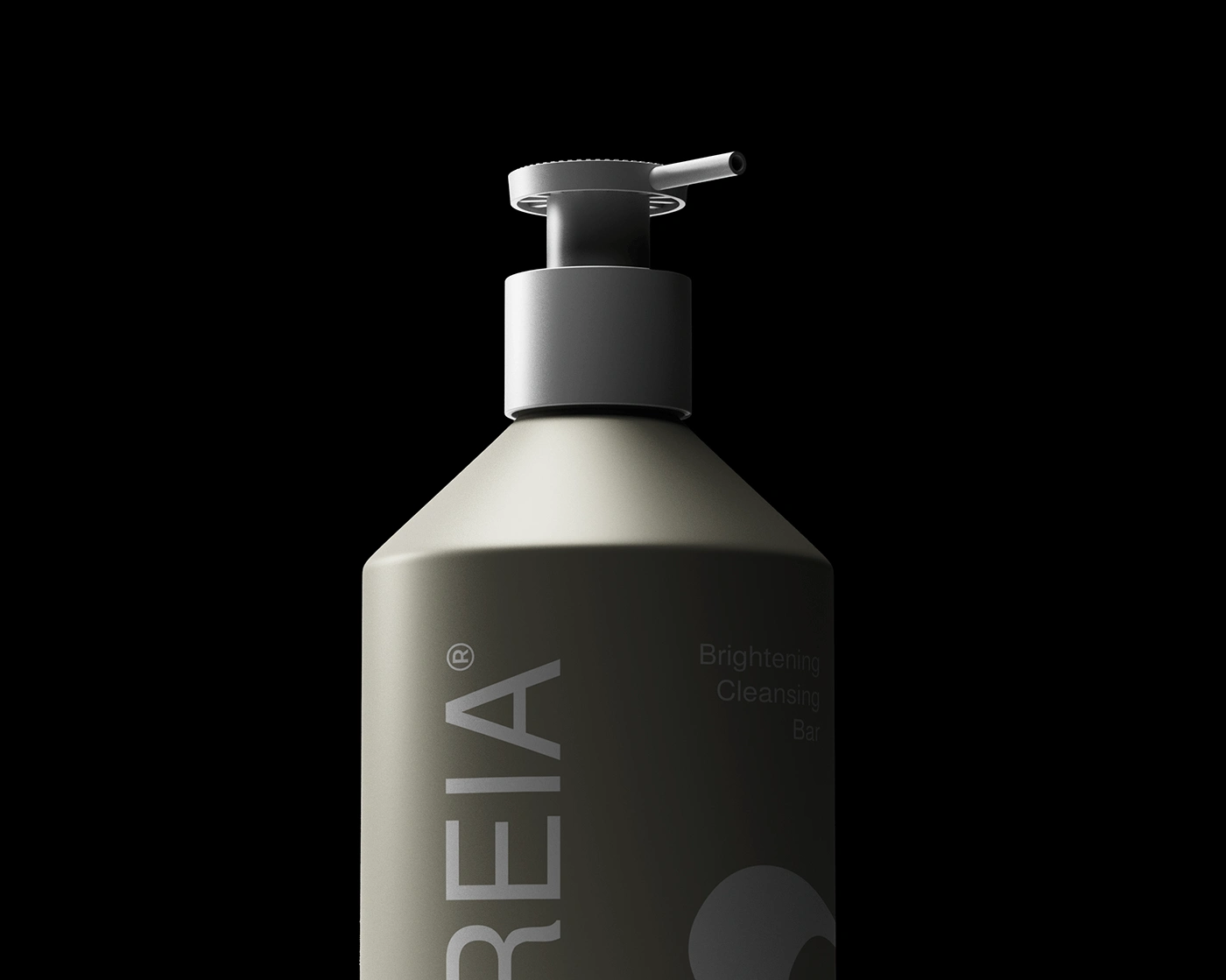
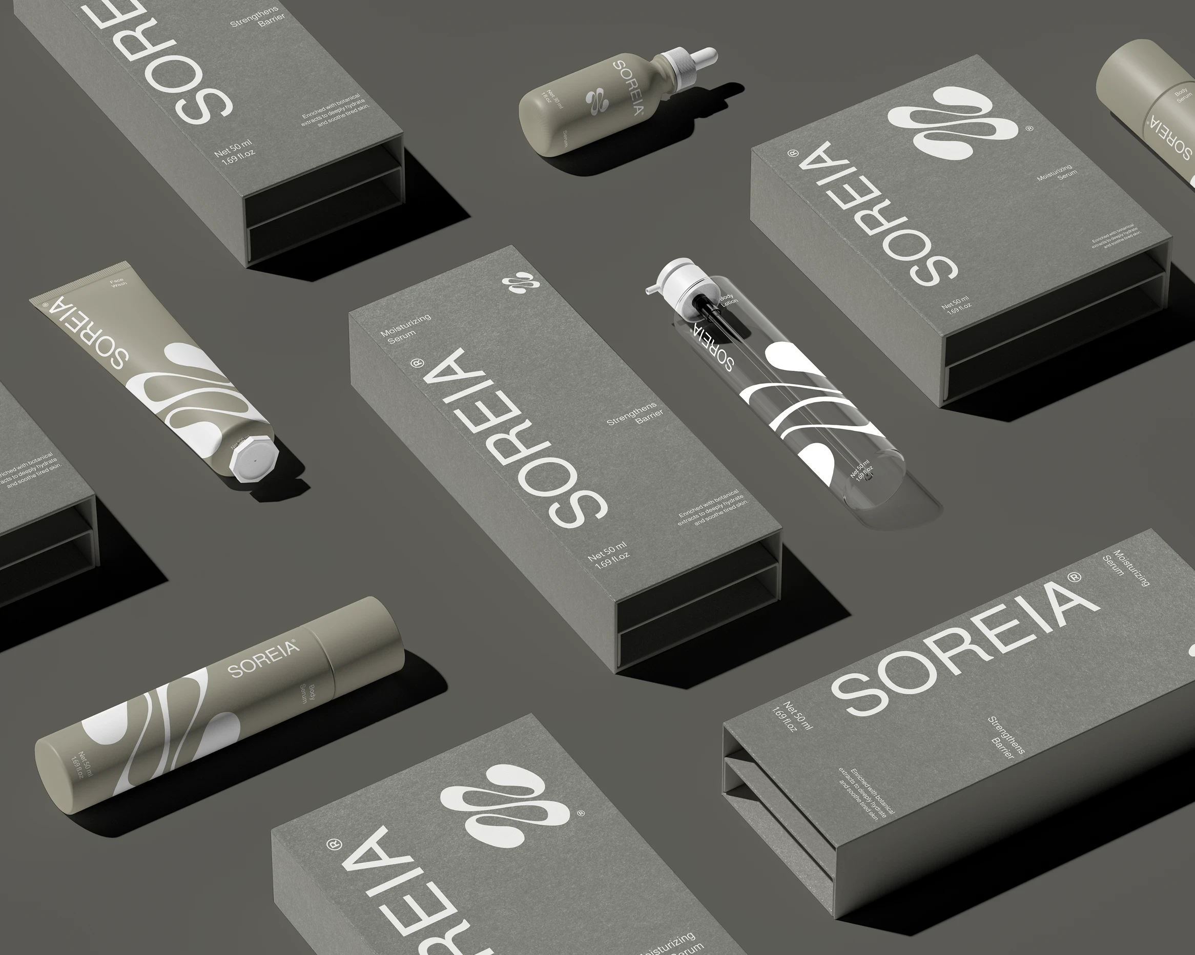
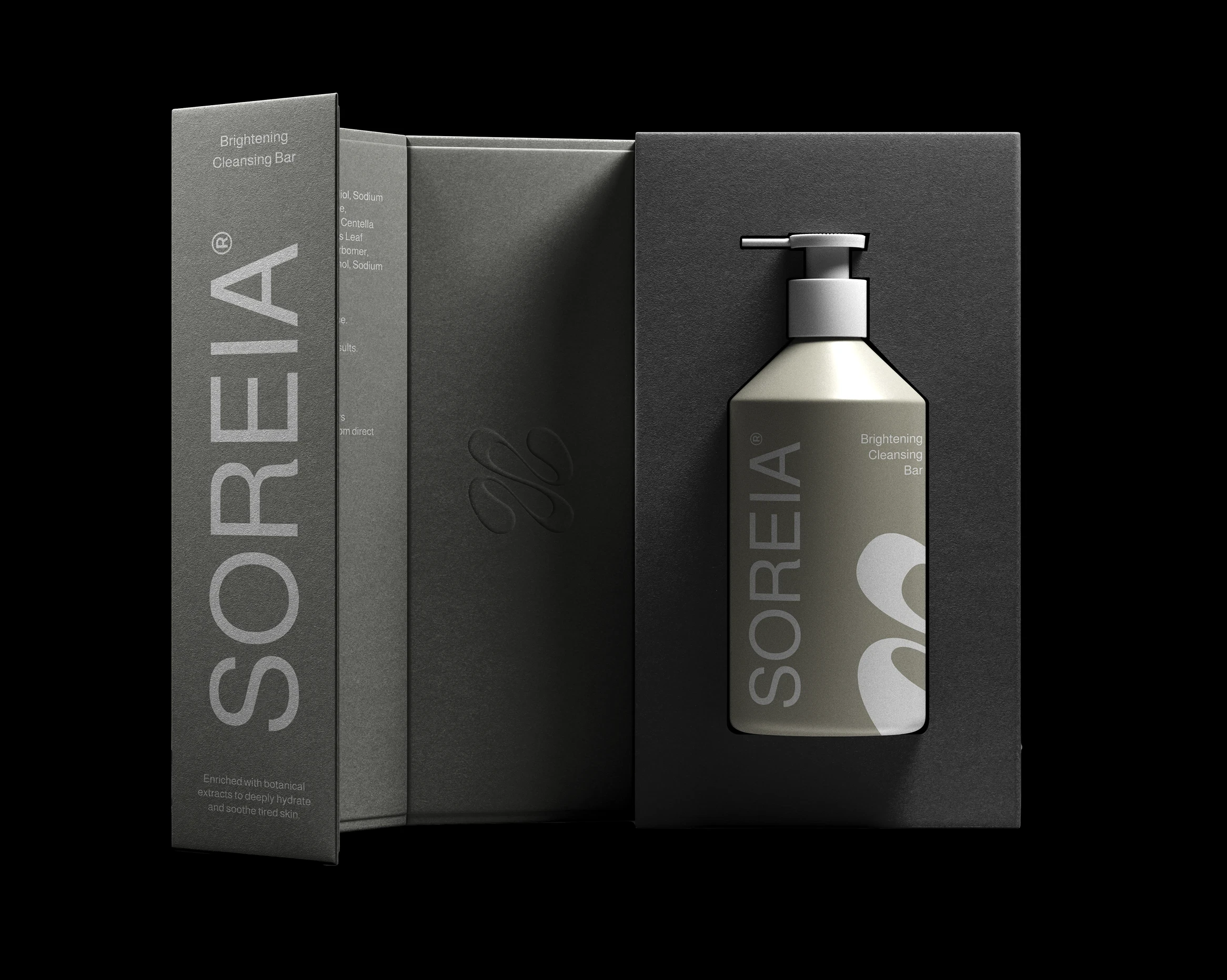
SOREIA is a skincare brand rooted in nature’s calm, offering gentle, plant-based formulations that nourish and restore.
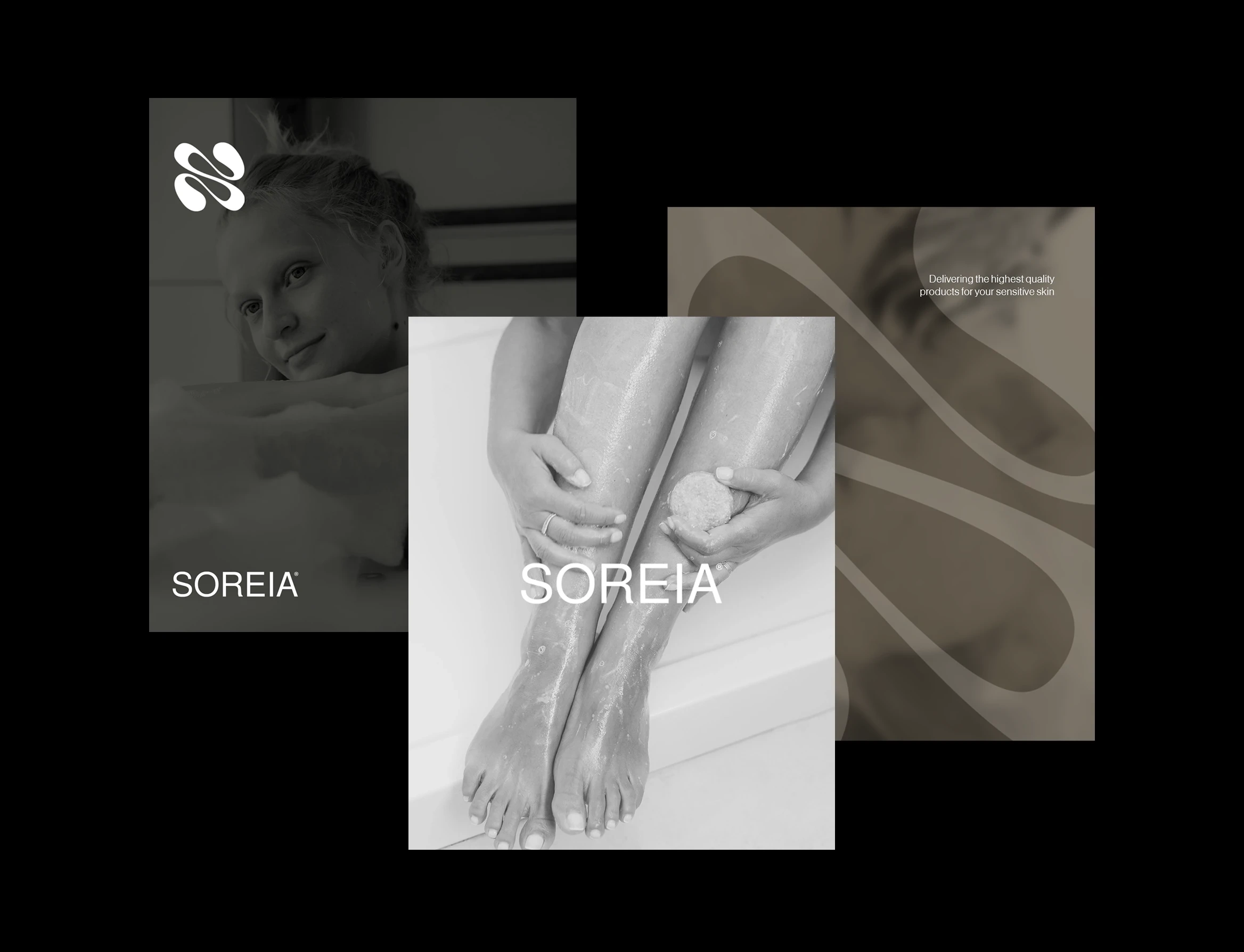
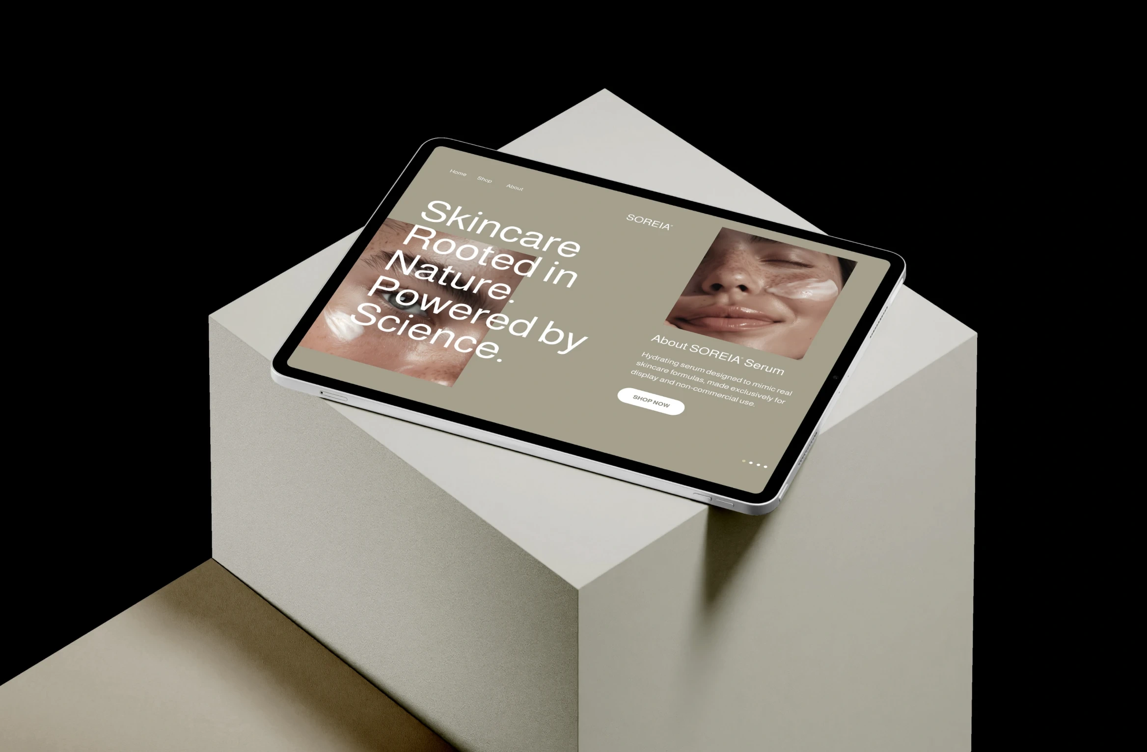
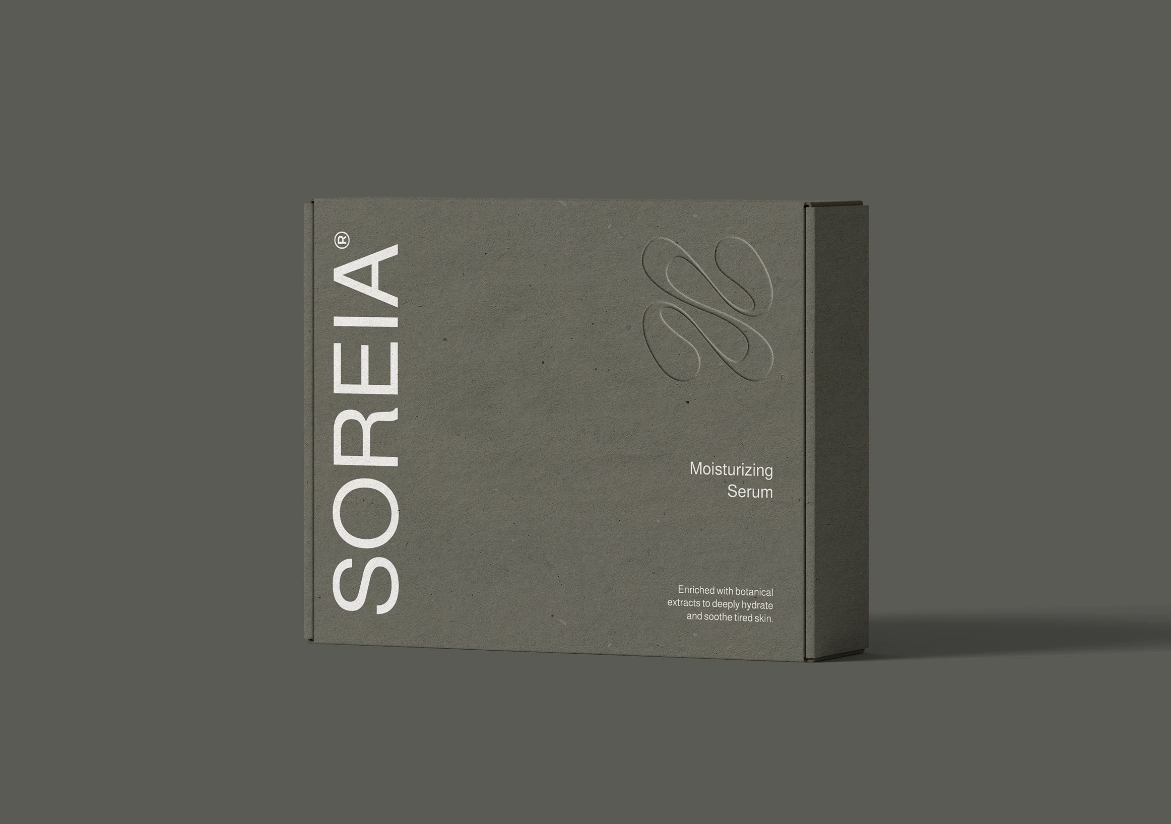
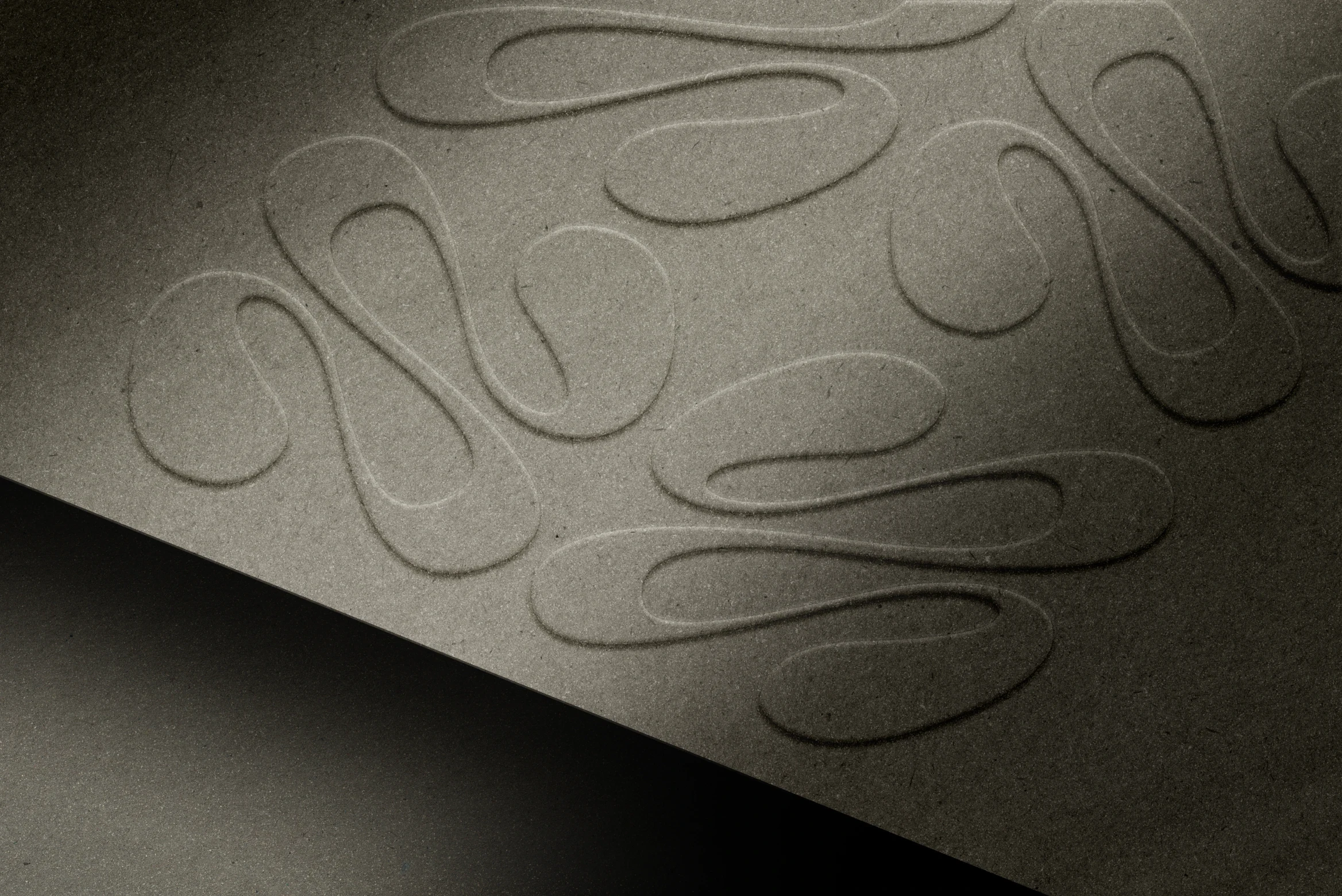
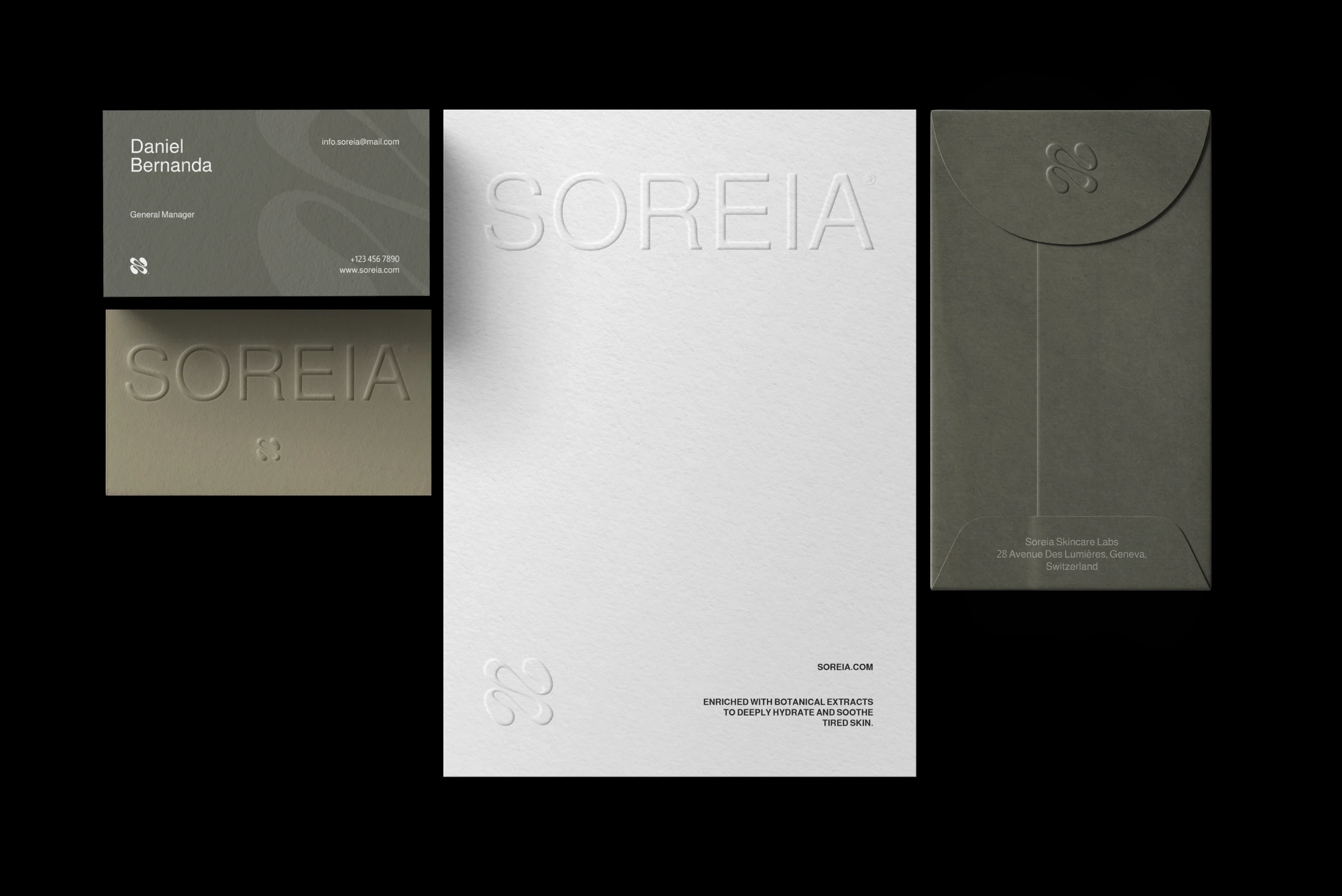
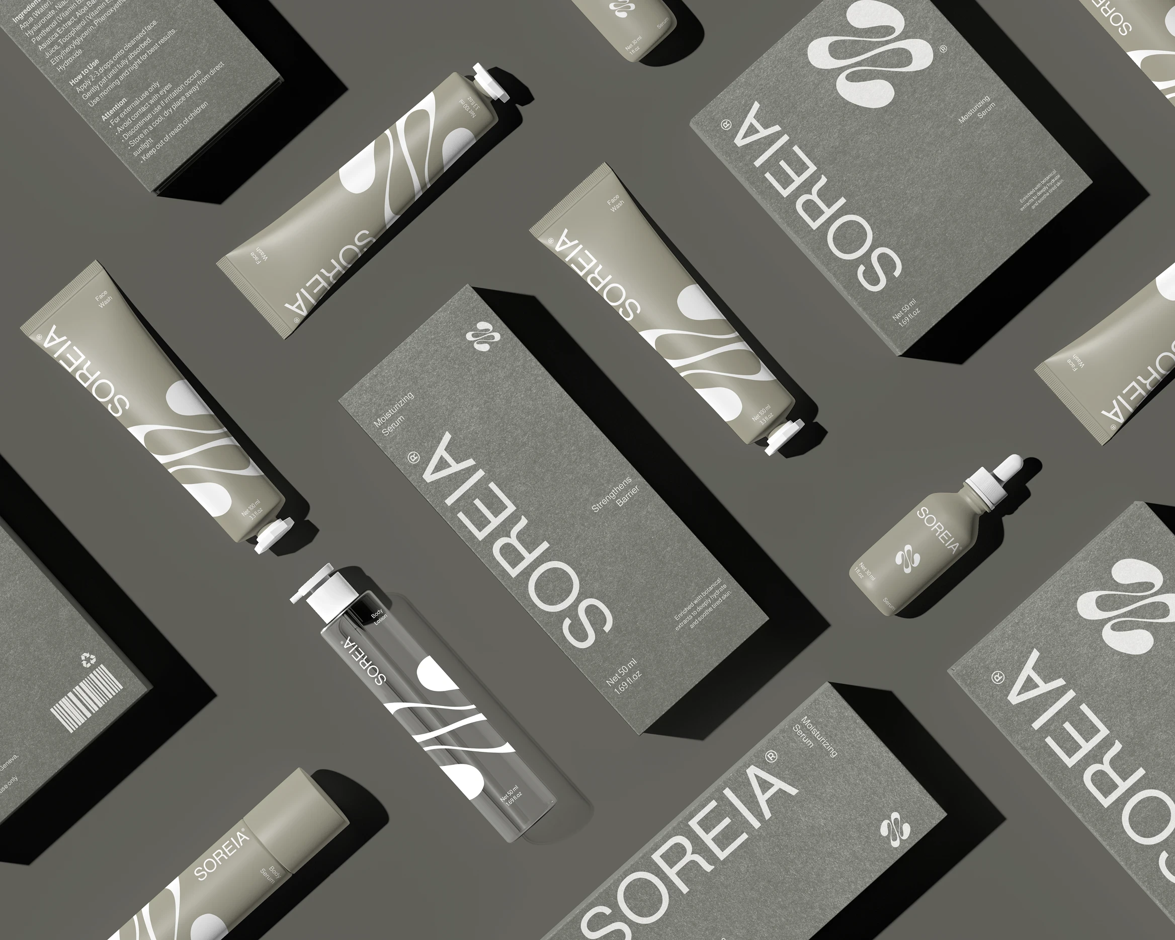
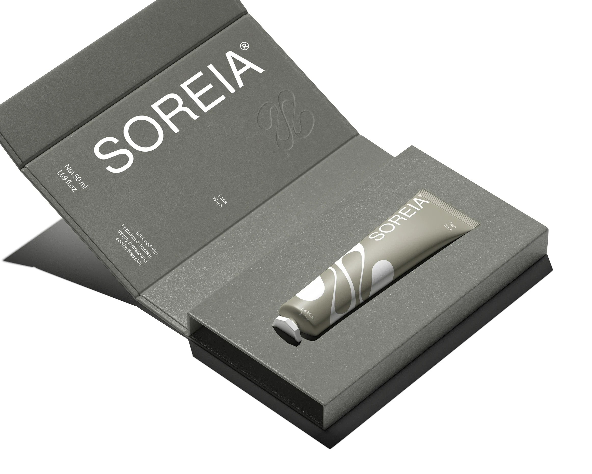
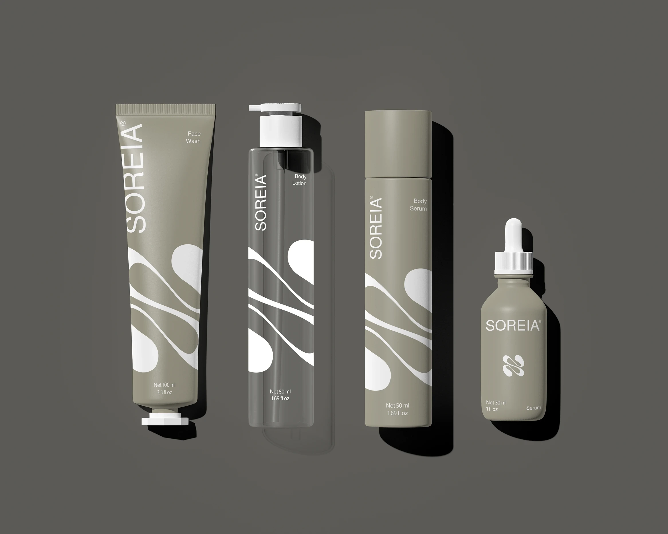
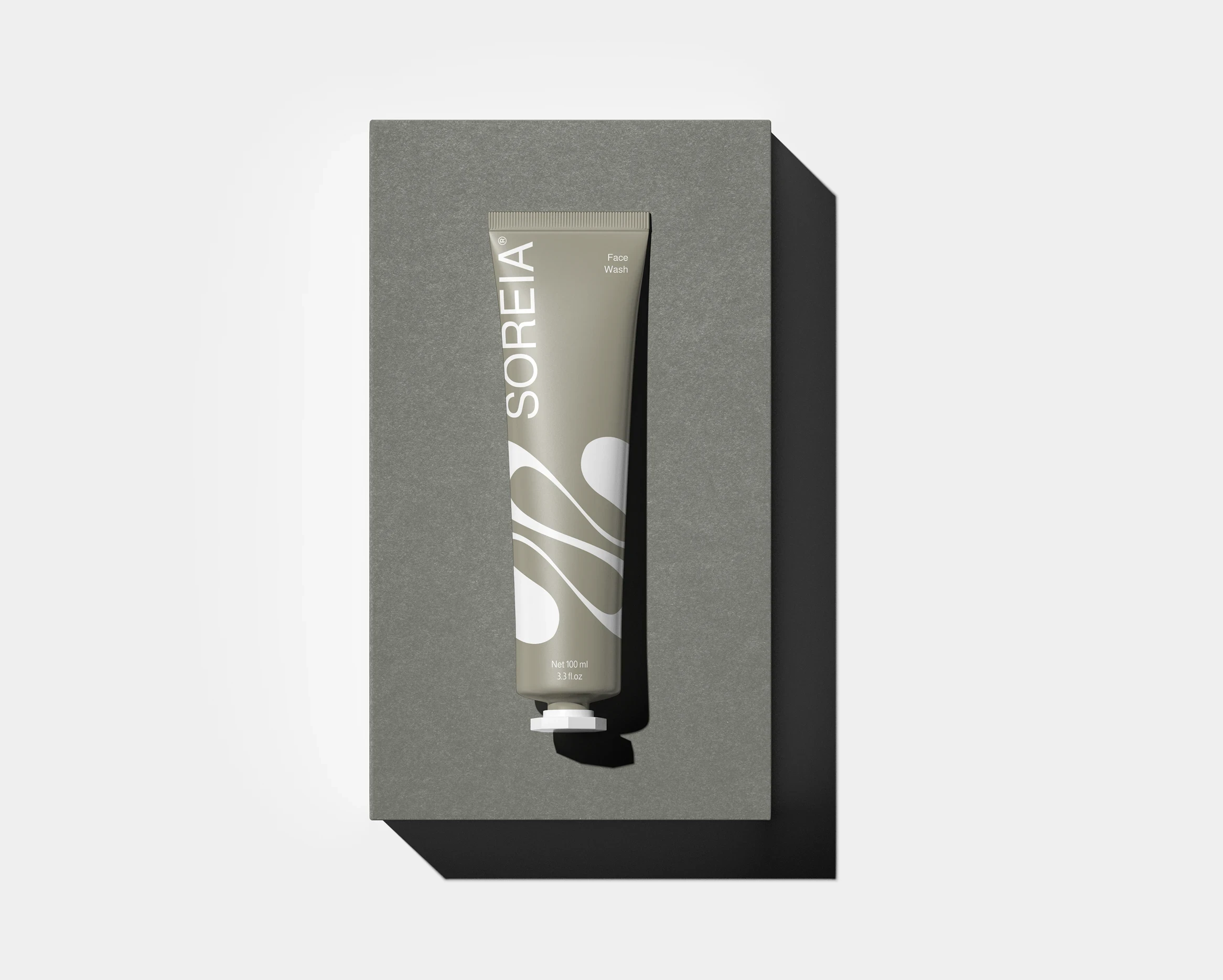
We developed a visual identity and packaging system that reflects SOREIA’s natural essence ,combining organic forms, earthtone palettes, and minimal design to create a soft yet elevated brand presence.
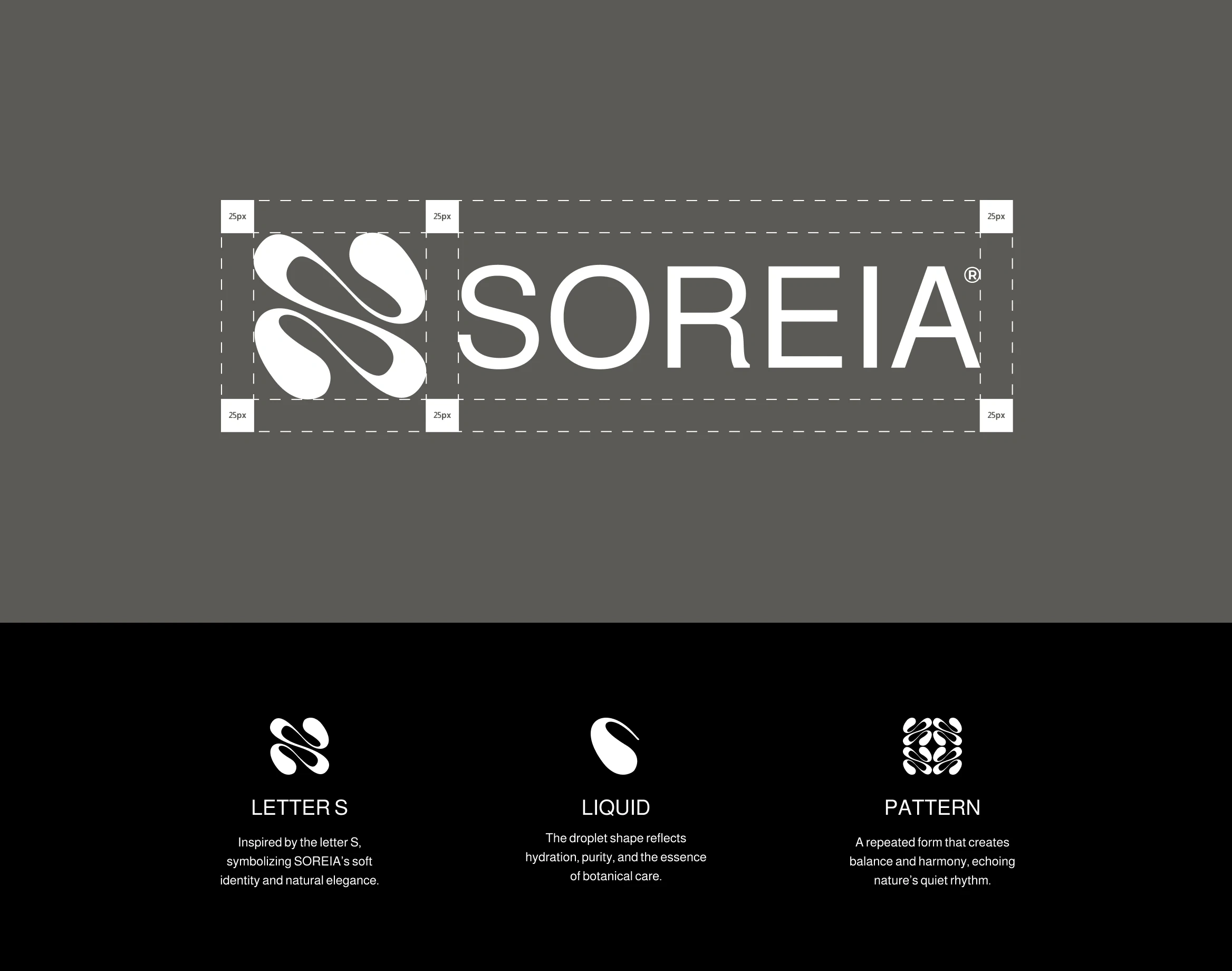
The logomark draws inspiration from the letter “S” and the shape of a water droplet, symbolizing hydration, balance, and nature’s quiet strength. The overall brand direction embraces simplicity, modern elegance, and a mindful connection between product and self-care ritual.
From concept to visual language, SOREIA is designed to feel honest, healing, and beautifully grounded.

Like this project
Posted Jul 1, 2025
SOREIA is a skincare brand rooted in nature’s calm, offering gentle, plant-based formulations that nourish and restore.