Webflow Redesign for Kat Irwin Design
Nikoleta Angelova
Project Overview
Kat Irwin Design, Web Designer based in Berlin.
Kat has created “Web Design Solutions for Impact-Driven Entrepreneurs” for the past 6 years as a self-employed designer and when she turned to me to help her launch and redesign her website I felt extremely honoured! If you do not know, the road to this collaboration was long and started at the beginning of 2022 when I decided to start my freelance career. It all started with one very long coffee chat, later on, social media collaborations, creating a podcast together and most recently working together on this very project.
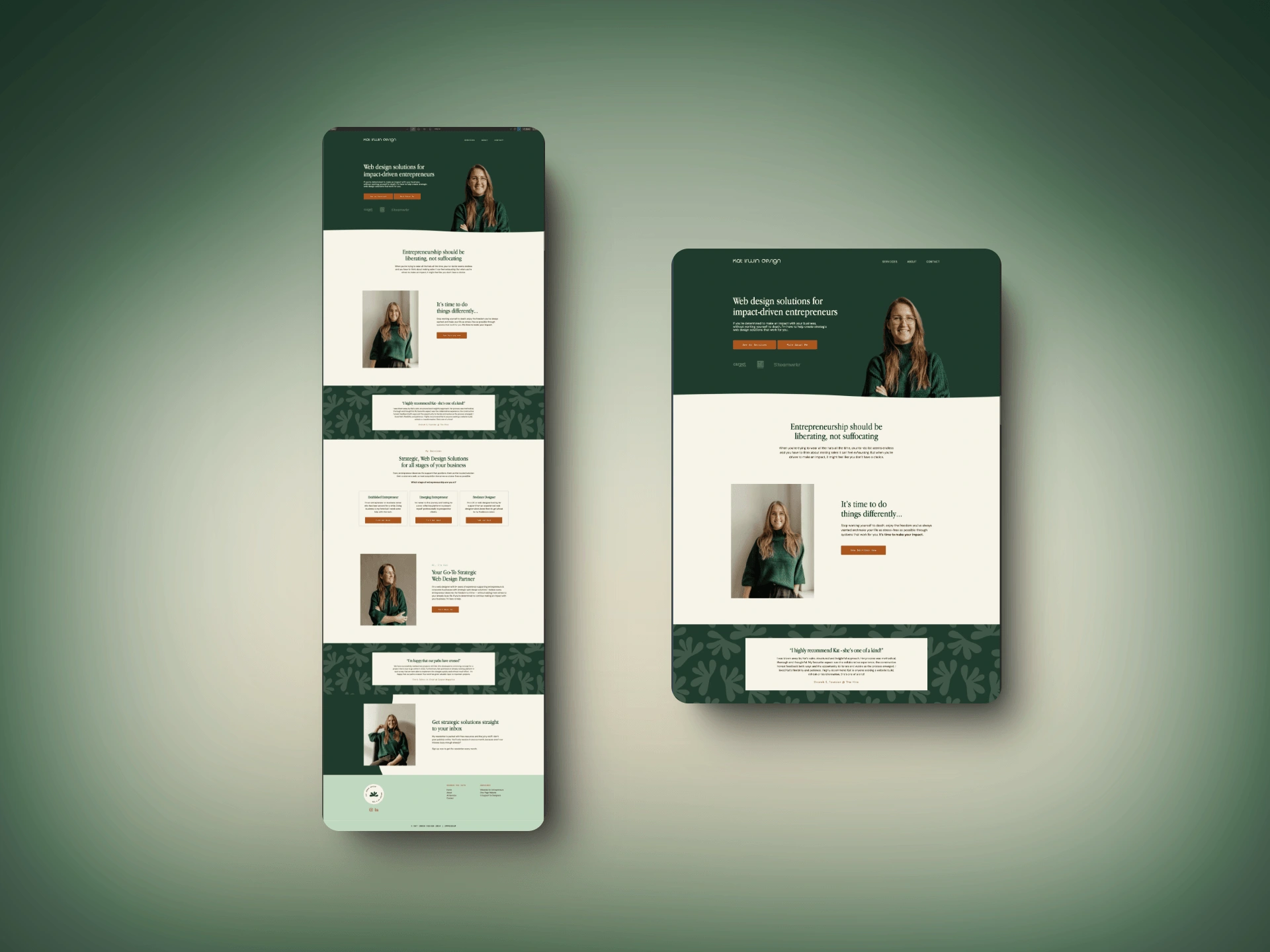
The homepage before the redesign or the work in progress.
Problem statement
We have a nice saying in Bulgarian about this very specific topic: Обущарят бос ходи or in translation: The shoemaker walks barefoot. Being your client is hard, finalising your portfolio and hitting publish is hard. Launching your website after so many years of gathered experience - also hard. We were joking while nitpicking on some of the web page layout and UX, but I was there for Kat not only to translate the Figma designs into Webflow but also to advise, suggest and say: this is good, we can focus on the next phase.
The Goal
To launch Kat’s website before she goes on holiday! 😁 This was priority 0 for us since we both knew, there were other pages to be added and of course, the layout would change naturally as her business grows.
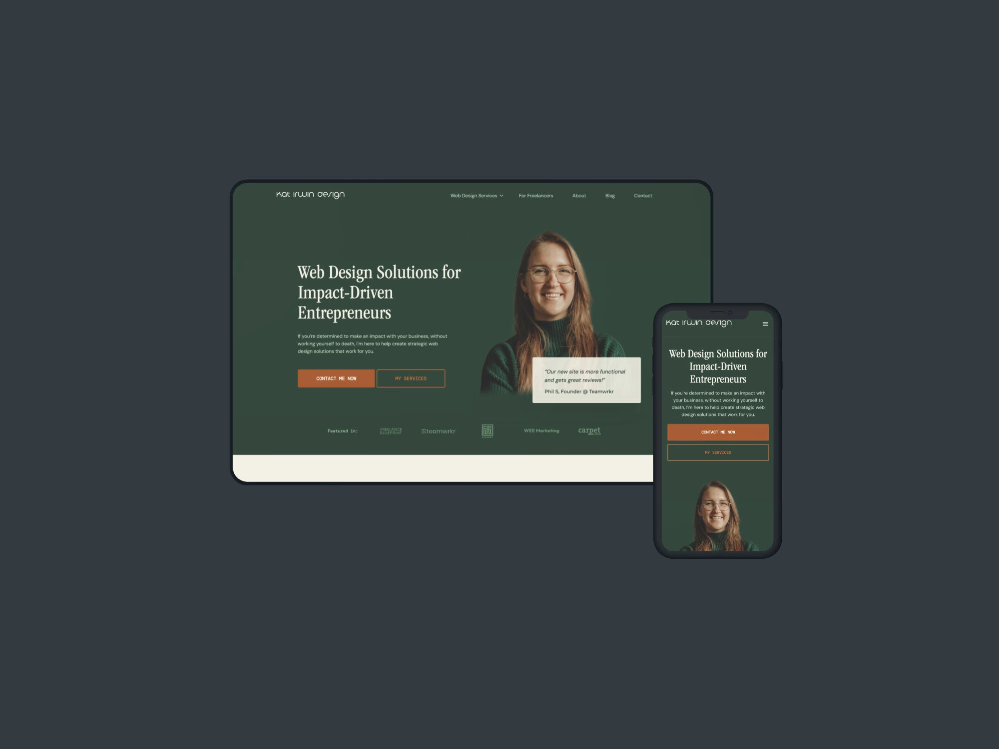
The homepage after the redesign.
Process
As I mentioned the first step was a design review and analysis of what we have. Designed screens (screenshots) in Figma, branding elements, visuals, Lottie animations, imagery, available copy, built sections, elements and containers in Webflow, the metrics used by the previous developer and style guide. After reviewing all this was time to create a backup version of the website and start exploring every page and observe the missing pieces.
After a thorough observation of the Webflow website structure and the Figma designs, we started working asynchronously on the UX and visual hierarchy of the homepage. Based on priority we started working on the next page which was p1 or Services. Midpoint of the project the new copy was available in Figma. Wrapping up with the creation of the other services pages, it was time to work on troubleshooting different forms, sections and design elements.
The last 3 days were left for minor changes, adjusting the responsiveness of the other 2 breakpoints and testing live on our devices.
Outcomes & Results
Well, I am happy to announce that we not only met the deadline but managed to build something together by joining efforts! 🥰 Here is Kat’s up-and-running website. And if you read all my case studies you would think, there is no way every collaboration is smooth as butter and so enjoyable. What can I tell you?! This one was! It might be because we already had established such a good friendship and worked on our podcast, or the fact that we communicate so transparently and easily. Not sure, but it's working! The last changes I made were on the 19th of April before the launch because of a sneaky SEO issue and redirecting links which took only a a few minutes to figure out and fix. ☺️
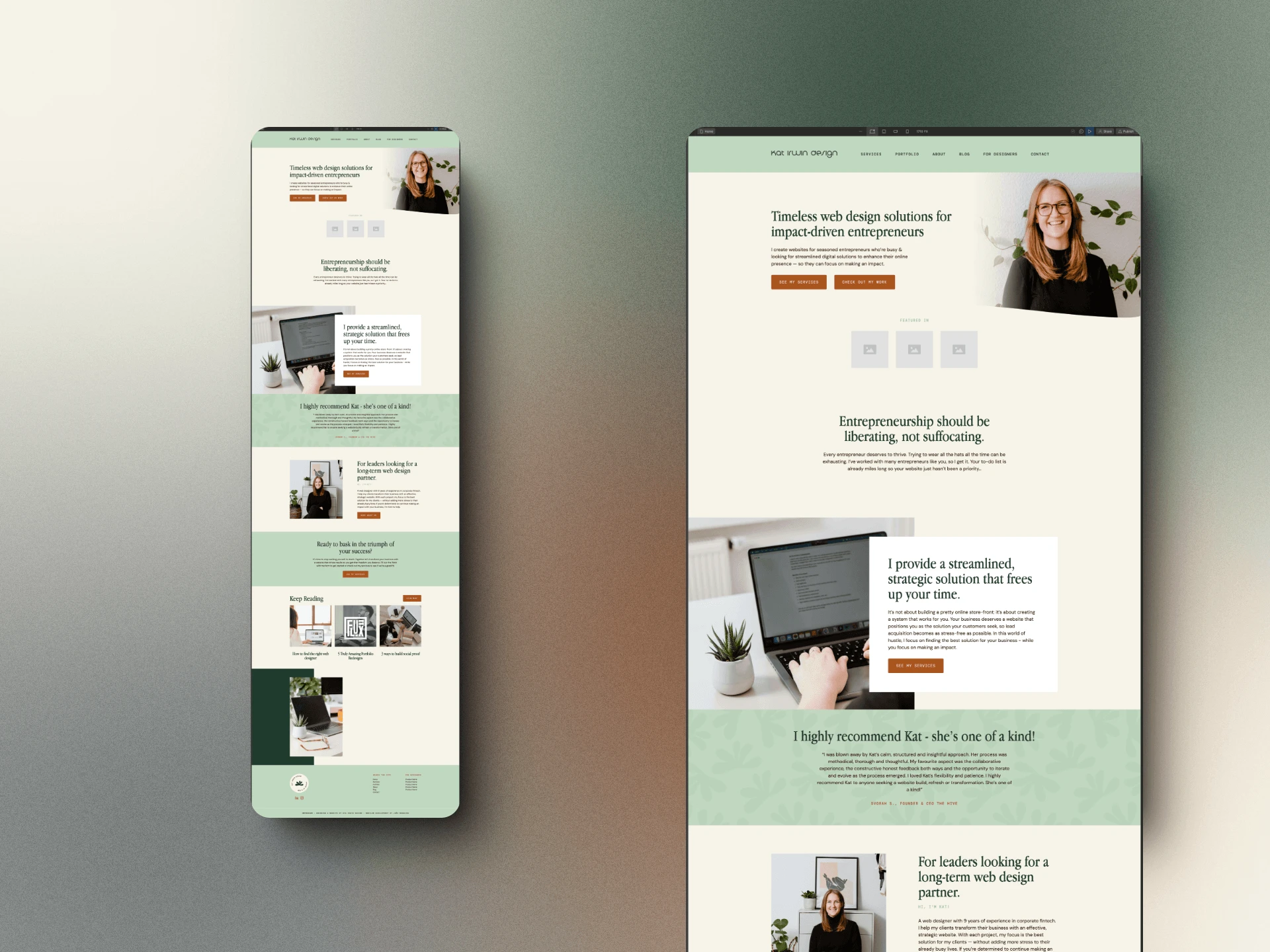
The latest mockup of the website.
Like this project
Posted Jan 31, 2025
Complete redesign of Webflow website based on UX high-fidelity wireframes. More about the project, challenges and process in the full case study.