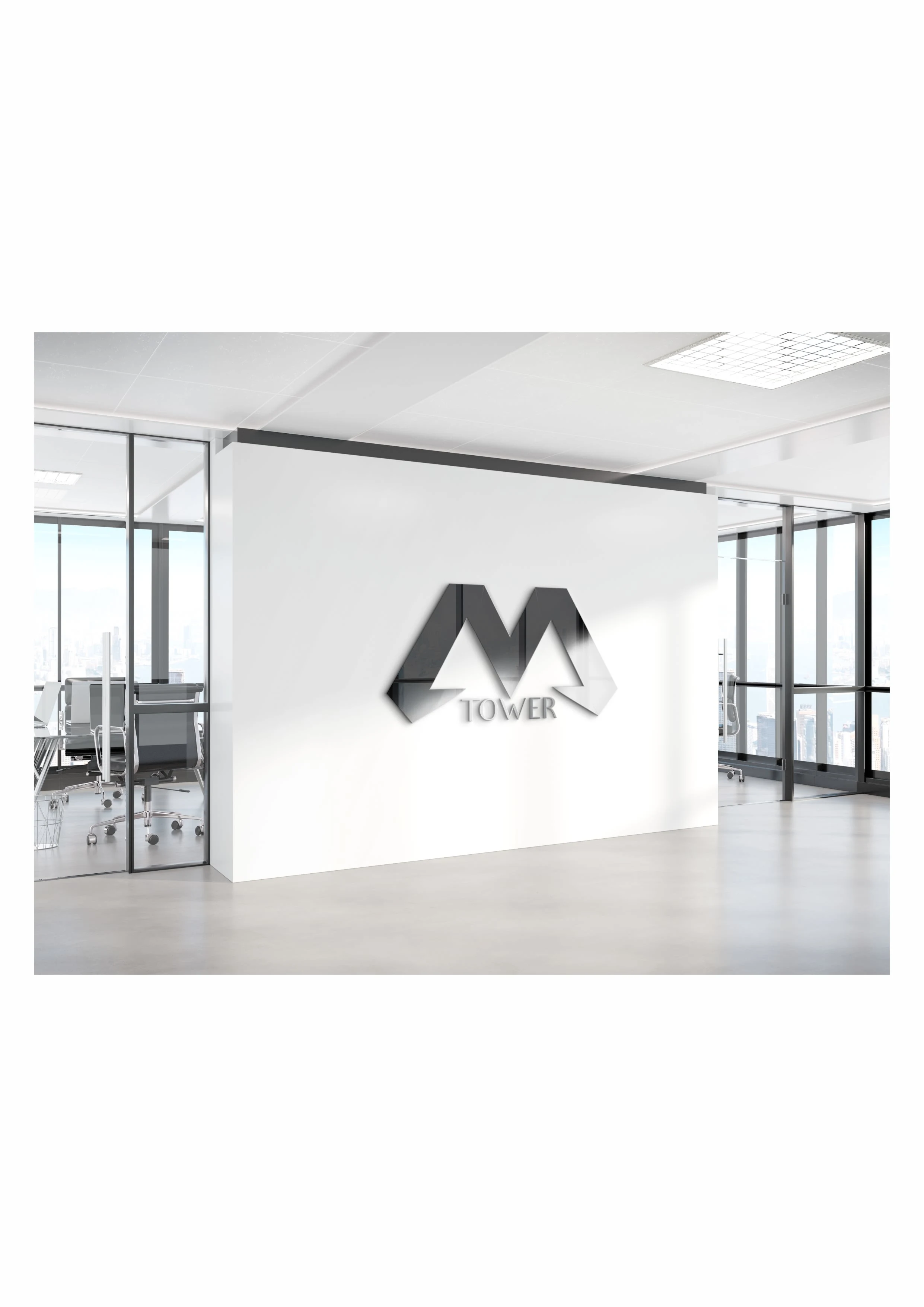
M Tower Logo
Overview 🔎
The project was really interesting and challenging as it involved the construction of a new business building
Problem & Solution 🤝
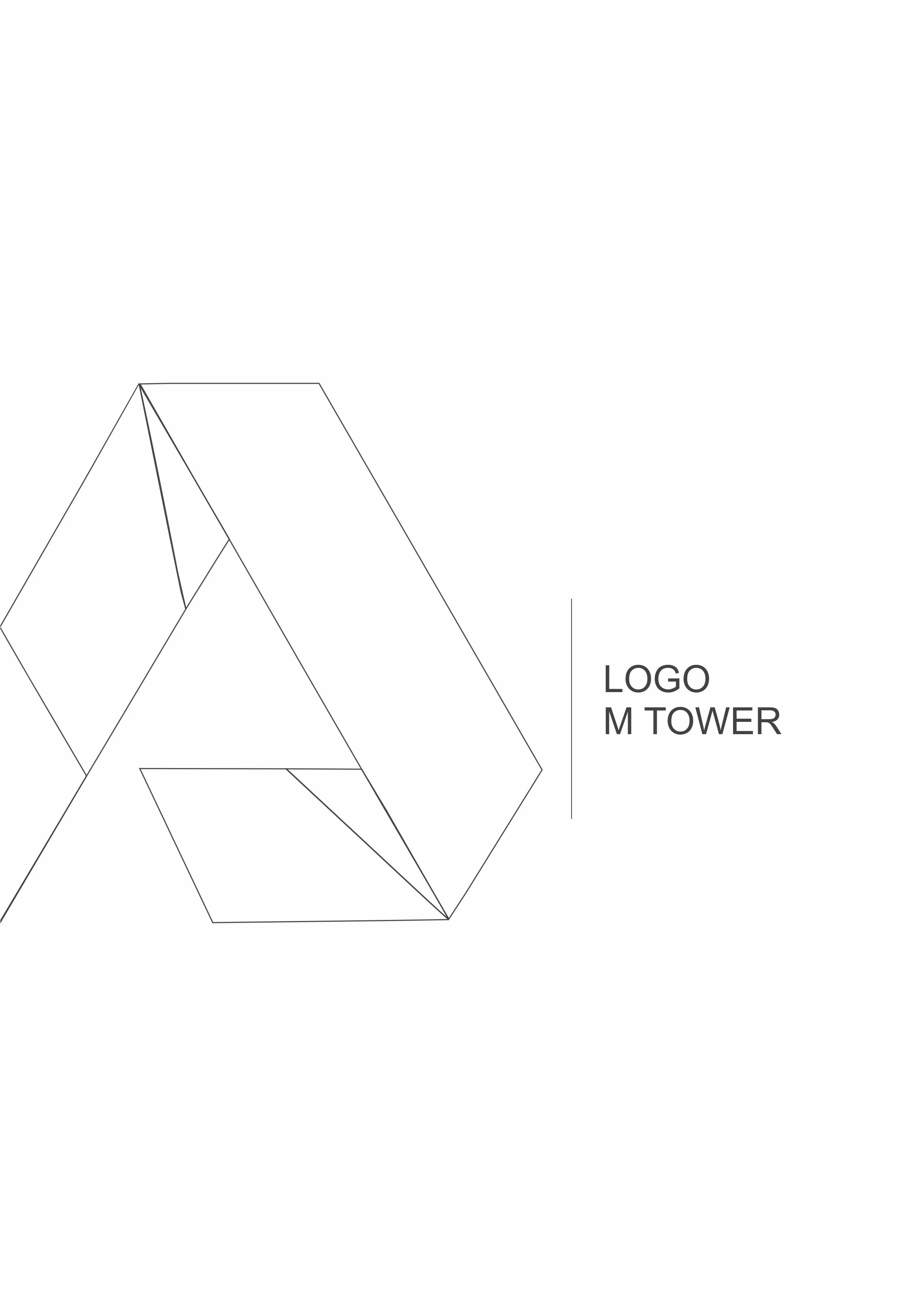
The logo is related to the building because it itself has the letter M in its architecture and the logo had to correspond with it
Process 🛣
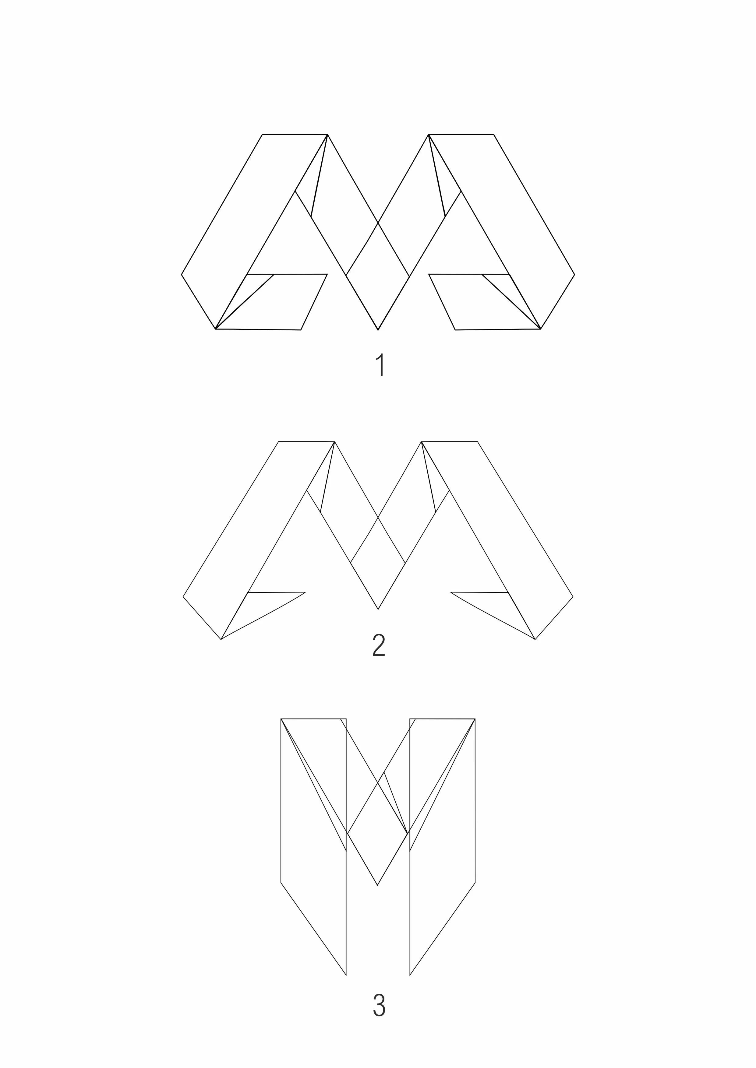
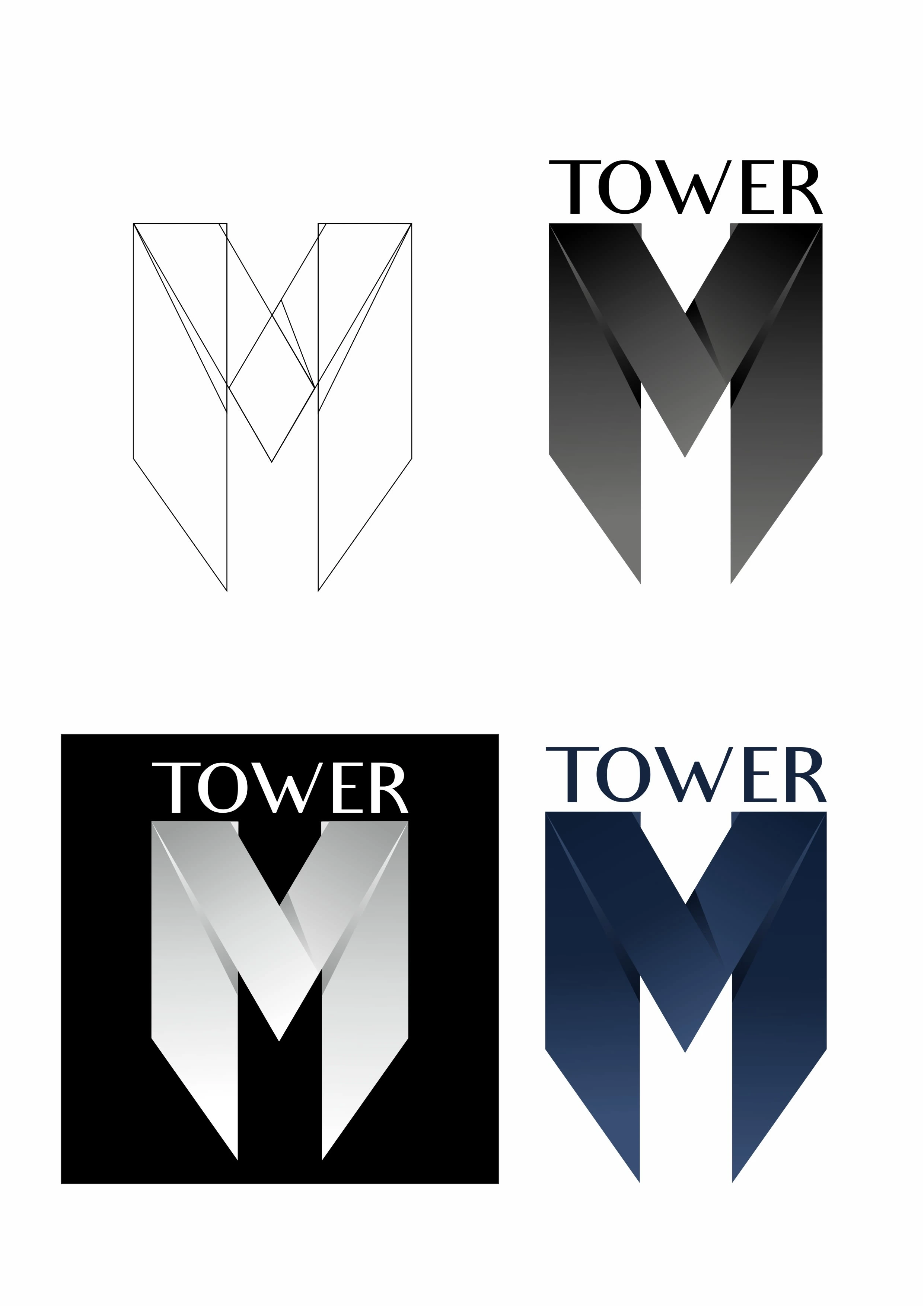
Therefore, as can be seen in the logo project, it had to be maximally architectural and at the same time radiate stability.
Results 🎁
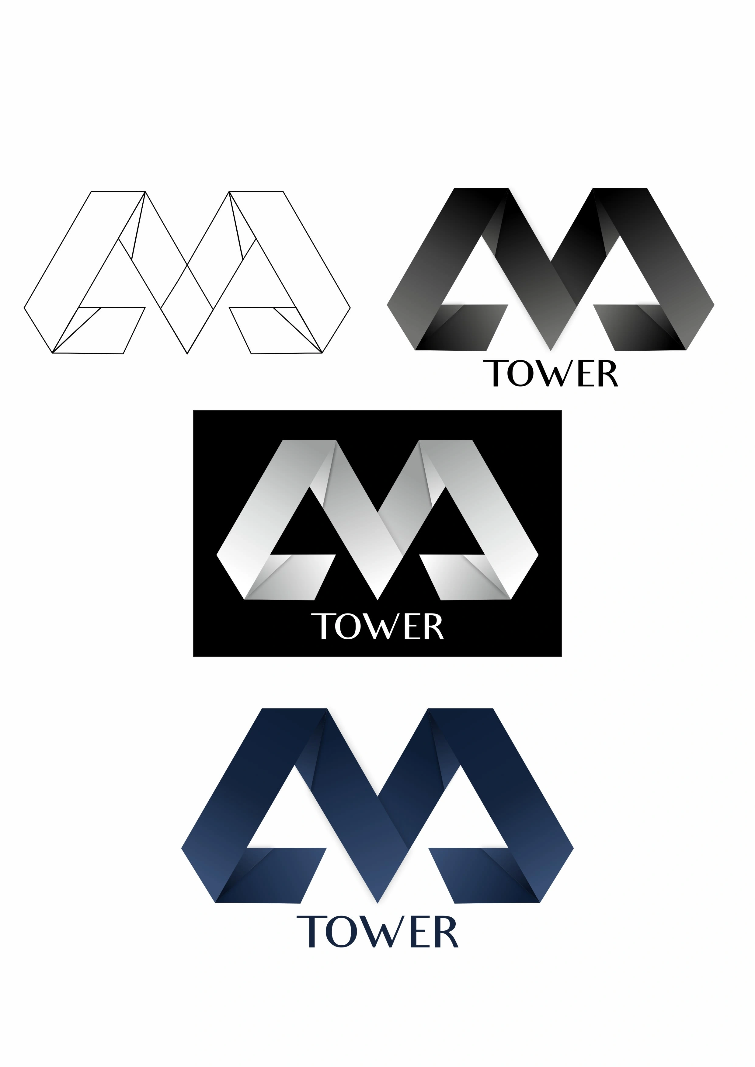
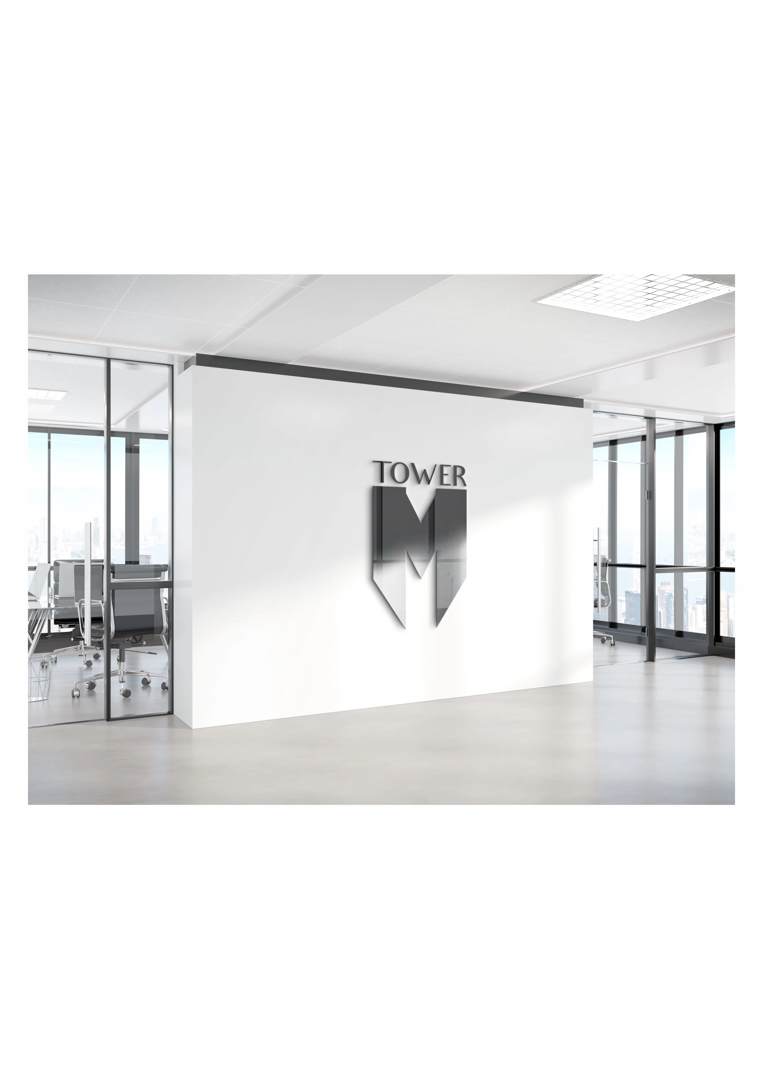
Of all the options, they chose number one because for them it is the most stable and it comes as close as possible to the architecture of the building itself.

Like this project
Posted Nov 17, 2022
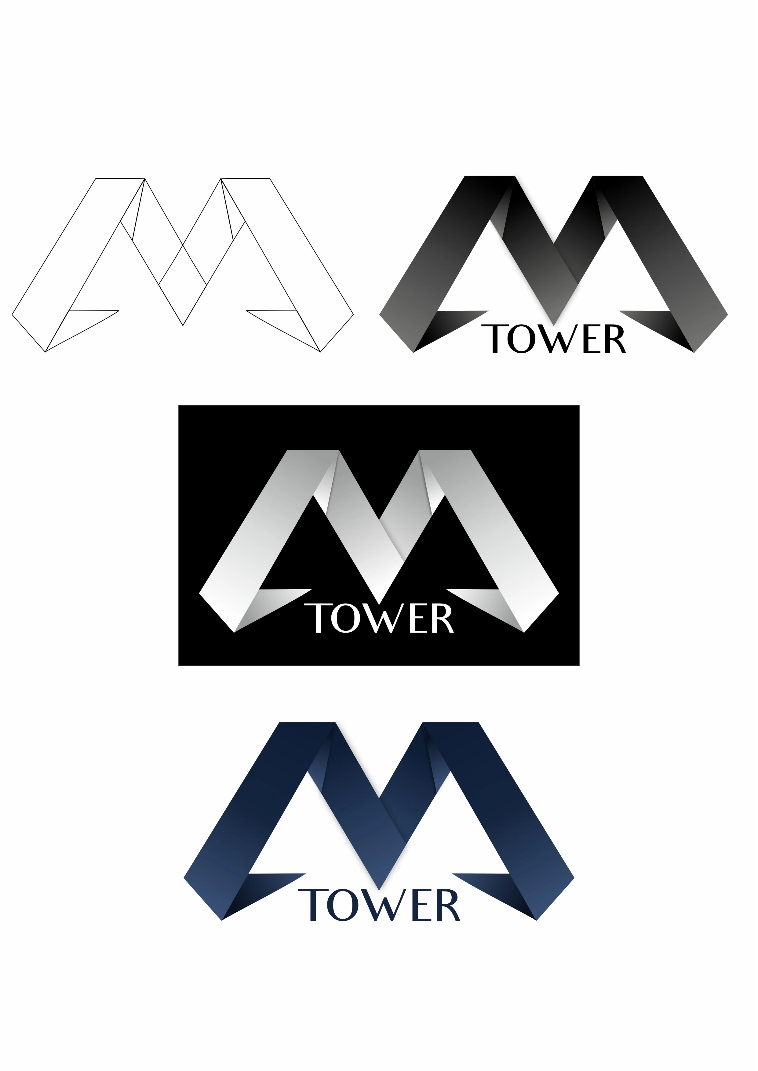
I was hired to design a logo for an office - an apartment block that is currently under construction. These are my suggestions, the option they chose is the 1
Likes
0
Views
10

