Modern Finance: Enhancing savers' capability beyond credit
Adebimpe Omolaso
quick link to the full Figma file:
Investa. ng is a fintech startup in Nigeria that helps users save money. In the first year of launching, users were able to save up to ₦35 million. However, customer retention has been a challenge as they lost users to competitors.
INTRODUCTION
I attended a kickoff meeting with the Product Owner, CEO, marketing team, and other stakeholders after being hired at Investa Nigeria. We agreed on the business requirements as well as my deliverables.
MY DELIVERABLES WERE CLEAR
Retain users
Help them engage with the company's products better
Help Investa become the top destination for saving and investing
However, the deliverables were not actionable as I needed real data to critique the users' existing constraints while interacting with their mobile applications.
We also recruited 4 new users (prospective users) and 6 existing users.
The results were as follows:
01
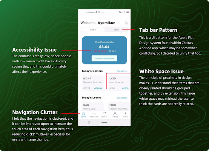
100% of users felt that the brand was inconsistent, especially in terms of UI elements e.g,. buttons
02
60% of new users failed to complete tasks due to unclear content and no feedback to let them know exactly what was wrong.
03
97% of users complained about unclear navigation due to inconsistency of active navigation items and are not sure about the page they are on.
My team and I set out to create a vision that would resonate with users in a bid to give the Investa mobile app an appropriate brand and experience. The result was almost instantaneous, with a 30% increase in user engagement.
This led to a rebrand that influenced brand trust and ease of use, thereby changing the task completion rate and flow awareness to a whopping 90% with the same users who were recruited at the initial research stage.
JOURNEY THROUGH THE WILDERNESS
Initially, our intentions were to create a consistent UI through lean UX and test things we created (since we had little to no funding budget for research) as we thought it would better propel users to save time on time.
However, this decision was flawed as the focus group's overall task completion rate by time grew by almost 20%. By extension, we increased the number of steps instead of simplifying them. So I proposed that we fixed this blockage, and the whole team agreed.
We had to look further into the product itself and learn how users are being onboarded and how they try to achieve their goals on the Investa platform. We discovered that "The process of understanding how to save can take a long time and requires many offline activities(with the help of care representatives).” This means saving often takes a long time to close ( especially for first users).
We set out to streamline this process and thus improve customer satisfaction and, thus, retention. I set out to make some assumptions based on our competitors, user flow after the competitive research to be able to see how they have been retaining our users.

Takeaways
After examining various credit, thrift co-operative, and investment apps, we discovered Investa was missing a couple of things, including;
Quick Action
Seamless navigation
Consistent UI Components
A gamified experience
AXING PATHS TO PAVE THE WAY
Exploring the Possibilities of Quick Action
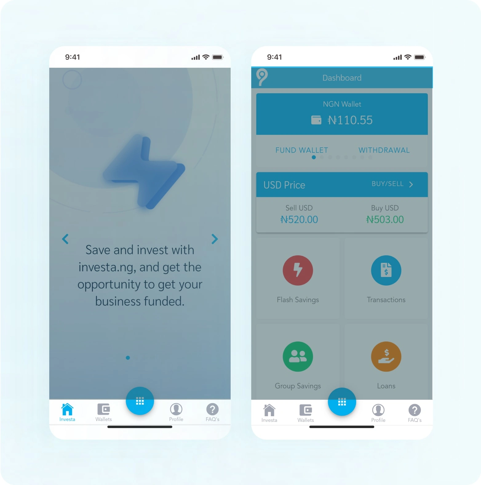
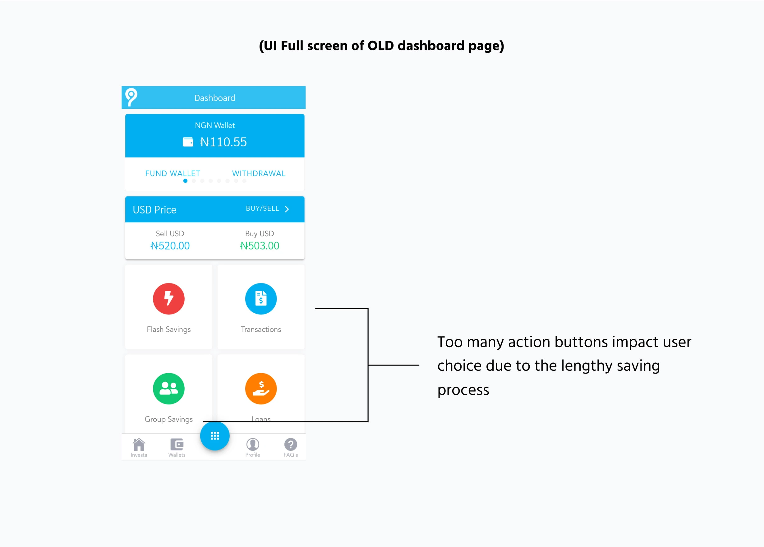
To address these issues, we decided to introduce "quick actions" and experimented by reducing the action box sizes so that the scroll length would be shorter.
However, we observed that the touch area was smaller, thus impacting the usability of the app. This led to longer timeframes for users to make decisions.
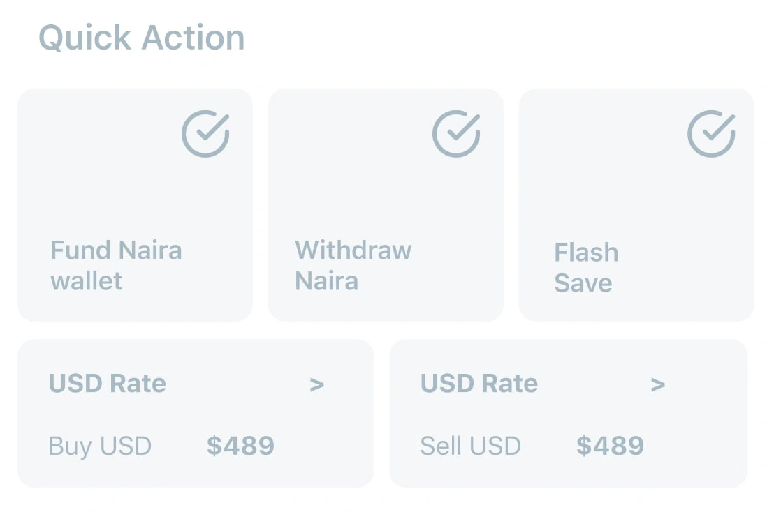
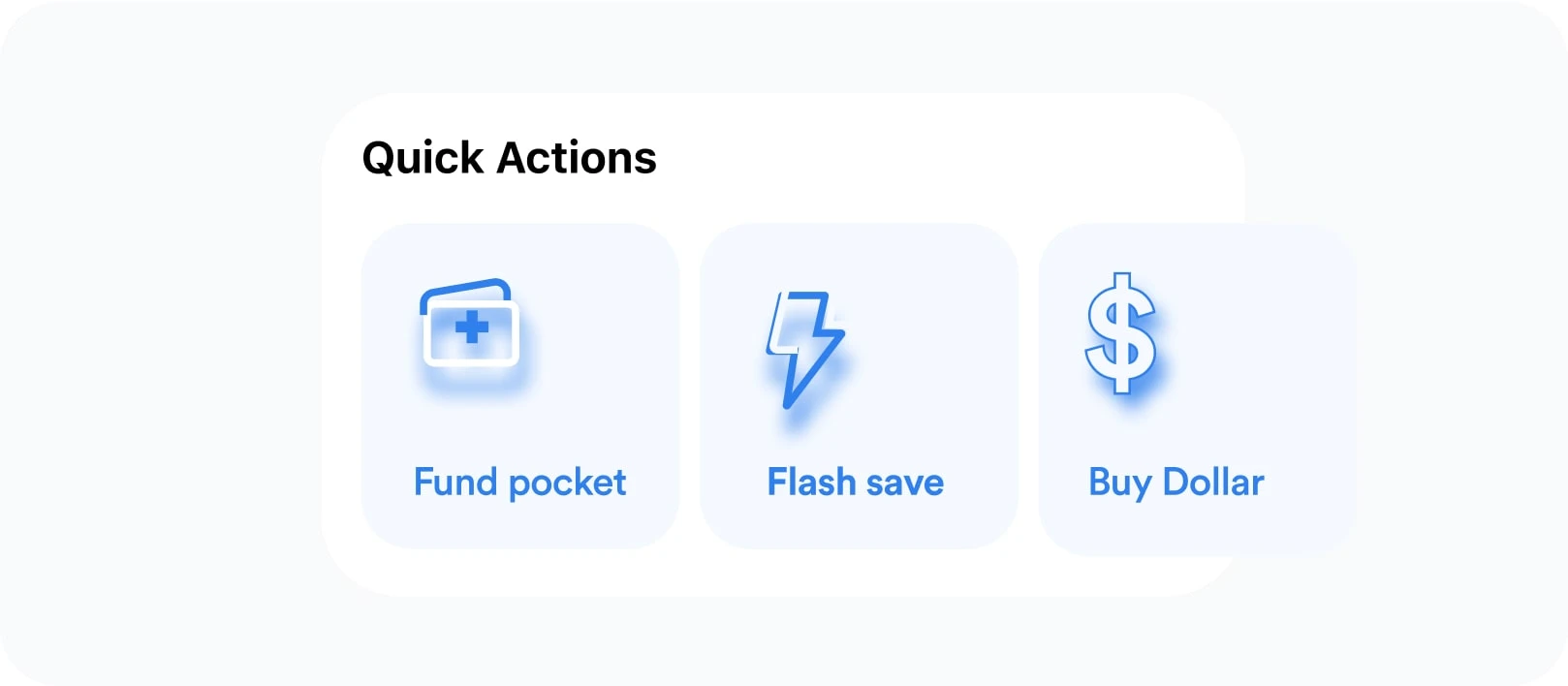
Making Navigation fun and intuitive
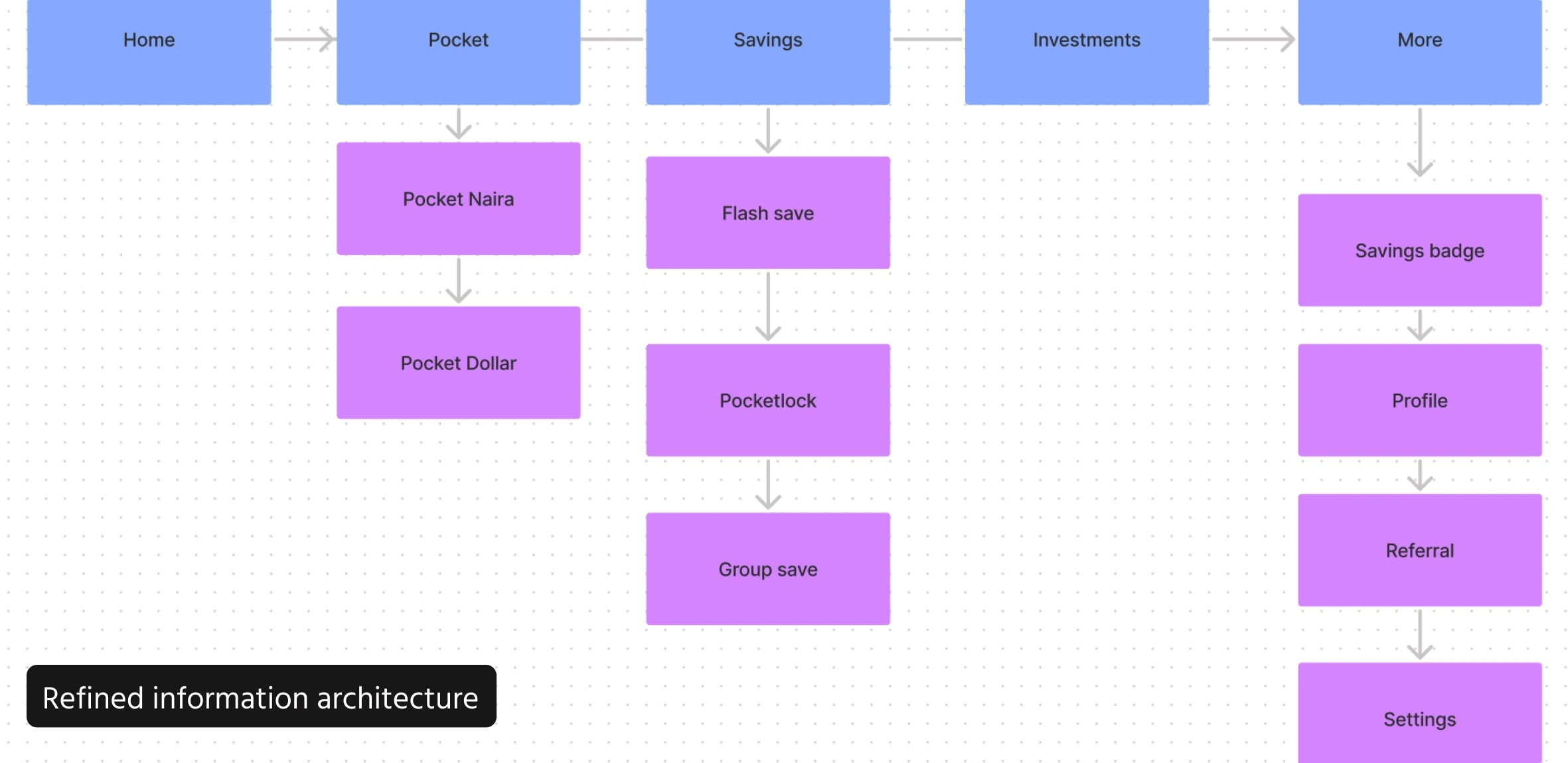
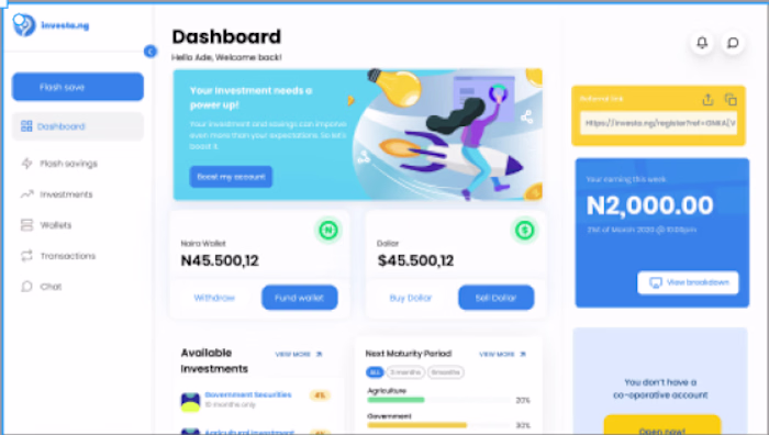
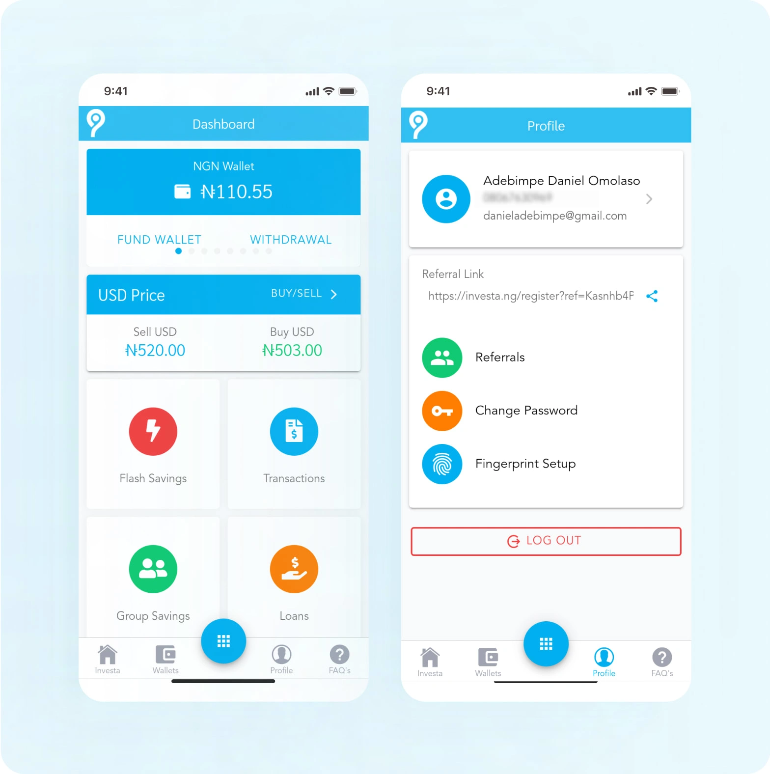
Now that the home page was fixed, the users needed to have a cleaner and more responsive way to navigate the app. The old interface featured a bottom navigation system. We initially chose to use a hamburger menu but after a Lighting-demo with the team (design, marketing, and product owner), we decided against changing the existing navigation.
Since we had to use the same UI patterns, we needed to reimagine the information architecture as we adapted the popular patterns used by our competitors.
UNIFYING THE ATOMS TO BECOME A SYSTEM
Just like other brands had a unified design system, we made a presentation to the Investa team. We explained why we felt a unified user interface and components management system would be best for the future of the product.
We also pointed out that it would allow us to onboard new design and developer recruits easily. It would also aid public perception of the app's identity and overall brand to stand unique and retain uniformity.
After getting the required approval, we set out to create a new style guide and illustration. We documented them during the hands-off stage so that the development team could create a components library, thereby having a unified design system since the code base was structured for React Native. During the testing phase, we noticed a whopping 50% usability increase as the users felt that the redesign had a richer appeal as we placed side by side the old interface with the new style components.
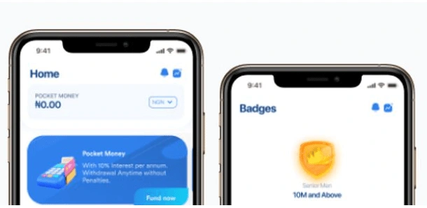
GAMIFICATION INTRODUCED

To that end, we introduced two types of badges, one of which was attached to the usage of the overall app, and another was attached to the usage of the different savings features to increase the rate at which our users saved on the app.
THE BEGINNING OF THE END
We were a bit anxious about our decisions as it was time to test the changes we had made before shipping...
So we decided to set a major goal that summarises the solution to our problem statement. Our new goal was to:
Enable both new and existing users to save without needing help online or offline( through customer care).
Impact
Saving money should be fun, and it should take less than two minutes to automate the process... This goal was what led me to conduct the usability test. The details are below:
5 users
Tools
Figma Prototype, Zoom
Metric
Task Completion rate
Task
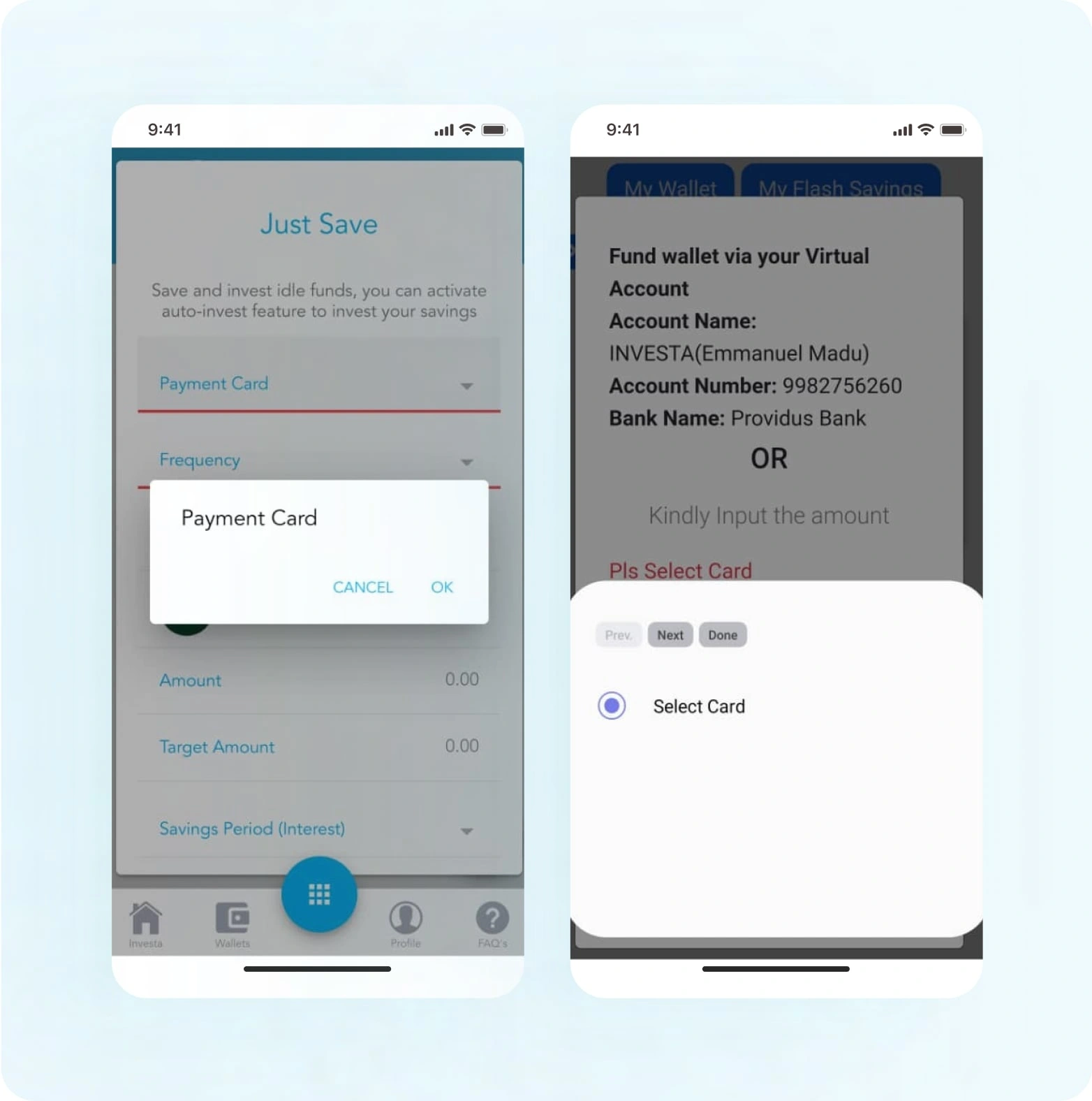
Fund your pocket money
Quickly save an amount
Create an account or Log in
Check your badge level without help
Results
The average completion rate for each task saw a whopping 22.5% as users engaged more with the app, leading to a 90% task completion rate.
Users had a positive and intuitive experience saving.
Users were able to navigate through the app easily
Lessons Learned
Users would be willing to choose you if you make their steps easier while keeping tasks enjoyable.
Design for the future and scalability is crucial when considering incorporating design systems.
Time is money. We could not launch this product due to the fact that the startup had hit its burndown rate. Most of us were not paid; if only we had arrived at delivering these updates much faster.
Next Steps
Assuming we had not hit the financing brick wall:
We would have focused more on expanding the design system
Also, we would have explored more ways in which the mobile app can enhance the trust users had in it.
Like this project
Posted Aug 19, 2023
Improving Saver's Experience A case study of enhancing saver's experience on their mobile
Likes
0
Views
14