Miss Patty Vegan Burger Diner Brand Identity Packaging
Natalia - Design By Tal

Miss Patty
Vegan Diner Brand Identity Concept
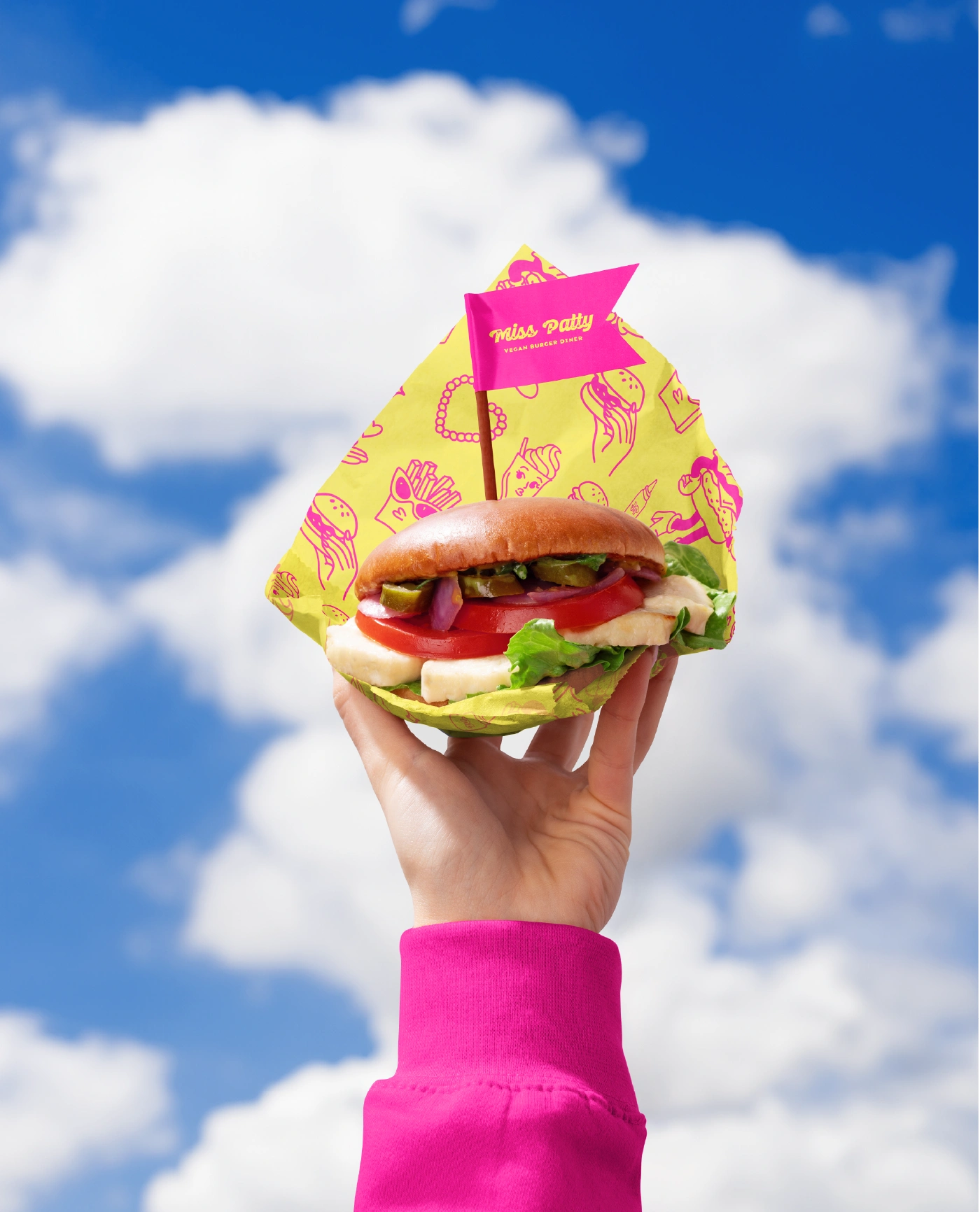
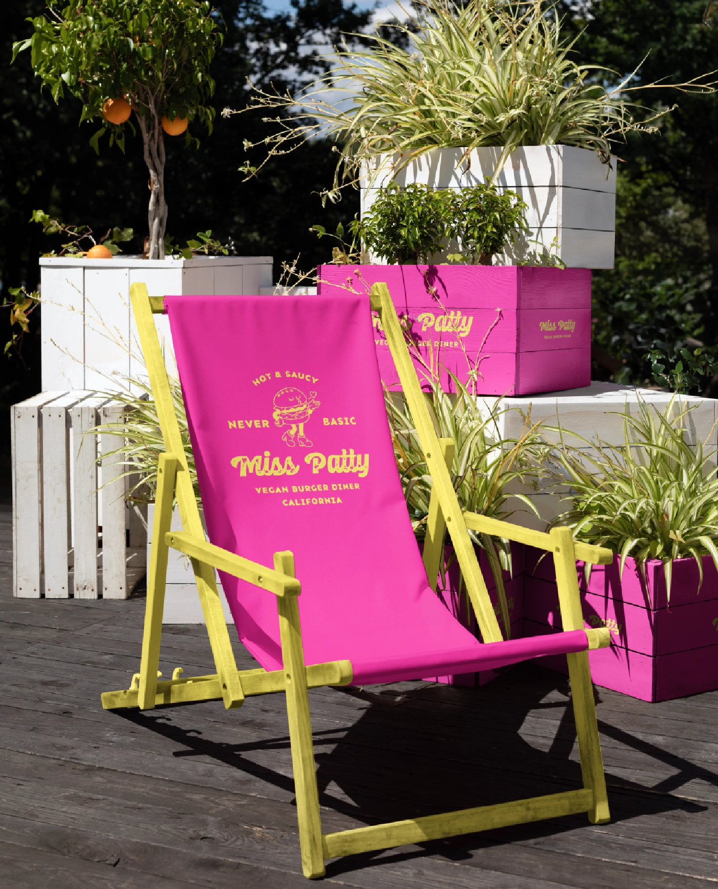
Miss Patty is a bold, flavour-packed vegan diner concept built to break every “clean and minimal” rule in the book. The goal was to create a visual identity that hits you with personality the second you see it. It revolves around loud colours, cheeky character work, and a nostalgic diner vibe elevated for a modern, plant-based audience.
Challenge
Vegan food brands often fall into the same aesthetic: soft, earthy, and minimalist. The challenge was to flip that on its head and build a brand that’s fun, spicy, and full of attitude, all while staying cohesive, intentional, and appetising.
Creative Direction
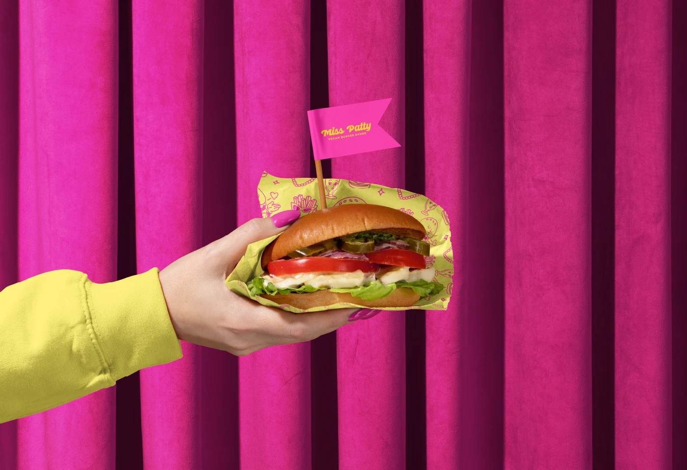
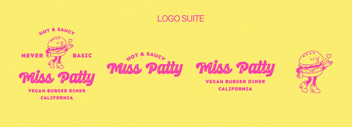
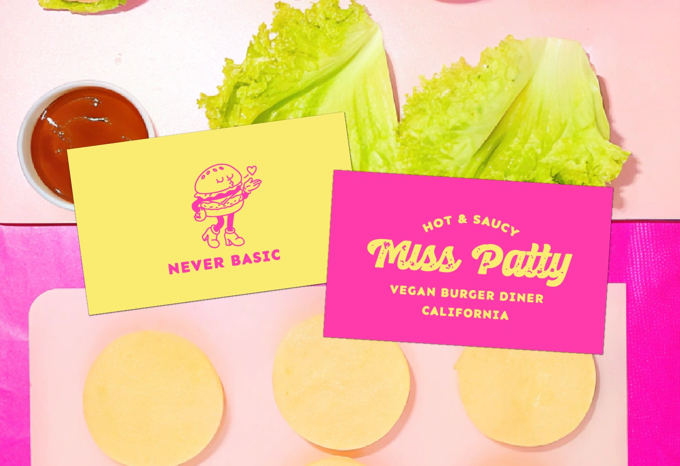
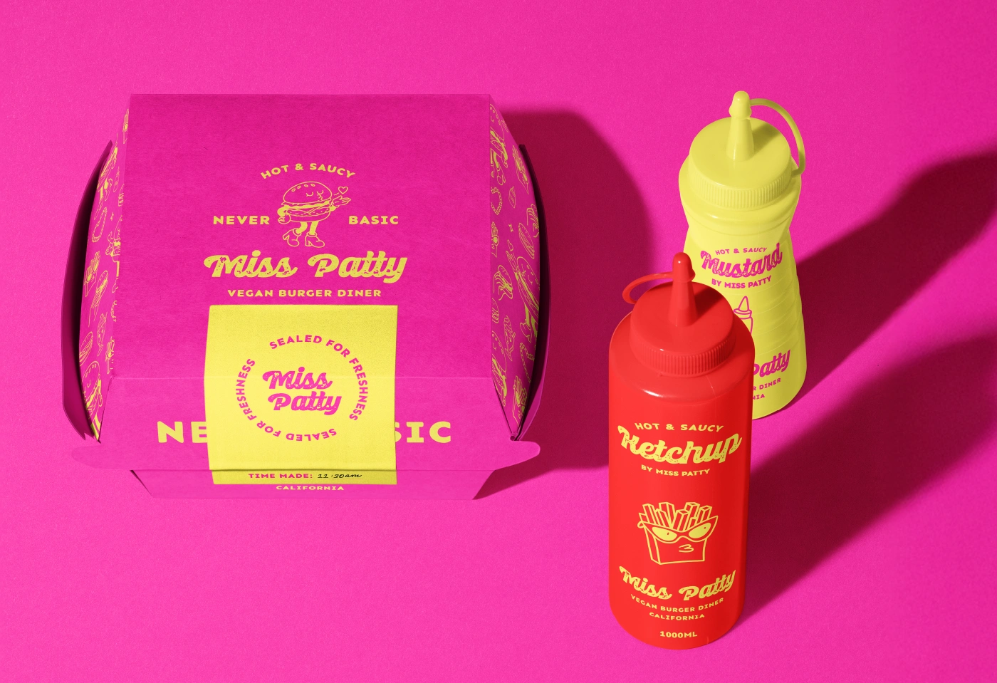
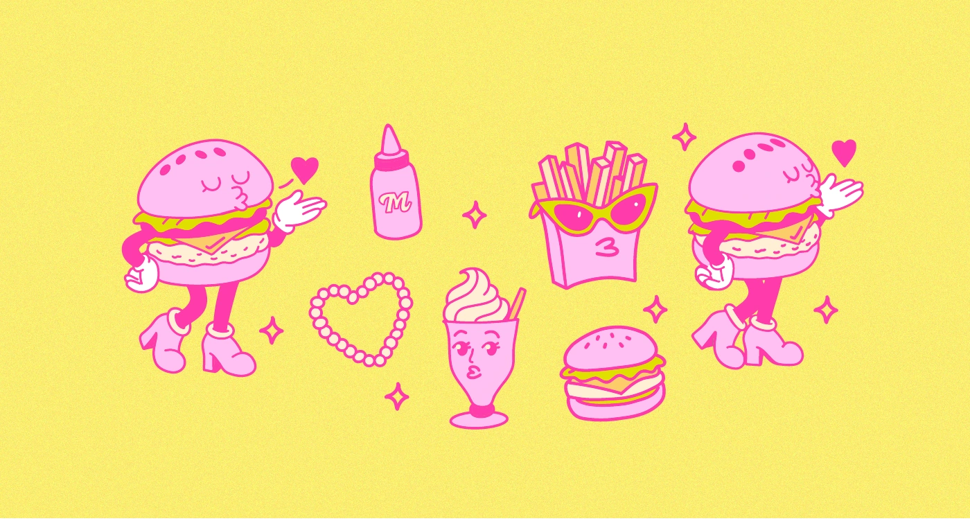
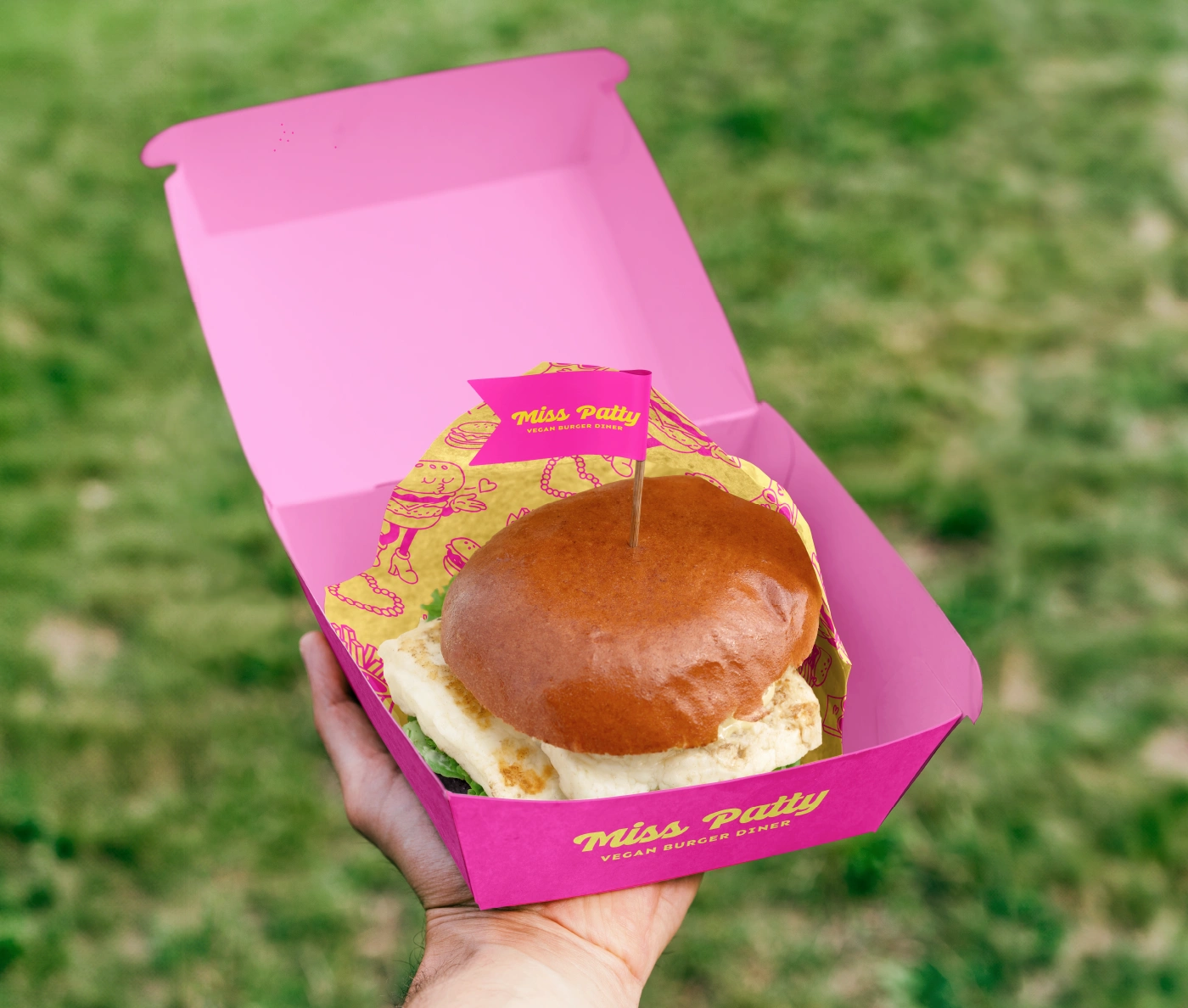
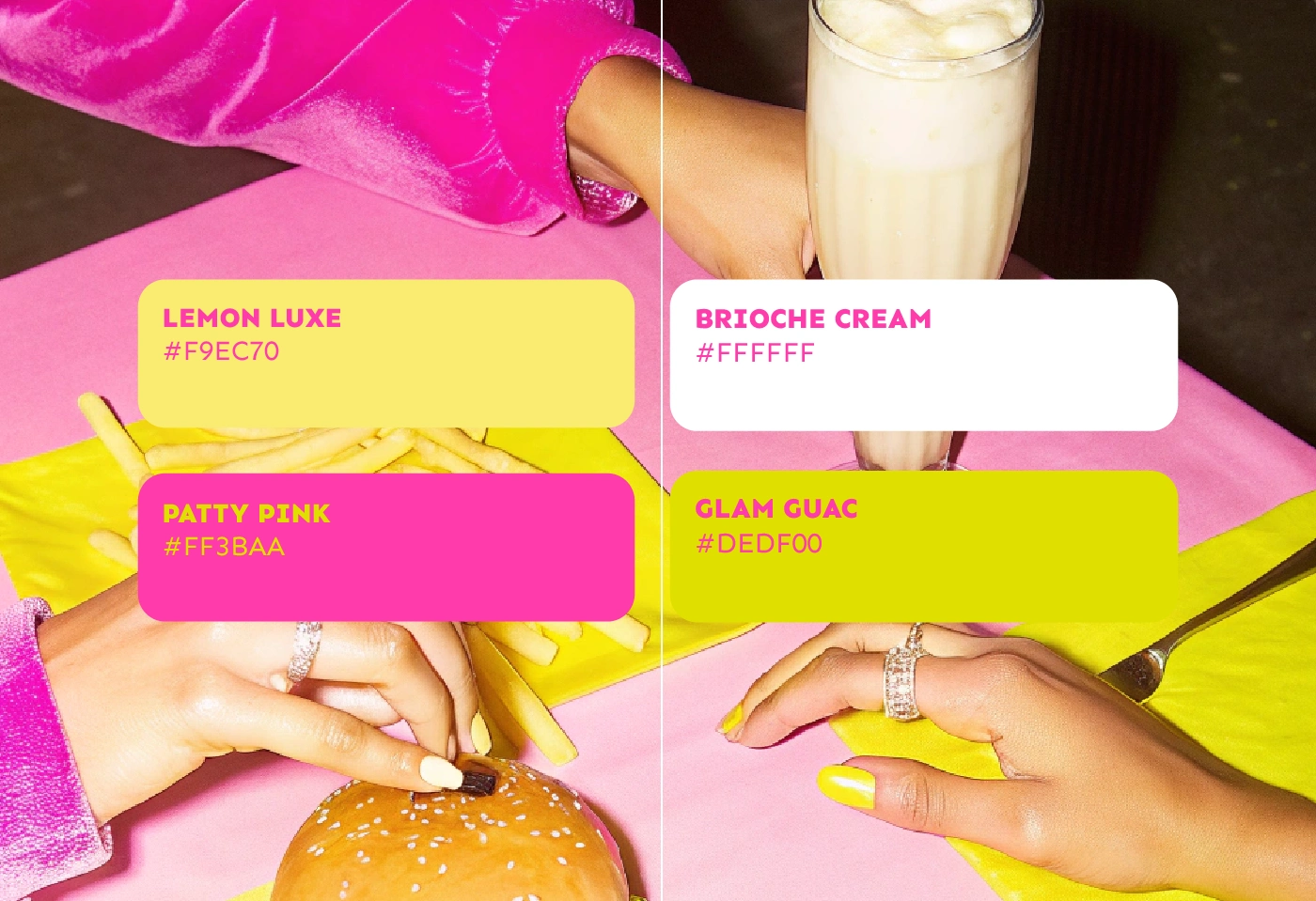
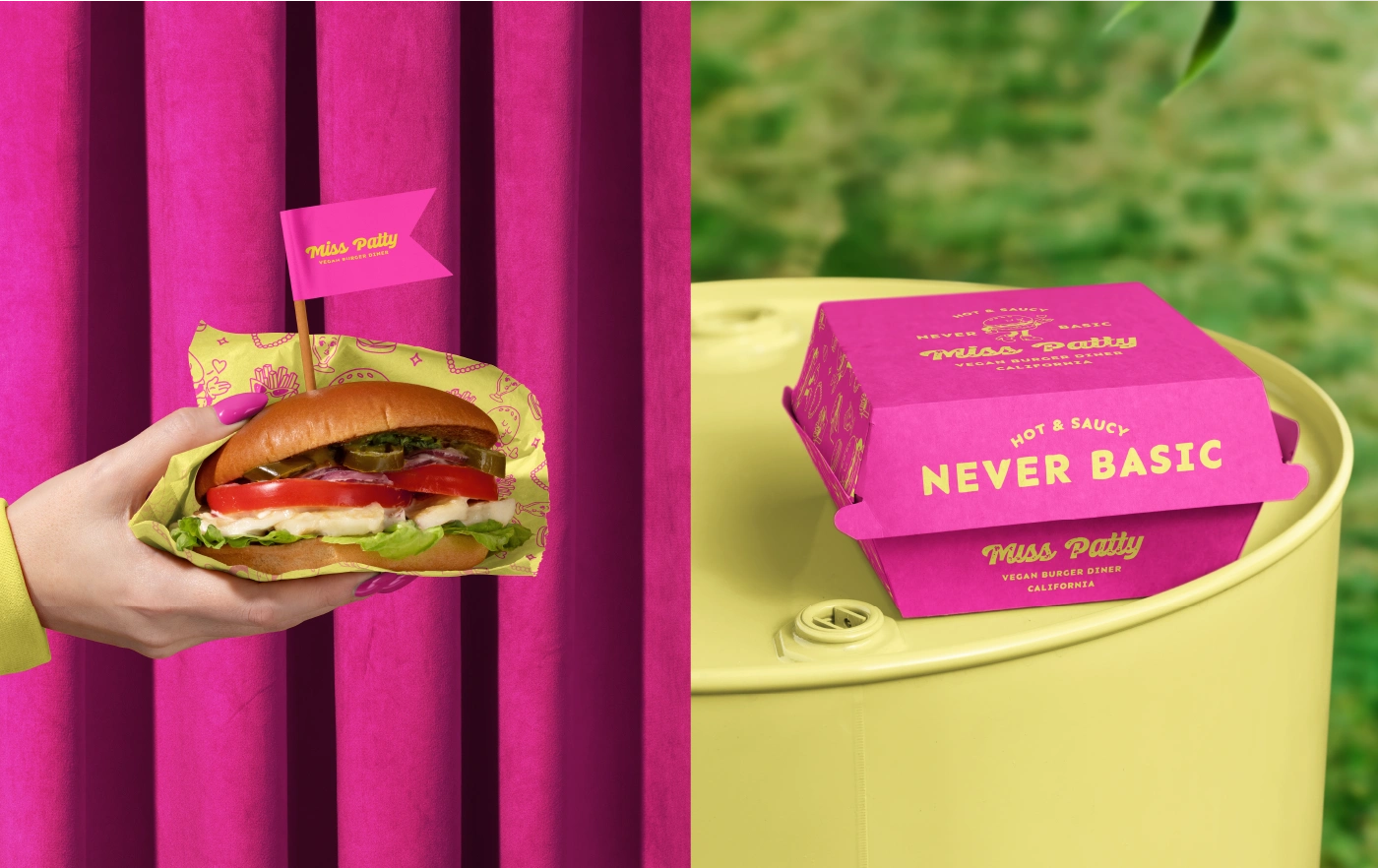
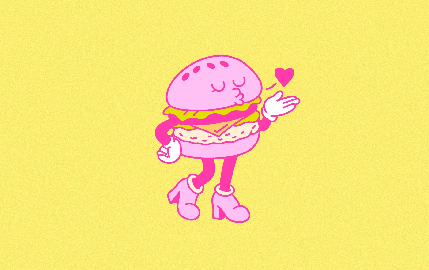
The brand leans into a retro-diner-meets-modern-pop look, mixing punchy pinks, mustard tones, classic checkered patterns, and bold typography. Miss Patty, the character mascot, became the soul of the brand: playful, confident, and instantly recognisable.
The visual world revolves around:
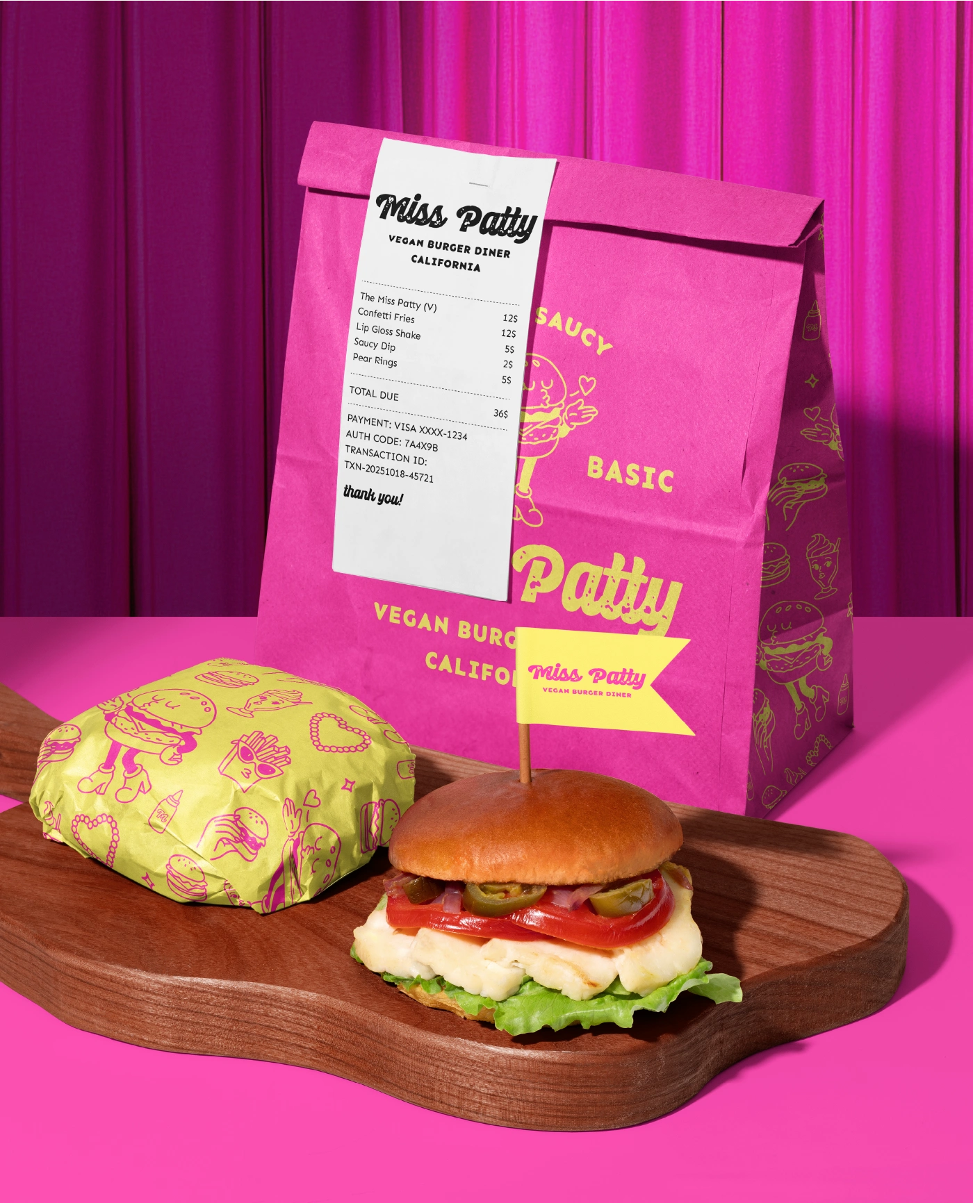
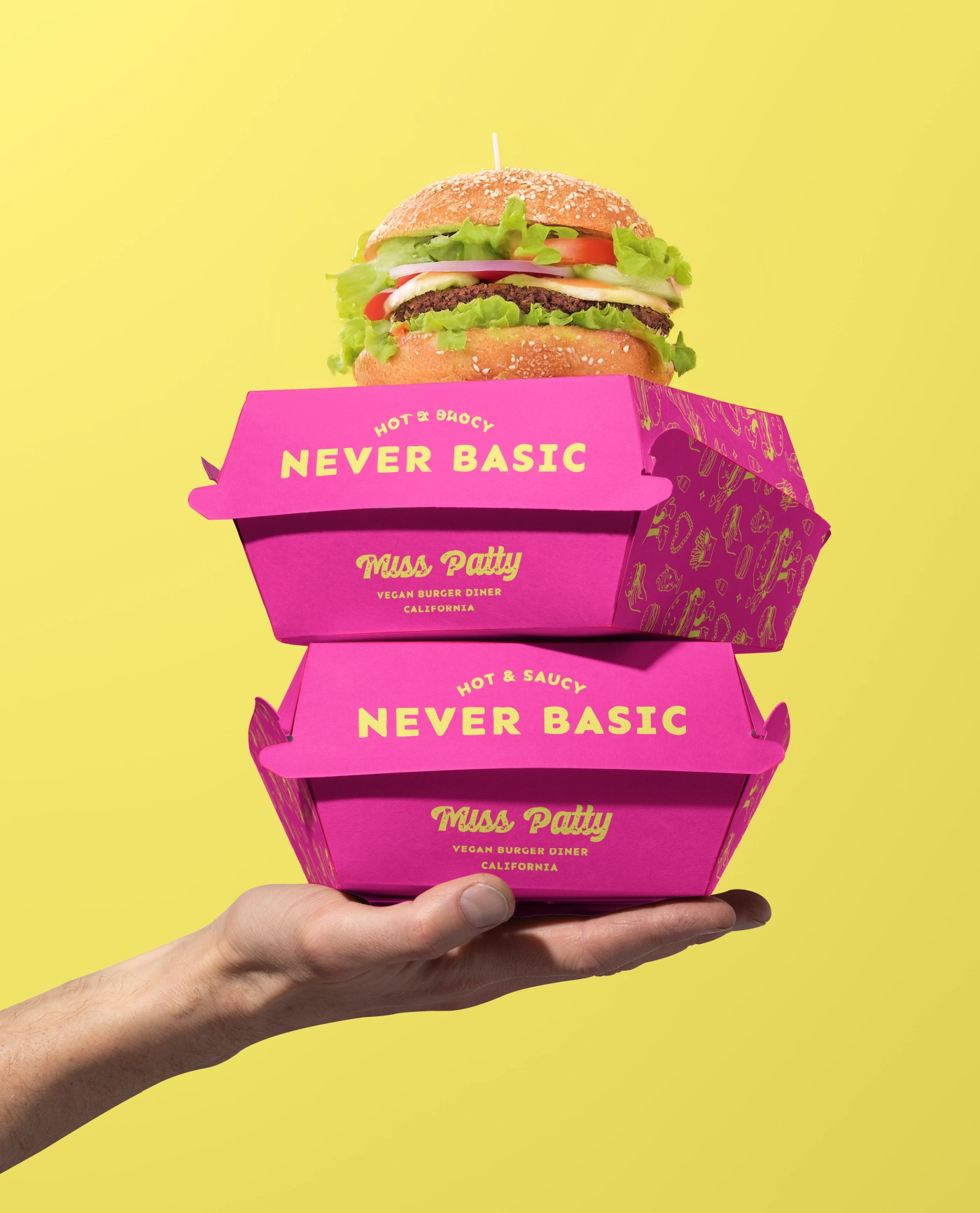
• stacked packaging moments
• diner booth lighting + energy
• bold graphic layouts
• nostalgic yet contemporary food culture cues
This direction allows the brand to feel like a whole experience rather than “just another burger”.
Design Approach
I combined vibrant colour blocking, expressive illustrations, and diner-style iconography to create a layered identity system. The goal was to ensure every touchpoint, from menu cards to packaging boxes carried the same punchy confidence. The mascot-driven visuals and bold type pairings help the brand feel alive, expressive, and ready to stand out on shelves or social media.
The final concept is unapologetically loud, visually immersive, and designed to spark instant curiosity. Miss Patty feels like a brand you want to interact with, it's fun, memorable, and bursting with flavour at every angle.
Like this project
Posted Dec 3, 2025
Miss Patty Vegan Diner Brand Identity ConceptMiss Patty is a bold, flavour-packed vegan diner concept built to break every “clean and minimal” rule in the book…