CureValue.org Website UX and Copy Enhancement
Danielle Feder
Verified
CureValue.org Website UX and Copy
Client: CureValue.org
Project: Website and Brand Copy Audit
Project Objective
To review the website homepage and provide actionable feedback to improve the UX and copy so that it tells a clearer brand story to their target audiences.
Context & Challenge
CureValue.org is a platform allowing people interested in medical tourism to search for treatments, doctors, and facilities, and receive personalized support and guidance in planning and booking their travel and medical care. The challenges to address included:
A website home page UX that did not provide users a clear call-to-action or next step to take.
Home page copy that did not clearly introduce users to CureValue's purpose and what they could accomplish through using the website.
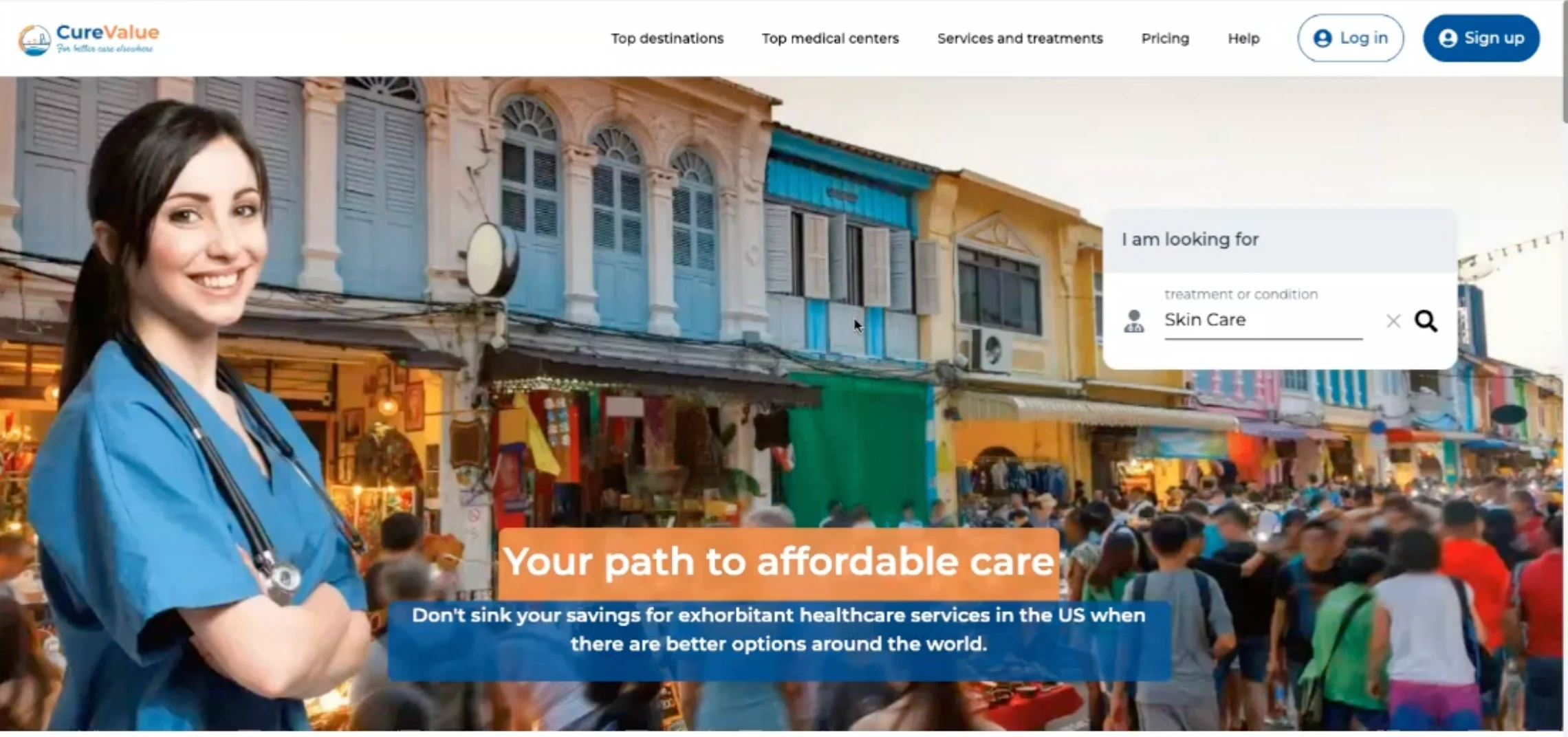
BEFORE: A search box with an unclear function that is easy to miss, site navigation that implies search functionality (by destination or facility) that does not exist, and copy that focuses on the negative instead of the problem CureValue solves.
My Approach
As a first step, I evaluated the home page as a brand-new user unfamiliar with CureValue to identify the primary opportunities for improvement. From there, I produced deliverables including:
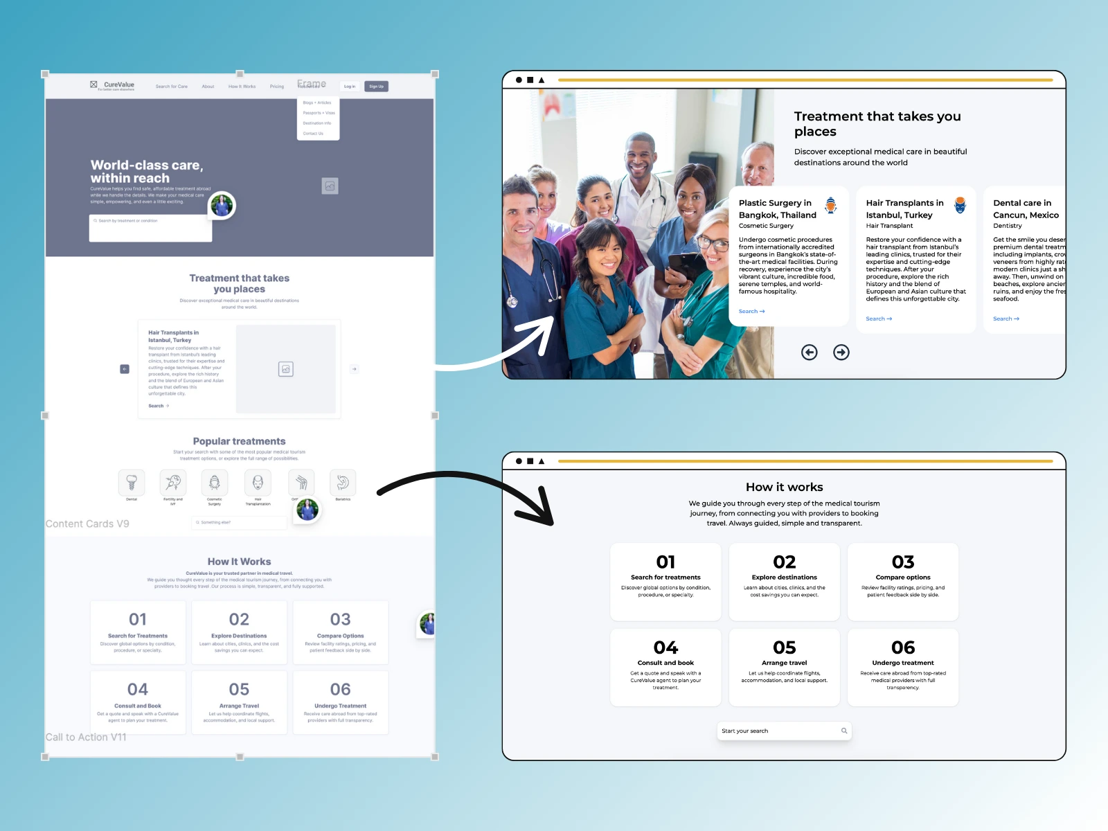
Updated Home Page Wireframe: I used Figma to develop a low-fidelity home page wireframe that directs website visitors towards the information they need and a clear call-to-action.
Refreshed Home Page Copy: I wrote updated website copy that clearly communicates CureValue's purpose and service offering, speaking directly to their target audience's pain points.
Additional Feedback: Offered additional high-level UX feedback, covering areas like the main site navigation menu and critical user journeys like account creation and treatment search.
Results
Achieved clarity on the user journey and aligned the home page layout and copy to effectively direct users to the appropriate next action.
An actionable plan for subsequent website updates, recommendations for larger re-design projects that would have the greatest impact, and guidance on best practices.
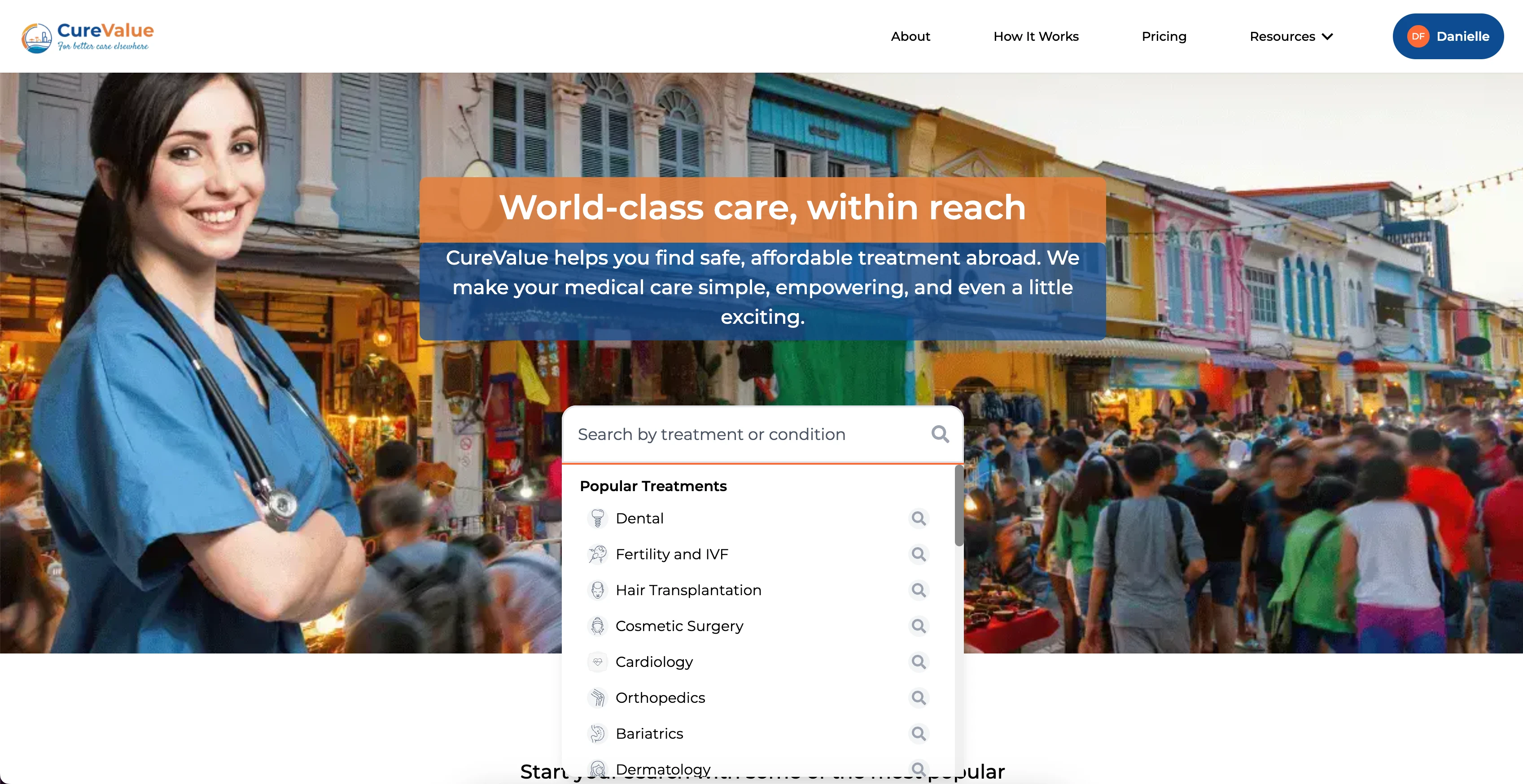
AFTER: Streamlined site navigation focused on driving users to learn information about CureValue that guides them towards signing up, a more centrally-located search with a clear function, and positive, solution-oriented copy.
Key Takeaways
No action without clarity: Providing users with as much information as possible as quickly as possible is not effective compared to identifying a clear call-to-action or best next action and only giving the specific information needed to get them there.
Clarity isn't reductive: De-prioritizing some information in the interest of clarity for users doesn't mean withholding necessary details or over-simplifying complicated concepts. Ideally, it means guiding users to the right information at the right time.
Like this project
Posted Aug 23, 2025
Optimized CureValue.org’s homepage with strategic UX insights and refreshed copy to engage users and drive conversions.
Likes
0
Views
22
Timeline
Jun 19, 2025 - Ongoing
Clients
autowoven